AUGUST 2008 ARCHIVES
April 28, 2008
Color Forecast 2009
Excerpt from Home Accents Today Magazine
by Lindsey Strader April Issue 2008
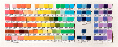
Images from Pantone View home + interiors Forecast for 2009
Breathe Easy
Pantone Color Institute’s palettes focus on reinventing color as “consumers continue to be more thoughtful than ever about what they are buying and the impact their choices are having on the world around them,” says Lee.
Breath Easy is a Pantone palette that reflects the need to hold onto what we have in the world around us. “Everyday concerns, not the least of which is environmental, plead the need to find a place of respite and relaxation–to unwind and rewind.”
Cool tones invoke this calming effect the best, creating “thoughts of breathing easily, a constant reminder of the clear, clean blues found in a cloudless sky, sparkling over a blue-green body of water,” says Lee. “Breathe Easy incorporates pure bright white and variations of the blue theme, including deep ocean and Provence blues,” Lee said. “Garden greens, muted vegetables yellow-green and the introduction of blue purple for a meditative tone, permeate this palette.”
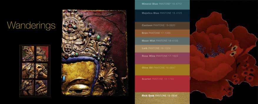
Wanderings

Pantone Color Institute created the Wanderings group. Lee examines the ever-fascinating exotic tones. Travel – real or aspirational – to far-off destinations such as Nepal and Machu Picchu serves as inspiration for this grouping.
“Dusky tones of rose, Dijon-like yellows and deepened taupe mix with both mineral and Mediterranean blues and misted gray. All shades are dramatically embellished by rich gold and scarlet red,” said Lee.
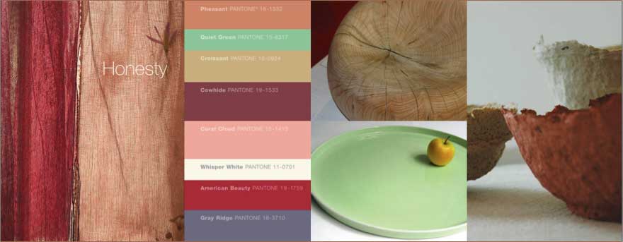
Honesty

Not a novel concept for most, recycling is an environmentally friendly practice that continues to influence home decorating and design, especially color, as ways for reusing products and materials keep evolving.
Pantone Color Institues’ interpretation of the recycling influence can be seen in Honesty. “Just as the name implies, Honesty speaks of a very real attempt at recycling – Creating treasure out of what was destined to become trash,” said Lee.
This palette revisits shabby chic, with a heavier footing on chic than shabby, she said. An appropriate subtitle for this palette could be “designer boutique meets flea market find.” Lee cited examples such as reusing discarded glass or ceramics to make artful mosaics, or using eco-friendly vegetable or plant dye to color natural fibers. “Included in the recommended mixes are unbleached whites. Tender greens, clouded corals, toasty warm tans and cool gray, unexpectedly punctuated by velvety-red rose.
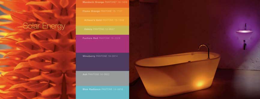
Solar Energy

Even though there is generally a bigger movement in 2009 into blue, blue-green and purple, warm is not going away.
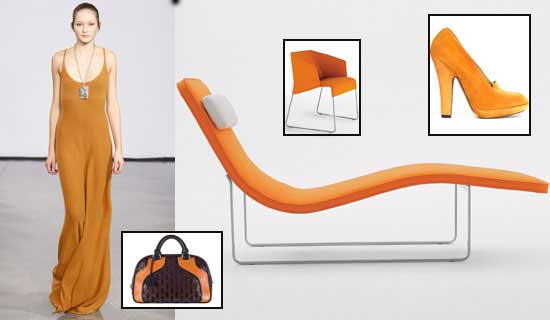
This palette, titled Solar Energy, figuratively captures the dynamic power inherent in the sun, depicting the rays of color that have come to symbolize an alternative to fossil fuels. When you have a color like orange, which has been a slow, steady grower, reinventing the hue is key to keeping the look new and fresh suggesting color combinations such as orange and gray for an updated glow.
Mandarin Orange, Flame Orange, Artisan’s Gold, Celery, Fuchsia Red, Wineberry, Ash and Blue Radiance make up the Solar Energy palette.
“Variations of mandarin and flame orange remain strong for future, with radiating gold and green-based yellows reinforcing the vitality,” said Lee. “A mulled purplish wine, fuchsia red and eclectic blue add an interesting dimension to the mix, while an ashy gray provides a calming neutral influence to this volatile mix,” described Lee.
April 25, 2008
What indigenous colors would fit your city?
Here are a few mentions found in Marylou Luther’s column in The Plain Dealer
Dear Marylou: You once wrote that a famous color expert believes that cities have indigenous colors. What is Cleveland’s shade? – U.W., Cleveland.
Dear U.W.: According to color expert Leatrice Eiseman, Cleveland is charcoal gray. In her geographic chromatics, New York is black and Los Angeles is white. And the color comes in between. “Chicago,” says Eiseman, is “similar to New York, but more dark, rich brown than black. Houston is take-no-prisoners red. Miami is a cha-cha-cha mix of bright color. And Denver is tan, rawhide and all shades thereof.”
April 24, 2008
What are the benefits of pink?

As far as a comment about pink from our color expert: in general, pink is the color most associated with good health, as to have a rosy ‘glow’ is seen as the optimum of good health. Even people with very dark skin get a rosy quality to their skin when they exercise or are in good health. Think of the expression ‘in the pink’, meaning healthy. It also connotes an optimistic viewpoint, as in ‘looking at the world through rose-colored glasses”.
April 21, 2008
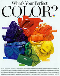
What’s Your Perfect Color?


InStyle Magazine April Issue 2008 by Charles Masters
Sure, black is nice. It’s slimming, sophisticated and makes coordinating clothes a no-brainer. But color, the right color-like a periwinkle that brings out those baby blues or a bright cardinal that matches your fiery personality-can transform your looks and your attitude.
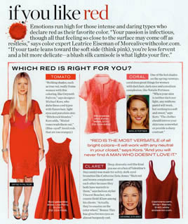 Emotions run high for those intense and daring types who declare red as their favorite color. “Your passion is infectious, though all that feeling so close to the surface you may come off as restless,” says Lee. If your taste leans toward the soft side (think pink), you’re less fervent and a bit more delicate-a blush silk camisole is what lights your fire.”
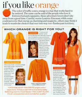 The color of traffic cones, orange is a hue that works hard to be noticed. The same can be said of the people who like it. Extroverted and expansive, these adventure lovers don’t shy away from a good time. Careful, warns Lee; while some could perceive that energy has charming and magnetic, others may think it leads to wardrobe choices that veer into way-too flamboyant territory.
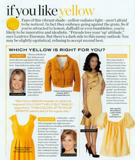 Fans of this vibrant shade-yellow radiates light-aren’t afraid to be noticed. In fact they embrace going against the grain. So if you’re attracted to lemon, daffodil or even bumblebee, you’re likely to be innovative and idealistic. “Friends love your ‘up’ attitude,” says Lee. But there’s a dark side to this sunny outlook: You may be slightly egotistical,refusing to accept second best.
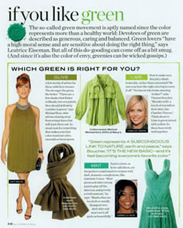 The so-called green movement is aptly named since the color represents more than a healthy world: Devotees of green are described as generous, caring and balanced. Green lovers “have a high moral sense and are sensitive about doing the right thing. But all of this do-gooding can come off as a bit smug. (And since it’s also the color of envy, greenies can be wicked gossips.)
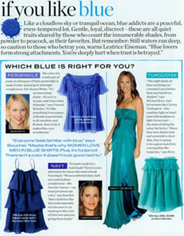 Like a cloudless sky or or tranquil ocean, blue addicts are peaceful, even-tempered lot. Gentle, loyal, discreet-these are all quiet traits shared by those who count the innumerable shades, from powder to peacock, as their favorites. But remember: Still waters run deep, so caution to those who betray you, warns Lee. “Blue lovers form strong attachments. You’re deeply hurt when trust is betrayed.”
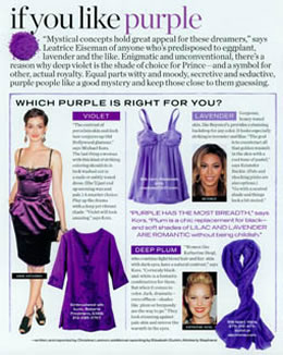 “Mystical concepts hold great appeal for those dreamers,” says Lee of anyone who’s predisposed to eggplant, lavender and the like. Enigmatic and unconventional, there’s a reason why deep violet is the shade of choice for Prince – and a symbol for other, actual royalty. Equal parts witty and moody, secretive and seductive, purple people like a good mystery and keep those close to them guessing.
April 17, 2008
What are your spring colors?
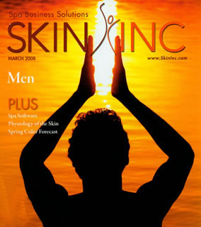
SKIN INC Magazine
March Issue 2008
Abby Penning

Spring is in the Air
The rush of new greenery on trees, bushes and lawns is also pairing with recent environmental awareness to push the natural shade as a hot seasonal hue. “The green colorings can be seen as an extension of the whole natural theme, and in particular, yellow-greens represent that,” says executive director of the Pantone Color Institute and author of More Alive With Color Leatrice Eiseman.
With lip options at both ends of the spectrum, a variety of shades are popping up. At one end, Eiseman describes the lighter look, saying that, “There are the cantaloupe-y shades, vibrant colors with softer tones, and this spring, colors are going to bring about the possibility of doing more of the subtle, soft lip color.”
The woman makes the makeup
Eiseman is also a fan of mixing the vivid makeup shades with classic standbys in more muted hues. “Using neutrals, you get something you can wear for several seasons and then accessorize with some of the more trendy pops of color,” she says. “In a time when people are concerned about politics, the election, the war and so on, some vitality in cosmetics can be a lift.
Spring fling
With its exciting flashes of color and innate flow, springtime is the perfect time to invent a new, refreshing look for your clients-and even yourself. Whether creating a bold statement with brightly line eyes and whisper-soft lips, or merely using blushes of pink and orange to grace lids and cheeks with touches of warmth, Eiseman recommends seeing makeup as an extension of the woman. “It’s viewing the faces as a palette and using makeup in an artistic way,” she says. “There are a lot of women who don’t do that, but makeup as art will be a big influence for the next year.”
April 15, 2008
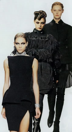
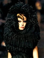
Mirroring the economy’s dour mood, designers back to black

Recession Chic
As described in Time Magazine for April
Christian Lacroix, a designer, usually known for bright colors, says his somber fall collection may be “linked unconsciously to recession,”

The article goes on to describe more recent films, like Tim Burton’s Sweeny Todd, have also inspired the somber palette. “We’re seeing a lot of dark movies these days, and they definitely influence the color story,” says Leatrice Eiseman, executive director of the Pantone Color Institute. Black is always the color people rely on most often in tough times, especially if they’re going to spend on big ticket items.”
Eiseman, who prepares an annual color forecast for the fashion and home markets, says black will most likely be included in pantone’s selection of the top 10 colors of 2008. “Psychologically, it’s also the color people wrap themselves in to become impervious to the outside world. It’s a security blanket,” she adds.
April 8, 2008
The reason for yellow’s surge in status?
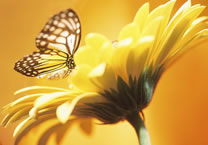
This spring, style hands you lemon
USA TODAY’s Lifestyle article
by Donna Freydkin.
Yellow is anything but mellow this spring and summer. The sunniest of colors is bursting out as the season’s hottest hue.
The reason for yellow’s surge in status? “It has a very clean, modern aesthetic. In a sense, it’s a fashionable neutral, says New York-based handbag and show designer Monica Botkier.
If yellow is your favorite, you never say: “Been there, done that.”
Yellow is luminous and warm because it is strongly associated with sunshine. It sparkles with outgoing activity. Yellow people are highly original, innovative, imaginative, idealistic, creative, artistic and often spiritual. You love novelty and challenge and have an inquiring mind. You are a reliable friend and confidant. You are optimistic and encourage others to do their best, so your friends love your “up” attitude. Your ambitions are often realized, and you usually have a sunny disposition, which makes you a fun “playmate”, Lee describes.
April 1, 2008
Gray Matters
April Issue of W Magazine
by Jane Larkworthy

Mention of the word “gray” has always sparked associations in the dour and the dowdy: “gray skies,” “gray mood,” “gray hair.” But these days, gray is downright chic and showing up everywhere: in Anne Kreamer’s recent eye-opening book, Going Gray; in the current Jasper Johns exhibition, “Gray,” at the Metropolitan Museum of Art; and where you’d least expect it – on the spring runways.

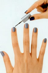
WHY WOULD YOU WANT A… GRAY NAIL POLISH?
Lee’s interview with O Magazine in January’s issue 2008
“I can’t remember the last time gray or navy nail polish was a trend. We’re in a time of big changes in the world, and (basics like) gray represent stability. Gray nail polish also suggests uniqueness; wearing it, you’re making a statement about being a bit off beat.” If you like offbeat, you’re in for a treat: Lee predicts canary yellow polish for next year.
MAY 2008 ARCHIVES
May 30, 2008
How does color thinking evolve?
An Update on Consumer Responses, Part ll
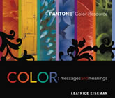
Editor’s note: The following is excerpted in part from Color Messages and Meanings, A Pantone Resource Book. Part 1 of this article appeared in the Winter 2007 issue of Innovation.
EVOLVING COLOR CONCEPTS
INNOVATION MAGAZINE
A QUARTERLY OF THE INDUSTRIAL DEIGNERS SOCIETY OF AMERICA
SPRING 2008
By Leatrice Eiseman, Affiliate IDSA

Many color concepts remain stedfast in consumers’ minds, rarely changing. Still, color thinking can, and does, evolve over time. In the previous issue of Innovation, I wrote about some of the color word-association responses collected during my 22-year stint as color consultant to Pantone. Last time I discussed the warm colors. Here I address the cool tones.
Defying Cool
Long associated with the serenity of a clear blue sky, the human mind easily wraps itself around the concept of blue as serene, tranquil and constant. It is the light, mid- and deep blue shades that bring a feeling of respite and introspection – quiet, cool permanence. Such association translates blue into a symbolic image of dependability and loyalty. Obviously, this works well in brand image and signage as it inspires a remarkable dedication from the consumer.

Blue is the first choice for corporate branding and identification.
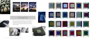
The constant challenge of such a pervasive use of a specific color is to keep it looking fresh and not hackneyed . If the essential message begs for a true blue image that speaks of integrity, look to a dominant blue used in innovative combinations.
But beware the oft-repeated messages that place all members of a color family under one umbrella. All blues are not calming. For example, for the Greek electos, meaning “gleaming, shy and brilliant,” come the electric blues.
These are the glowing hues that defy the typically cool message of the blue family, demonstrating the spark that can emanate from this glittering shade. Vivid blue are now used as familiar signal colors – especially in high-tech applications such as the control panel on a slick new appliance.
An Avocado Comeback
With a multitude of greens so plentiful in the surrounding world, the human eye literally sees more green than any other color. As a result, green can convey many moods.
An abundance of green also indicates the availability of water – so necessary for human survival. A majority of people see green as symbolic of nature and new beginnings, as green refreshes, restores and reaffirms that the seasons repeat in exactly the same sequence every year, always heralded by the emergence of the tender green shoots in spring.
Leafy greens also connect with newness, youth and growth. Various other greens, especially yellow greens, identify vegetables and fruits – fresh, healthy and so important in today’s organic world. Even the formerly reviled avocado green has taken on a new cache. Green continues as the symbolic color family representing sustainability and eco-consciousness. This goes far beyond trend and embraces a cause that resonates with many of todays’ consumers. But be aware that there is also a growing skepticism of manufacturers and products that use green symbolically but are not actually green.
In children’s markets, the dedication to yellow green is more about the continuing saga of Shrek. And even thought that does no seem like a new influence, the shelf life of a color can continue as a legend grows. In fact it is continuing, with a new Shrek stage musical slated to open later this year and another film in 2010.
Studies show that greens with an undertone of blue are among the most popular in that family. For example, teal is a thoughtful color that excludes confidence and is considered more elegant than an ordinary green or blue embracing the symbolic qualities of both. It is a tasteful color, often preferred by those who appreciate sophisticated styling, a rather upscale shade that could not be described as ordinary.
Back to Black
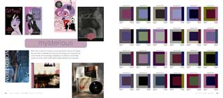
Purple is also not considered ordinary, defining many moods. Depending on the undertones of the shade and its positioning with other colors, purple can be exciting and energizing, even sensual (thanks to mother red), or mysterious and somewhat mystical. The blue purples have been used to express certain heavenly, transcendental or spiritual properties, taking awareness to a higher level of awareness to a higher level of thought in relaxation to the cosmos. With new-age philosophies proliferating, these shades have become more mainstream.

Purple flowers and foods are more distinctive in appearance and taste than most, supporting the uniqueness of the hue. Think aubergine, the elegant French word for eggplant. It’s definitely an acquired taste. Think berries, grapes and purple plums – as sweet as they might be, a burst of tang often accompanies the first bite.
The exclusivity concept attached to purple came about because of affordability and availability. In ancient times, only the wealthy could buy purple garments as the dye was extracted from tiny mollusks – approximately 336,000 snails yields one ounce of dye. So purple became the provenance of kings, queens, nobles and wealthy, powerful patrons. That concept is completely lost in todays more democratic approach to color usage, where people of any background can embrace a color simply because it appeals to them and is affordable.
In my recent book Color Messages and Meanings, I could not resist a quote from Alice Walker’s The Color Purple, so I included it on the page showing the various purple tones and meanings. She wrote, “I think it pisses God off if you walk by the color purple in a field somewhere and don’t notice it.”
Strange as it may seem, white is perceived as a color. Pure white is highly visible to the human eye and, because of its clarify and reflectance value, is viewed as brilliant. Pure white always has been and will remain the ultimate color of purity and cleansing . Temperature-wise, it always says cool.
Black is not only the quintessential color of power and empowerment but also of staying power. In consumers’ minds, black invariably adds elegance, sophistication and greater perceived value. And regardless of media’s inevitable question to me regarding the ‘new black,’ my response is: Black is the new black!
Dr. Alan Hirsch, M.D., is a founder and neurological director of the Smell and Taste Treatment and Research Foundation in Chicago
Matthew Suttor is a composer and lecturer in sound design at the Yale School of Drama.
May 13, 2008
We were fascinated by writer Peter Schjeldahl descriptive color terms
CRITIC’S NOTEBOOK
MEDIUM COOL
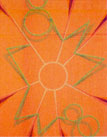
“A show of small, tidy canvases at the punctiliously hip New Museum designates Tomma Abts, the Turner Prize-winning German-English painter, who is forty years old, as the doyenne of a sudden fashion for good old abstract painting in newfangled guises. She’s pretty cool. Her one-of-a kind (though all of a type) compositions deploy serpentines, polygons, rays, and other generic forms in schemes of stringent color: worried red, disgruntled gray-green, caffeinated peach.”
Excerpt from Peter Schjeldahl Critic’s Notebook in the New Yorker Magazine.
May 5, 2008
The 2008 Crescent Color Trends program, includes Lee’s palette overviews.
As found in the
Crescent 2008 Color Trends Forecast
The latest trends in custom framing and home design.
W E L L S P R I N G
Water universally symbolizes cleansing and clarification. The Wellspring palette provides expression of this life-sustaining force. Its variations on blue and aqua define water’s cooling, soothing qualities. Deep undersea green, violet indigo highlight the blues with a glimmer of effervescence. Porcelain and shades of Rust ground the combinations, providing balance.
C H I N O I S E R I E
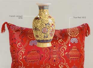
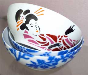
The Chinoiserie palette suggests Asian-inspired design, a style based on the blending of graceful shapes and charming motifs found in ancient Chinese porcelain, paintings and silks. Chinoiserie artfully combines tones of Purple Wildflower with French Jonquil, bright Azalea and hushed greens. And, as always, the traditional touch of antiqued Chinese True Red.
A G R E S T I C
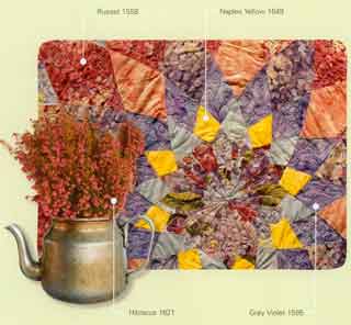
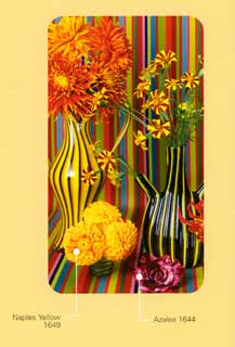
In this palette the culture of handcrafted materials takes a decidedly upscale direction. It’s contemporized country, a redo of rustic textures and surfaces in new color combinations that are both comforting and unexpected. For example, mix Russet with Wasabi and accent the combo with golden Naples Yellow or Vibrant Hibiscus.
R E C O L L E C T I O N S
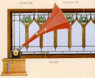
History repeats itself, but there are always interesting new adaptations that energize traditional themes, usually through new color mixes and new materials. ReCollections provides a link to the past, with Williamsurg Blue and muted Cong Green. Those warm familiar tones take on a fresh look when combined with surprising hues like elegant White Gold-Renaissance and warm English Rose.
N U A N C E S
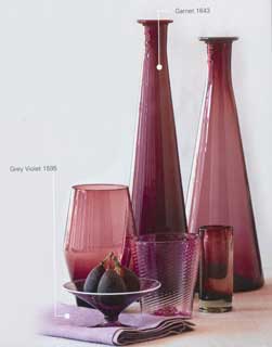
Classic, nature-inspired neutral hues will always have a place in the world of home furnishings. The Nuances palette provides a beautiful collection of neutrals that can be paired and layered to create unexpected and intriguing accents. Combine Crimson with Tampico Brown or Garnet and Highlight with Brownstone.
H I G H P R O F I L E
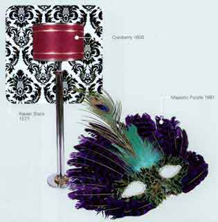
Inspired by the styles that have managed to survive the fads and foibles of the past, the High Profile palette presents classic shades of Very White, Raven Black, Claret and Neutral Gray. It gets its glamorous accent with an impact of Cranberry, Majestic Purple and glimmering Silver – Renaissance and Gold – Renaissance.
 E T H N I C C H I C
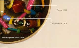
Today we have a plethora of design influences from around the globe. As urban nomads, we can wander the world, physically and digitally, looking for the styling and color language of other cultures that speaks to us. Ethnic Chic brings a new level of sophistication to this trend, paring rich hues with softer neutrals. Try Purple Wildflower with Empress Gold and Serengeti. Or juxtapose Sunset Clay against Calypso Blue and Sepia.
S A V O R I E S
The Savories palette gives you the ingredients to whip up something whimsical. In a stress-filled world filled with commitments and concerns, this palette is your recipe for turning a living space into a fanciful timeout. With its exuberant hues, you can create delightful blends like Maroon with Wasabi, then accent with vibrant Naples Yellow.
May 1, 2008
Which Red Should I Use To Paint The Wall?
New York Times – Home & Garden
Room to Improve
by Stephen Milioti
Q. I want to paint a room red. How can I make sure it will feel livable?
A. You absolutely can create a comfortable room with red walls by focusing on the details and combining risk-taking with research.
One expert on color, Leatrice Eiseman, has only good things to say about red. “Red is the color of the heart, of sensuality,” said Ms. Eiseman, the executive director of the Pantone Color Institute. “It works well virtually anywhere in the home, and works particularly well in the bedroom.”
When it comes to choosing colors, Ms. Eiseman said, “I don’t like rules, but there are general guidelines.”
Start by determining what kind of feeling you want to create in the room. Darker reds, sometimes referred to as the bluer shades, produce a soothing, calming effect, she said, while brighter or golden reds offer more excitement, especially in the bedroom.
The easiest way to tell the difference between the two, she said, is to hold up a bunch of swatches and compare them. “Your eye will then clearly distinguish brighter or darker.” Ms. Eiseman warns that a “bordello red” — a shade that is too bright or too glossy — will be hard to live with over time. She suggests choosing a true red, which has “both the brights and the darks in it.” Examples include American Beauty from Pantone and Real Red from Sherwin-Williams.
JUNE 2008 ARCHIVES
June 29, 2008
Does intense pink really make men (and boys) weak?
“I can’t tell you how many times I have been asked this question, especially from mothers of teenage sons! Actually there have been studies done that both prove and disprove this theory. The first study, and the most famous as it received a great deal of media attention, was conducted by Dr. Alexander Schauss of Tacoma, Washington. He observed that after a period of “hyper-excitement” his blood pressure, pulse, and heart beat lowered more rapidly when he viewed a specific shade of intense pink.”
DI retail design magazine May Issue 2008
Pink in retail design
An Excerpt from New retail formats take flight at London Heathrow
Technology is also apparent at Thomas Pink, where a “Pink Business Bar” shows the latest stock results and news on a pink LED display. Customers can listen to music on a pink iPod, drink Pink-branded water and write on postcards with iconic London images.
June 18, 2008
An Event Design Magazine excerpt, September 2007
THE PSYCHOLOGY OF EXPERIENCES
SENSE AND MARKETABILITY
T A S T E
Taste Bud Trickery Nothing against taste buds, but about 90 percent of what we call taste is really smell. The scientific term for it is synesthesia. Designers can capitalize on this phenomenon by using scent to inspire food-based buying decisions. Hirsch suggests putting scratch-and-sniff stickers on marketing elements. “When they smell the scent, the customer will perceive the flavor and will be more inclined to buy the product,” he says. To go for a pure taste bud assault, Hirsch suggests appealing to fat receptors in the mouth by serving sugary drinks and spicy foods. “If you want to make people more placid and compliant, go for a sugar and fat taste,” he says. You can get the opposite effect by stimulating the system with tastes like horseradish and bitter herbs. The powerful spiciness registers as pain in the mouth and nose, creating a state of alertness.
DO: Want to make a tiny footprint seem larger? Leverage the synesthesia. Hirsch says hints of green apple and cucumber scents can do the trick. Want to make a huge space feel more intimate? Think ribs. “Barbecue roasted meat makes people perceive a room as smaller,” says Hirsch.
DON’T: Exhibit near highly polluted areas. The air makes people aggressive. “Studies show that the more air pollution in an area, the more auto accidents there are because drivers drive more aggressively,” says Hirsch.

S M E L L
Subliminal Scent In his research, Hirsch found that introducing certain scents got people to buy more in a retail setting and gamble more in a casino. Scent also increases learning potential and attentiveness. A mixed floral smell, for example, increases the speed of learning by 17 percent. But pumping scent bombs into crowded convention centers or at outdoor venues is about as effective as tossing money into the wind. If you’re going to pump in fragrance (see “Aromatherapy” on eventmarketer.com), try pumping in a scent at a barely-there level, just above what the fragrance industry calls detection threshold. “It doesn’t knock your socks off,” says Craig Warren of the Sense and Smell Institute. “But if someone cued you, you’d say, “oh, I do smell something.” Companies like ScentAir Technologies and Aromasys formulate and sell scents for branded environments.
Do: Pick stimulating notes like citrus and mint. “peppermint is a good performance booster,” says Warren. Most Floral scents make people happy. Vanilla takes the cake for most universally liked scent.
Don’t: Go for a rose scent, Warren says. “It reminds people of funerals.”

S E E
Color Currents Every color has inherent psychological and emotionalmeanings, says color specialist Leatrice Eiseman. Her “rich” palette, for example, combines brown, claret red, and olive green to convey quality and taste. Old school rich tones like purple an black have given way to hues of espresso, red wine, and martini olives. One way marketers can make the see-then-feel connection is to let go of the connotations and embrace new color trends. When a new color combination comes on the scene, about 10 percent of people will immediately adopt it, says Eiseman. For the other 90 percent, “what happens is, over time, the eye becomes more accustomed to seeing that color and even the person who is resistant to it when it first comes out ultimately starts to absorb it out of peripheral vision.” Being first on the scene to effectively combine current colors is an opportunity for designers to make a brand statement. “A lot of attendees are people who will say, ‘this is interesting,’ says Eiseman. “They will look at what you have to offer as something intriguing because they think you are very aware.”
Remember that no one uses each of the senses without the others. You can get the benefits of scent-induced environment without the odor by using color. Want the hypnotic, happy-making effects of a punchy lemon or lime scent? Try creating a vibrant yellow or green environment. “People can match colors and odors, and match both with moods almost spontaneously,” says Warren.
Do: Get three for the price of one. Bright tones like this season’s greens and yellows not only “smell” fresh, they get you greater visibility plus tap you into one of the hottest color trends. “You would be perceived as having the latest approach,” says Eiseman.
Don’t: Use your logo as the sole inspiration for your exhibit design. “You don’t have to remove the equity you have in that color,” says Eiseman. “But surround it with other [current] colors to give it a fresh new perspective.”
H E A R
Sounds Personal Sights and smells can remind us of happy childhood memories, but sounds can be stimulating, too.
Matthew Suttor, a composer and lecturer in sound design, says, “Visual memory can be faulty, so sound is very potent way to localize someone physically in a space, but also [a good way to create] a certain kind of environment.” Delivering sound to one person at a time can be especially helpful for making an emotional connection in an otherwise overcrowded, over stimulated environment. “We live in this iPod culture not where everyone can control not only the volume at which they listen, but what they’re listening to as well, “says Suttor.
Museums and galleries, for example, use interactivity to personalize the experience. (See the bird in the diorama and push the button to hear it chirp.) “It’s the difference between a individualized auditory tour and a one-size-fits-all sound experience,” Suttor says. “We’re a society of individuals and we want to be in control.”
Do: Remember that sound is more than music. Auto brands often experiment with unique sounds in their TV ads, a practice called conceptual sound design. The audience makes an association between the known object, the car, and an unknown or playful sonic effect. “We’re able to make an association between sounds and images that we read as being innovative,” Suttor says.
Don’t: Turn up the volume. Says Suttor: “People use volume as a way of selling things but it can also be a repellent.”
June 9, 2008
Do Fashion Trends Trickle-Down or Bubble-Up?
The influence can trickle down or bubble up, however, the trickle down effect is still the most-used way, especially as so many high-end looks now have become aspirational.
For example, I saw a kid of about 17 on the ferry yesterday that runs between Bainbridge Island where I live and Seattle. He had on a pair of jeans, not designer, a striped knit shirt that did not appear to be a designer look, maybe Old Navy, sneakers that appeared to be customized but I could not tell the brand and a very large Louis Vuitton duffle that was new and not a fake!!
His style sense ‘on the street’ might inspire a designer who saw his look to do other looks like that, still his clothing is already out in the marketplace, so it is not the individual pieces of clothing that is so inspirational, but the way that he put it all together. Very individualized, incorporating high, mid and low. It was the bag that he held very proudly— and wanted everyone to see.
Lee
June 2, 2008
Summer fashion trends from New York
Desicribed by Lee
The summer season 2008 has some really fun colors to chase the winter doldrums away. The Spring forecast from the fashion collections shown in New York has some vibrant tones guaranteed to lift every mood. Included is a lively blue, a refreshing alternative to navy, while the sunniest possible yellow, sparkles with vitality. A yellow green, the color of a lime, brings a splash of citrus, while a delicious melon tone adds a special deliciousness. A brilliant tango red instills a scintillating energy and a pinkish-purple color, like typical bright spring flower injects some magic into the mix.
Lee states, ‘while it is fun and inspiring to look at the trend colors, the ultimate challenge for most people is creating combinations for a ‘real-life” wardrobe.
As explained in Lee’s book More Alive With Color: “We all know how the denim blues work with every other color. Another alternative hue is a shade of blue that looks like the sky on a gorgeous spring day that is a backdrop to every color that appears in nature. Think of any color of flowers—from cheerful daisies to pink roses or exotic purple orchids against the beautiful blue of the sky—would we ever say Mother Nature made a mistake is combining her colors?!
Sky Blue blends beautifully with cool tones and adds a balancing touch to warmer combinations, especially in the expected warmth summer. You can’t help but create beautiful combinations using nature as the inspiration. Variations of green, from the deep forest shades to pale khaki, also make a wonderful background to many other colors, just as they do in natural surroundings.
The deepest black or midnight blues as well as earthy browns also contribute to the shades that Lee refers to in her book as the Crossover colors. These are the hues that become the background shades in the wardrobe and are fashion classics.
Lee also explains how so many neutrals that are found frequently in nature will blend and harmonize with so many other colors. Think of the comforting shades of warm sand; imagine the quiet grays of stone and pebbles. But the Crossover colors are not all neutral or dark. Think to Mother Nature and she uses vibrant reds as accents in berries and flowers or ripe fruit, or the warming touch of sunshine yellow to make your day brighter.
Summer 08 includes neutrals like toasty tans and silver grays. But again, as Lee advises: “In this season of renewal, punch up those dependable basics with the vibrant bright tones to bring a sense of vitality to you and your wardrobe’.
For more information about Lee’s color concepts, her books, fanguides for matching and combining, online career training and enhancement training program utilizing color, please visit morealivewithcolor.com.
JULY • AUGUST 2008 ARCHIVES
August 19, 2008
Colorful Excerpts from
Purple Hues Enliven Perennial Color
by Linda Miller, Fashion Editor, NewsOK.com
Who knew a color could evoke feelings of dependability and constancy?
That’s the power of blue. It’s reliable, like the sky.
Unlike sky blue, navy, periwinkle and baby blue, which tend to be eternally popular, the hue that’s getting much of the attention this year is blue iris, a purple-blue that’s been named the color of the year by the Pantone Color Institute.
Insecure times call for a color that’s reassuring as well as magical. No ordinary blue will do.
“There’s something very sophisticated about it and a little bit mysterious,” said Leatrice Eiseman, executive director of the Pantone Color Institute.
Adding a pinch of purple to blue gives it more interest. It’s not just ho-hum navy blue. Purple gives blue personality, Eiseman said.
While fashion designers embraced this color and other ranges of blue for fall, purple blues also are popping up in upholstery fabrics, ceramics and glassware, giving the shade even more credibility.
“We know that green is connected to the environment, but so is blue,” Eiseman said. “It speaks about the environment, water and sky without having to be another green.”
For those who don’t gush about blue, Eiseman suggests giving periwinkle a close look.
“Periwinkle blue is the happiest of all blues,” she said.
One thing to remember: Blues tend to have staying power. “It’s not the kind of thing you pull out of your closet and say, ‘Oh, that’s over.’ Blues you usually keep around longer,” she said.
The blue blazer is the perfect example. “There’s that feeling of dependability about blue,” she said.
August 13, 2008
BRITISH VOGUE
Lee’s recent interview with Kay Barron
Why do you think that designers have gone for a more unusual sophisticated palette for autumn & winter? (For example, Halston has chosen unusual combinations including ochres, egg blue, aubergine and copper and have combined them in a way that they need to be worn together, rather than with the contrasting black colours we have seen previously.)
I think ‘unique’ is a key word here. There has been a movement away from ‘cookie-cutter’ looks, both in design and in color that has been gaining momentum for several seasons. It really offers women the opportunity to exercise their creativity – a more ‘artistic’ approach to fashion and a means of self-expression.
Are soft subtle prints and shades for autumn & winter a big incentive to buy?
I don’t know that it is a ‘big’ incentive to buy, but for those who are of a more practical nature, especially in unsure financial times, there is a sense that those colors will not look outdated. They are more ‘reliable’ and that can provide an incentive to buy. At the same time, the softer palette, especially neutrals can be accented with more vibrant colors, providing a good background to that touch of brightness.
Do you find certain colours more soothing to work with?
In general, the more soothing colors are those in the cooler range, as in greens, blue-greens, blue-lavenders and pure whites. Neutrals can also be soothing, as in calming grays or taupes.
Which colours sell the best, in your experience?
One of the reasons that designers often use black is that it is often a color that consumers defer to – it is not only safe, but it covers many bases – sophisticated, yet practical, trans-seasonal, combines with many colors and is flattering to the figure. I don’t have actual sales figures, but this is what colleagues in retail report.
How do colours affect sales? Especially for autumn & winter seasons?
Colors always affect sales, since 80% of human perception is based on visual cues, and color is the most vital part of that ‘visual cueing’, meaning that whether on display, in a shop window, in an ad or on the web, color is what captures the eye. And in sales, capturing the eye is all-important.
Are there colours which sell better in summer than in the autumn? Are the colours that are coming through for autumn & winter unusual for the season?
As a general rule, it is the brighter or lighter colors, including white, of course, that do best in that season. It is different to see those colors for an autumn & winter season, but again, there has been a growing movement to making colors more ‘trans-seasonal’. For example, a light colored summer weight jacket could be layered in winter with either a warm cashmere sweater, typically, a fall color such as russet or aubergine worn under, or winter outerwear worn over it. That satisfies the need for both the practicality in challenged economic times as well as the uniqueness mentioned above.
Which colours are you attracted to?
Personally I am drawn to Pantone’s color of the year and that is Blue Iris. It is a beautiful blue with a slightly purpled undertone, so it is soothing but a bit magical at the same time.
How do you predict colour trends? What is the process?
There are many things to consider. An awareness of socio-economic issues, such as the economy or strong social movements that embrace a particular color family (as in green associated with eco-awareness or Bono’s red campaign). The world of art and entertainment, an event that will garner world-wide interest (as in the Olympics). Even food trends and health issues, travel destinations, buzz words that are starting to surface (such as ‘iconic’ last year) as well as lifestyles. But we need to stay ahead of the curve – that is the challenge.
August 8, 2008
More on C O L O R T R E N D S in 2 0 0 8
Excerpts from Is plum the new black? Has the green movement spawned a palette?
Written by Jill Connors from Pointclickhome in which our very own colorful expert is featured.
Liberty

Color trends come and go, but one constant remains: Color is the most powerful element in home decorating. It can excite, relax, inspire and delight. The “it” colors today do all those things and more.
Plum is the New Black
“People always love blues and greens,” notes color expert Leatrice Eiseman, “but what’s especially new is that blue is also taking on more of a purple tone.” The Pantone color “Liberty,” for example, is blue like the blue in an iris and that Eiseman says is one of the hottest colors right now, because the color’s move to purple gives it a more meditative mood.
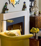
Solar Yellow
Another top color trend is inspired by the power of the sun and our eco-conscious mentality. “The warm colors connote energy,” says Eiseman, who created a “Solar Energy” palette for Pantone that includes vibrant yellows and oranges. An interesting juxtaposition to the hot hues is the use of grays.
 Personal Style
More than anything, color choice is all about personal style. “There’s never just one hot color,” says Eiseman. “People surround themselves with the colors that suit their lifestyle and their moods.”
Personal Style
More than anything, color choice is all about personal style. “There’s never just one hot color,” says Eiseman. “People surround themselves with the colors that suit their lifestyle and their moods.”Oceanic Palette
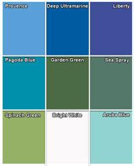
This palette of blues and greens, created for Pantone by Leatrice Eiseman, is perfect for creating a place of respite and relaxation. “It is a given that cool tones inspire us.” The palette, named “Breathe Easy,” includes sky blues, watery blue-greens, and a deep-ocean blue, as well as yellow-greens and a blue-purple.
Solar Palette
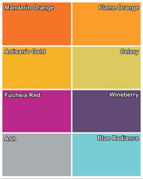
“This palette captures the dynamic power inherent in the sun, depicting the rays of color that have come to symbolize an alternative to fossil fuels,” says Eiseman who created the dazzling palette called “Solar Energy” for Pantone. It includes variations of Mandarin and Flame Orange, Gold and green-based yellows, with an interesting dimension added by Purplish Wine, Fuchsia Red, Electric Blue and Ashy Gray.
W e f o u n d a n o t h e r c o l o r t i d b i t o n t h i s s h a d e . . . .
THROUGH THE GRAPEVINE
Can’t we all agree on something?
If it’s purple, yes.
As found in Fashion & Style’s Front Row in the New York Times July 31, 2008
In a Divisive Campaign, Purple Becomes the New Neutral
By ERIC WILSON
CABLE news networks may never agree which program is fairer and more balanced, which talking head is the puppet of whose talking points, whether John McCain, in his latest advertisement, was undignified or whether Barack Obama, on his European tour, was presumptuous. But on one crucial point, the pundits have surprisingly taken the same position.
Purple is in.
Keith Olbermann, the commentator on MSNBC, has worn solid pale purple ties twice in the last week. And on Tuesday, he wore another one with purple stripes. Lester Holt, the weekend anchor of NBC Nightly News, appeared on camera in a more vibrant shade, approaching magenta. Over on Fox News, pretty much the polar opposite on the political spectrum, Bill O’Reilly was in shiny grape, and Kelly Wright, an anchor of “Fox and Friends Weekend,” showed that purple is bipartisan.
Is a color that represents the middle ground between Republican Red and Democratic Blue a sartorial statement of objectivity?
“Purple is the new neutral,” said Jim Moore, the creative director of GQ, who was making a point with two meanings. A silvery shade of purple happens to be in vogue at the moment because it goes with a lot of the gray fabrics of the season. But in this election, the news media’s objectivity has also been part of the story, with complaints that the press is alternatively too soft on Mr. McCain or Mr. Obama.
So rather than risk the appearance of favoritism by wearing red or blue, the press has gone purple. This is not an isolated trend, as the list goes on. In the last week, Charles Gibson, George Stephanopoulos, Al Roker, Michael Reagan, Jay Leno (while introducing an “Obama Mia!” sketch), Jim Hoagland of The Washington Post and Jim Lehrer have worn variants of the plum cravat, plus a pocket square in Mr. Roker’s case. Even Brian Williams, not a big fan of the style pages, wore a tie that could be described as a soft periwinkle for his interview with Mahmoud Ahmadinejad.
“I’m surprised to see it on so many people throughout this whole political season,” said Tommy Fazio, the men’s fashion director at Bergdorf Goodman. “There are other ways of not being partisan.”
July 21, 2008
WHAT IS YOUR PERSONAL CYBERSPACE COLOR(S)?

An excerpt from an article found in the New York Time Magazine describing a digital personalization – a trend in culture today.
The Medium
Personalize This
By VIRGINIA HEFFERNAN
Recently I joined a small, anonymous online community and found myself confronted by a deeply pleasurable array of choices. What color, on a spectrum (or what passes for a spectrum in digital media), did I want for the background of my personal page? How considerate. “Dusty blue,” I thought, with the high-handed decisiveness of Diane von Furstenberg or Dolce, “but more blue than dust.” I skidded around on the color wheel — too dark, too light, too purple, too black — settling on a shade that made me think of a dark blue Mexican sky.
Oh, but I was just getting started. For the lettering, I selected a pale green, like a mint Nicorette. I made the menu bars dark rainy blue-black. I also had the choice to upload a photo for about half an inch around the central page. I skimmed through my photo archive, reminiscing. This took 45 minutes. Finally a snapshot dominated by a large exercise ball stood out. The ball was dark green, and I cropped the photo till all you saw was the green rubber sphere, which had the texture and dimension of a blown-up balloon, stretched thin in some parts. The picture, plugged into the page-design software, worked perfectly as a border; you would have no idea it was a ball.
Brilliant design. I messed around with more borders and then with the fonts, settling on two that (I believed) were fresh and unexpected but didn’t sacrifice legibility.
In four hours, this corner of cyberspace was thoroughly personalized.
Do you know your Personal Signature Colors?
Click on Lee’s book More Alive With Color to learn more.
EPTEMBER 2008 ARCHIVES
September 30, 2008
Thunder’s colors are working already
From Linda Miller
Fashion Editor for The Oklahoman
Style probably isn’t a word that’s tossed around too much when discussing NBA uniforms. Strip away all the details and most uniforms would look the same. Knee-length shorts. Sleeveless jerseys, tucked in of course. Loose but not sloppy. Roomy enough for players to run, jump, dive and dunk.
So, what sets one NBA uniform apart from another?
The colors.
For the Thunder’s new uniforms, it’s white for home and sky blue for the road.
White is a high visibility color, said Leatrice Eiseman, executive director of the Pantone Color Institute. White will make the players and uniforms stand out on the court against their opponents.
“White is an attention-getter,” she said.
The road color, sky blue or Thunder blue as it will be called, is the most universally understood, Eiseman said. “Most people associate it with dependability, loyalty, the trueness of a sky that never falls. … People just associate blue with an optimistic viewpoint.”
There’s a positive feeling attached to it, she said. “More people have positive feelings to blue than any other color.”
Accent colors red-orange and yellow offer a good balance to the coolness of blue and the starkness of white. Energy is associated with red-orange, and yellow conjures images of sunlight and evokes cheer and friendliness. Those colors are very approachable, Eiseman said.
The Thunder’s Nick Collison, who modeled the white home uniform for the media, said at first he wasn’t sure he would like so many colors. But he does, he said.
Looks like the power of blue and attention-getting white are already working.
A tidbit on Color Trends
Excerpted from an article in the
Atlanta Constitution
written by Nedra Rhone
BLACK HISTORY
In Western culture, the color black has commonly been associated with power and death, but it has also been linked to various cultural movements over the years. “Every decade since the 1920s, there has been some blip where black has gotten attention primarily … because of its austerity,” says Leatrice Eiseman, executive director of Pantone Color Institute.
In recent decades, she says, the color has moved beyond those cultural associations to become ultimately aligned with high tech and high style.
Here’s a black timeline, according to Eiseman:
1920s-1940s: Black colors the bohemian culture in America.
Late 1950s-1960s: Black is co-opted by the Beat Generation.
1960s-1970s: Black is Beautiful movement attempts to take back black.
1980s: Black and Goth become common bedfellows.
1980s-present: Black enters new era of sophistication, elegance, and association with all things high tech.
A bit more from Color News and Views
Excerpt from Business Week
Scott Kirsner is the author of the new book Inventing the Movies, and a journalist who has written about innovation for Variety, the Boston Globe, Wired, and BusinessWeek. He also edits the blog CinemaTech, which covers the intersection of new technologies and the entertainment industry.
Persistence is a virtue
Even the smartest people tend to underestimate the amount of time it will take to hone a new idea and persuade the world to give it a try. Without the tenacity—and the resources—to keep plugging away over years (or decades), innovators inevitably fail. Herb Kalmus, founder of Technicolor, realized in 1915 that it would require a series of “progressive steps” to develop the technology for capturing color on film and playing it back in a theater. Over the years, he had to continually hunt for new investors and cajole his board to bankroll more experiments. In 1939, two pivotal Technicolor movies came out: The Wizard of Oz and Gone With the Wind. Their success helped persuade Hollywood—after almost 25 years—to move toward all-color movie-making. (And Technicolor is still a key part of the movie industry today.)
Psych 101
A fixation on product development, design, funding, and business plans often causes innovators to overlook something that’s crucial: developing a nuanced understanding of the psychology of the people they hope will use their product or service. How do they work today, and what tools do they use? What are their business models, and their worries? In Hollywood, the adoption ofdigital cameras has been slow not because of flawed technology, but because the manufacturers didn’t spend enough time understanding the psychology of the artists who would use those cameras.
September 22, 2008
Current Health 1 magazine
by Betsy Tecco
1. Considering that teenagers are probably not consciously aware that colors can affect how they feel, please explain in simple terms why colors influence us so much. I realize you could write forever on this topic, but I’m just looking for a basic explanation that young readers can understand.
Teenagers can remember how, from very early ages on they were given their first box of Crayolas, how they have been fascinated by color. And as they grown older that fascination translates into the color of their toys, bikes, clothing or nail polish! The human mind (and eye) is adapted to “reading’ and interpreting color. Red for danger as in stop signs, yellow for the approaching school bus and so on. So color is not just a question of most or least favorite, but also about color as signals color and associations to nature as well as color and emotions. (See below)
2. How is it that each color has become associated with different emotions? I would think it’s partly due to their appearance in nature. For example, fire and blood are red, therefore red means burning love or anger or passion. Are there other reasons for these associations?
You are correct. Much of color feeling comes from color in context of nature. Humans are very attuned to the most general reactions as from the time they are babies, the presence of color in nature is very apparent in our everyday lives. For example: from the first time they were taken outside for a walk in their strollers, they were aware of the green that is so all-present in nature. Then as they grow older, they go to the park, play in the backyard, take a walk in the woods and do all of the other things that invariably attach the color green to nature. Green is the #1 association that people have to nature. So it continues to evoke that feeling as time goes on—into adulthood.
3. In your book you list adjectives and personality traits under specific shades of colors. Does that mean those colors make us feel that way? For example, sky blue is calming. Why is that?
The example you chose is good one. Blue is considered calming and dependable primarily because of its connection to sky. The sky is a ‘constant’ in our lives. It never goes away or falls to the ground. Even on those gray or cloudy days, we know that the blue sky is still there and when the clouds disperse, there is the beautiful blue sky again!! So there is also a hopeful quality to it. Likewise, yellow is so connected to sunlight that it is invariably thought of as cheering and warm. We are drawn by yellow, just as the sun draws us. It is also the most visible color in the spectrum.- reaching out and grabbing our attention.
4. What if I prefer a certain color? Does my favorite color say anything about my personality or does it just make me feel a certain way when I see that color? For example, your book describes deep blue as reliable, traditional, and introspective. I love that color and would describe myself in those terms. Is that coincidence or not?
Of course, there are always personal associations to color. Perhaps pink is a favorite because every time you wear it, someone gives you a complement. Or perhaps, it was the color of the cotton candy that you ate too much at a carnival that made you very sick on the way home. More than likely, pink is not going to be a pleasant association after that! As to your describing yourself in the same terms as the color, there is often a strong connection between your personality traits and the colors you choose. Many people are innately drawn to the colors that reflect their personality. But remember, thy can also express who you would like to be or have others think of you that way. Barack Obama wears a lot of blue. Is that because it is a favorite color or that he want people to believe he is reliable and dependable? I can’t speak to that, as I don’t know him personally, but politicians have often used the power of persuasion in their clothing.
5. Along the same lines as #4, the Luscher Color Test is well known but also controversial in its ability to provide insight about people. What do you think of color quizzes like this?
I think there is a great deal of truth in Luscher’s findings. I think it can get a bit confusing with the color in first place, second place and so on, but there is definitely credibility. We can speak in general terms, but every person is an individual and can fit many of the general descriptions, but personal experience can “color’ their feelings.
6. If you were advising a school on what color(s) to paint the classrooms to help the students perform better on tests, what would you recommend?
That is a ‘magic bullet” question that I cannot answer. There is no one magic color. The amount of light that comes into the room, the direction it faces and so on. And I suspect, in the long run, there is no color that can substitute for good study habits!!
September 18, 2008
Excerpt from
Palettes for High-Traffic Homes
Stylish color combinations and finishes to withstand even the wildest kids, parties, and pets.
by Jill Connors
An Animated Approach

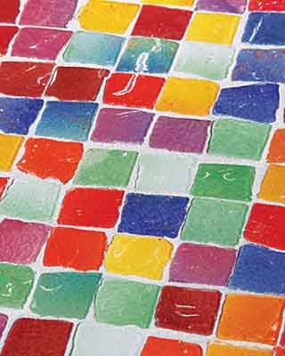
The colors in this tile mosaic represent the “Anime” a 2009 palette color expert Leatrice Eiseman developed for Pantone which was inspired by the neon tones of Japanese anime, the cartoon style familiar to many youngsters. “These colors give everyone the option of bringing vibrant color into their rooms,” says Eiseman.


For those with kids, pets, and a penchant to party, strong colors are the perfect solution to withstanding wear and tear without sacrificing style. Color experts agree that bold color is a hot trend. “It’s time to throw away the rulebook and go with colors that are both whimsical and practical,” says color consultant Leatrice Eiseman.
Using lavender in the bedroom to soothe someone before going to sleep.
Real Simple magazine: What is a soothing color for sleep?
Lee: I continually conduct color word association studies that record the most prevalent responses that we get regarding various color families, lavender being one of the them. What we have found is that lavender, being a cool color closely akin to blue, takes on a soothing quality that would be excellent for a sleeping environment. Lavender is also a ‘child” of the mother color purple, which is perceived as meditative – an excellent relaxing mode conducive to sleep.
a purple tidbit from Lee’s book
C O L O R : M E S S A G E S A N D M E A N I N G S
Amethyst, generally a blue purple, takes on some of the protective qualities of the blue family. In Egypt, amethyst was thought to be a healing amulet, offering divine protection from evil. It was believed that amethyst brought peace of mind and protection from insomnia.
September 12, 2008
Purple Passion
The Wichita Eagle
by Bonnie Bing
Call it eggplant, amethyst, grape, violet, boysenberry, aubergine, plum or wine. Whatever the name, the colors you’ll see a lot of this fall are from the purple family. Purple, a color tied to royalty, reigns this season. For designers, many of whom had stayed with the somber colors for many seasons, included bright, rich jewel tones in their collections for fall. Among those who chose highly saturated purple tones for their fall lines were Tracy Reese, Zac Posen, Peter Som, Elie Tahari, Kimora Lee Simmons for Baby Phat, the always colorful Betsy Johnson and Douglas Hannant. Hannant says that a must-have for fall is a spiral seam dress in imperial purple. He’s so fond of purple that he told a source at the Pantone Color Institute that he thinks it’s an excellent color to paint a room.
Leatrice Eiseman, author of several books about color and the executive director of the Pantone Color Institute, said, “I can tell you that purple is ubiquitous — in fashion, home furnishings, and its ‘dual personality’ is what makes it so interesting.
“Purple has a bit of the red undertone for excitement and sensuality while the blue side of purple makes it more introspective and calming.”
If purple isn’t among the colors you usually wear, at least give it a try. Before you say, “I don’t look good in purple,” remember that color analysts agree that there is a shade of most any color that will look good with your coloring. Perhaps your skin tone is better with a purple that has a lot of blue, while someone else should stay away from the blue-purple and go with lighter shades with pink in them, or the very dark, rich tones.
“Blue Iris” is a rich shade of purple that the people at the Pantone Institute are calling the Color of the Year. This particular color of purple has a lot of blue in it, but is a much more exciting color than navy blue, for example.
Team purple with gray from soft dove to charcoal, or with a fall favorite: green. You also can wear deep khaki and rich camel with purple hues. And of course it works with black, as well. Solid purple isn’t your only choice. Take a look at the wide variety of prints –abstract, geometric and floral — that have purple in them.
But if it’s just a touch of the purple passion trend you want, choose from a wide assortment of handbags, shoes, scarves and jewelry, all in shades of purple.
“There is interesting complexity that makes for an intriguing color,” Eiseman said. “You either ‘get’ purple or you don’t. Purple lovers are those who love its complexity and drama.”
Excerpts from
The Power of Paint
San Antonio Express-News
by Aissatou Sidime
When Leatrice Eiseman was looking to sell her large country-style house, she was concerned about whether her paint colors — peach, berry, blue and teal in various rooms — would hurt offers. Eiseman is director of the Pantone Color Institute, which studies people’s reactions to different colors, but she still wanted guidance. Conventional wisdom cautioned to repaint in neutral colors. But her real estate agent told her not to worry.
“He said, ‘Don’t paint it. It has a wonderful feel,’ ” Eiseman recalled. The agent said the home’s fun feel would appeal to large families in which each child wanted his or her own distinct room, or even to someone looking to open a bed and breakfast.
Sure enough, an investor bought the house and turned it into a B&B.
While Eiseman’s situation is rather atypical in the advice, it does reflect a common dilemma for home buyers — even those with some color expertise: How far should an owner go in expressing herself in paint when she expects to sell the house later?
Multiple colors are used to add visual interest and make architectual features such as the shake shingles, shutters and doors stand out.
WHAT’S HOT AND WHAT’S NOT IN THE WORLD OF PAINT
INTERIORS
•Deep blues
•Coffee colors
•Sage and other greens
•Colorful powder rooms and entryways
What’s not:
•Pure white walls
•Colored baseboards
EXTERIORS
What’s hot:
•Dark red
•Dark green
•Greenish gray
•Mottled golden, sandy, camel colors
•Royal to navy blue doors
•White, brown-toned and red-toned shutters
What’s not:
•Black shutters or doors
•Outlining window seals
•Bold colors
SOURCES: Leatrice Eiseman, Kathy Fogle, Paula Stone, Michelle Uhrig
But shoppers also buy homes based on the emotion a room evokes, color experts say. “If you do the house all in bland colors and there is nothing inspiring in any way, then the house becomes so bland that they walk away and don’t remember anything about the house,” Eiseman said.
Secondly, paint colors, like fashion, go in and out of favor. For instance, greenish and golden tones are popular in cement siding on new homes in the San Antonio area, but pale blues and slate gray were the rage a decade ago, Uhrig said. Similarly, in interiors, “food colors” that remind shoppers of chocolate and coffee are popular now, but pale pinks and sherbets once reigned.
In the newest trend, consumers are looking for colors that remind them of nature. But because of home-design television shows, buyers increasingly are open to splashes of color in kitchens and family gathering spots, such as game rooms, Eiseman said.
“In kitchens, it works because we already have colorful items there, with food and greater color
options in appliances,” Eiseman said. “And color is happy and whimsical, which goes with what people
are looking for in those gathering areas.”
September 5, 2008
Why does proper color matter?
Monica S. Castelhano (Department of Psychology, University of Massachusetts at Amherst) and John M. Henderson (Department of Psychology, University of Edinburgh, Edinburgh, Scotland) published some interesting research demonstrating the power of proper color. They tested various scenes to see how quickly people processed the “gist” of it and then whether that processing was enhanced purely by the use of color or if it was the use of “proper color.” They tested abnormally colored blurry scenes, normally colored scenes and monochrome blurry scenes. The results? Proper
color matters.
Our brains register the colors in the pictures and link the colors to our expectations of how it should be. Colors supplement and strengthen the structural information we absorb. In 42 milliseconds, our eyes can receive an image and send it to our brains. Our brains can then manipulate this information, and activate schemas that rely on a network of stereotypes that help us make sense of it all. Color, in effect, allows our brains to be more efficient and allows us to function better and react faster in any environments we may find ourselves.
Hooray for color — and for psychology.
by MELANIE SCHMIDT
Melanie Schmidt has a passion for improving organizations and people. Melanie founded Timpano Group to grow organizations beyond business as usual with an engaging approach to strategic thinking, practical planning and stakeholder communication.
So why not color the cold clouds blue?
WWAY NewsChannel 3
by Jerry Jackson, Wilmington, NC
A viewer recently inquired about those colorful satellite pictures of hurricanes that are commonly shown on TV this time of year. Specifically, the viewer wanted to know what the colors represent. Like many things in meteorology, the answer may not be exactly what you think.
“False colorized infrared satellite images” (the technical term) have been a staple of weathercasts for many years. These images come from satellite data that measure the wavelength of electromagnetic radiation being emitted by an object. Essentially, infrared satellite imagery measures cloud temperatures.
Strong hurricanes are usually represented by colors such as red or orange. However, the actual colors that appear on an infrared satellite picture are completely arbitrary. After all, a hurricane doesn’t not appear as a mass of red clouds in real life- clouds are actually white or grey in appearance. But hurricanes are often assigned red or orange colors on television. These red and orange colors indicated clouds that are cold, not hot.
Remember, strong hurricanes contain clouds that reach great height. The higher you go, the cooler the clouds. So why not color the cold clouds blue instead of red on a satellite image? The answer is simple- red looks “meaner” than blue. Even in meteorology, there is a touch of psychology…
September 3, 2008
Tidbits from
Fall fashion preview
by LaMont Jones, Pittsburgh Post-Gazette
There’s something about men’s and women’s fashions for this fall and winter that flies in the face of the nation’s fiscal freefall.
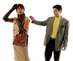
Styles are more subtle, pared down and less flamboyant than last year. But there’s still a feel of luxury, and it’s derived from beautiful fabrics, touches of fur, embellishments and shine, observed eBay style director Constance White.
“For the most part, it’s a very polished, luxurious season, along with a glamorous, conservative season,” she said. “Conservatism is the overarching mood of the season. You can’t help but draw an inference from the difficult economic climate and the rise of conservative fashion that we’re seeing. There’s no question that women and men are reacting to the high gas prices, to higher food prices, and the fallout from the real estate market.”
The color palette for men and women tends to darken as weather transitions from hot to warm to cool to cold, and silhouettes this season definitely veer toward lean and clean.
Consider color, which pops against canvases of black, chocolate and an array of grays. Blue hues continue strong from spring and summer in shades such as Caribbean Sea, Blue Iris and Twilight Blue, while purple reigns as the most ubiquitous color for fall-winter. Some loud retro colors are still in the mix, a la chartreuse and fuchsia, but the palette goes more traditional and natural with a little extra pigment giving a jolt to berry shades and gem tones.
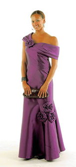
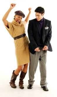
“Fall is traditionally a time for subdued, quiet colors, but this season we are seeing a shift toward cool hues with bright, exciting undertones,” said Leatrice Eiseman, executive director of the Pantone Color Institute. “Conventional tones such as warm autumn hues, chocolate browns and steel grays are also among the fall color choices.”
A plum tidbit that is still juicy
Plum, the Color, Is Having Its Star Turn
by Stuart Elliott, New York Times, Media & Advertising
Plum is the hue of choice among several marketers.
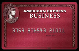
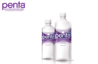
Examples of how plum may become the new black for advertisers and media companies include a new Plum Card from American Express, coupon inserts in Sunday newspapers under the RedPlum name and plum-colored labels for products like Penta water.
There is also Plum TV, a channel available in resort communities; PlumChoice Online, a PC services company; and even books by Janet Evanovich featuring a character called Stephanie Plum. The titles include “Plum Lovin’ ” and “Plum Lucky” and, coming in January, according to Dori Weintraub of St. Martin’s Press, which publishes Ms. Evanovich, “Plum Spooky.”

Trend watchers suggest several reasons so many marketers seem to be going plum loco. One recurring thought is that the success of technology brands like Apple and BlackBerry is giving fruit a good name, hence the proliferation of plums as well as brands like Pinkberry and Red Mango, which are both frozen yogurts.
Plum TV was introduced a year earlier, in Nantucket, Mass., by Chris Glowacki and Tom Scott, and has since been expanded to upscale communities including Aspen, Colo., and the Hamptons.
In fact, Mr. Scotti of American Express said, the introduction of the Plum Card was successful: an initial release of 10,000 cards was all gone, he said, “and we’re already in our second release.” excerpt from Lee’s book Messages & Meanings
But purple does have its very own distinctive personality. It’s an excellent substitue for blue or red when either seems to be the obvious coice. For example, a corporate logo for a business that wants to be thought of as dependable and forthright, yet at the same time capable of creative innovation, might well consider a blue purple in a business arena where so many logos are blue. Tweaking the purple to the blue side (yet still maintaining the undertone of red that is inherent in purple) would give the company image the added boost it is seeking.
OCTOBER 2008 ARCHIVES
October 27, 2008
International Herald Tribune
THE GLOBAL EDITION OF THE NEW YORK TIMES
Fashion & Style
Upping the color quotient
By Oliver Horton

Color has emerged as a major hook for fashion brands and retailers, with mid-season injections of merchandise translating to a vast array of shades in stores.
“Consumers are now seeing 10 to 15 colors where before they saw five,” said Martin Raymond, co-founder of the Future Laboratory, a consulting agency in London. This season, for example, alongside subdued blacks and charcoals for autumn, retailers are carrying purple, bold reds and blues, forest green and muted oranges. And that’s just the knitwear.
Jackie Nash, owner of the British forecaster Global Colour Research, complained that fashion no longer matches the traditional biannual cycle of autumn/winter and spring/summer. “Because fashion is so rapid,” she said, “trends are more about catching the eye. So you had bright yellow in summer ’08 because the chemists could do yellow really fast. That’s not a sensible trend, it hasn’t taken time to evolve.”
Christine Foden, director of the forecasting specialist D.cipher in London, agreed: “Fast fashion helps to drive trends faster and makes the high street interesting. The problem is that we are driving newness when the customer hasn’t caught up.”
Seasonal color forecasts, produced two years in advance by specialists that include the color systems company Pantone (editor’s note: Leatrice Eiseman is the executive director of the Pantone Color Institute and Pantone’s voice in color forecasting) and fabric exhibitions like Première Vision in Paris, have enormous influence on what ends up in stores.
Their work permeates every aspect of the market – from yarn spinners to clothing manufacturers – and every price level – from LVMH Moët Hennessy Louis Vuitton to H&M.
For many, a season’s color card is as prescriptive as it is predictive.
The popular idea of forecasting may involve a crystal ball, but color prediction is a sophisticated discipline. The Comité Français de la Couleur, for example, collaborates with fashion and industrial designers, art directors, plastic makers, researchers, journalists, writers and color specialists known as “rainbowologists.” Acting as a think tank, the group explores what’s selling, new technologies, catwalk trends and even sociological forces to produce a set of benchmark colors that are used by companies worldwide. Its chairman, Olivier Guillemin, said: “People in industry need to have some direction.”
But fashion has become deregulated by fast fashion players, who leapfrog the slow manufacturing process thanks to factories primed for in-season ranges. They are then able to react when a new dye is introduced, or a color becomes popular. Basic items like T-shirts can be colored and into stores within weeks. While fashion endeavors to mix slowly evolving shifts in color with flibbertigibbet injections, other businesses are becoming more fashionable in their approach to color.
“In the last three years, interiors, lifestyle, automotive, architects and product manufacturers have started seeing color as a key motivator,” said Raymond of Future Laboratory, adding: “Color can make a product seem premium or aspirational. So for very little increase in cost, they can put up the price substantially.”
Seasonality has expanded beyond fashion and invaded other sectors, wooing buyers with this season’s iPod, dishes or paint. Nash said: “The future of color forecasting is in industry and in interiors. People are spending more of their disposable income looking after their homes. The color of washing-up bowls or plastic salt and pepper pots is a big thing.”
The turnaround of color in interiors operates at a pace much closer to fashion’s traditional cycle. It’s about colors evolving from season-to-season, one shade dropping off and another pushing through. “You get a movement of color in interiors,” added Nash.
As much as there is commonality in palettes from luxury to mass market and across industries, the range and subtlety is diverse. Many companies require tailored reports, for instance. And different groups of consumers enjoy quite divergent tastes.
“In a financial recession, the top end of the market head to their default: dark palettes, blue, gray, silver. At the lower end, expect brighter, brasher colors, especially in packaging and in the automotive trade,” said Raymond.
Tim Hoar, business development manager at London’s renowned Central Saint Martin’s College, said: “People take color for granted. But it’s a very intuitive thing, probably the first thing you decide on. If they get the color wrong, it won’t sell.”
A major influence on today’s color trends is concern for the environment; the most obvious reflection being the emergence of forest green. “We’re getting quite bogged down in what is ecological and environmental,” said Kate Scully, an independent forecaster who is writing a book on color for the publisher Laurence King. “Sustainability is an issue that impacts hugely on the way we view textiles and fashion.”
Raymond of Future Laboratory expanded on the psychology: “Brown, green, blue and faded yellow make consumers assume a product is more environmentally friendly. There’s no reality to it. But those colors are now shorthand for sustainability.”
Foden of D.cipher said that ethical concerns were having an impact on popular colors – and not only in the swing toward green. Orange is a strong color contender for winter 2008 and one that has a real environmental basis. “A dye stuff company called Rubia Pigmenta Naturalia visited all the forecasting houses with colors dyed from the madder root,” she said.
“Since the 1850s red has been dyed using chemicals,” she added, but the environmental appeal of a shade made with natural dyes helped propel orange shades into a prime market position. “What Rubia PM achieved is muted variations on red through to oranges and copper rose shades – absolutely beautiful,” added Foden in praise of the Dutch company.
But there is a twist. For spring 2009, the shade is evolving into orange corals and brighter oranges. For these colors, the eco dye process goes out the window because one root can only offer so much variety. “That’s the creative world,” sighed Foden. “We get inspired and then go off at a tangent.”
F A S H I O N & S T Y L E
CHICAGOSTYLE.COM
StyleChicago.com spoke with Leatrice Eiseman, Director of Pantone Color Institute and author of More Alive with Color to obtain the real truth behind this season’s palette.
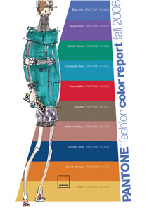
PANTONE Fashion Color Report Fall 2008

Fall 2008 Color Trends
Pantone, a color industry leader, studies designer collections to find out what colors will be in style each season. Only the most popularly featured colors make the cut to be in its biannual Fashion Color Report. Leatrice queries New York fashion designers for their color picks for the season.
“We have a leg up because a lot of them will tell us ahead of time, and they’ll send us sketches in advance. Some of them use the Pantone swatches so we know exactly what colors they’re using,” said Eiseman. Pantone tallies up these colors to report the most popular colors of the season. So while not every color made an appearance in every collection, at least
one is was likely to show up in each collection. “Each designer has his own take on the colors of the season,” said Eiseman.
Pantone tallies up these colors to report the most popular colors of the season. So while not every color made an appearance in every collection, at least one is was likely to show up in each collection. “Each designer has his own take on the colors of the season,” said Eiseman.
The Palette

Season for Change
“This has been a season for change,” said Eiseman, referring to the top three colors for fall. Though earth tones are the traditional choice for this season, the cool, tranquil Blue Iris, Royal Lilac, and Shady Glade tones are top picks among designers. Blue Iris, Pantone’s Color of the Year for 2008, is even turning up in housewares such as towels and glassware, according to Eiseman. “It’s established itself as a good fall color,” she said. At Ralph Lauren, capes and a velvet and tulle dress were done in Shady Glade, while a maxi length skirt and matching jacket came in Royal Lilac. Royal Lilac also showed up in the collections of L’Wren Scott and Donna Karan’s DKNY label. Ocher also showed up at the DKNY show on a loose-fitting turtleneck sweater.
According to Eiseman yellow has gained momentum in the past few seasons, after its initial popularity in Europe. Aurora Red, another warm color on Pantone’s report, appeared on a skirt suit at Oscar de la Renta.
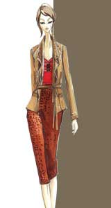
PANTONE’S Fall 2008 Color:
Shitake; Sketch from Elie Tahari.
Eiseman also pointed out the importance of neutrals in the top colors of the season, such as Shitake. “In an economy that’s a little dicey, people might not want to go out and take a risk with “she said. Catharine Malandrino’s Shitake jersey dress is evidence that designers are on the same page.
From top to bottom – sketch from Reem Acra, Blue Iris; sketch from Zac Posen, Royal Lilac; sketch from Carmen Marc Valvo, Shady Glade – feel free to mix them together to personalize your look.
…and speaking of kitchens.
Wall Street Journal Online
INTERIOR DESIGN
Kitchens by Crayola
Cabinets, Appliances Offer More Ways To Make a Loud Personal Statement
By June Fletcher
The next hot color for the kitchen is…you name it.
High-end kitchen appliances and cabinets used to come in just a few neutrals — white, bisque, black,
stainless steel — with an occasional novelty option, like fire-engine red. But this year, more manufacturers are offering dozens and, in some cases, hundreds of vibrant color finishes — for an extra charge, of course — making for some eye-popping kitchen conversation pieces: The red refrigerator. Nordic-blue cabinets. The pumpkin range.
October 14, 2008
A kaleidoscope of diamond jewelry predicted for 2009
by Lorraine DePasque
This spring, a shake-up of earthquake-like proportions is about to happen, with something rare and wonderful at its epicenter: Natural colored diamonds.
On top of growing consumer curiosity, rising interest among high-profile designers, and broadening retailer excitement about color, the Natural Color Diamond Association (NCDIA) is boosting marketing and advertising to consumers and educating jewelers.
But even with consumer cravings and NCDIA initiatives in place, can colored diamonds – typically much pricer than colorless – really thrive during tremulous economic times?
Jewelry and fashion experts say yes, crediting the penchant for aspirational buying that remains embedded in the AMerican consciousness, despite the economy.
“Years ago, people didn’t even look at the high end and, instead, they just struggled and said, ‘Why bother?'” says Leatrice Eiseman, executive director of the Pantone Color Institute. “But some five to eight years ago, all that began to change. No matter what shape the economy is in, consumers watch what’s happening in luxury.”
Technology has educated consumers, she says, while exposure to celebrities wearing natural colored diamonds has driven desire.
Eiseman, dubbed “the international color guru,” predicts that 2009 should be a particularly good year for all shades of yellow diamonds, as the sunny hues have become lasting fashion favorites. “It’s the third season in a row that (Pantone has) chosen yellow as one of the top 10 fahion colors,” Eiseman says. “One season doesn’t mean much, but three in a row does, particularly in this country, where it’s unusual for yellow to be in the top ten.” Echoing the belief that the masses look to the high end for direction is jewelry and style expert Michael O’Connor, Platinum Guild International-USA’s senior vice president.
“It used to be that very few people understood colored diamonds – maybe only consumers who read the fashion publications,” he says. “But today, eve those who read People magazine have seen celebrities wearing them, and so they want them too.”
Such mass-market exposure has prompted manufacturers, including New York-based Waldman Diamonds Complete, to create mid-level price-range pieces that go beyond the brown and black diamonds long available via home shopping networks, among others venues.
“We did some research and found that the majority of sales in the natural yellow diamond jewelry are $20,000 to $100,000 retail,” says Kenny Friedman Waldman’s president and maneging partner. “So, we developed the ‘Arctic Sun Collection’ of 18-karat gold jewelry, featuring natural fancy yellows in the $2999 to $7,999 range.”
Currently, engagement rings and one pair of earrings are in th collection, Friedmans Says, but it will grow.
“People want equal or greater perceived value, even though they want to spend less,” he says.
October 7, 2008
A tidbit on Color Psycology
What is color psychology — and can it help you sell your home?
HowStuffWorks.com
by Jessika Toothman
It’s hard for most of us to imagine a world without color, but something we could also have trouble grasping is that those colors — whether the inviting blue of a clear summer sky or the cold impersonal gray of a waiting room — can actually have a psychological and physical impact on us.

While everyone reacts to colors, a number of factors influence that reaction. Researchers haven’t been able to pin down any universal classification system that will be able to predict how people will interpret and respond to the colors around them. This is because a person’s culture, gender, age, emotional and mental state, specific experiences, mood — as well as the appearance and combination of the colors themselves — can all affect the reaction. And even then, those reactions might vary in type and intensity from person to person. This hasn’t slowed the research down one bit, though, and the field of color psychology (closely entwined with that of color preference) is a popular one.
Research into color psychology isn’t solely for academic purposes either. Many aspects of marketing focus on the impact colors have on people. Everything from logos to lobbies can be designed with color psychology in mind. People even consider the choice of colors in aspects of dress like fashion and uniforms and the décor of rooms like hospital rooms and nurseries.
On the next page, we’ll spend some time examining how different colors affect us and see if there are any likely candidates someone could consider splashing on the walls to help a house sell.
The Color Wheel

Colors can elicit strong reactions in people, both physical and psychological, as well as various symbolic associations.
Glancing at each color on the list below, think for a moment how it makes you feel, then read on to see if you had a common reaction. If not, don’t worry. It’s not an exhaustive list, and some event, personality trait or demographic factor might have made you feel another reaction. For example, if you’ve almost drowned in the ocean, blue might not be a very relaxing color for you. If you’re an eight-year-old girl, you might scorn anything other than pink.
Let’s run through that old trusty eight-crayon Crayola box:
• Red
Red is the color most people have the strongest associations with and reactions to. People frequently report feelings of strength, courage, aggression and excitement. Red can elicit an increased heart rate and energy level, and just a dash of red on something can really draw someone’s attention. Whether it’s a stop sign, a Valentine’s day card or a warning label, red is there to catch the eye.
• Orange
Orange can spark some serious reactions, too — people typically love it or they hate it. Orange is often linked with flamboyance, energy, comfort and warmth.
• Yellow
Yellow can be a happy, cheerful color. People often report feelings such as enthusiasm, energy, excitement and optimism when viewing it. In some shades and amounts, yellow is believed to be mentally and creatively stimulating, but in others it can be associated with cowardice, fear and anxiety.
• Green
Green is a color commonly used in expressions and symbolic associations, and it’s only second to blue as a favorite color. Natural shades of green can feel refreshing, balanced and soothing, but other shades of green can invoke sickly, bland or slimy feelings. Green is often symbolic of concepts like peace, envy, luck and fertility.
• Blue
The majority of people agree: blue’s the best. Maybe that’s because this color can actually trigger the body to produce calming chemicals. Blue frequently invokes words like dependable, loyal, logical, soothing, calm and focused, although some shades can bring feelings that are more dynamic and exhilarating, or cold and distant. Blue also tends to increase worker and athlete productivity.
• Purple
Purple is the balance between the liveliness of red and the serenity of blue, so some uncertain shades of purples can leave people feeling a little uneasy or introspective. Others can invoke feelings of loyalty, quality, mysticism and wisdom.
• Black
Black is a powerful color, often bringing to mind authoritativeness and other strong, sometimes overwhelming, emotions. Black can be associated with grieving in the Western hemisphere, but head East and the color white makes people think of mourning.
• Brown
Brown often conjures up feelings of stability and naturalness. People commonly report experiencing sensations of reliability when they see brown and a sense of order and wholesomeness.
Of course, these are just some of the main basic colors; people can actually see millions of colors, which vary from each other in several ways. Above, we split them up by the some of the different hues they come in, but colors can come in different saturations — how vivid or pale (unsaturated) a color is. Finally, colors can be judged by their brightness (intensity or value) — a color’s amount of light energy.
NOVEMBER 2008 ARCHIVES
November 30, 2008
A unique colorful excerpt from Jessa Crisspin’s book review and insight of Alex & Me
A TALE OF ALEX, BIRD WITH A WALNUT-SIZED BRAIN (AND WHAT A BRAIN IT WAS)
Alex learned elements of the English language to identify shapes, colors and sizes.
For 23 years, Alex the African Grey Parrot had been surprising scientist Irene Pepperberg with his skills, skills no birdbrain was supposed to have. One day in 2000, working at MIT’s Media Lab, Pepperberg soared beyond surprise to sky-high astonishment. She was engaging Alex (so named in honor of the “Avian Language Experiment”) in sounding out phonemes, the individual sounds that make up words.

Alex had already made progress on this task. If shown a tray of plastic letters, the kind parents affix to a refrigerator door to stimulate their kids’ alphabet learning, he responded correctly to questions. Shown an array of letters that included, say, a red “Ch,” a green “N” and a blue “S,” and so on, when asked, “What sound is blue?,” Alex answered “Ssss….”
That day, some of MIT’s corporate sponsors had flocked to watch Alex do a demo. Alex answered a phoneme question correctly, but then piped up with “Want a nut.” Like students everywhere, Alex liked a good snack now and again, and to push his luck with his teachers.
Wanting to keep him on task, Irene pressed Alex with another question, and got the correct answer and immediately, another “Want a nut.” A third Q&A round followed, but this time Alex underscored the seriousness of his craving with the avian equivalent of italics: “Want a nut.” At this point, Pepperberg writes, Alex “became very slitty-eyed, always a sign he was up to something.” He looked at her and slowly said, “Want a nut. Nnn…uh….tuh.” No birdbrain there! Alex had just leaped from sounding out phonemes to spelling out the letters of a whole word.
Fascinating data began to come in. Alex responded to questions posed in English that, for instance, asked him to describe or to count objects. Significantly, the key questions were novel, assuring that answers were not memorized ones or offered by rote. This too is captured on film: When presented with a tray full of objects of varies shapes and colors, Alex was asked “How many blue block?” He responds accurately: “four.” When Irene held up two keys, one large and green, the other smaller and gold, Alex correctly answered questions like, “What color bigger?”
(Answer: “Green.”)
Alex & Me offers enough detail about training methods and data results to demonstrate that it’s genuine comprehension at work here: Alex understands what he’s saying.
Alex accompanied a student to the lab’s restroom one day. This wasn’t his first exposure to a mirror, and in the past he acted scared of the “strange” bird looking back at him. This time was different. Alex looked attentively at his reflection and asked, “What’s that?” Told by the student, “That’s you, you’re a parrot,” Alex looked some more. “What color?” he asked. And that day Alex learned a new color: Gray.
Alex the African grey parrot, famed for his role in cognition research conducted by psychologist Irene Pepperberg, passed away at the age of 31 in the fall of 2007.
November 22, 2008
chicagotribune.com
By Wendy Donahue
Tribune reporter
Obama’s call for change doesn’t extend to his blue ties
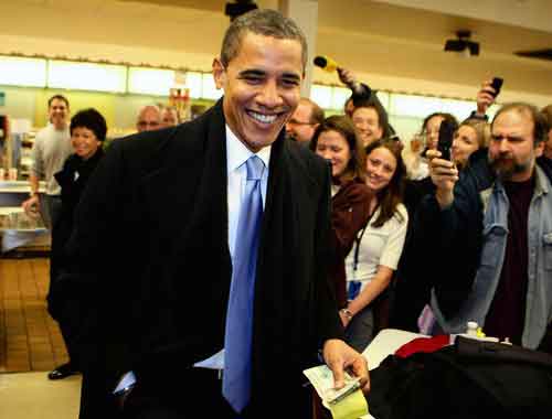
When President-elect Barack Obama met with John McCain on Monday to talk teamwork, his tie was blue.
When Obama met President George Bush at the White House to talk transition the Monday before that, his tie was blue. Bush’s was too. No news there. But, after a campaign defined by “change,” few political style watchers guessed that Obama would perpetuate this necktie trend that Bush propagated some eight years ago: powder blue as the new power red. Whether Obama’s choice is calculated or subconscious, good reasons exist for hueing to blue.
“It’s the color attached most to dependability and constancy, a message that Americans want to believe in troubled times,” said Leatrice Eiseman, director of the Pantone Color Institute and author of “Color: Messages & Meanings” (Hand Books Press, 2006). “Obama has used blue most consistently [with this idea], representing a kind of grace under fire.”
Obama has worn red, too, including Sunday on “60 Minutes.” But rather than a blazing Reagan red, it has skewed closer to wine—tinged with blue, which provides a little more depth of character, Eiseman says.
Bold red neckwear still has its place, but it’s shrinking, said Joe Lupo, part of the styling team Visual Therapy, with offices in Chicago and New York. He is co-author with Jesse Garza of the upcoming book “Life in Color: Visual Therapy’s Guide to the Perfect Palette” (Chronicle Books).
Lupo approved, for instance, of Obama’s red tie at the Grant Park rally Nov. 4.
“He used the cool blue and soft approach to win the election,” Lupo said, “but clearly stated that he’s here and means business [on Election Night]. I seriously doubt that he will need to drag out the red tie too often going forward, and hope that he chooses not to.”
Indeed, “with our country in disarray, it isn’t the time for politicians to come around as so bullish. That’s what happens when you wear red,” said Michael Fisher, men’s editor for Stylesight, a trend forecasting firm based in New York.
That may be one reason that blue ties have exploded at the retail level, with not just politicians but also businessmen buying into the many variations. Blue, Fisher said, conveys confidence and importance without seeming sinister or overly sober. When Obama and Bush both wore blue last week, it showed “that this is not the time to take hard stances on ideology but to remain open-minded and unified,” Fisher said.
“In the old days it was just navy, and probably a light blue or two, but we literally have at least 30 shades of blue out there now,” said Michael Ostrove, senior vice president for the luxury menswear purveyor Paul Stuart, which just opened a shop at 107 E. Oak St.
Another tie color that has sold well at Paul Stuart this fall is Ostrove’s personal preference as well as the top color trend in women’s fashion this fall: purple.
Before the election, Obama seemed to share his wife’s penchant for purple, which, as a mix of blue and red, upholds the virtues of blue while standing out a bit more.
“Wearing these non-traditional colors shows a level of individuality, which suggests leadership,”said Greg Shugar, an attorney who operates the Naperville-based TheTieBar.com, which sells ties for $15 each. “Of course, the guy has to have something smart to say as well.”
All of this talk about color and symbolism inevitably draws skepticism, Eiseman knows.
“People say, ‘Well, I don’t think about that.’ But when we reach inside our closets every morning, we know our hand goes for a certain something because it’s speaking to us,” she said. “Maybe subliminally.”
Blue has climbed in popularity all over the world because of its universal associations, she said,
particularly for sky blue.
“No matter where you live, the earth may shake and the water may come, but the sky is there. It’s the color your mother said to you as a child: ‘Look at that beautiful blue sky.’ You can do all the pleasurable things—play ball at the park, go swimming—because the sky is blue. And if there are clouds, the clouds are going to disperse. And there is going to be a blue sky.”
November 19, 2008

Lee was recently asked….
Do you think there has been a recent resurgence in the color yellow? If so, why do you think that is?
As the next door neighbors on the color wheel (orange and yellow-green) have gained so much more acceptance in the last few years, it opens the door for yellow to be more accepted by consumers. So it feels fresh and new, while at the same time there is some familiarity because of the relationships to orange and yellow-green.
Why are people attracted to the color? What is the color associated with?
Yellow is always associated with light, especially sunlight, so it is perceived as warm, inviting and cheerful. And in spiritual terms, it is thought of as the color of enlightenment as well. It is a great color for bringing light into an environment, especially in a north facing room and if you get depressed on gray days, yellow really makes you feel like there is sunshine present.
I’ve heard many designers say that yellow is the hardest color to get right in terms of paint color. Why do you think that is? Do you have any advice for people who would like to incorporate yellow into their interiors?
It can be difficult as even the slightest bit of green as an undertone can get very green looking on the walls, especially if there many windows in a space surrounded by reflected green of foliage, trees and such. If you like greenish yellow, that is not a problem, but most people prefer their yellows just a bit more subtle and not too blatant. So it is really important to test the color in the room before committing to a yellow. They can always be ‘dirtied’ a bit— or go to the creamier side and that fits many comfort levels.
November 15, 2008
Laguna Hills Flowers

Flower Therapy Induces Happiness and Positive Feelings
Flowers have an immediate impact upon stressful or depressive states by bringing delight and happiness in our lives and providing a long term positive effect on our good mood. There has been developed a new type of complementary therapy called flower therapy. It is thought that our emotional states can be elevated or turned from negative into positive ones through flower therapy. The multiple benefits we receive from this therapy are related to the form, color and smell a flower gives off. Flowers provide us with a pleasant view and a beautiful smell, inducing emotional health through synesthesia.
Red roses enhance the energy in our body and make us more active by stimulating adrenal glands, the indigo of an iris makes us more confident and tranquil by removing fear or inhibition, sunflowers boost energy and also make us more optimistic, bluebells release melatonin – the “sleep protein” in our organism and therefore induce a good night’s sleep, orange daisies act favorably upon our lungs and immune system by keeping away allergenic factors, while lilacs and green zinnias remove stress and anxiety.
Also, the impact of flowers present at workplaces was scientifically proved to enhance productivity and the energy level, improving at the same time short and long term memory. They also improve companionship and relationship among colleagues in the workplace.
Leatrice Eiseman is the Executive Director of the Pantone Color Institute and strongly believes in the curing effects of these frail and tender plants. She thinks that color therapy and flower therapy are very much alike due to the fact that they both use color energy in order to improve moods and chase away sadness and distress. “Color can help us find the balance we seek from our surroundings. And flowers are an ideal way to harness the power of color to enrich our lives,” she says.
Internationally acknowledged color expert Leatrice Eiseman stated that “our response to color is intenselyemotional and flowers can be a catalyst for feelings that stimulate more than just our senses of sight and smell. An artful floral arrangement has the ability to convey a feeling or create a mood without using words, just color.
“The color expert recommends us five types of floral arrangements, each for enhancing a different state of mind, depending on the predominant color. She says that soft yellows and greens, peach shades, warm pinks and creamy whites form a palette of fragile and tender colors – nurturing colors – that are extremely beneficial for emanating confidence and cheerfulness all around and caressing sick individuals.
Lavender and pink colors create a romantic environment through inferring intimacy and love feelings. Hot reds, purples, pinks and oranges create sensuous, passionate and seductive settings for lovers. Light shades of sea and sky colors – green and blues – make a floral arrangement perfectly suited for a place in which serenity and peace of mind is needed. Playful and joyous feelings are induced by a whimsical arrangement of powerful, contrasting colors. This type pf arrangement can be successfully used for birthdays and any kind of celebrations.
High Point Market Fall 2008 Trends Forecast
By Furniture World Magazine
Featuring insights from leading trend-trackers, manufacturers and retailers, the new, in-depth special report identifies and explores the season’s important product, color, lifestyle and demographic trends, and offers recommendations from leading industry experts on connecting with today’s consumer in the coming months.
“This report comes at an ideal time for buyers across the country and around the world, many of whom are preparing to attend the High Point Market next month,” says Brian D. Casey, president and chief executive officer of the High Point Market Authority, official sponsor of the High Point Market: The World’s Home for Home Furnishings. “With some 2,000 exhibitors set to introduce product here, it’s important for buyers to learn as much as they can about what’s on trend in advance of their arrival here at Market.
Among the trends detailed in the new report:
Sanctuary
Today’s consumers confront a complicated world. From political issues to personal concerns, they find themselves surrounded by problems for which there are no easy answers. According to researchers at Getty Images, one of the world’s largest providers of photography and illustration to the media and advertising industries, people are responding to this confusion by seeking simplicity. Home is perhaps the most natural place to create a sanctuary from the outside world, and home furnishings manufacturers are also seeing consumers trending toward simplicity.
“Cleaner lines, simpler styling and natural materials are catching on. Heavy carving is out. Consumers are interested in and buying minimalist pieces, especially in accents,” says Tom Liddell, senior vice president of national sales at the Powell Company.
Function
While consumers are seeking simple shapes and clean lines, they also have another desire, one that adds a layer of complexity for manufacturers.
“Function is big,” reports Don Essenberg, executive vice president, chief marketing officer at Magnussen Home Furnishings. “Today, a piece of furniture can’t just be decorative. It has to do something, and what it does has to relate to the end-user’s lifestyle.”
Functional features such as charging stations for cell phones and iPods, flexible styling, pieces that can serve multiple purposes, and storage are all trends that fit consumers’ lifestyles today. Michael Slone, of Florida based retailer Slone Brothers Furniture, finds that his customers are not only asking, “How does it make my life better?” but are also focused on one particular functional feature. “It’s all about storage, storage, storage,” he says. “Case goods sell on how they help the customer meet her storage needs.”
Color: Pantone’s View
“I tend to be wary of phrases such as ‘what people want,’ ” says Leatrice Eiseman, executive director of the Pantone Color Institute and one of the world’s leading experts on color. “People are different, not everyone wants the same thing.”
In her PANTONE VIEW home + interiors 2009 forecast, produced specifically for the home furnishings industry Eiseman’s eight palettes offer a full complement of on-trend colors. The Pantone home palette is included in the Fall Trends Report with a characterization of each palette label, “Wine Country,” “Honesty,” “Discerning Tastes,” “Reveries,” “Wanderings,” “Solar Energy,” “Breathe Easy,” and “Animate.”
Michelle Lamb, senior editor of The Trend Curve and a top trend-tracker recommends the purple hues for those looking for the one, sure-fire shade in any of these color directions. Since its last trend cycle more than a decade ago, Lamb reports that this time “the hues are on the red side rather than the blue, acting first as a bridge between blue and red, ultimately replacing both.”
Pattern: Simply Complex
In patterns, Lamb sees more decorative complexity complementing the streamlined forms of furnishings. “Right now, this is a small movement, but I expect mini-floral designs, simple stripes, plaid and denim to take on this highlighting role,” she says. “I’m also seeing textural embellishment, such as embroidery and crewel coming on the scene.”
For the urban inspired consumer, the design direction connects to the ‘60s and ‘80s in a movement Lamb calls Graphic Arts and Eiseman illustrates in the Animate palette.
Wood finishes will be getting lighter, with medium shades having the greatest appeal. “Eco- concerns have led to an increased use of reclaimed woods,” Eiseman notes, “And they’re being combined in some fascinating ways. Though some are a little funky, they’re all artfully executed. I think this movement arises from the younger generation’s putting environmental concerns ahead of the old design rules,” she states.
Tuning Into Style
Technology continues to drive spectacular growth in home entertainment furnishings, “especially as the transition from housing bulky TVs in armoires to showing off high-tech panel screens accelerates,” Michelle Lamb says. “Today, most solutions offered for flat screens look more like the TV stands of the 1970s. So simply upping the style quotient for these pieces should result in even more sales.”
Though dominated by the Baby Boom generation for the past 20 years we are seeing a seismic shift in the home furnishings demographic focus, the 35 – to 54- year-old woman. Baby Boomers, defined as people born between 1946 and 1960, are aging out of the target demographic. In fact, most of our customers now belong to Generation X – born between 1963 and 1980.
“There is a sea change in who’s buying and going to buy home furnishings,” says Magnussen’s Essenberg. “The Baby Boomers are still out there, but their influence is on the wane. Generation X is taking over and Generation Y (born from 1981 – 2001) is beginning to come on.”
The prevailing myth that the Baby Boomers are the largest of the three generations is busted by the U.S. Census Bureau’s population estimates. The Boomers are actually the smallest of the groups, with just under 77 million people. Generation X will contain approximately 84 million people, and Generation Y will come in with just under 82 million.
In our target demographic there will be about 31 million GenX and 22 million Baby Boom women between the ages of 32 and 56 years old next year. To maximize this opportunity, our industry will need to respond to the Xer’s different worldviews and home lives.
Michael Slone finds the buying cycle has been greatly compressed. “Today, the average time spent in the store is half what it was 10 years ago,” he says, “More consumers are using the Internet to select the stores they’re going shop. We’ve made a considerable investment in our website.”
About the High Point Market Authority: The High Point Market Authority is the official sponsor of the High Point Market in High Point, North Carolina. Featuring an extensive selection of exhibitors spanning every category, style and price point and attracting tens of thousands of visitors from more than 110 countries twice each year, the High Point Market is the driving force of the home furnishings industry.
DECEMBER 2008 ARCHIVES
December 31, 2008
By Leatrice Eiseman for Kate’s Paperie in Manhattan, NY
GIFTS IN COLOR
We look to Mother Nature as she truly is the best color instructor.
Giving a gift is an act of kindness—one that should be enjoyed by both recipient and the giver. We have all had the experience of opening a gift and feeling that rush of pleasure especially if that gift is in a favorite color. But how do we know what colors will evoke an emotional connection? The answer is that we look to Mother Nature as she truly is the best color instructor.
Nature’s colors do appear to vary during the course of a day, because of changing light in the atmosphere, forming various ‘palettes.’ In the earliest hours, a dewy ‘wetness’ permeates the atmosphere. The natural elements of water and air are a strong influence on the predominantly cool blue undertones of what is called the ‘Sunrise’ Colortime™ palette. This palette literally sparkles with jewel tones such as amethyst, emerald, royal blue and turquoise. There are some warm colors included, but they are pure and cooled down, like sparkling Chardonnay or luscious berries.
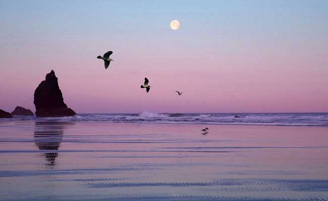 At the opposite extreme, is the Sunset Colortime palette. This is the time of day when colors take on a golden, mellow, ‘drier’ quality, eventually exploding into the fiery colors of Sunset. The natural elements of fire and earth light up this palette with festive reds, glowing ambers, hazy magentas and vibrant corals. Zesty pesto greens and periwinkle blues add a tasteful touch.
 Nestled between Sunrise and Sunset is the Sunlight Colortime palette. These are the hours that the sun shines at its brightest, rendering the colors it lights on a bit more muted and sun drenched. All of the natural elements are represented here, with ‘natural’ a key word as all shadings are subtle. Think delicious shades of grape, peach, strawberry and bisque, balanced by placid blues and willow greens.
Mother Nature also provides a group of colors that are found frequently in nature, so that our eyes are accustomed to seeing them in combination with many other colors. There are 18 of these Crossover Colors™, as they are called, among them, the black of night, sandy beach beige, stone gray and the ubiquitous signal color, true red. Within this palette are also the colors that have grown to symbolize the concept of “sustainability’. This eco-awareness theme rings true for so many people today as it speaks to the preservation of earth reflected symbolically in the rich browns, tans and taupes. The purity of water is expressed both in the sky and ocean depth blues, while the need for solar energy is represented by sunny yellow. And most importantly is pineneedle green, the color most connected to the preservationof nature.
Taking a bit of extra time and thinking about the personal coloring of the gift recipient can be a vital clue to your success in gift selection as most people tend to prefer colors that blend with their natural coloring.
Try to use these colorful guidelines the next time you purchase a gift and watch the “giftee’s” eyes really light up!
Visit Lee’s others websites at, www.colorexpert.com and www.morealivewithcolor.com
December 29, 2008
Excerpt from
What Your iPod Says About You
Forbes.com
Elizabeth Woyke and Brian Caulfield
Apple’s iPod sports many personalities. Who do you want to be today?

Apple recently rolled out brightly hued versions of the nano handsets, including a red iPod nano and iPod shuffle. Apple’s ads push the colorful little music players with the simple tag line “nano-chromatic.”
Apple was the first company to realize that gizmo players are as much about personal expression as they are about function. More recently, companies cranking out mobile phones have caught on, too. “Phones are becoming reflections of us as individuals and an important way to express our personalities,” says Ehtisham Rabbani, vice president of product strategy and marketing for LG.
It’s a sharp contrast to the drab shades most consumer electronics sported just a few years ago.Leatrice Eiseman, executive director of the Pantone Color Institute, says tech companies, with the exception of forward-thinking Apple, largely ignored her color recommendations up through the ’90s. “They didn’t understand the impact of color–they felt it had nothing to do with their devices,” she recalls.
That’s changing. The color trend in cellphones ramped up in mid-2007. Consider the Samsung Juke, which Verizon released in October 2007 in red, aqua and royal blue. Phones like the sporty Juke, which appeal to younger consumers, are often first to get the color treatment. Nokia just announced two new colors–passionate purple and graphite–for its fashion-conscious Supernova line of phones in Europe.
Handsets that target older customers, such as pricey smart phones, are more likely to be offered in more conservative colors, says Sapna Tahliani, a device marketing manager for Verizon Wireless. That’s starting to change, though. Research In Motion’s BlackBerry, long considered the workhorse of smart phones, now comes in pink, red, amethyst, gold and–in the U.K.–a reddish orange shade called “sunset.”
That’s because our emotional reactions to color guide our shopping decisions, says Eiseman. That has handset manufacturers studying color psychology, investing in materials research and consulting color forecasts.
Of course, no one knows that better than Apple. It’s iPod nano now comes in nine colors. However, when it comes to adding color to mobile phones, Apple lags behind. While a myriad of colorful third party cases and covers are available, Apple’s phones still come with just a basic black, or white, back.
Apple isn’t the only phone maker going for a basic look. In a sign that neutrals aren’t totally passé, Rabbani says black is LG’s most “stable” color across all demographics. Among younger consumers, light blue is increasingly hot. “Blue is a safe color with appeal across gender and age groups,” he notes. “Light blue stands out; it’s the new pink.” LG relaunched the Chocolate, a sleek music player/phone, earlier this year in a pale blue.
Fittingly, blue is America’s favorite color, says Eiseman. “Consumer products often include blue in some form because a certain percentage of the population will always respond to it,” she adds.
Says Eiseman, “Today, if you don’t do something that involves color, you’re seen as very backward or very boring.” Clearly, that’s a message few people want to send about themselves.
December 21, 2008

A recent blog post to Pantone’s colour of the year choice for 2009
From tenacityworks.com
Blog entry: COLOUR OF NOW
So Pantone just chose their colour of the year for 2009. Interesting choice… “14-0848 Mimosa, a warm, engaging yellow, is the color of the year for 2009. In a time of economic uncertainty and political change, optimism is paramount and no other color expresses hope and reassurance more than yellow.”
Read up a bit about the psychology of colour and apparently yellow is “considered an optimistic color, people lose their tempers more often in yellow rooms, and babies will cry more. It is the most difficult color for the eye to take in, so it can be overpowering if overused. Yellow enhances concentration, hence its use for legal pads. It also speeds metabolism.”
Maybe blue would have been a better choice for our times as apparently people are more productive in blue rooms. Studies also show weightlifters are able to handle heavier weights in blue gyms.
I suppose it would have been a bit of a downer if they chose Cool Gray 10C.
Lee’s comment to the post
As the director of the Pantone Color Institute and the person involved in choosing Mimosa, I can tell you the choices are thoughtful and meaningful– not just an arbitrary choice. At this point in time people need reasons to try to be optimistic and yellow is invariably the color that people (in our studies) think of as representing hope and good cheer. They do not lose their tempers more in yellow rooms– that is erroneous information, there are no studies to back it up– it has become an urban legend that is false.
Leatrice Eiseman
December 18, 2008
NPR – New York
National Public Radio’s New York affiliate.
Interviewed by Brian Lehrer.
Brian: What have you seen happening in the last year due to economy?
Lee: More neutral colors are being used, but what we’re finding now is that this may be true only of high-ticket items. Also, what we’re seeing is that people are using more color as accent.
Brian: How do you know that trend towards neutral palette is due to housing bust?
Lee: Conventional wisdom has always said to use neutral colors, but we have seen a change. With all informational shows out there, people are learning how to use color. More color is actually being used now that makes your home more memorable, so you should do something memorable with color in your house.
Brian: What’s the hot color for next year?
Lee: Pantone has named Mimosa Yellow as the Color of the Year and there’s a very good reason for that. Every color has an emotional attachment and with yellow we have optimism, sunshine. It’s very cheerful but not overwhelming. It’s a beautiful, mellow yellow.
December 15, 2008
Setting A New Tone
By Donna Sapolin
FLYP MEDIA
Visit www.flypmedia.com/issues/19/#5/1 to hear Lee describe color forecasting, taste and psychology.
FLYP (www.flypmedia.com) is an online magazine that offers a window on the issues shaping America and, by extension, the world. FLYP aims to exploit the full palette of available web tools to provide users with an engaging, easy-to-navigate and enriching multimedia experience.
December 11, 2008
Mental Floss Magazine
A portion from
How Cereal Transformed American Culture
by Ian Lender
Making Red Blood Redder

In many ways, the cereal flake is the perfect consumer product. It’s easy to produce, easy to sell, and surprisingly lucrative. To this day, cereal comes with an eye-popping profit margin of 50 percent. These merits became clear to Charles Post, a failed suspender salesman who moved to Battle Creek in 1895. Post began selling knock-off versions of Kellogg’s products with a twist of his own—advertising. At the time, advertising was associated with snake-oil salesmen and con artists. But Post, who had a background in sales, didn’t mind drizzling a little snake oil on his product. He published pamphlets with titles such as “The Road To Wellville” and claimed his cereal, Grape-Nuts, could cure appendicitis, improve one’s IQ, and even “make red blood redder.” By 1903, he was clearing $1 million a year.
Across town, Dr. Kellogg refused to sully The San’s reputation with heathen advertising, and his profits suffered as a result. W.K., however, had no such qualms and set out to emulate Post. In his first national campaign, he told women to “Wink at your grocer, and see what you get.” (Answer: a free box of Kellogg’s Corn Flakes.) Within a year, he’d sold 1 million cases of cereal. With the leading cereal makers embracing such unabashed hucksterism, it was clear that cereal’s connection to its fundamentalist roots had come to an end.
Thinking Outside the Box
All across America, the eyes of investors lit up with dollar signs, and would-be cereal barons descended on Battle Creek like locusts. By 1911, 107 brands of corn flakes were being made in Battle Creek alone.
But the cereal business had one major drawback—there was little substantive difference between brands. To stand out from the crowd, manufacturers realized that they had to focus more on the outside of the box than on what was inside. Some tried decorating their products with adjectives, creating names like University Brand Daintily Crisped Flaked Corn. Others competed to appear the healthiest. Tryabita, for example, was infused with celery flavor because, well, it sounded healthy.
But the real winner was a cereal called Force. Its mascot, Sunny Jim, was a strutting, top-hatted gentleman who became so popular in newspapers and magazines that other cereal makers rushed to create their own mascots. For a cereal called Elijah’s Manna, Charles Post even tried putting a picture of the prophet on the label. Although the product was eventually pulled, one industry ground rule had been established: Every box needs a character.
Before long, cereal makers had an insatiable appetite for finding the right mascot, regardless of the cost. During the Depression, Post Toasties decided to use cartoon animals on its boxes and paid its cartoonist $1.5 million in the first year. That artist was Walt Disney, and he used the earnings to build the Disney empire.
The Children Are the Future

Cereal’s total reliance on advertising meant that it was essential for companies to keep up with new forms of media. Quaker Oats, for example, hitched its sales to the rise of radio in the 1920s by giving away more than 1 million radios as part of a promotion. Cereal companies were also quick to buy up radio stations and produce radio shows. For the most part, they churned out dramas and gossip shows aimed at housewives. But a radical shift in demographics came in 1936, thanks to a boy named Skippy.
A Dennis the Menace type who frequently interrupted his adventures to extol the virtues of Wheaties, Skippy was the first cereal character directly marketed to children. As it turned out, kids ate him up, and cereal producers learned an important lesson: Children are suckers. The flood of kid-friendly, cereal-shilling characters that followed reads like a Who’s Who of American iconography, including the Lone Ranger, Dick Tracy, and Buck Rogers. By the 1960s, cereal advertisers were devoting 90 percent of their budgets to reaching children.
In the process of targeting the young, cereal companies also realized that kids don’t care about their colons. They want sugar. Lots of sugar. In 1939, a Philadelphia heater salesman named Jim Rex created the first sugared cereal, called Ranger Joe Popped Wheat Honnies. Ironically, he designed the cereal to minimize the amount of sugar children consumed. He reasoned that if he lightly presweetened his product, kids wouldn’t add more sugar on top. He was wrong, and his good intentions were lost on bigger companies. After Ranger Joe sales skyrocketed, manufacturers started producing cereals such as Sugar Smacks, which contained a shocking 56 percent sugar.
How did cereal companies reconcile this with their original commitment to the health movement? Taking a page out of Post’s playbook, they declared that sugar wasn’t bad for you because it gave you the fuel you needed to start your day. With trusted radio personalities extolling the “energy-giving” virtues of cereal, impressionable kids and their frazzled parents rushed to stores.
TV Nation

Television took advertising for sugar cereals to a new level, and the master of the new medium was an ad man named Leo Burnett. He invented TV programs specifically designed to entertain children and sell Kellogg’s products. Much like Skippy a decade before, Burnett’s characters would turn to the screen in the middle of a show and pitch the merits of a particular brand. There was nothing subtle about it. Howdy Doody, Roy Rogers, Andy Griffith, Rin Tin Tin, the Beverly Hillbillies, Yogi Bear, and Fred Flintstone all became television icons because they were good at selling cereal.
Also at Burnett’s urging, cereal companies invested heavily in early television technology. (They still do; cereal is the second-largest advertiser on television today, behind automobiles.) The financial backing let them shape the medium to suit their needs—namely, adding color. Burnett was one of the earliest believers in motivational psychology and understood that colors appealed to kids and moms subliminally. When color TV became a reality, he persuaded Kellogg to use anthropomorphized cartoon animals as mascots. He thought animation would make for better, more colorful commercials. The first mascot they produced was Tony the Tiger, whose meteoric success was followed by hundreds of other cartoon icons. Burnett’s advertising style was so effective that cereal sales continued to rise every year, unlike most products at the grocery store. After a while, parents and child psychologists became concerned that the ads were a little too effective. In the late 1960s, consumer advocates claimed that using cartoon characters to target children was overly manipulative, if not unethical. Eventually, in 1990, they forced Congress to pass a law banning TV characters from pitching directly to children in the middle of a show. Protective measures aside, cereal had strayed far from its wholesome origins. While Dr. Jackson’s dream of displacing pork chops from the breakfast table had become a reality, his cereal wasn’t what it used to be.

Bitten by the fangs of consumerism, Granula had transformed into Count Chocula in the course of a century.
December 9, 2008
Paint the town red (without blowing your green)
Chicago Tribune
By Wendy Donahue Tribune Reporter
The holiday party circuit looks subdued this year, but that doesn’t mean you should.
More than ever, your fellow recessionistas need you to help make spirits bright. That means adding pops of color to the standard-issue black palette – while retaining some fiscal sobriety.
“The psychological boost is a good idea,” said Leatrice Eiseman, director of the Pantone Color Institute and author of “More Alive With Color” Even if you are going to go for the black dress because it’s practical and something you already have in your closet, you should look to accessorize it – whether with a necklace or belt or even shoes in a color – with something that’s going to lift you. And what better time to do it than during holidays when you can wear brighter colors and it can look beautiful?
December 4, 2008
Yellow expected as a bright spot for 2009
By SAMANTHA CRITCHELL
AP Fashion Writer

(AP Photo/Pfaltzgraff Everyday)
This undated photo provided by Pfaltzgraff Everyday shows a dinnerware pattern called ‘Palermo’ from the ‘Pfaltzgraff Everyday’ collection. Pantone, which provides color standards to design industries, specifically cites mimosa, a vibrant shade illustrated by the flowers of the mimosa tree as well as the brunch-favorite cocktail, as its top shade of the new year, but the company, in general, believes the public will embrace many tones of optimistic yellow.
NEW YORK – Enough gloom and doom: There’s a prediction from a leading color source that cheerful and sunny yellow will be the influential color of 2009.
Pantone, which provides color standards to design industries, specifically cites “mimosa,” a vibrant shade of yellow illustrated by the flowers of some mimosa trees as well as the brunch-favorite cocktail, as its top shade of the new year. In general, Pantone expects the public to embrace many tones of optimistic yellow.
“I think it’s just the most wonderful symbolic color of the future,” says Leatrice Eiseman, executive director of the Pantone Color Institute. “It’s invariably connected to warmth, sunshine and cheer – all the good things we’re in dire need of right now.”
In the spring fashion collections previewed earlier in the fall for retailers and editors, pops of yellow brightened the runways of Carolina Herrera – who called her favorite shade marigold – Badgley Mischka, Zac Posen and Michael Kors, among others. Kors even included a retro yellow polka-dot bikini that clearly harkened back to a more upbeat time.
The fashion world first embraced orange a few years ago and that has evolved into yellow, which had already been gaining popularity in the home market, too.
“People know yellow lightens up the atmosphere,” Eiseman says.
Home-goods companies based in Paris and Milan, Italy, have already been heavily influenced by yellow, says Tom Mirabile, vice president of global trends and design at Lifetime Brands, Inc., whose portfolio includes Cuisinart, Farberware and Pfaltzgraff.
It helps that it looks good in florals and has a close association with nature, a driving force in the marketplace right now, and it complements current favorites green and purple. (In 2008, “blue iris,” a purple-tinged blue, was color of the year.)
“I’d say you should get used to seeing yellow in places you’re not used to seeing it, “Eiseman says.
December 3, 2008
As Seen in MacLife magazine
by Michelle Delio
How Pantone’s Color Expert Colors Your World

Eiseman formulates her color predictions through research and staying on top of societal and cultural shifts.
Don’t tell Leatrice Eiseman that yellow agitates adults and makes babies cry. “After hearing that story once too often, I tracked its source and discovered it was based on false research,” she says. “Yellow evokes sunshine, warmth, and happiness—not arguments or crying.”
What people really think about color is important to Eiseman—please call her “Lee”—head of the Eiseman Center for Color Information and Training and executive director of the Pantone Color Institute. Her job is to choose the hues that will be wildly fashionable next season or next year, as well as the colors that will compel consumers to buy her clients’ products.
Eiseman doesn’t spend her working days locked up in a room crunching data or aiming darts at a brilliantly hued board to see where they land. Rather, she identifies color trends by synthesizing history, current events, psychology, marketing principles, fine art, pop art, and street fashion, along with all the information culled from her own color surveys.
“Right now, I’m researching the color preferences prevalent during previous recessions,” Eiseman says. “What I’m finding is that neutrals are preferred during economic downturns, especially for big-ticket items. People don’t want to invest in trendy-colored items when times are tough. They’re looking for stability and longevity.”
Nevertheless, Eiseman says that flooding the market with beige items isn’t necessarily the right approach right now. Instead, manufacturers should focus on coming up with new ways of combining neutrals with livelier colors to “tweak the consumer’s eye and spark interest.
How to Avoid a Marketing Blood Bath.

In the never-ending search for the new and exciting, it’s important for companies to understand how their target audiences tend to respond to specific colors. Some years ago, Shiseido hired Eiseman to consult on colors planned for use in the Japanese company’s American line of bath and beauty products. The first thing that caught Eiseman’s attention was the rejuvenating bath salts tinted bright scarlet. In the States, red-tinted water in the tub would likely conjure up visions of a blood bath, likely to appeal only to gloomy goths. Apparently the Japanese aren’t in the habit of offing themselves in the bath, but Eiseman says it wasn’t easy to convince Shiseido to go with a soft orange (though the peach-colored bath salts ultimately became a best-seller).

Eiseman suggests “pungent colors” in this spread from Color: Messages & Meanings, a Pantone Color resource guide that she wrote.
Cultural issues are easier to deal with than having a color scheme rejected because the CEO (or his spouse) hates a particular color.
“It’s not about what you or I happen to like,” says Lee. “You may despise green, but that’s not a valid reason to banish its use from the product packaging, unless you are also the target audience. And even then, you can’t just pick whatever hues appeal to you with no consideration of what those colors are communicating.”
Apple’s Color Code.

Eiseman says Apple is a company that really knows how to use color effectively.
“Apple has revolutionized industrial design and made powerful technology personal through the use of color,” says Eiseman, who took a consulting gig with a major PC company some months before Apple released the first Bondi Blue iMac. She suggested that they release computers with colorful cases, but the company felt that no one would be interested.
For her part, Eiseman is a devoted Apple-tech enthusiast. She has two iMacs and a number of Apple laptops in her collection of home and office computers. She uses Keynote for all of her presentations, and her assistant, Bobbie, uses Leopard’s Spaces feature as well as CoverFlow to create online training materials. Eiseman also uses iPhoto to organize the image collections she relies on for inspiration and uses her iPhone to syndicate blog updates from anywhere in the world. She says she loves iTunes because “sometimes, mindless entertainment is the most essential application of all.”
The “Starbucks Phenomenon.”

Eiseman stresses that color associations aren’t set in stone. For example, not too long ago brown was a low-rent color associated with dirt and introverted people. Then, in what Lee calls the “Starbucks phenomenon,” café culture became popular in the United States and we developed a whole new language and set of associations for brown, which is now affiliated with words like “rich,” “soothing,” “robust,” and “earthy,” as well as environmental awareness, comfort, and luxury.

“It’s a whole new world for brown now,” Eiseman says, adding that the other colors to watch in 2009 include fuchsia and other rosy hues, purple as a power color for men, and the clear, clean colors used in Japanese animation (Eiseman just designed an anime color palette for Pantone).
With all the colors that are available to us, Eiseman says she’s puzzled by the proclivity that some artsy types have for dressing head-to-toe in black.
“Granted, black is an empowering color,” she says “And it’s an easy color; there’s no need to put a look together. But I feel that creative people who dress all in black all the time are missing the opportunity to hone their skills by working with color on a personal level. Try pushing the black to the back of the closet for awhile, break out some color, and see what happens.”
 Emotions run high for those intense and daring types who declare red as their favorite color. “Your passion is infectious, though all that feeling so close to the surface you may come off as restless,” says Lee. If your taste leans toward the soft side (think pink), you’re less fervent and a bit more delicate-a blush silk camisole is what lights your fire.”
 The color of traffic cones, orange is a hue that works hard to be noticed. The same can be said of the people who like it. Extroverted and expansive, these adventure lovers don’t shy away from a good time. Careful, warns Lee; while some could perceive that energy has charming and magnetic, others may think it leads to wardrobe choices that veer into way-too flamboyant territory.
 Fans of this vibrant shade-yellow radiates light-aren’t afraid to be noticed. In fact they embrace going against the grain. So if you’re attracted to lemon, daffodil or even bumblebee, you’re likely to be innovative and idealistic. “Friends love your ‘up’ attitude,” says Lee. But there’s a dark side to this sunny outlook: You may be slightly egotistical,refusing to accept second best.
 The so-called green movement is aptly named since the color represents more than a healthy world: Devotees of green are described as generous, caring and balanced. Green lovers “have a high moral sense and are sensitive about doing the right thing. But all of this do-gooding can come off as a bit smug. (And since it’s also the color of envy, greenies can be wicked gossips.)
 Like a cloudless sky or or tranquil ocean, blue addicts are peaceful, even-tempered lot. Gentle, loyal, discreet-these are all quiet traits shared by those who count the innumerable shades, from powder to peacock, as their favorites. But remember: Still waters run deep, so caution to those who betray you, warns Lee. “Blue lovers form strong attachments. You’re deeply hurt when trust is betrayed.”
 “Mystical concepts hold great appeal for those dreamers,” says Lee of anyone who’s predisposed to eggplant, lavender and the like. Enigmatic and unconventional, there’s a reason why deep violet is the shade of choice for Prince – and a symbol for other, actual royalty. Equal parts witty and moody, secretive and seductive, purple people like a good mystery and keep those close to them guessing.

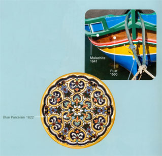
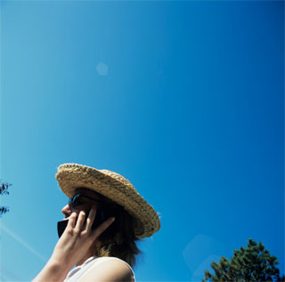
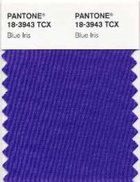
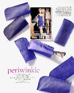
 Personal Style
More than anything, color choice is all about personal style. “There’s never just one hot color,” says Eiseman. “People surround themselves with the colors that suit their lifestyle and their moods.”



 At the opposite extreme, is the Sunset Colortime palette. This is the time of day when colors take on a golden, mellow, ‘drier’ quality, eventually exploding into the fiery colors of Sunset. The natural elements of fire and earth light up this palette with festive reds, glowing ambers, hazy magentas and vibrant corals. Zesty pesto greens and periwinkle blues add a tasteful touch.
 Nestled between Sunrise and Sunset is the Sunlight Colortime palette. These are the hours that the sun shines at its brightest, rendering the colors it lights on a bit more muted and sun drenched. All of the natural elements are represented here, with ‘natural’ a key word as all shadings are subtle. Think delicious shades of grape, peach, strawberry and bisque, balanced by placid blues and willow greens.