DECEMBER 2009 ARCHIVES
December 31, 2009
Design Guide The Source for Fine Home Furnishings, Products and Services
Dallas-Fort Worth 16th Edition
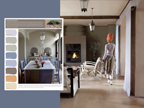
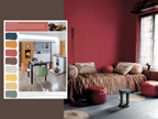
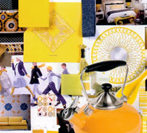
Color Trends
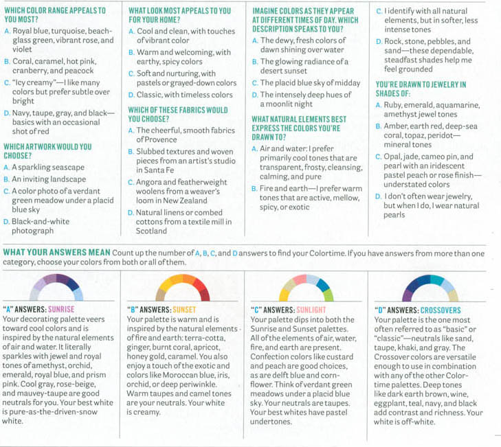
As Director of the Eiseman Center for Color Information and Training, executive director of the Pantone Color Institute, color forecaster and consultant, a published author and self-proclaimed color addict, Leatrice Eiseman is easily identified as America’s leading color expert. Each year she scours the globe-from market to market-looking for refreshing inspiration in every corner of the earth, before translating her thoughts into the next year’s much-anticipated Color and Design Trends forecast.
High fashion reigns supreme in setting the pace for color, pattern and design trends, “but look around you,” says Eiseman, “color inspiration is everywhere.” The entertainment industry, food, graphics, packaging, technology and worldly cultures-not to mention our own personal moods, ambitions, and needs-are a few of the social influences that shape the way we see and apply color in our everyday lives, she explains. “In this economy, people tend to ‘burrow’ as an at-home diversion,” she states, which creates a society that is less prone to want to throw away or start over from scratch when it comes to creating a comfortable and stylish home atmosphere. However, “People are always looking to freshen and feather their nest,” which is precisely what Eiseman aspires to provoke in the lives of interior designers, decorators and homeowners…
Unusual color combinations create an unexpected look of sophistication” traditional color hues are rapidly becoming a concept of the past.” Another suggestion-“add some whimsy,”-she recommends. “Show stopping colors grab your attention and move you to stop and smile.”
“…other pieces of advice include mixing bold vibrant shades with darker hues for a seamless juxtaposition, or play up the neutral toned elements in your home by accenting them with pops of dynamic and unpredictable colors.”
Looking towards the future of color and design, Eiseman gravitates towards aesthetic ideas that not only impact us now, but will unquestionably have an even greater impact on us down the road.
People surround themselves with the colors that suit their lifestyle and their moods,” says Eiseman. Whether it’s bold, bright, risk-taking hues, or a soft, subdued natural palette that brings you home, coloring your world is about evoking an emotion and capturing the soul. Armed and ready with inspiration from the color queen herself, it’s time to let your true colors shine through.
December 28, 2009
The Academy Report
Preserving Motion Picture History
Volume 22 • 3rd/4th Quarter 2009
As some of you may already know (or not) my husband, Herb, is a voting member of of the Academy of Motion Picture Arts and Sciences. In addition to receiving about 60 movies to review every year and ultimately to vote on, he receives the quarterly report that very often contains interesting stories about the film industry.
Naturally, my attention is always drawn to articles that concern the use of color in film and/or film advertising. I was especially interested in a story about vintage posters as it dealt with the preservation of the colors in that unique art form.
I learned a new word when I read an article in the report about that subject and that word is “in-painting”. It literally is the process of reconstructing lost or deteriorated parts of images. This task would be carried out by a skilled image restoration artist. In the digital world, in-painting (also known as image interpolation) refers to the application of sophisticated algorithms to recover lost or corrupted parts of the image data that are seen as small defects.
RESTORATION VERSUS CONSERVATION, THAT IS THE QUESTION.
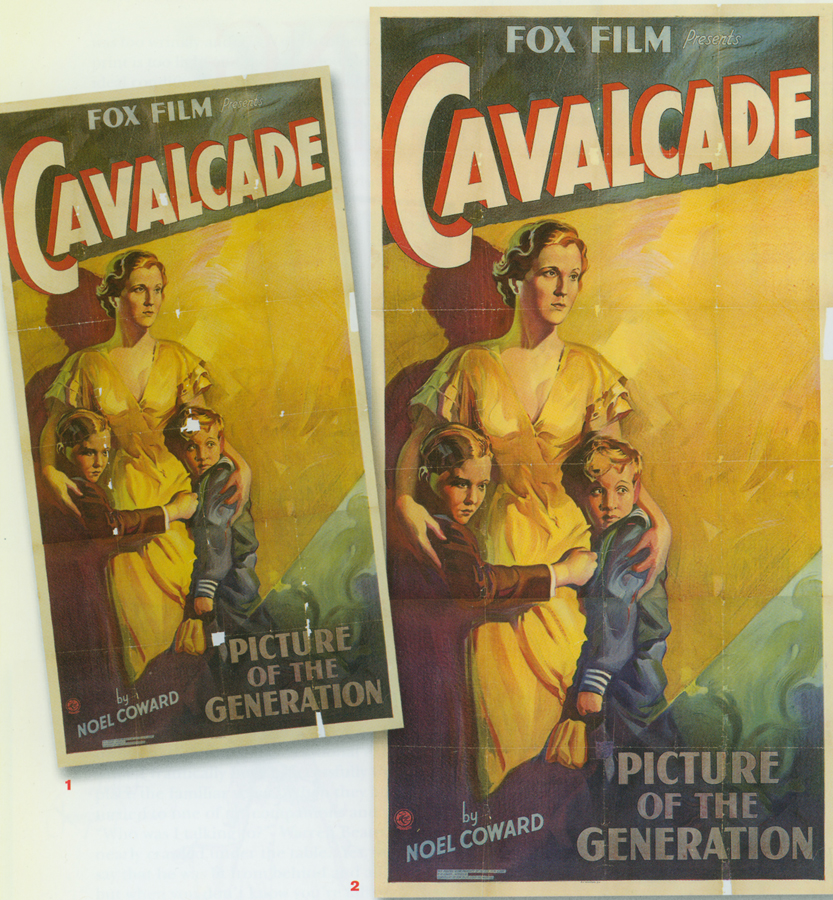
The article dealt with the restoration of beautiful poster for a film called “Cavalcade” written by Noel Coward. It had been acquired to grace the second floor lobby of the Samuel Goldwyn Theatre in Hollywood. The poster was delivered in good condition with the exception of some white blotches that were actually exposed areas of the lining of the piece.
To quote from the article:
“…While some private collectors support restoration techniques such as air-brush painting to make the poster appear like new (over-painting the fold creases and borders, brightening the colors and in-painting any losses), these techniques are not approved by conservators or museums as they provide a false sense of newness and may actually prove damaging to the poster in the long run. The accepted conservation rule is to preserve the historical integrity of the item and only take measure that are reversible in the future. Hence the decision was made to tone in areas of loss to visually integrate the extant elements.The losses were in-painted using watercolors applied directly to the exposed areas of the paper lining. No areas of the original poster were covered by the in-painting. The goal was to enhance the viewer’s enjoyment of the poster by removing the distractions of the losses without being deceptive.”
December 24, 2009
HAPPY HOLIDAYS TO OUR WONDERFUL READERS!
THANK YOU!
I Can See in Color
Blige: “After seeing the film, I realized the things that Precious and I have in common. When you’re depressed, you can never really see your life clearly; everything seems to be in black and white. When you choose life, like Precious did-by the end of the film, just like I did during my ‘No More Drama’ era, you begin to see life, and it’s clearer-in color”
I hope my readers will forgive my taking a moment to vent. I love that there is more information available on the web concerning color psychology, when it is properly vetted and accurate. But I really dislike the propagation of information that is based on old information and urban legends. For example, the following article appeared on a website from Category Cloud Design: graphics, inspiration and marketing. It is attractively done and I am certain that these people mean well, are interested in educating others and are trying to show the importance of color, so please read the following copy and look for my comments at the end.
CATEGORY CLOUD design graphics inspiration marketing
{BLUE} The color of peace and tranquility. It’s been stated that people are more productive in blue rooms. Although, be careful. It can cause feelings of sadness…we don’t want to cause people to have “A case of the Monday’s”. While blue can calm people, it can also decrease your appetite. People typically stay away from blue foods (aside from blueberries and plums)…blue is usually an indication that something has spoiled or is poisonous. If you want to eat less, eat off of a blue plate.
{FUN BLUE FACT}: In Columbia, Blue is associated with soap. Yep, soap. Can’t get more random than that!
leatrice eiseman Says:
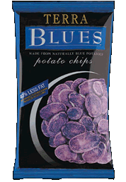
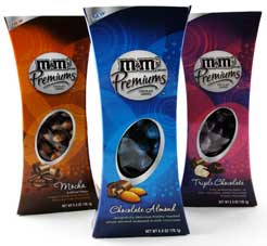
Love that you are promoting the use of color and helping to educate people about it, but sorry–there are no definitive studies about blue suppressing appetite. As matter of fact, blue china and dinnerware is a big seller all over the world, cobalt blue glasses and glass plates are very popular (think Williams Sonoma and Mexican glassware) so you would think there would lots of thin people as a result, whereas people are getting fatter, especially in U.S. That is an urban legend, especially when blue berry flavors are mixed in smoothies, drinks and with yogurts. There are blue potatoes now, blue corn chips, blue m&ms, blue sweet enticements on cakes and pastries. My advice is not to pick up on the old urban legends without checking more recent and credible info. I have written seven books on color, have three websites and a blog and am always looking at more current info to update the old legends that simply are no longer true.
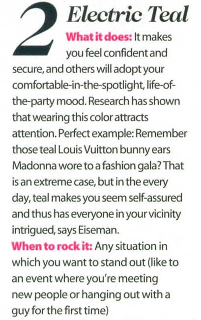
One more point; as I point out in my books, not all blues speak of serenity. There are electric blues,that, just as the name implies, speak of excitement and high energy.
December 21, 2009
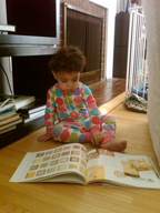
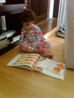
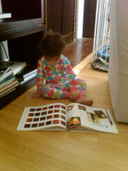
One of my new ‘pen pals”, Joshua Moores of Washington DC wrote that his daughter was a fan of my books and sent some pictures to prove it.
I always love to connect with fellow color aficionados, so I want to share some images of my youngest ‘reader’. Is she destined for a career in color consulting, or what!!
As her dad is an interior designer specializing in commercial interiors and her mom is an architect, there is a very good chance we have a budding color design specialist in the making.
Love the pajamas….she probably picked them out!
December 18, 2009
In Washington a Different Kind of Bubble
New York Times
December 15, 2009
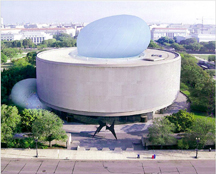
Sitting atop the national mall will be a strange new site to Washingtonians.
At the Hirshhorn Museum and Sculpture Garden, a 145 foot tall inflatable baby blue bubble will emerge from the top of the drab gray exterior of the building and it will house a meeting hall. It will be erected only for May and October, and in storage the rest of the time.
Two air pumps would be used to inflate the baby-blue structure, “that would swell out of the top of the internal courtyard of the museum.” A smaller, globe shaped structure (also baby blue) will emerge out the side of the building, creating a public lounge overlooking the mall.
As reported in the New York Times there is an ‘aura of lightness—of a building that seems ready to float off into the sky–anchored by a “gigantic tube of water”.
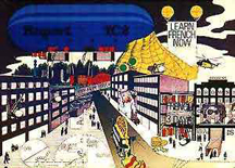
“The structure itself, if it is ever built, will be part of a long tradition of architects seeking to tap into the energy and accessibility of popular culture. It includes projects like Archigram’s 1969 Instant City, which was partly inspired by the cheap, ethereal structures of postwar Los Angeles, and Peter Cook’s 1968 Ideas Circus, an informal think tank enclosed underneath a big dome that could be packed up in trucks and moved from city to city.”
Photo courtesy Environmental Communications Photo courtesy Environmental Communications
Might this start a whole new approach to room additions?
December 14, 2009
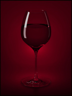
Lighting can influence how wine tastes
10 December 2009 Mainz, Germany
The background lighting provided in a room has an influence on how we taste wine. This is the result of a survey conducted by researchers at the Institute of Psychology at Johannes Gutenberg University Mainz, Germany. Several sub-surveys were conducted in which about 500 participants were asked how they liked a particular wine and how much they would pay for it. It was found that the same wine was rated higher when exposed to red or blue ambient light rather than green or white light. The test persons were even willing to spend in excess of one Euro more on a specific bottle of Riesling when it was offered in red instead of green light.
“It is already known that the color of a drink can influence the way we taste it,“ says Dr Daniel Oberfeld-Twistel of the General Experimental Psychology division. “We wanted to know whether background lighting, for example in a restaurant, makes a difference as well.” The survey showed, among other things, that the test wine was perceived as being nearly 1.5 times sweeter in red light than in white or green light. Its fruitiness was also most highly rated in red light. Accordingly, one conclusion of the study is that the color of ambient lighting can influence how wine tastes, even when there is no direct effect on the color of the drink.
“The extreme lighting conditions found in some bars can undoubtedly influence the way a wine tastes,” concludes Oberfeld-Twistel. He also recommends that serious wine tasting should be conducted in a neutral light color environment.
Perhaps a partial explanation of why lighting influences the way we taste wine is that in what we perceive to be pleasant lighting conditions, we also regard the wine as being more pleasant too. Additional research is planned to provide further insight into this fascinating phenomenon.
Daniel Oberfeld, Heiko Hecht, Ulrich Allendorf and Florian Wickelmaier
Ambient lighting modifies the flavor of wine
Journal of Sensory Studies, 2009, 24(6), pp. 797-832.
December 11, 2009
For those of you who may not be aware. Lee Eiseman names the color of the year for Pantone.
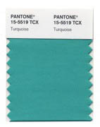
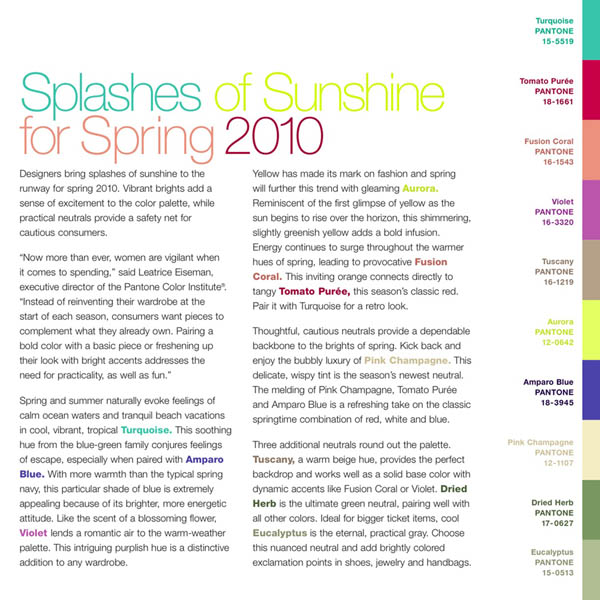
The color of the year for 2010 (drumroll) is Pantone’s TURQUOISE.
The Associated Press posted an article announcing Turquoise as the PANTONE Color of the Year for 2010. In the article, editor Samantha Critchell includes quotes from Leatrice Eiseman, Tommy Hilfiger, interior designer Charlotte Moss, Kristin Martin, brand manager at Le Creuset, and Jane Schoenborn, design director at Lilly Pulitzer. The article has also just appeared in top newspapers including the LA Times, the Chicago Tribune and The Miami Herald. Yahoo
Finance has mentioned it, too, showing how important color impact is in the world of finance…
Click the link below to read the full article.
For the full report click
December 7, 2009
University of Michigan
News Service
December 2, 2009
Male and female shopping strategies show evolution at work in the mall
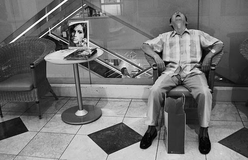
Male and female shopping styles are in our genes—and we can look to evolution for the reason. Daniel Kruger, research faculty at the University of Michigan School of Public Health, says it’s perfectly natural that men often can’t distinguish a sage sock from a beige sock or that sometimes women can’t tell if the shoe department is due north or west from the escalator.
From an evolutionary perspective, it all harkens back to the skills that women used for gathering plant foods and the skills that men used for hunting meat. The contrast emerges because of the different foraging strategies for hunting and gathering used throughout human evolution.
Sex-specific strategies can be seen in the modern consumer environment, according to Kruger’s new study, “Evolved foraging psychology underlies sex differences in shopping experiences and behaviors,” scheduled for the December issue of the Journal of Social, Evolutionary, & Cultural Psychology.
The study examines shopping through the framework of evolutionary psychology to understand why so many more women enjoy spending a day picking through racks of clothes with friends, while most men can’t get out of the mall fast enough.
“We have evidence that the kind of skills, abilities and behaviors that are important for hunting and gathering in current foraging societies emerge predictably in our modern consumer environment,” said Kruger, who decided to conduct the study after a winter holiday trip with friends across Europe.
After exploring sleepy little villages and reaching Prague, the first thing the women wanted to do was shop, Kruger said, and the men couldn’t understand why.
“But that is not so unreasonable if you’re thinking about a gathering strategy,” Kruger said. “Anytime you come into a new area you want to scope out the landscape and find out where the food patches are.”
Kruger said that gathering edible plants and fungi is traditionally done by women. In modern terms, think of filling a basket by selecting one item at a time.
Women in foraging societies return to the same patches that yield previous successful harvests, and usually stay close to home and use landmarks as guides, he said. Foraging is a daily activity, often social, and can include young children, if necessary. When gathering, women must be very adept at choosing just the right color, texture and smell to ensure food safety and quality. They also must time harvests and know when a certain depleted patch will regenerate and yield good harvest again.
In modern terms, women are much more likely than men to know when a specific type of item will go on sale. Women also spend much more time choosing the perfect fabric, color and texture.
Men, on the other hand, often have a specific item in mind and want to get in, get it and get out, Kruger said. It’s critical to get meat home as quickly as possible. Taking young children isn’t safe in a hunt and would likely hinder progress.
Of course these behaviors aren’t genetically determined and don’t apply to everyone, but there are consistent broad themes, he said. So why is this important?
“The value is in understanding each other—both your own shopping strategy and the strategy of the complimentary sex,” Kruger said. “It helps demystify behaviors—guys, myself included, have been puzzled by why women shop the way they do.”
And women can have a hard time understanding a man’s aversion to it, he said.
December 4, 2009
DuPont Announces World’s Most Popular Car Colors
Silver Gleams in First-Ever DuPont Global Color Rankings for 2009
12/1/09
Lee is the color expert that Dupont enlists yearly to help interpret trends
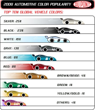
DuPont announced that silver, black and white are the top colors in the first-ever ranking of worldwide vehicle color popularity. Now in its 57th year, the annual DuPont Global Automotive Color Popularity Report is the original and most authoritative source for automotive color popularity information and trends with detailed breakdowns for the top automotive markets as well as this year’s newly announced top global colors.
Top Ten Global Vehicle Colors:
1. Silver – 25 percent
2. Black – 23 percent
3. White – 16 percent
4. Gray – 13 percent
5. Blue – 9 percent
6. Red – 8 percent
7. Brown/Beige – 4 percent
8. Green – 1 percent
9. Yellow/Gold – 1 percent
10. Others – <1 percent
“By gathering and analyzing color popularity data around the globe, DuPont is able to better identify trends and help our customers in the automotive industry develop color palettes for the future,” said Nancy Lockhart, color marketing manager for DuPont OEM Performance Coatings. “The auto industry is an increasingly global business, so regional and global color data are vitally important to designers.”
Although the results suggest an ongoing convergence of color choice globally with color preferences becoming more homogeneous across regions, distinct regional differences remain. The top three colors – black, white and silver – continue to show strongly around the globe with growth of these colors across regions.
“It’s important to recognize that most people today, no matter where they live in the world, have access to cutting-edge information about popular colors from many sources like glossy magazines and fashionable websites and often will see the same widely distributed films,” said Leatrice Eiseman, executive director, Pantone Color Institute and author of the blog Eisemancolorblog.com. “The top colors become ‘aspirational’ with a universal appeal.”
Changes Across Markets
“There are still distinct regional differences in preference, but global trends are unmistakable,” said Lockhart. “Color preference can change from year to year because of a variety of factors including types of vehicles introduced, reduced vehicle size, consumer tastes and even the economy. These and other cultural, societal and demographic influences can shift regional trends over time.”
In North America, white (17.8 percent) remains the top color choice with black (17 percent) and silver (16.7 percent) in second and third place. However, examining black’s popularity over time shows it is rising –up six percentage points from 2005 – while silver and white have dropped in popularity by about two points over the past five years. Chroma colors blue and red remain solidly popular in the North American market, rising from 11 percent in 2006 to approximately 12 percent this year.
In Europe, the top color black (27 percent) continues to gain popularity over silver (19.9 percent), which is continuing to decline. White is growing in popularity but remains a second tier color with 10.2 percent of the market.
Japan saw a wide swing of color popularity for the year, ultimately aligning more with the North American and European markets. White remained the top color choice at 28 percent, dropping 4 points from 2008. Silver dropped five points to 23 percent, tied with black.
In contrast, the Chinese vehicle market experiences fluctuations in color preference. Silver rose four points to 36 percent for the year to remain the top color, with black dropping eight points to 23 percent as the second most popular color. As this market continues to grow there will likely be less variation year to year.
The market in India shows strong preference for silver (26.4 percent), white (23.4 percent), red (16.1 percent) and blue (10.9 percent) with the remaining colors each garnering 6 percent or less of the market. Of interest, the Russian market looks similar to India with strong chroma colors mixed throughout the rankings, most noticeably in the green area. In the Russian rankings, silver was first (23.4 percent), followed by green (18.2 percent), black (16.7 percent), blue (15.5 percent) and red (10.8 percent).
The DuPont Global Automotive Color Popularity Report remains the authoritative ranking of color preferences and is the industry’s only report to include detailed information on the automotive markets in a variety of countries and regions, including: North America, Europe, Russia, South America, Mexico, Brazil, Japan, South Korea, China and India.
Automotive Color Trends
“In the automotive market, it is essential to forecast trends at least three years ahead of the target model year, due to the length of time it takes to develop, source and manufacture a vehicle,” said Lockhart. “As a partner with our automotive customers, DuPont develops a yearly color trends show that highlights new vehicle colors and technology advancements for the industry.”
The 2009 trend show, “Contrast of Color,” is focused on global interests in automotive coatings, using contrasting ideas to merge a complete and fresh approach to long-lasting color preferences. With the use of pigments and hue-shifting elements, traditional colors have been freshened to provide a sense of uniqueness and personality to consumers’ vehicles.
“There are many reasons to buy a new car, yet we know color is often the ‘driver’ for purchasing a vehicle,” said Eiseman. “Consumers have gotten very savvy about how and where to look for color trends and they do look for guidance on “what’s new (and newsworthy) in color.”
The color trend show uses opposite themes that evolve into one color palette of diverse, simple, complex, and upbeat color trends. The themes are defined as: “Traditional Avant-Gardist,” “Normal Maniac,” “High-Tech Ecologist” and “Global Patriot.”
The “Traditional Avant-Gardist” category exploits colors as classic and modern. These classic colors have a twist of elegance and prestige while maintaining their long-lasting appreciation. These colors – Water Desert (blue), Wooden Nickel (medium dark gray) and Winter Lavender (purple)– are expressions of historical colors remembered by generations that have been updated to fit the future trends.
The “Normal Maniac” category shows that colors can be quite simple and frankly, wild. These colors are bright and chromatic – Simple Chaos (blue), Serious Fun (green) and Running Start (yellow). Small cars, limited editions, and aftermarket usage may showcase the confidence of this palette.
The “High-Tech Ecologist” palette features natural colors with modern characteristics. As fuel-efficient vehicles are integrated into the new vehicle market, the branding of new color spaces will evolve. This soft, yet rustic, palette will have enduring appeal for consumers – Light Intensity (orange), Frozen Wave (light blue) and Microcosm (dark blue).
The “Global Patriot” category responds to the growth in global markets. Although each region has its own preferences, general color trends are shared worldwide. This global palette will relate the worldwide trend to consumer’s local demands. These familiar colors of silver, black, white, gray, blue, red and beige are updated to exhibit extensive popularity in today’s mature market in Authentic Replica (dark red), Crystal Crème (beige) and Dark Diamond (silver).
DuPont Supports the Global Automotive Industry
In addition to paints and coatings for new cars and aftermarket applications such as collision repair, DuPont supports the global automotive and transportation industries with a vast array of products including elastomers for hoses, belts and other parts; engineering plastics for molded components; electronics products for microcircuits and flexible and printed circuits; and a variety of polyester films. The DuPont offering also includes glass-laminating products, fuel cell components, refrigerants and thermal protection materials. DuPont is working actively to introduce sustainable, bio-based materials into fabrics and engineering polymers and fuels. These products reduce dependence on petroleum resources, reduce vehicle weight and improve fuel efficiency.
DuPont is a science-based products and services company. Founded in 1802, DuPont puts science to work by creating sustainable solutions essential to a better, safer, healthier life for people everywhere. Operating in more than 70 countries, DuPont offers a wide range of innovative products and services for markets including agriculture and food; building and construction; communications; and transportation.
NOVEMBER 2009 ARCHIVES
November 30, 2009
I know that I have written on this subject before, but I think the message bears repeating. We know that color enriches our lives in many ways, not the least of which is the variety of colors that we eat. It is essential that we get a full spectrum of colors on our plate so that we can be assured that we are getting the right nutrients for our bodies.
What are the compounds that each color delivers? Starting first with:
Red
Red foods contain the antioxidant, lycopene, shown to play a role in reducing the development of certain cancers and may also be effective for staving off heart problems.
Orange
Orange foods are wonderful sources of beta-carotene, a component of vitamin C. Orange fruits and vegetables help to bolster the immune system and eyesight.
Yellow-green
Yellow green foods are loaded with phytonutrients like lutein for eye health, chlorophyll to protect cells from damage, and folic acid, important for growth and development.
Blue/purple
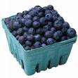
Forget that old nonsense about blue food causing a diminished appetite. There are no definitive studies to prove that old saw that claimed that people are unaccustomed to seeing blue foods, therefore they are turned off by a blue cast to any food. But there are bluish foods, like blueberries and they are an excellent source of brain-protective antioxidants. Eating berries can keep the mind sharp and focused. There are also blue-tinged yogurts, blue potatoes, blue corn and loads of bluish purples found primarily in fruits.
As for yellow, there is a variety of benefits, everything from the bioflavanoids in lemons to the potassium in bananas. And, of course, you know your mother knew best when she told you to eat your veggies, a virtual storehouse of vitamins and minerals. The challenge is to keep your plate filled with a variety of colors—the bigger the variety, the better.
November 25, 2009
Observatory
By Happy Accident, Chemists Produce a New Blue
Kenneth Chang
November 24, 2009
“Blue is sometimes not an easy color to make.”
“Blue pigments of the past have been expensive (ultramarine blue was made from the gemstone lapis lazuli, ground up), poisonous (cobalt blue is a possible carcinogen and Prussian blue, another well-known pigment, can leach cyanide) or apt to fade (many of the organic ones fall apart when exposed to acid or heat).”
“So it was a pleasant surprise to chemists at Oregon State University when they created a new, durable and brilliantly blue pigment by accident.”
“The researchers were trying to make compounds with novel electronic properties, mixing manganese oxide, which is black, with other chemicals and heating them to high temperatures.”
“Then Mas Subramanian, a professor of material sciences, noticed that one of the samples that a graduate student had just taken out of the furnace was blue.”
“I was shocked, actually,” Dr. Subramanian said.”
“In the intense heat, almost 2,000 degrees Fahrenheit, the ingredients formed a crystal structure in which the manganese ions absorbed red and green wavelengths of light and reflected only blue.”
“When cooled, the manganese containing oxide remained in this alternate structure. The other ingredients-white yttrium oxide and pale yellow indium oxide-were also required to stabilize the blue crystal. When one was left out no blue color appeared.”
“The pigments have proven safe and durable, Dr. Subramanian said, although not cheap because of the cost of the indium. The researchers are trying to replace the indium oxide with cheaper oxides like aluminum oxide, which possesses similar properties.”
“The findings appear in the Journal of the American Chemical Society.”
Financial Times/London
Ways for the connoisseur to keep a foothold in hard times
Avril Groom
November 14, 2009
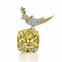
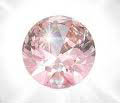
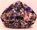
“Of all the gem-guality diamonds that emerge from the ground, less than 1 percent are anything other than white. Large coloured diamonds are so rare that, through history, they have become famous with their own names and myths, like the supposedly cursed blue Hope or the 1280-carat Tiffany yellow.”
“Deeper colours are rarest, the brightest defined as “vivid” or “intense”. These are always the target of collectors and the grades rise exponentially in value. Colour tones are categorized too, with purer shades worth more.”
“This value reflects a diamond’s rarity and collectibility rather than its suitability for making beautiful jewelry. Many are never set, too valuable to be held anywhere other than in a bank or museum. Those that are traditionally make important pendants or rings, where the stone rather than the designer’s art is the main event.”
“Now, the focus on coloured stone jewelry of all types, and on mixing different tones, is placing a new emphasis on coloured diamonds and on pale, subtle shades that were less valued in the past.”
“People who become fascinated by coloured stones are inevitably drawn towards diamonds,” says Melvyn Kirtley, Tiffany’s European president and trained gemologist. “They come in an infinite variety of colours, but their chemical structure gives them more fire and vivacity than any other stone, and they are proportionately more valuable.”
“Although all top-end jewelers emphasize their desire to concentrate on, and their ability to find, examples of large, super-rare coloured diamonds for collector clients, they are also noticing greater demand and interest in delicate shades which, says Mr Kirtley, “many people find more appealing, particularly from a wearability viewpoint”, although he emphasizes that some depth of colour is necessary and most Tiffany coloured diamonds are not more dilute than the fancy category.”
“Grading coloured diamonds is extremely complex. The standard chart prepared by the Gemological Institute of America scarcely gets to grips with the issue.”
“Once all the variables of quality and colour are taken into account, a flawless, pure-coloured, vivid stone could be worth up to 10 times a similarly sized example only a couple of categories lower. So, in these economically stressed times, are people tempted to go for the paler shades on the principal of more bang for your bucks and, if they do, will the investment prove sound?”
“John Calleija, Australian jewelry designer, who works primarily with pink diamonds from the Western Australia Argyle Mine-predicted to be exhausted by 2019-says: “Paler pink diamonds are considerably less expensive than the deeper colours so, if a client prefers the paler colour, then the lower price point is a bonus.”
“In a recession, when the fine jewelry market has taken a blow, paler coloured stones are a way for the connoisseur to keep a foothold in the market without breaking the bank.”
November 23, 2009
On my recent trip to London for color forecasting meetings, I was taken by some of the jewelry displays I saw in trendier high end shops. The following is an excerpt from the London Financial Times, written by Avril Groom.
Financial Times/London
Bling overtaken by tough chic and Gothic
Avril Groom
November 14, 2009
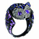
“Black Gold” is no longer solely a term for oil. It means exactly what it says, and if it sounds like an oxymoron, it actually reflects an appetite for subtlety and stealth in the jewelry market today. Where white gold use to be the default position for metal with an absence of colour, increasingly the plating has a darker hue, providing a more industrial, masculine counterpoint to rose gold.”
“Almost perversely, some designers enjoy plating on yellow gold. “It’s a private pleasure-only the purchaser knows what is under there,” says London jeweler Hanna Martin, who has been working with blackened gold for five years and helped to popularize it.”
“Yellow gold gives an added kick when eventually the plating starts to wear off. “I don’t see wear as a defect,” she says. “It reveals glimpses of the true value of your piece, and the contrast between black and yellow is very appealing.”
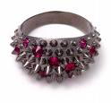
“Ironically, blackened finishes-marginally more expensive than yellow gold-are used to give a worn, antique look, such as the settings Solange Azagury-Partridge used for her deep, all-ruby or emerald pieces for Boucheron nearly a decade ago. It has since become the choice for setting deep-coloured stones-Chopard uses it to give a matt, aged look where dark stones such as tsavorites are paved, but shade the same setting into white gold to highlight brilliants such as diamonds.”
“It makes certain stones look dark and glamorous,” says jeweler Ben Day, known for his richly coloured rings. “It’s great to have another metal colour at my disposal. I first used it with black diamonds and then found it enhances deep greens, reds and purple. The finish varies from gunmetal to black-it depends on the stone but it should be delicate, not too Goth and heavy.”
“Recent interest in black diamonds and dark Tahitian pearls set the trend but it has now taken off as a featured metal rather than just a setting.”
“This started with men’s jewelry but, as women’s fashion veered towards tough chic and Goth looks, jewelers such as Ms Martin make no distinction.”
November 20, 2009
From Cognitive Daily comes an interesting study about color and human perception, written by Dave Munger
November 19, 2009
Detecting faces: People use some of the same strategies computers do
How does our visual system decide if something is a face? Some automated face-detecting software uses color as one cue that something is a face. For example Apple’s iPhoto has no trouble determining that there are two faces in a color picture: Do people, like computers, use color to help decide whether something they see is a face? Humans are excellent at identifying colors, and while faces can be many colors, there are also many colors that are very rarely seen in faces (e.g. blue, green, orange).
Could we use skin-tones to help identify faces?
Markus Bindemann and Mike Burton created a set of images with faces placed in random locations, some were full-color, some black-and-white, some had faces in black-and-white and color backgrounds, and some had black-and-white backgrounds and color faces. The faces also varied in size and position within the pictures. One-third of the photos contained no faces at all. Twenty-four volunteers watched as these images flashed in front of them, indicating as quickly as possible whether they saw a face.
Did the color of the faces matter?
Here are the results: Color faces were detected significantly faster than black-and-white faces. Even when the black-and-white faces were on a color background, they were still detected significantly more slowly. Similarly, more errors were made on black-and-white faces compared to color faces.
In a second experiment, Bindemann and Burton showed viewers face pictures that were half-color and half-black-and-white, in addition to the normal full-color faces. Once again, full-color faces were detected significantly faster.
The researchers say this means the visual system must be searching for skin-colored areas of a roughly elliptical or oval shape–much like computers do.
Excerpted from a study conducted by Bindemann, M., & Burton, A.M. (2009).
The Role of Color in Human Face Perception Cognitive Science, 33, 1144-1156: 10.1111/j.1551-6709.2009.01035.x
November 13, 2009
Two blog entries to tide you over until next Friday!
Immersion In Nature Makes Us Nicer
Tom Jacobs
August 17, 2009
New research finds those who feel a strong connection to the natural world have a more caring attitude toward others.
Maintaining a connection to nature, either through the presence of indoor plants or artwork depicting the natural environment, has been shown to decrease stress levels and stimulate healing. Newly published research suggests it may also make us better people.
A series of studies suggests immersion in nature “brings individuals closer to others, whereas human-made environments orient goals toward more selfish or self-interested ends,” according to a paper posted on the Web site of the Personality and Social Psychology Bulletin. This appears to be the first research to examine the impact of the natural world on people’s values and aspirations, and its findings have intriguing implications for architects, designers and urban planners.
A team led by University of Rochester psychologist Netta Weinstein conducted three studies in which participants were shown a series of slides depicting either natural landscapes or urban settings. They looked at each slide for two minutes, while they were asked to notice the color and textures and imagine the sounds and smells of the environment pictured. They were then asked to what extent they felt involved in and engaged by the photos.
Those participating in the first study were then asked to rate the importance of four life goals, two of which were related to community and connectedness (“to have deep, enduring relationships” and “to work toward the betterment of society”) and two of which were more egocentric (“to be financially successful” and “to be admired by many people”).
The results: Those exposed to the nature scenes placed a higher value on community/connectedness values and a lower value on self-oriented values than those who saw the cityscapes. What’s more, “as individuals were more immersed in the slides presenting natural settings, they experienced greater increases in intrinsic [community/connectedness] aspirations.”
Another test confirmed these results by having participants engage in a”funds distribution” task. “As individuals were more immersed in nature slides, they were more likely to make generous decisions,” the researchers write. “As they were more immersed in non-nature slides, they were less generous and greedier.”
In a separate test that did not involve slides, “participants who were immersed in a lab setting with plants present reported higher valuing of intrinsic aspirations” than those in a setting devoid of living green growth.
So why would immersion in nature instill feelings of selflessness? Weinstein and her colleagues suggest the answer lies in an enhanced sense of personal autonomy. “Nature affords individuals the chance to follow their interests and reduces pressures, fears, introjects and social expectations,” they write.
While conceding that more research will be necessary to confirm or refine these results, the researchers say their findings “highlight the importance of effective urban planning that incorporates green spaces and other representatives of nature.”
Their findings will also be of interest to architects and interior designers. Frank Lloyd Wright’s concept of bringing the outside inside may not just be a prescription for aesthetic beauty, but also for peaceful coexistence.
“Together, these findings suggest that full contact with nature can have humanizing effects,” the researchers conclude. “Our results suggest that, to the extent our links with nature are disrupted, we may also lose some connection with each other.”
The Healing Power of Children’s Art
Charlotte Reznick, Ph.D.
November 2, 2009
Since the first cave paintings, we humans have found creative ways to express ourselves with art. We naturally draw, paint, and doodle to capture thoughts and feelings. Art has also been used throughout history for healing. Studies show that it creates brain wave patterns that enhance the autonomic nervous system, hormonal balance, and brain neurotransmitters. While doing artistic expressive art, the body’s physiology shifts from stressed to serene.
The same for children. It’s often easier for a child to talk about pictures than about himself or his feelings (grief, anger, shame, etc.). Drawing and painting will allow your child to express difficult feelings or to disclose what he might not share verbally. His artistic expression can give you a clearer sense of his inner struggle, an insight that will help you guide him.
Drawing also increases your child’s awareness of her inner world and creates a window onto that landscape. Art can be a launching point for conversations that reveal her thinking about the world around her.
You don’t have to be a trained therapist to use therapeutic art techniques with your child. Just stock up on a variety of supplies—giant rolls of paper, colored paper, crayons, paints, and a variety of markers, including scented, metallic, fat, thin, even markers that change color as they write over another color. Then try the following art exercises to explore new ways to communicate with your child.
Draw a self-portrait. On a large sheet of paper, trace your young child’s body. Have her fill it in with her feelings. Happy might be a bright yellow sun near her heart; sad may be blue teardrops coming from her eyes. Older children can design and complete their own. You might be surprised at what and where emotions turn up.
Picture the future. Artwork is also an effective starting point when you’re working with clear end-goals, like getting a good night’s sleep or reducing a fear. Suggest your child make two drawings—how things are now and how he’d like them to be. Once he can picture where he’d like to be, he can start taking steps to get there. And he can hang his pictures in his bedroom as a reminder of the possible positive future.
Show and tell. After an imaginary journey, such as a walk through a special place she imagines with her eyes shut, have your child draw her experience. The visual rendering gives you both something to look at as she shares. If the drawing illustrates a problem—say, a dangerous goblin or a fire at home—ask her to imagine what might solve the situation. She can even draw the solution right onto her picture.
Talk to the image. Once your child has released his feelings onto paper, he can speak with them. He might use his picture of Worry to ask what it needs to calm down, or to tell it to leave. It’s often easier to converse with feelings when they’re outside than when they’re gnawing away inside, at for example, a stressed-out tummy.
Take artistic action. Although it’s a great release when a child can draw her angry, hurt, or upset feelings, pictures don’t have to be static. She can erase part of it, or draw over it in “healing” colors with a changeable marker—an immediate transformation that feels magical. She can even rip up or throw away the paper. These actions can offer a hurting child a sense of control and satisfaction.
Capture the memory. The special places your child visits on his imaginary journeys can be personal healing sanctuaries. Hanging pictures of them somewhere private but visible will remind him that he can return whenever the need arises. And drawings of trusted animal friends and wizards may help him remember support is always near.
Accept every drawing. Some kids are hesitant to put their mental pictures to paper; they’re afraid they won’t be good be enough. Reassure your child that anything he creates is fine. Sometimes all that comes are strokes of bold color evolving out of a wonderful or terrible feeling that is finally set free on paper. Praise each one. They are the artifacts of your child’s precious inner world.
November 9, 2009
Alive with Color
Opening up with Color
Our daughter, Lori, is an art therapist and photographer. Her experiences, which are borne out by the writings of experts like Faber Birren, tell us that art therapy has done a great dealto help mental patients “open up.” Children, for instance, may have difficulty articulating their thoughts, yet express themselves easily with crayons and paints. It is a normal tendency for children to use bright colors, with the luminous warm shades often the most preferred. When a child uses black crayons frequently, it is an indication of pent-up emotions, a too-rigid upbringing, or a very restricted environment.
Love of red is quite common in children and shows a carefree spirit. Immature behavior and over-dependecy on adults go with a love of yellow. A preference for green shows a well-adjusted, balanced personality, just as it does with adults. Mothers are often painted in pastel shades, and darker colors tend to be used for disciplinarian daddies. Brothers and sisters are painted in colors appropriate to the way the child perceives them.
Children are essentially quite primitive in their color choices, which may remain the same through adolescence. Adulthood tends to bring a refining of color preferences.
Touches of bright color are used in children’s wards in hospitals to downplay the institutional look. Nurses are often encouraged to wear colorful smocks. Warm tones in hospital settings should be cheerful and not too intense; yellows and yellow-greens should be used cautiously as they can cast a sickly pallor on the faces of the young patients.
November 6, 2009
This is a very “informal” study, done with just four subjects, but it does show yet another indication that the old urban legend “people lose their appetites in the presence of blue” does not necessarily hold up—especially with donuts!!
KENS5 San Antonio
Feeling blue? These shades may keep the pounds off
Marvin Hurst
November 4, 2009
There’s a constant chase by those who are weight challenged to lose and maintain a decrease in pounds. But is there a magic bullet to help get you there?
“It just sounds so enticing,” said University of Texas Health Science Center’s Dr. Sue Cunningham. “It’s what we want to hear. We want to have something simple solve a complex problem.”
According to Dr. Cunningham, the battle to fight of the pounds is a tougher one for women just because of their lifestyles. Men, the registered dietician said, have a higher metabolism.
Yet, all around us are pictures of perfection in magazines, on the web and on television. These women seem to physically have it all. Cunningham is quick to point out that some of those women have expensive health advisors and chefs at their fingertips.
“It’s not something that the average person has the ability to take advantage of,” said Cunningham.
But there’s a Japanese company that claims to be able to put affordable weight loss in the palm of your hands. In the case of their product, it’s more across the span of your face.
For less than $20, the company asserts that wearing blue lens sunglasses can help you shed those unwanted pounds. Dr. Cunningham said there could be something to their claim.
“That, certainly, could in the short run result in lower intake of food,” she said, which would mean fewer calories consumed.
The magic in this weight loss formula is simple psychology. Colors, according to experts, affect our mood. In this case, color and food correspond, just as a person would responds to the aroma and flavor of their favorite foods.
Experts say blue is a soothing color. In fact, the soothing blue can reportedly suppress your appetite. KENS 5 picked up a couple of pair of blue shades from a local mall for about $10 each. We put them to the test in a place where food doesn’t stand a chance: our newsroom.
So with a freshly baked box of Krispy Kreme donuts in hand, we sat four of our staffers down to see if the blue shades put the brakes on their appetites. Three out four said the glasses made no difference at all.
“Makes it (the donuts) look shiner,” said one female staffer. “They could be green these are Krispy Kreme.”
“I don’t feel like there’s a difference,” said producer Anita Hines. “With or without the glasses.”
“They look different,” said one of our production guys. “They’ve got a different shade to them.”
Only “Great Day SA” Host Bridget Smith seemed affected by the blue sunglasses.
“I don’t know what it is. I can’t explain it,” Smith said. “They just don’t look appetizing.”
Dr. Cunningham said most of our food is not blue. But she points out color psychology doesn’t work for everyone. And, it’s just not practical to wear shades every time you eat. She said the human desire for your favorite food, generally, wins out no matter what weight management plan you’re on.
“The real key to weight management is for someone to have a realistic look at their habits and lifestyle.”
As for the diet sunglasses, she believes in the end they will leave you blue. “I see it as a crutch,” said Cunningham. “Kind of a gimmick thing.”
November 2, 2009
Coco Before Chanel
Moving Pictures
Fall 2009
From the 20th Anniversary Edition of Moving Pictures Magazine come some interesting comments about Coco Chanel and her stance on black and white. The article, written by Andre Chautard refers to Chanel’s humble beginnings and her ultimate influence on the fashion world.
In the new film “Coco Before Chanel”, Chautard states that the film’s designer, Catherine Leterrier, “got her start in the fashion industry, so her admiration for the film’s subject comes as no surprise.”
“Chanel wore black from the beginning,” Leterrier continues. “In those days, black was worn by poor people or widows. To go out at night when you were young, you would wear pale colors. Coco would have none of that instead, she wore black and felt that she would look even more sophisticated and younger than the others, and she did just that.
Choutard states that ” The sequined evening dress Chanel wears in the film–presages the designer’s invention of the “little black dress”-a must have in every woman’s wardrobe. What is very modern about Chanel is that she worked on herself. In her days, the famous couturiers were not good-looking. She was a star that everybody wanted to copy and look like. She was her own muse. She had the genius of that.”
Chautard describes a particular scene saying that party guests raided the attic trunks for a night of dress-up. “While the other women go for florid, busty and feminine, Chanel follows her own style instincts, as she would her whole life. Chanel is showing nothing, wearing no color, only black and white, being the simplest tomboy.”
The designer, Leterrier says. “But still she is seductive, and the most mysterious. We wanted to show that contrast.” Chautard points out that, that contrast by saying that “Leterrier costumed actress Audrey Tautou in a man’s shirt and boy’s black school uniform that she picked up at a flea market, playfully accented with a white glove as handkerchief. Black and white became the famed designer’s signature colors”.
To quote Chanel herself, as she said in 1926, “Women think about all colors except the absence of color. I have already said that black has it all. White, too. Their beauty is absolute.”
Chautard completes the article by stating, “It’s difficult to overstate how much Gabrielle “Coco” Chanel revolutionized the fashion world in her extraordinary lifetime. Any one of her numerous innovations-the “little black dress,” costume jewelry, women’s sportswear, the Chanel skirted suit, designer perfume (the everlasting Chanel No. 5) among them-would be enough to ensure a designer’s place in sartorial history. Together, they are testament to no less than iconic status.”
Having seen the film myself, I can say that, not only is it an interesting and provocative look at Chanel’s beginnings, but the scenery and set design are fabulous. For anyone interested in fashion history and the beautiful use of color as a mood-enhancer, this film is well-worth the price of admission.
OCTOBER 2009 ARCHIVES
October 30, 2009
Media Post News
Accidental Purchases: Blame Package Design
Aaron Baar
August 28,2009
Poor package design is costing marketers more than $2 billion in U.S. sales as consumers are accidentally reaching for copycat house brands that are meant to look like the well-known branded products.
According to a new study by strategy and design agency The Brand Union, 70% of consumers said they had purchased the wrong product in a supermarket in the past year. Some 60% said they had trouble differentiating products on a store shelf due to the packaging. The most confusing categories: canned goods; cold and allergy products and hair care items. (Of the 23% of consumers who said they were confused by the canned goods category, 42% said they ended up purchasing the wrong product.)
Copycat packaging tends to be the biggest factor when it comes to accidental purchases. According to the study, half of consumers said they accidentally purchased the wrong product because they were misled by the color or name of the imitator. “The biggest problem is happening when you have copycat brands, and weak design in the category in general,” JR Little, a senior strategist at Brand Union and one of the study’s authors, tells Marketing Daily.
While many consumers said they were fooled by the packaging of store brands in particular, many retailers are looking to give house brands a brand identity (Target’s Up and Up, or Wal-Mart’s Good Value brands), which may change the equation, says Brian Rafferty, executive director of research and strategy for Brand Union and another author of the study.
“Many store brands are moving away from the copycats to their own brand identification,” Rafferty says. “Shoppers are now aware enough of store brand quality that they don’t have to rely on copycat [packaging] for accidental sales.”
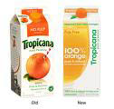
Meanwhile, established marketers looking to change their package design may want to tread carefully. As Tropicana learned last year when it changed its packaging, only to find sales drop 20%, consumers often don’t respond well to change.
In fact, more than three-quarters of consumers said they view package design changes as a “marketing tactic,” while only 14% said it represented an improvement in quality. The lesson: Communicate the product and consumer benefits to a package redesign, Rafferty says. “It’s important to communicate the benefits of redesign to consumers,” he says. “Also, what’s the overall brand impression and is [the new packaging] still managing to convey what that is.”
October 26, 2009
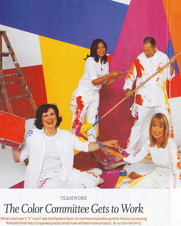
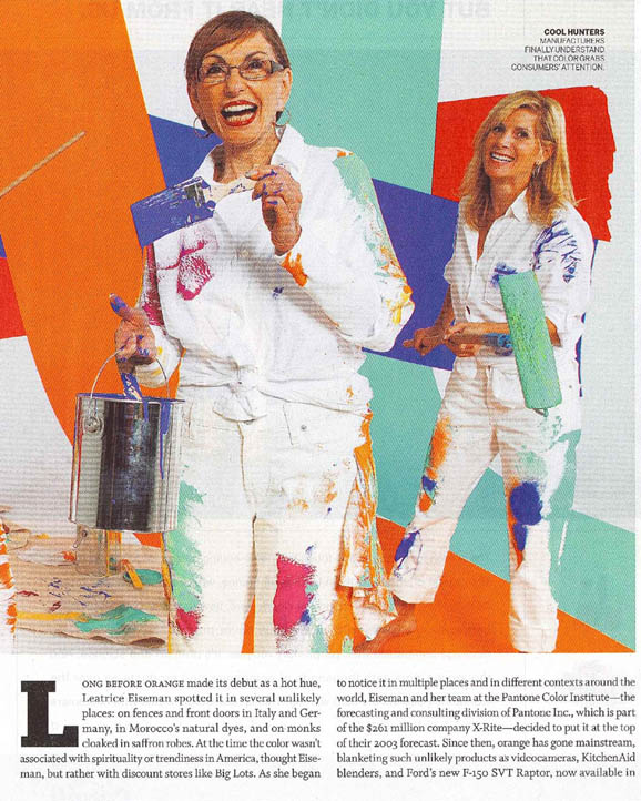
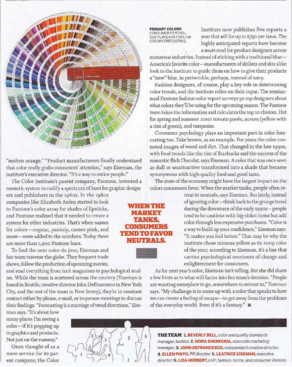
Fortune
The Color Committee Gets to Work
October, 2009
October 23, 2009
Earlier this week we wrote about “Guided Imagery’ as a technique for relieving stress and finding inspiration for color in the home. The following excerpt from a story about Guided Imagery appeared in Psychology Today and relates how this method utilizes color to help children feel less stressed.
The Power of Imagination
How children can heal.
by Charlotte Reznick, Ph.D.
Psychology Today
Banish Belly and Other Aches…. Guided Imagery Helps Kids Ease Tummy Troubles
“Eight-year-old Alice suffered from horrible stomach pain. In my office she closed her eyes, breathed slowing into her belly, and asked inside what was the cause. Stress appeared as a large square black block in the middle of her brain. What to do? Her inner voice said Calmness was the antidote. Pictured as a swirling lavender ball, she breathed Calm feelings into hands, belly, neck, and head. Stress melted and her tummy stopped hurting.”
“Over the past 25 years I’ve seen how the pain of chronic stomachaches and headaches can debilitate a child. The worry, anxiety, fear of pain, and feeling out of control can send kids over the edge. But kids can also learn imagination techniques to help them heal.”
“I was therefore extremely pleased to read about the new research just published in the November journal of Pediatrics showing that guided imagery CDs relieved children’s chronic stomach pain. Conducted at The University of North Carolina at Chapel Hill and Duke University Medical Center, 30 children ages 6-15 listened to relaxing CDs several times a week over eight weeks. The children enjoyed the CDs so much that there was virtual complete compliance. Their results showed 63.1% of the treatment group significantly decreased their pain, compared to 26.7% in a control group that just received standard medical care. Once the two-month study was over, the control group was given the same guided imagery treatment so they wouldn’t lose out; results were similar (61.5% improved). At a six-month follow-up, children continued to do well.”
“With these tools, kids make up their own creative scenarios. Below are five suggestions to help you on your way.”
1. Teach the Balloon Breath as a Foundation Tool
“The Balloon Breath is a simple technique of breathing slowly and deeply into the belly while focusing attention about two inches below the navel. This type of diaphragmatic breathing helps center and calm.”
2. Pay Attention to Wisdom of Inner Guides
“An imagined Animal Friend (or Wizard) can be a valuable tool to access inner wisdom. These imaginary guides are kind, loving, and have a child’s best interest at heart. Gifts from them are used to receive power and assistance. One six-year-old boy’s pride of lions stood guard around his hospital bed to give him courage during a frightening medical test. Another eleven-year-old girl received the Gift of a spiral-moving rainbow to heal chronic stomach pains, along with rainbow glasses to see the world in a more positive light.”
3. Incorporate Color to Relieve Pain
“When children are very focused and involved with their personal imageries, they are distracted from their pain. One seven-year-old girl created a “color therm-o-meter” that could raise or lower different emotions and pain. She initially worked with feelings; they seemed easier for her then the pain itself. She increased ‘blue’ Calmness and decreased ‘orange’ Fear; then increased ‘pink’ Love and decreased ‘black’ Anger. This helped her progress directly to reducing her pain in a similar manner. And a 12-year-old boy found that by first increasing his pain, he realized he had some control over it. He then used this control to lower his pain to an acceptable level.”
4. Practice The Three-Question Exercise
“It’s an easy imagery formula that may relieve or totally eliminate pain. Start with doing the Balloon Breath. Ask your child: “Where in your body do you feel the pain?” Then follow with:
(1) What color is it?
(2) What shape is it?
(3) How heavy is it?
“Be accepting and positive of any response. Have your child continue to breath slowly three or four times between rounds. Repeat the three questions and your reactions to them.”
“Over the course of three to five to ten minutes, there is generally a change from dark, sharp, and heavy, to light in color, round, and light in weight. I’ve seen this work with all kinds of pain. The length of this process depends on your child’s openness to relaxation and the intensity of pain.”
“If there are any bits of pain left, suggest a conversation with Pain in order to find out what your child needs to know, understand, or do to let go of the rest. Or, he can imagine melting away any leftover hurt through his body (through skin, belly button, or whatever he comes up with).”
5. Use the Power of Audio
“As in the fine UNC/Duke study, a well-chosen relaxation CD can work wonders. A favorite all-purpose guided imagery with the kids I see is imagining planting a magical garden where they visualize growing healthy and strong. While their garden grows, they float in a nearby healing pond, allowing the waters to wash away their pain…….”
“Remember, it’s not necessary to have the perfect script, or years of experience for facility with this work. What is important is your sincerity, your respect for your children and their process, and your allowing them to bring forth their natural inner wise healer. As a young pre-teen discovered: “Your imagination can help you heal.”
Charlotte Reznick is the author of The Power of Your Child’s Imagination and an Associate Clinical Professor of Psychology at UCLA.
October 19, 2009
One of the most fascinating techniques for finding color inspiration in the home is called Guided Imagery. I first learned about this technique through Dr. Arthur Ellis of Westwood, CA. I have used it personally many times and have recommended it as well.
The following is excerpted from Chapter 2 of Colors For Your Every Mood
One of the most fascinating ways of finding your true decorating colors is through a technique called “Guided Imagery.” Used primarily to reduce stress, guided imagery simply utilizes your own imagination to lead you gradually into a happy memory that banishes tensions and soothes your nerves. As decorating your home is such an expression of your personality, what better catalyst than your own fertile mind? And if you don’t think of yourself as being imaginative, think again. You have a lifetime of experiences from which to draw.
Guided imagery is best done by relaxing in quiet surroundings where you will not be interrupted. Get into a relaxed position. Breathe deeply, slowly, and in a rhythmic pattern, as you pull from your memory a favorite setting where you have truly felt comfortable and happy, energized, joyous, or calm. Immerse yourself in the memory. Think of the scents, the shapes, the sounds, and, most importantly, the colors.
You might be sinking your toes into warm golden sands on a beach in Maui. Or reveling in the sight of the pristine white stucco houses mirrored in the sparking cool water of the Greek Islands. Perhaps it’s a much simpler vision of mountains undulating into the distance or the nostalgic memory of sitting in Grandma’s kitchen with a red-and-white checked tablecloth and matching curtains (can you smell the chocolate chip cookies in the oven?)
These memories still live deep within your heart and brain (in your neocortex, to be exact) stored as millions of neuron impulses, as well as in your amygdala–that section of the brain that gives emotional meaning to those memories of red-and-white gingham curtains and chocolate chip cookies. Now use this same technique to help you pull from your memory the colors you associate with that special scene.
Perhaps your journey will take you back to sense of one of the eight Personal Color Moods we’ve just discussed, or it may provide a whole new concept of colors that have given meaning to your life. What you are trying to do is rediscover the colors connected with the guided imagery experience and use them to recreate the mood they inspire in a present-day setting. Allow yourself the luxury of bringing those wonderful places back into your consciousness. They can be relaxing or they can be energizing, whatever you need. This exercise will help you avoid colors that depress or antagonize you. It will also provide moments of quiet introspection.
If you are having trouble visualizing your own memorable scene, here are just a few of some very common ones people use in guided imagery.
AFRICAN HERITAGE
Rich in native crafts and wildlife, the colors of the great African continent display the diversity of its people through the variety of hues available in their textile dyeing and ornamental beadwork, which reflect the vibrant colors of forest birds and flowers, and the warm rich colors of the wide grass plains, dotted with wildlife. The color spectrum is well represented in vibrant reds, blues, greens, oranges and yellow, but it is the marriage of these brights with the ever present ivory, earthen brown and ebony black that produces the intriguing combinations.
Examples of African Heritage color combinations are…
IVORY, EBONY, RED CLAY and JUNIPER; GOLDEN GLOW, INDIGO, TIGER LILY
and SUDAN BROWN.
PARISIAN CAFE
One of the world’s most beautiful and elegant cities, Paris is a melange of the colors of its timeworn limestone and granite, stone grays, and greige outlined with wrought-iron blacks; the sidewalk cafes with their green-trimmed awnings, the ubiquitous rattan chairs and geranium flower boxes.
Examples of Paris’s color combinations are
…

DEEP CLARET, PARISIAN BLUE, DEAUVILLE MAUVE and WROUGHT IRON; FRENCH VANILLA, OMBRE BLUE, DRY ROSE and GARGOYLE.
October 16, 2009
Is there truly a “psychology” of color?
There is no questions that color wields a powerful psychological message. Indulge me for a moment and imagine a scenario where, having heard what you thought might be a prowler in the backyard, you called your local police department. They respond to your call, you open the door and there stand two policemen in Lollipop red uniforms, Peacock Blue polka dot ties, worn with Sunny Lime shirts and matching caps. You might be inclined to call the prowler in to protect you from the police!
Of course, this is a totally ludicrous example, as we know there would be no credibility suggested in this whimsical combination of cartoon character colors. They would look more like escaping circus clowns than benevolent protectors. They are far more likely to appear in deep True Navy pants, jacket, tie, and caps, denoting a dependable, strong, credible image, worn with a white shirt that speaks of purity and cleanliness.
Every color has a meaning that we have either learned by association or inherently sense that enables us to recognize the color message. For example, red is imbued in the human psyche as a call to action–an instinctively primal reaction as it is the color of blood and fire, two very important elements for human existence. They are, at the same time, life threatening, yet life-sustaining.
When you were little kid, Mommy and Daddy took your hand when you came to a stop sign at an intersection (or more likely pointed out the warning from the car) and said, “Red means stop.” There are cultural and traditional meanings of colors as well as their broader associations as they appear in natural settings, such as a tranquil blue sky or a sunny yellow that is always perceived warm.
We also have purely personal reactions to color that are most often based on childhood experiences:
Those that made us very happy–a shiny new red bike as a birthday present
Those that made us very sad–the color of the little brown squirrel that you ran over when you were speeding on that bike
Those that were traumatizing–the color of a hospital’s emergency room walls on the day you broke your leg and had to suffer through the anxiety
If you were on that red bike on the day you broke your leg, then red might not be one of your favorites, unless the happiness of getting that bike overrode the anxiety you felt at breaking your leg. As you can see color reactions can be very personal, yet there are general messages that have been gleaned from research, including word association studies that do show some universality in feelings about specific colors.
To find out more read The Color Answer Book
October 12, 2009
Scientists Use Post-Hypnotic Suggestion on the Stroop Effect
September 22, 2009
Steve G. Jones, M.Ed., citizen journalist
(NaturalNews) The field of psychology uses various instrumental studies to examine cognitive processes. These processes are either controlled or automatic. Further, automatic processes can either be innate or learned. When a process is automatic, it is performed automatically and unintentionally by the brain. An example of an automatic process is reading. Psychological studies use hypnotic suggestion to determine the connection between the brain and automatic processes.
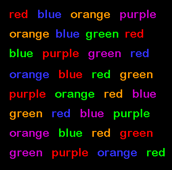
One such instrument is the Stroop test. When words of colors appear with a congruent color ink,it is easy for the brain to process it because reading is an automatic process. For example, when the word RED is written in red ink, both the meaning of the word and the color of the ink are automatically processed.
Hypnotic and post-hypnotic suggestion have been used to study the Stroop effect and automatic processes. Raz et al. (2002) studied both highly suggestible and low suggestible participants after using a post-hypnotic suggestion that told them they would have difficulty reading the words. Results showed that the low suggestible participants were not influenced by the post-hypnotic suggestion. However, the highly suggestible participants were better able to process the incongruent examples of the Stroop test. It was also concluded that the post-hypnotic suggestion does not alter vision; for example, it does not cause blurring or tell the participant to focus on a different location (MacLeod & Sheehan, 2003).
October 9, 2009
The Brilliance of Autumn
Abby Penning
Skin Inc.
September 2009
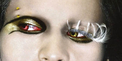
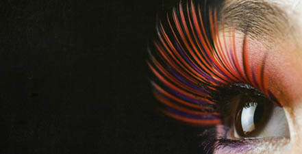
A bold flash of color is something many people are looking for these days and they aren’t being let down in the realm of makeup. The hues for eyes, lips, cheeks and skin this fall are offering a much-needed jolt of energy, blending well thought-out basics with smart swaths of red, blue, purple, green, pink, orange and yellow.
“I call fall a study in contrasts. The colors are more unique and thoughtful than we usually find for autumn,” says Leatrice Eiseman, the executive director of the Pantone Color Institute and founder of www.morealivewithcolor.com. Acknowledging the season’s pensive mood but also noting a touch of newer things on the horizon, J. Scott Berry, a professional makeup artist, and southeast regional manager and skin care and spa consultant with Repechage, says, “Colors are more sophisticated. I’d sum up the look as a return to basics with a new millennium flair.”
Eiseman adds, “Fashion designers are acknowledging the tricky economic time by using dependable, fundamental basics, but people also don’t want to do the same old, same old, which is a great place for cosmetics to come in and offer more of an opportunity to use color.”
Of course, spa professionals and makeup artists are in a perfect position to provide clients with the additional brightness new seasonal colors can bring, so now is the time to invest in key new makeup items for autumn.
Radiant Complexion
“As an esthetician, I’m most thrilled about the sheer foundations in Leesburg, Florida. Well-maintained skin-always a top priority in spas-is being showcased for the fall, and letting the complexion be one of makeup’s main features helps spa professionals display some of their favorite techniques. “The look is really an incredible, perfect skin foundation, so if the skin is healthy, it looks beautiful, and you can just let it shine through,” Berry explains.
To even out a facial palette, neutral hues in warm beiges, cool taupes and creamy tans provide great base tones. “They’re classic shades that go with everything, and they’re great bookends for the more vibrant colors of blue, red and purple,” Eiseman notes.
Clean, flawless skin also shows off a woman’s personal coloring, but it needs the right prep work, too. “Making makeup look great on the skin is definitely all about exfoliation and hydration,” says Tricia Campbell, director of education for jane iredale-The Skin Care Makeup. “You need a good moisturizer and a good eye cream; eyes need as much hydration as possible.”
Additionally, a simple step can help cosmetics stay in place. “Makeup disappears as you wear it throughout the day,” Berry explains. “You can avoid this by simply applying a primer underneath foundation and eye shadow. It’s a quick, two-second step that helps the makeup last so much longer.” Kimberly Frey, creative director for Brush Up With Barbara and Mineral Mine, agrees, saying, “Foundation primer is a perfect way of prepping the skin for cosmetics. It helps so the makeup doesn’t grab, caking up in places. It just glides right on with a primer.”
Properly maintained, well-treated skin offers a healthy, vibrant aspect to any makeup look and, with an eve.smooth complexion, the possibility to highlight certain colors and features on the face is even greater. Creating that beautiful base of flawless skin is always one of the most vital aspects of a good cosmetics look, but it is essential with this autumn’s focus on the skin.
Shining eyes
The eyes are the facial feature where some of the boldest, brightest, most unique colors take the stage this fall. Serious base shades in brown, green and gray are lightened up with pretty pops of pinkish reds and bold purples for the eyelids, while deep shades of blue and indigo are offering a particularly powerful punch in the liner department. Berry comments, “There are a lot of earth tones, but they’re not the earth tones of several years ago, which were pretty dull. These have some vibrancy, even if they are a little more matte, especially on the eyes.”
Warm browns, earthy greens and yellow golds will help to ground the more vivid eye shadow hues, as will an enriched shade of gray. “The iron shade is a strong gray with undertones of brown. It’s very versatile and looks great against almost any skin tone,” Eiseman explains, noting that iron also matches well when mixed with little bursts of pinkish orange and dusty deep pink on the lids.
Another strong shadow shade-purple-also isn’t going anywhere, although it’s not quite the smoky hue from seasons past. “It’s very practical that purple is sticking around because people can reuse the purple products they already own,” says Eiseman. “To make it look new, you can use different ways-contrast it with lighter, brighter color, or wear it in a different way.”
Those seeking a darker, smokier look don’t have to go far in this season’s cosmetics shades to find a little more edge. “Eye shadows for the fall include a sheer pink, a taupe nearly nude shade and a smoky, metallic gray. Metal and rich metallic shades are really big for the fall,” Campbell notes. Eiseman also sees a metallic sheen to the season, though she says she’s noticing golds, silvers, bronzes and coppers in more burnished, de-lustered states.
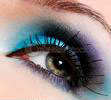
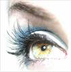
Eye liner-always a staple to help eyes stand out-is showing up in interesting colors this season, but there is one in particular that’s a must. Campbell explains, “A key color for fall this year is blue-it is the new black when it comes to the eyes. Using a blue eye liner on the inside rim of the eyes really helps them pop, opens up the eye and makes the whites of the eyes appear brighter.” Eiseman also sees the presence of blue in the season, saying, “It’s not too bright, more subdued, but it’s a classic spring color that is showing up in the fall, which really helps bridge the seasons and brings more versatility from the spring to the rest of the year.”
This autumn’s blue brings a little more moodiness than the traditional spring pastel tints, though. In fact, to create a bold evening look, Campbell suggest the following: “Take a blue eye pencil to cover the lash line and use it lightly all the way up to the lid crease. Then, for a night out, add a twilight gray shadow over the top of it for really intense, smoky eyes.”
Multiple shadows and shades aren’t always necessary for a bold, sought-after eye, however. “You don’t have to have three separate eye shadows to get a three eyes shadow-look,” says Berry. “With just one shadow, you can apply a base loosely with a large brush. Then, with the same color and using a small brush, you can create some contouring along the brow bone and in the crease. Next, you can wet that same shadow to use as a liner, applying it along the lash line with a very fine brush.”
Frey also suggests refreshing eyes after a long workday, saying “A shadow or liner color’s intensity is really what changes from day to night in makeup, and to make sure your eye makeup doesn’t get washed out, an eyeliner sealer can be used. It can help intensify the same color from a more work look to an evening one while still using the same shades.”
Jeweled Lips
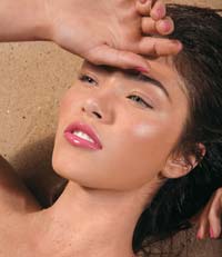
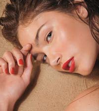
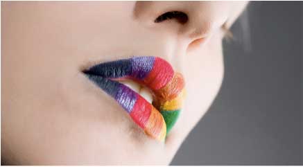
Full and vibrant for autumn, lips are getting an infusion of color courtesy of shades such as pinks touched with rose and orange, nutmeg-tinged copper and the stalwart red. “I love red lips,” says Berry. “Vibrant, bright colors on the lips have been trying to sneak in since about 2002, and American women really hadn’t been buying it, but more and more, they are coming around. Nothing is more attractive than red lips, and it doesn’t have to be fire-engine red, but just some good, bright color.” With cooler hues prevailing on the eyes, the mouth is a feature on the face that can harbor warmer color. For example, a bold rose red color is something Eiseman is also enjoying this fall. “It’s not a bright cherry red, but a more vibrant rosy hue. It’s a great color coming into the holidays,” she explains, calling it a happy marriage of pink and red. Additionally, she notes, “It’s really flattering next to the skin.”
Seeing a quieter side of autumn’s lips,, Campbell says the metallics will also be moving down from the lids to the mouth, but in a more lip-appropriate, warmer tone. “With the blues, silvers and metallics on the eyes, a great nutmeg, coppery lip gloss gives the lips just the right glittery sheen with a touch of smooth color,” she explains. However, she notes, “You can do a more dramatic lip too, maybe a really deep berry, to pair with really silvery-sheen eyes.”
Pairing the right lip color with the right eye color is really the target to hit this fall, with some of the best matches being the hues opposite each other on the color wheel. Eiseman suggest a more goldenly pink hue on the lips to match eyes in a deeper purple, or going with a rose red to match with iron shaded lids.
Pairing the bolder colors also requires a delicate touch with the texture, Frey notes. “I think the matte lip is coming back around. It’s one of those things where everything old is new again,” she says. “However, it’s not powdery matte; it’s more like a lip stain that is geared toward a more neutral look.” The fresh pinks, reds and copper tones of lip glosses, stands and sticks will help the mouth look lively this autumn-it’s just a matter of finding the shade that suits each client best.
Luminous Color
This fall really offers makeup options for anyone’s taste, from metallically sheened natural hues in iron and earth tones to deep, bold touches of red, purple and blue. “The uniqueness of the season is going to come from the different ways the colors are combined,” says Eiseman. “It’s time to do something experimental-go for the unusual, the unique. Build a beautiful mosaic out of the colors. You want to do what flatters the skin tone the most. To only use warm colors on warm skin tones and cool colors on cool skin tones is really doing a disservice to a woman, I think. You need to have a balance of temperatures.”
This season’s shades are great to mix and match in whatever ways a person prefers. “Everything is so versatile,” Campbell notes. “You can use a nude or nutmeg pencil to line the lips to go with a coppery gloss, and use gold or silver to line the eyes for a shimmery pop.”
You can also use the variety of hues to revamp the look a a client who doesn’t have too much to spare for a whole new color palette. “The bolder colors are great as highlights, and they also acknowledge the more conservative mind-set of the consumer,” Eiseman explains. “Using the color combinations helps give people something new.”
Really, the key for this fall is to follow what looks best in a bold way. “If you add a little color to the face and know how to do it right, it can give someone a whole different-and a much better-day.” Berry says.
October 5, 2009
What your car color says about you
The Color Answer Book
Vibrant Red: Sexy, speedy, high-energy, and dynamic
Deep Blue-Red: Some of the same qualities as red, but far less obvious about it
Orange: Fun loving, talkative, fickle, and trendy
Sunshine Yellow: Sunny disposition, joyful, and young-at-heart
Yellow Gold: Intelligent, warm, loves comfort and will pay for it
Dark Green: Traditional, trustworthy, well balanced
Bright Yellow-Green: Trendy, whimsical, lively
Light to Mid Blue: Cool, calm, faithful, quiet
Dark Blue: Credible, Confident, dependable
Deep Purple: Creative, individualistic, original
Neutral Gray: Sober, corporate, practical, pragmatic
White: Fastidious
Black: Empowered, not easily manipulated, loves elegance, appreciates classic
Silver: Elegant, loves futuristic looks, cool
Taupe: Timeless, basic, and simple tastes
Deep Brown: Down-to-earth, no-nonsense
worldfamousmag.com has these additional insights on car color
Brown: If you have a brown car that signifies that you are reliable. You are true to yourself and to those around you. You are earthy and don’t engage in “showboating”. You are approachable, responsible and worthy of friendship.
Black: A slick black car is the epitome of power and authority. Think CIA or Secret Service. If you have a black car, you are sending the message that you are in control and are self-assured.
White: There are many white cars on the road. What they say about their owners has a lot to do with their upkeep. A clean white car shows that you pay attention to detail. You are careful and pure. A dirty white car makes you look sloppy and indifferent.
October 2, 2009
True Colors
AAA Magazine Westways
Peter Bohr
Our director Leatrice Eiseman was quoted in this article by Peter Bohr
Q: Should I be concerned about any practical considerations when choosing the color of my next car? Or should I just choose whatever looks good to me?
A: My last car was painted yellow. Vivid yellow. The color of an egg yolk, a springtime daffodil, the morning sunrise. And according to Leatrice Eiseman, author of several books about color, my car-color choice indicated a sunny disposition, joyfulness, and being young at heart.
I chose yellow for the same reason that most folks select their car’s color: I liked it. Simple as that. I didn’t put much thought into it.
However, the choice of a car’s color may have more profound consequences than merely demonstrating to fellow highway travelers that you are fastidious (white), elegant and cool (silver), empowered (black) or sexy and speedy (red). It can affect your pocketbook. It can affect howmuch care your car will require. It might even affect your safety.
First, common misperceptions. It’s logical to assume that a speeding driver in a brightly colored car is likely to attract attention from an officer of the law. Police don’t talk about such things, but in reality, radar guns are color-blind.
Then there’s the urban legend about insurance companies using the vehicle identification number to determine a car’s color and boost rates for cars painted flashy colors. But color isn’t encoded in the VIN. And some states-California among them-don’t allow color as a rating factor. “Vehicle type is an allowable factor,” says AAA actuarial manager Joe Evleth, “but no one has attempted to stretch this to include color.”
White, silver, and light colors, especially ones containing metallic flakes, show fewer defects and also are the easiest to keep up, says Mike Pennington of Meguiar’s Inc., a maker of care-care products. Years ago, black, red, and dark colors in general tended to oxidize and fade. But clear-coated paint jobs on modern cars greatly reduce oxidation issues.
Instead, clear coats accumulate fine scratches, usually from washing and drying with dirty sponges and towels. Scratches show up more vividly against dark-colored base coats, says Pennington, giving the car a dull appearance. It requires great care to prevent scratches.
Finally, there’s the matter of car color and safety, a complex relationship, according to a 2004 study by the AAA foundation for Traffic Safety. For instance, white may be the most visible at night, but not against a snowy backdrop. And though red stands out during the day, it’s perceived as black at night.
Still, a Spanish study showed that light-colored cars were slightly less likely to be hit by another car, and that black cars were the most likely. A study from New Zealand showed that black cars, as well as brown and green cars, were twice as likely to be involved in serious-injury crashes than silver or white cars.
My current car’s color? Dark blue, which says I’m dependable and credible. Boring, perhaps, but good traits for a writer.
September 28, 2009
UNIGLO
If you were the richest man in Japan, what retail business might you invest in? Tadashi Yoni would be that person and he believes in simple styling, well made garments at a reasonableprice in a wide assortment of color. So much so that it became the inspiration his stores, Uniglo (derived from of “unique” and “clothes”). It is a retailing giant in Asia and has spread into 750 stores in six countries, including Australia, the UK, the U.S, and most recently into that bastion of fashion, France. The lynchpin garment comes in clean, classic designs, notably cashmere sweaters that sell for $90 U.S. and come in 20 colors.
My first exposure to Uniglo was in London where a new collection of Pantone sweaters was being unveiled. I was like a kid in a candy store—20 different shades stacked precisely from floor to 50-foot high ceilings, filled with color. I settled on a Lavender Violet (to be exact, Pantone 17-2934).
This clever display appears to be a sweater and leggings, but it’s actually two sweaters—one worn the conventional way and the other turned upside down, with the mannequin’s legs clothed in the sleeve. While I might not suggest that approach in real life, it is really innovative in a display!
September 25, 2009
As you might know our color guru blogger has been a prime consultant to Pantone for 24 years. Here are excerpts from Pantone’s new yellow catalog taken from Color: Messages and Meanings, A Pantone Color Resource by Leatrice Eiseman with images from Tim Heyer.
We are happy to see our color pick of the year showing up both here and abroad.
Michelle Obama in a Mimosa yellow Michael Kors suit as featured in Vogue magazine.
It was the official color of the big Parisian home and decor show Maison & Objet.
September 21, 2009
From the pages of HFN
Home Furnishings News for Industry Decision Makers
September Issue
Corporate Spotlight Feature
Also from HFN…
August 2009 edition
Letters to the Editor
Unknown Admirer
To the editor:
Say it isn’t so. I cannot believe that HFN has succumbed to celebrity worship (Power 100, HFN, July 2009). Outside influencers-you have got to be kidding. When have Jaclyn Smith or Cindy Crawford earned the attention of all home manufacturers/retailers/designers/marketers so that they could use their lines as inspiration or an indicator of what is to come, while ignoring a true industry influence like Lee Eiseman, of the Pantone Color Institute. She is the true celebrity as the “Rock Star’ of color who has helped to shape thinking through her color forecasts that are truly indicators of important colors to come and an enormous help to so many people in every home and fashion related industry. She has commanded very large audiences through her remarkably accurate forecasts, both at trade shows like the Housewares Show, as well as constantly being quoted in the media for her insights. I certainly hope that when you compile another list of those who should be recognized that she is front and center again, as she deserves to be.
Name withheld upon request
Retailer
Los Angeles
September 18, 2009
With the waning days of summer I walk around my garden, absorbing the beauty of the myriad colors I see. Like a squirrel storing the nuts for the winter ahead, I commit to memory this beautiful spectrum that is just beginning to fade, but even in that fading process, a new variation of reds, russets and purples come forth until finally the starkness of empty branches will take over. But even then, there are the contrasts of shape, foliage and always, the color of the faithful evergreens to carry us through until the purple crocus announces its presence in January.
Here are some of my summer favorites…
The gamut of hydrangeas
The glorious dahlias
Echinacea
Roses
The colors speak for themselves!
September 14, 2009
Excerpted from Colors For Your Every Mood
Seeking Equilibrium: Homeostasis
Throughout our lives, we seek balance on many levels: spiritually, aesthetically, emotionally, and physically (the ancient Chinese called it the balance of yang and yin). Today our lifestyles and attitudes require a perpetual balancing act between work and play, practicality and fantasy, technology and humanism; seeking what is new while treasuring the old.
Above all, our homes are critical to our sense of equilibrium. For increasing numbers of people, it is both work place and living space. Now, more than ever, there is a need for home to be a safe haven; a place where we can feel secure, nurtured, connected, and comfortable; a place to regroup, refresh, and replenish. Color can be an instant equalizer and a “quick fix” in helping us to achieve that ever-important balance in our busy often hectic lives.
Although we have no conscious awareness of it, our eyes search for balance in our immediate environments. Having someone tell you that your home is warm is always taken as a compliment because warm colors are perceived as cheerful and welcoming. Excessive warmth, unrelieved by a cool touch, however, can be too much of a good thing. Too many cool colors with no suggestion of warmth can have a chilling effect on our moods as well as on others entering our home. And being told that your home is cold would definitely not be taken as a compliment!
Perhaps you have had your colors “done,” and you were told to decorate your home in the same colors that you wear. If you were placed in a warm palette, you might have been told to decorate exclusively in warm colors. If cool colors were chosen for you, then you might have been told to decorate only in cool colors. This is not necessarily good advice especially if it came from a color analyst who got her certification from a home-maintenance product company after an “intensive” one hour training session!
As far as color is concerned, beware of the words exclusively, only, never, and always. These are very judgmental and may be outmoded, at least as far as you are concerned. If you prefer either warm colors or cool colors for your clothing as well as your living space, then by all means use what pleases you. But remember that using warm colors exclusively can make you feel uncomfortably overheated, and using only cool colors can make you feel that the atmosphere is uninviting and sterile.
Our innate longing for balance welcomes the soothing touch of green plants in a warm room, just as a large vase of red tulips brings a cheering warmth to a too-cool interior. This need to maintain internal equilibrium or a sense of balance (called homeostasis) is a natural phenomenon that is inborn, a purely physiological reaction.
To prove this to yourself try the following experiment:
Concentrate on a fixed red object for about ten seconds. Look away at a piece of plain white paper, and you will see the complimentary shade of green. This is homeostasis in action–our body’s ability to provide relief to our eyes and restore our sense of balance. We need only to take a cue from our own restorative powers by turning the color temperature up or down, allowing one color to dominate and the other to support.
September 11, 2009
GREEN
If you were playing a word association game, what would be your immediate response to the word “green?” Would you visualize the brilliant blue-green of a tropical ocean, a verdant bed of velvety moss, silver-green willow branches, the lush deep green of a pine scented arbor, the sophisticated sparkle of emeralds, or the sickly yellow-green associated with nausea and mold or slimy scary creatures? As the range of green is enormous, so are the possibilities of positive or negative associations.
The Gamut of Greens
Perhaps it was Kermit the Frog who best understood this complex color when he so aptly stated: “It’s not easy being green!”
Responses to green run from high praise to pure disgust. Why the extreme divergence of opinion on greens? Perhaps it’s because, of the 8 million to 10 million colors discernible to the human eye, the widest range distinguishable is in the vast variety of greens. The color of many edible plants (or at least their leaves), green was the first color to appear on earth and very necessary to human survival.
Want to know more about green? Check out Colors For Your Every Mood
September 8, 2009
What Dogs and Cats Really See on TV…and Elsewhere
Helena Sung
Posted July 23, 2009
Have you been looking for another way to enjoy time with your pet?
Consider watching television as it is not just humans who can enjoy a flat screen TV.
“Turns out quick thinking cats may actually prefer high end flat screens.” This according to Dr. Alex Melrose a Veterinarian from New Zealand.
“Despite a popular myth, dogs and cats do see color — just not as much as humans can. Dogs can pick out the color blue, but “red, green and yellow all appear similar.” Cats can detect a fuller range of colors in the blue, green and yellow spectrum, says Dr. Melrose, but see very little reds.”
“If you recall from biology class, the human eye has light-sensitive cells called “rods” that help us see in dim lighting and “cones” that enable us to see color and detect fine detail. Dogs only have two types of cones at the backs of their eyes, while humans have three types of cones that are packed at 10 times the density at the back of our retinas — hence our ability to enjoy the rainbow of colors.”
“Now that you know how dogs and cats see differently than we do, what can you do to enhance your pet’s television-watching experience? “Turn the brightness [on the tv] down,” says Dr. Melrose. “And pick out shows with lots of fast-moving action scenes where everyone’s wearing lots of blue stripes.”
September 4, 2009
examiner.com Seattle
Expressive art and your child
East LA Child Care Examiner
Rosemary Akhavan
September 2, 2009
“I have always encouraged my clients to allow their children to express themselves freely through color and art or craft projects. You might think that everyone would do so, but think about your own color like and dislikes and/or stereotyping. Do you pass that on to your child? Just as the author states, children should be allowed free reign without fear of judgmental comments concerning colors or color combinations”
The following is an excerpt from “Expressive art and your child”
“A study conducted by Marcel Zentner in 2001, of the University of Geneva indicated that children associated colors to emotions differently than adults. The adult’s favorite color universally was blue, whereas, children preferred the color red. Adults were consistent in associating certain colors to emotions: Happy was yellow, Sad was black, and Angry was red. In contrast, children chose a wide range of colors to associate with each facial expression. Happy tended to be red, and Sad tended to be blue, however, no color was chosen to represent Angry. One significant correlation that Zentner did find was that children associated bright colors with Happy, and dark colors with Sad. So parents, remember not to be critical of your child’s color choice, although children have been found to associate color with emotions, they do it differently from adults.”
August 31, 2009
In the next few weeks I will be heading to Washington D.C. for the 2009 DDI (Display and Design Ideas) show.
DDI is the longest-running event of its kind in the industry, the DDI forum covers topics and discussions of the most pressing issues among thought leaders in the retail design community.
The theme for the talk is “Future Forecast: A Mosaic of Color and Style.
Mosaics reflect cultural, geographical and political differences, yet coordinate seemingly disparate elements that, in the end, create an integrated whole. They are also a practical, eco-efficient way of bringing together previously used materials, colors and finishes to create new and unique combinations. Mosaics can be a record of the past, but new technologies continue to re-invent future usage.
August 28, 2009
From time to time we hear that boys are born with proclivities to certain colors, girls to others. I have long held the opinion that children, regardless of sex, can be trained and encouraged to enjoy and understand color.
From Publishers Weekly comes an interesting review of a book that points out certain differences in development, yet at the same shows helps us understand how training can help a child, regardless of sex, develop various skills. In the words of the reviewer:
…. (This book) “underscores how small the differences really are and what parents can do to resist the harmful stereotyping that grows more entrenched over time”.
The book is not specifically about color, but helps to disprove the theory that all skills are inborn and largely based on sex.
Pink Brain, Blue Brain: How Small Differences Grow into Troublesome Gaps—and What We Can Do About It Lise Eliot. Houghton Mifflin Harcourt, $24 (384p) ISBN 978-0-618-39311-4
Professor of neuroscience at Rosalind Franklin University, Lise Eliot (What’s Going On in There?) offers a refreshingly reasonable and reassuring look at recent alarming studies about sex differences in determining the behavior of children. Her levelheaded approach recognizes assertions by the “nature versus nurture” advocates such as Michael Gurian, Leonard Sax, Louann Brizendine—e.g., boys lag behind girls in early development, are more risk taking and spatially adept, while girls are hardwired for verbal communication and feeling empathy. Eliot revisits much of the data showing subtle differences in boy-girl sensory processing, memory and language circuits, brain functioning, and neural speed and efficiency, using clever charts and graphs of her own. However, she emphasizes most convincingly that the brain is marvelously plastic and can remodel itself continually to new experiences, meaning that the child comes into the world with its genetic makeup, but “actually growing a boy from those XY cells or a girl from XX cells requires constant interaction with the environment.” At the end of each chapter, she lists ways to nip early troubles in the bud—i.e., for boys, language and literacy enrichment; for girls, stimulating movement, visual and spatial awareness. Dense, scholarly but accessible, Eliot’s work demonstrates a remarkable clarity of purpose. (Oct.)
August 27, 2009
These images from Africa provided by John A. Eisenhauer owner of Bainbridge Travel.
Thank you John!
August 24, 2009
Lee’s South African Tour
As some of you may already know, my assistant Bobbie and I visited South Africa recently as I was asked to do presentations in Johannesburg, Durban and Cape Town. Our hosts could not have been more hospitable (and fun). The sponsors were Decorex Joburg 2009 together with Plascon Paints as the show sponsor and media-partner DSty. Their mission was to ‘’guide visitors through the maze of trends towards the highway of conscious living”. Now in its 16th year, the show is the definitive mix of the emerging and the established, manufacturers and suppliers – large and small.
Their theme was definitely green as they spoke to edible landscapes, food forests and peach-pip pebble floors.
Geothermal heating, vermiculture, earth-friendly décor and salvage chic. Green is the buzzword du jour, giving rise to do-good design, the inventive-reuse of hand-me-downs and a flare-up of all things organic.
Sprouting a forest of eco-caring ideas was the recurring theme for Decorex Joburg 2009. The event showed visitors that it is possible to live an elegantly frugal life by doing more with less. Decorex Joburg forms part of the Decorex SA portfolio of decor shows and is owned by Thebe Exhibitions & Projects Group.
This of course, resounded with me as I have been including the green theme in my thinking for the past several years. Obviously, this is a world-wide concern.
According to Melanie Robinson, Decorex director, the show sets the example with green exhibition practices, using the event as a role model towards greener living. “While concepts such as ‘edible landscapes’ might sound slightly ‘out there’, by trying radical ideas we can spark off positive energy to take exhibitors, staff and suppliers as well as visitors on the exciting, lifesaving journey of going green.”
It is most encouraging that a new generation of designers featured at Decorex shows are driven as much by ethics as by aesthetics,” she adds. “This is in step with their new responsibility to analyze the life cycle of their designs and the items they use: how a product is made, how it will be used and where it will go at the end of its functioning life.“
The exhibition aimed at making Decorex SA a zero waste event, from reducing packaging and re-use of materials such as banners to eco-friendly printing and re-imagined green breathing spaces throughout the exhibition.
“The economic climate has catapulted recession decor to new heights, as opulence and glamour make way for a new form of minimalism: getting by with what we have, topped up with inventiveness”, adds Cairey Slater, general manager: exhibitions. “Add eco-caring products to the mix and the result is a dynamic eclectic look – seen by many as the decor style of the 21st century.”
SHOW THEME: NEW FUSION – URBAN AND CHIC
“The overall show theme ‘ New Fusion: urban and chic’ fits Joburg like a glove,” says Nika Smit, Decorex marketing manager. “It reflects the trend-setting international outlook, African roots, pioneering thinking, green consciousness and doing things on a larger-than-life scale.”
“Edgy, confident, individual and highly expressive, Joburg has an urban attitude like no other,” she adds. “More than a city, it’s a hatching place for all that’s über-Africa. When people relax they do so in free style and to their own street beat – in penthouses in the newly-revived centre of the city, town-houses in the suburbs, bohemian-chic studios in a gritty industrial part of town; an eco-estate with the ‘best’ address, or a well-loved family home in the warm heart of Soweto.”
PLASCON 2010 COLOR FORECAST
Plascon’s 16-year relationship with Decorex SA as sponsor resulted in the most colorful collaboration ever with the launch of the Plascon 2010 Color Forecast. In step with global attention focusing firmly on Africa, this new collection inspired by the splendor of the continent connects with its creative energy and natural splendor.
The four palettes of the Plascon 2010 Color Forecast — Northern Exotica, Southern Spectacle, Eastern Promise and Western Desert — each represent the natural, cultural and historical riches of their namesake geographical regions in Africa. Northern Exotica is awash with blues and whites inspired by the French, Arabic and African influences on Morocco and Tunisia. Southern Spectacle is an eclectic mix of purples, mustards, greens and blues inspired by the diversity of South Africa. Eastern Promise is a warm palette of vibrant spice colors including reds, oranges and yellows, drawn from the printed textiles of the Samburu and Masai tribes of Kenya and beyond, while Western Desert is a collection of rust, burnt umber and stone, drawing on the colours of the Namib and the markets of Nigeria, Says Anne Roselt, Plascon Color Manager, “2009 focused on the “green movement” and this continues into 2010. However, wherever we researched we found inspiration from Africa coming up and therefore we have identified Africa as the major trend influence coming through for 2010.”
Reasons cited for this include South Africa’s selection as host nation for the 2010 FIFA World Cup. “Add to this Nelson Mandela’s enduring global appeal and the fact that the latest international newsmaker, President Barack Obama, has roots in Kenya. Filmmakers are increasingly choosing the Mother Continent as the location for movies and holiday makers are hard pressed to find anything even close to the magnificence of our National parks. And, not only did this year’s New York Fashion Week see African designs showcased alongside the likes of Ralph Lauren and Louis Vuitton, but these fashion greats themselves drew on the continent for inspiration for their own collections.”
I couldn’t agree more. Actually, when I was first invited to do the presentations, I was struck by the fact that I had already devloped a palette for the Pantone View home forecast for 2010 that was based on that stunningly beautiful continent. And when Anne sent me her gorgeous palettes, I was vastly impressed by her choices and combinations of color based on the four geographic regions of Africa mentioned above.
LEE EISEMAN’S COLOUR TALK TOUR STARTED AT DECOREX JOBURG
My talks were based on taking an in-depth look at how colour can attract success to a product, environment or design. The presentation entitled ‘Colour and Emotion’ offers insight into the link between color and the consumer psyche. As appeared in their descriptive information, Decorex said, “Hailing from the USA Eiseman has written seven books on color. She is the Executive Director of the Pantone Color Institute, the Director of the Eiseman Centre for Color Information and Training and a color/design consultant to many industries. Fortune Magazine has named her as one of the 10 top decision makers for her work in colour and she is widely viewed as the foremost international authority on colour trends.
The Fabulous Bush Trip
From a message sent home during the trip:
We are having an awesome time. The lodge we are staying in is fabulous . This is definitely not a tent in the desert! Gourmet food for all meals and a small picnic spread taken out into the bush for the touring twice a day (in a Range Rover with only a covered top, but lots of blankets). I have had to curb my appetite, but they have surprised me by sticking to my vegetarian ways and offering me options and/or additions. But the food is pretty healthy to begin with, so no problems there.
The lodge was built by the Cointreau family (of liqueur fame) and it is fabulous. High beamed ceilings, plush leather sofas, art and artifacts, interesting textiles, beautiful native woods, a bathroom looking out into a wooded area with a stream and fully equipped with every lotion and potion you might need.
On the very first day, we sighted zebra, wildebeests, giraffes, rhinos, baboons, monkeys and various birds, some small and some bigger than the American eagle. The next day we saw hippos, impalas, kudus and a herd of elephants. I thought Bobbie would collapse– she adores elephants and to see them roaming on the plain was magical. In the afternoon, while we were seated outside our rooms, a monkey was checking us out from a nearby tree.
All of the animals are free roaming and we were warned not to leave windows or doors open at night as the monkeys and baboons are notorious thieves and will come in to steal goodies from your room, but we were both so tired after the wine, food and the first bush trip that we heard none of their conversation. Our guide and host is so knowledgeable–he knows every species of animal, bird and foliage.
What I have noted most about color on the bush trip is that almost everything blends with the topography. Natural camouflage has never been more evident, so that it is more often the people that stand out in color, as opposed to the animals!
The arts and artifacts in every region were very special and original. No lack of color there. Bobbie and I did manage to make some wonderful purchases. And speaking of color, there is a multi-hued area of Cape Town called Bo-Kaap that is pure technicolor and Bobbie did manage to get some colorful shots. Check out those images below.
A very special thank you to our hosts, hostesses, arrangers, drivers and audio/visual people and most especially to Samantha van den Berg, Errieda and Ian du Toit and Ann Roselt.
Stay tuned for more exciting pictures from Africa…
August 21, 2009
The Hollywood Reporter
“It’s what brown can do for them that makes Manure an inside job”
Borys Kit
Not a word you will find frequently on this blog, never the less “Manure” is a story that makes great use of a color and of course, that color would be brown. Manure is a film in production about two men fighting each other to control that business.
Images courtesy of Manure movie
“And everything, from the suits to the leaves to the sky, is brown” says Borys Kit in the Hollywood Reporter. Brown is used not only to depict the inspiration from the theme but also to reflect a 1950’s epic film. Art direction is of prime importance to the brothers producing the film, Michael and Mark Polish. They looked at many shades of brown, narrowing it down to ten variations.”
Images courtesy of Manure movie
“Exploring the sets, it’s not only the browns one notices but also that everything is hand-crafted, an entirely painted film on painted stages, something not seen much anymore these days.”
“It really recalls a bygone era where everything was done by hand,” says Jonathan Sheldon, a partner with the brothers at their Prohibition Pictures banner.”
Images courtesy of Manure movie
August 17, 2009
House Beautiful
September 2009
Find Your Color Personality
We are happy to report that Lee’s Color Clock™ concept was excerpted on page 96 of the September issue of House Beautiful.
“Now there’s someone to help to find the best colors for your home. Color expert Leatrice Eiseman
(morealivewithcolor.com) has divided colors into four times of day-sunrise, sunlight, sunset and crossover, which takes its palette not from a time, but from classic colors lifted out of nature. She believes that each of us is strongly drawn to a specific Colortime®. If you use your own Colortime® colors to decorate, “not only will you look your best, it will bring you a sense of balance and well-being-and revitalize your home,” Eiseman says. Take her color quiz to find out what your colors are.”
August 14, 2009
Real Simple
The 4 Universally Flattering Clothing Colors
Some hues bring out the best in everyone, regardless of skin tone or hair color.
By Yolanda Wikiel
Flattering Color: Eggplant
“Some colors work for all skin tones and hair colors, because they fall into the middle of the color spectrum, meaning they’re not too warm or too cool,” says Leatrice Eiseman, author of The Color Answer Book (Capital Books, $20, amazon.com) and director of the Pantone Color Institute, the international authority on color. Case in point: eggplant (Pantone 19-2311 TC). Eiseman calls the tone “the perfect purple” because it is extremely versatile, almost like a black, a dark brown, or a navy.
Flattering Color: True Red
Designer Bill Blass once said, “When in doubt, wear red.” And he was right. Not only does red stop traffic but it may also make you a winner. In a study conducted at the University of Durham, in England, researchers found that athletes in combative sporting competitions who wore red were more apt to win than contestants wearing other colors. Pantone 19-1664 TC flatters everyone because it “resides in the center of the color spectrum, in between a cool cherry red and a warm, orangey tomato red,” says New York City makeup artist Sonia Kashuk.
Flattering Color: Indian Teal
Colors on opposite sides of the color wheel enhance each other, which is why strawberries look so good packaged in green containers, Eiseman says. It’s not surprising that this teal―Pantone 19-4227 TC, the color-wheel opposite of pink―plays up a healthy flush in the skin. Plus, it’s more versatile than a bright, summery turquoise, so you can wear it well into the fall with black, brown, and other neutrals.
Flattering Color: Mellow Rose
Sorry, Pretty in Pink fans, but Molly Ringwald did not look all that great in her bubble-gum pink prom dress. She should have opted for a more sophisticated shade, somewhere between a light pink and a peach, which looks more like a neutral than a pastel. The subtle color (Pantone 15-1515 TC) highlights the natural flush of one’s face, says Kashuk, giving anyone who wears it a glow. No wonder Kashuk recommends a similar shade of lipstick to all her clients.
August 10, 2009
How do colors get their names?
“[…]
Color names come from various sources, starting in ancient times to describe light and dark, day and night. Then came the association of color with various natural phenomena such as red with blood, yellow with sun, the green of vegetation, blue of sky and water, brown of the Earth, and the remaining colors that are also evident in the environment.
In some languages such as he Shona language of Zimbabwe, no words exist to distinguish between red and orange, while in other cultures color names describe some pretty basic functions. In the Eskimo language, for example, blood and bile are used as descriptive words, as is the name for a purple red, which literally means the color a of person who has choked to death.
For the most part, color is described with more aesthetically pleasing words. Chinese Yellow was adapted as a color name for this imperial shade, because the ancient Chinese venerated yellow as the color of the emperor and only he could wear it (talk about an exclusive club!). One ruler actually called himself the Yellow Emperor, and it is only fitting that a color was named in his honor as he is reputed to have been the inventor of Chinese script.
The name of a color draws our attention more forcefully to the attributes of a color. A color called Chocolate Brown is perceived of as delicious and rich, but Decadent Chocolate tempts us even more. Champagne Beige, as in plush carpeting, is seen as much more upscale than a nondescript beige. A lipstick called Hibiscus is far more suggestive of tropical delights than the unimaginative and uninspired “shade #10.”
[…]”
For more, please read The Color Answer Book
Excerpted from pages 8 and 9.
August 7, 2009
The Next 48hours Cape Town
World’s Colour Expert Visits Cape Town
Peter Tromp
August 6, 2009
PETER TROMP spoke to LEE EISEMAN, internationally renowned guru on colour and its importance in everyday life and design. The American is visiting South Africa to celebrate the launch of Plascon’s 2010 Colour Forecast and will present colour talks in a three city tour. Her Cape Town presentation, entitled ‘Colour and Emotion’, will take place on August 12 at The Pavilion at the V&A Waterfront from 10am to 12.30pm, and will take an in-depth look at how colour can attract success to a product, environment or design.
Colour obviously plays and has played a very important part in your life. What triggered the initial fascination, and when was this?
Starting in childhood, I was always fascinated by colours, and I loved to create colour combinations. My mother was the primary influence as she painted interiors of our little “row house” in Maryland a different colour every year. She preferred that to spring cleaning.
How does one become a colour expert? In other words, how did your love of colour transition into a career?
I recognized the need in the part of both individuals and companies for colour advice. The market was there. I just needed to learn how to get the word out and I did that with my first book in 1983. (‘Alive With Color’, re-done more recently as ‘More Alive With Color’.) It was brought to the attention of the CEO of the largest colour communication company internationally. He asked me to head up his colour institute, which I accepted with the proviso that I could retain additional clients needing colour advice.
What does an average day for an internationally renowned colour consultant usually look like?
There is no average day. Every day is a new challenge as I work with so many industries, so I must constantly do research and look for trends, speak at trade shows and develop online colour programs. I also teach a yearly colour program on Bainbridge Island, WA where I live and work. I also constantly speak to media, write books on colour (seven, so far), attend international forecasting meetings and so on.
How important, or significant is an awareness of colour in everyday life?
Enormously important, starting in childhood. Colour can affect mood, make impressions, induce creativity and, more pragmatically, sell products.
What do you think are some of the most widely held misconceptions about the importance of colour?
Many companies in the past have not taken the subject seriously, thinking it a bit of fluff to add later on down in the production process. That is changing rapidly and more industries are understanding the importance of colour and the need to engage people like myself, colour consultants, to give educated advice. On a more personal level, it can create self-esteem and more self-awareness, so it I not just a question of the aesthetics of colour, but colour and the emotional aspect, which is one of my favourite subjects.
Tell us about your trip to South Africa. What has brought you here?
Anne Roselt, colour manager of Plascon, first approached me. I was instantly engaged as this is a country that has always fascinated me. And you are very much in the news. One of my colour forecasts shows Africa as a huge influence on colour internationally. And then when I saw Plascons’s beautiful palettes, I knew I had to visit the source of such beauty.
* Images Courtesy of Plascon 2010 Forecast Colour
Obviously, these seminars appeal to professional people from various industries, but what can interested parties from the general public stand to gain from them?
I think that there is a fascination for colour that many people hold and as I like to point out, everyone has the ability to be creative with colour. They simply need to learn more about the subject and that is what I will be coming to do, to add another perspective.
* For more information on the presentation and to book, email monique@tepg.co.za or visit www.decorex.co.za or go to www.colorexpert.com and www.MoreAliveWithColor.com.
August 3, 2009
It seems now more than ever it is imperative to make a great first impression, especially when it comes to a job interview.
Have you ever wondered…
What colors should I wear for a job interview?
As is frequently said, you never have second chance to make a first impression. So, as color is a vital part of that first impression, it is important to get the color right. First, look at the industry that interests you the most and wear colors that are appropriate for that business. For example, a conservative industry such as banking, accounting, or law will pay pay more attention to an applicant in a conservative power color like True Navy or Charcoal Gray. You’ll simply look more credible in those colors, and that is the message they want to broadcast to clients.
If you are looking for a job in a glamour industry, women can and should wear trendy colors to accent more basic colors like black so you let them know that you are aware of the latest trends. Men can bring interesting trend colors into shirts and ties, or they can look very GQ in all black. What you don’t want to do is wear something as unimaginative as a white shirt and solid tie.
Men should avoid dark shirts and ties with dark suits for conservative industries. You’ll look like something out of an old mafioso movie or too fashion-forward for banking, insurance, accounting and law firms.
If you are one of many applicants, and chances are you will be, try to make yourself memorable by using a conversation piece for color-a piece of jewelry, a scarf, or a really wonderful suggestion of color around the face, as you will be seated and the interviewer will see you only from the waist up. For example, a True Navy sweater with a really terrific Turquoise color, perhaps in a piece of jewelry, outlining your face. For men it could be an interesting tie that has a touch of color in a memorable pattern.
Avoid colors that are fun for other occasions like sports or vacation wear, but could look tacky or garish in a job interview, such as really brilliant Lime Fizz green or Mega Magenta. They are likely to remember you, but for the wrong reasons!
To find out more about signature colors based on personal coloring check out page 56 of The Color Answer Book or More Alive With Color.
JANUARY 2009 ARCHIVES
June 29, 2009
“The end of a “Kodak moment”
Quotes excerpted from The New York Times
Kodak Will Retire Kodachrome, Its Oldest Color Film Stock
by The Associated Press
June 23, 2009
It is time to say goodbye to an old favorite.
Last Monday it was announced that Kodak is retiring Kodachrome.
“It was the world’s first commercially successful color film, immortalized in Mr.Simon’s song in 1973: “They give us those nice bright colors. They give us the greens of summers. Makes you think all the world’s a sunny day. …So, Mama, don’t take my Kodachrome away.”
Sad but true as time and things always change. The digital age is upon us. We are here to say Goodbye Kodachrome, your vivid imagery will always remain in our hearts and slides.
June 26, 2009
Article from Artslink.co.za
Submitted by Ian du Toit
PR Company: Errieda du Toit PR
June 17,2009
Colour expert on three-city tour
International colour guru Lee Eiseman will do talks in Joburg, Cape Town and Durban taking an in-depth look at how colour can attract success. Do you know your Iron (a browned-down grey) from your Crème Brulee (a greyed-down beige)? It has been said that Lee Eiseman – an international colour guru visiting South Africa on a three-city tour of colour presentations in August – knows so much about the history of colour, the psychology of colour and the application of colour that she can make colour interesting to a convent of nuns who only wear black. More importantly, she constantly updates the dynamics of colour and how it responds to the pop culture, the economy and world events.
According to Eiseman, about 80% of human experience filters through the eyes, making visual cues vital to getting the message across – whether it be an appropriate interior environment or a fashion statement or advertising message. “It is invariably colour that rivets the eye and elicits the strongest and most emotional responses.”
Eiseman is brought to South Africa by Plascon and Decorex SA to coincide with the launch of Plascon’s highly awaited Colour Forecast for 2010 at Decorex Joburg. Eiseman will do colour talks in Johannesburg, Cape Town and Durban, taking an in-depth look at how colour can attract success to a product, environment or design. The presentation, entitled ‘Colour and Emotion’, offers insight into the link between colour and the consumer psyche.
Hailing from the USA, Leatrice (Lee) Eiseman has written seven books on colour. She is the Executive Director of the Pantone Color Institute, the director of the Eiseman Center for Color Information and Training and a colour/design consultant to many industries. Fortune Magazine has named her as one of the 10 top decision makers for her work in colour and she is widely viewed as the foremost international authority on colour trends.
Eiseman’s presentations are must-attend events for anyone whose success depends on communicating with colour or uses visual stimulation to elicit response from their targeted consumer. These range from interior designers, architects and graphic artists to creatives in beauty, fashion and marketing.
Not exclusively for professionals, anyone who’s intrigued by the comings and goings of colour trends or captivated by colour’s connection to emotions will find new insights.
June 22, 2009
Gadget Lab/Wired.com
Nokia Patent Seeks Emoticon for Phones
by Priya Ganapati
May 19, 2009
A few years back, I was asked to recommend colors for snap-on covers for Nokia phones. So I was particularly fascinated by the following article showing Nokia’s newest direction in connecting color and emotion. Sort of like the old mood rings that changed color with mood and then there were even bathing suits that did the same thing (really!) so this is not a new concept, but still, people are always fascinated by color and its connection to emotions.
Feeling blue? Let your phone say that to the world. Nokia has filed a patent for a system that would allow a phone to transmit the user’s basics emotions along a text or voice message and have the receiver’s device flash the appropriate light to indicate the emotion. “Light messaging allows a user to express a mood while having an ongoing call or while sending a text message,” said Nokia in its patent filing. “The light messaging may set the tone of the communication.
People react to lights and colors very deeply and emotionally.” That means when a user sends a text message, they can choose an appropriate mood from the phone’s software options. A color corresponding to that emotion is embedded with the message and sent. The receiver’s phone then lights up displaying that color along with the message.
Here’s how the system would work, says the filing. It would consist of a transmitter, a light indicating signal such as an LED and firmware to select the mood. When, for instance, a text message is to be sent, the user would select a color to go with it, such as red for high priority messages. When the message is received, the red color is displayed either through a special LED element or on the entire keypad or as a backlight of the appropriate color to the message.
June 17, 2009
Inspiration and design can come from many places. One could be inspired by architecture while another may be inspired by a beautiful bolt of fabric.
Wherever you draw your inspiration it is not hard to be inspired by the 2009 Fall/Winter catalog from 18Karat.
18Karat has given beauty to the notion of “chaos and order”.
One particularly catching aspect of “chaos and order” is found in the textiles section of the catalog “knits and weaves”.
Sketches of weaves show the simple and complexity of a knit weave. The weaves show 18Karat’s natural fiber blanket weaves. The woven blankets “natural-toned palette ranges from light ivory to charcoal with gradations of linen and grey tones. They represent the unadulterated tones of the animal coats.”
Pictures and excerpts from 18Karat Fall/Winter 2009 catalog
June 15, 2009
Feeling anxious?
Golden or mellow yellow induce feelings of optimism and enlightenment.
Creative block?
Purple will boost your creativity
Irritable?
Nature’s greens are great equalizers and harmonizers. Experience the great outdoors.
Find out more in The Color Answer Book
June 12, 2009
June 8, 2009
Color-Coding Your Menu
By Susan McQuillan for Psychology Today, June 2009
The best way to shop for and eat foods with all the nutrients you need is to forget about nutrients as color is a much better guide. Susan McQuillan makes some interesting points color and food in Psychology Today, June 2009.
It seems that the color of your food is just as important as the food itself. This article by Susan McQuillan suggest that some foods are better than others and can be called “super stars”.
She tells us that the foods you eat every day–fruits and veggies, meats and meat substitutes, dairy products and bread–all contain vital nutrients that contribute to a healthy diet, stating that “Deeply colored fruits and veggies-are superstars.”
She believes that the best bet is to think: color as the natural color of food can be a reliable indicator of the vitamins, minerals, and other nutrients.
She also states that “dark green veggies such as broccoli, spinach, and sugar snap peas are high in vitamin C while red, yellow, and orange fruits and vegetables such as carrots, sweet peppers, and sweet potatoes can also be rich in vitamin C. Purplish-blue foods, like grapes and blueberries are also high in vitamin C and fiber.”
And while we may not think of white as a color, still white fruits and veggies, like mushrooms, potatoes, and bananas, supply B vitamins and minerals, while white dairy products-milk, yogurt, cheese-provide ample amounts of calcium and are usually fortified with vitamin D.
In her continuing rationale for other colors, she says that “brown foods in the form of grains, nuts, and seeds supply vitamins E and B, which include folic acid. Brown and white foods like meat, fish, poultry, tofu, and legumes stand out as defining sources of protein and minerals like iron and zinc.”
“The foods you eat every day-fruits and veggies, meats and meat substitutes, dairy products and bread-all contain vital nutrients that contribute the a healthy diet.”
“Focus on choosing a wide variety of foods from every food group, every day, at every meal, include plenty of “super-stars”, and you’ll get the nutrients you need.”
Excerpts from Color-Coding Your Menu
June 5, 2009
Have you been searching for that perfect pair of golden boots or those to die for yellow pumps?
If you answered yes, we have the website for you.
Shoes by Color has made shoe shopping a little bit easier by grouping the shoes you love into color categories from golden boots to animal sneakers.
Find the shoes you want by picking the colors you love.
Want to find what color of shoe works best for you?
Read More Alive with Color to find the shoe that fits best in your seasonal color palette.
June 1, 2009
Last Tuesday on the Today show Bobbi Brown gave some interesting and useful tips that just might make that “free gift with purchase” work for you.
Lipstick too bright?
Create a new color by mixing the bright color with a beige to tone it down.
If you are feeling really brave you could try using a black lipstick in place of the beige for a more dramatic effect.
Image from Pantone,Inc. “What is Black?”
Eye shadow too bold?
Try adding water to the shadow and using it as an eye liner or use the bright color under a darker color for a more understated look.
The May 2009 issue of InStyle had some additional beauty tips for the skin, lips and eyes.
Skin: Press a sheer concealer around the nose to tone down redness. Try a darker foundation to give warmth over the sunscreen foundation which may make skin look lighter. Layering your rouge with bronzer will give you that warm glow that looks like it radiates from within. Try adding highlighter to temples and cheekbones to enhance bone structure.
Lips: Use a lip pencil in neutral on the entire lip to make your lipstick last then add a dap of gloss to the center of the bottom lip to add shine.
Eyes: Use an at home kit to make brows a shade lighter than your hair color. Highlight the eye with a light cream shadow at the inner corner to catch the light and make your eyes look wider.
MAY 2009 ARCHIVES
May 29, 2009
From January 5, 2009 edition of Seattle Post Intelligencer
“Purple reigns at Seattle online emporium”
If you are a person who enjoys all things quirky and individual and purple, Adam Sheridan has the store for you.
The purple store is an online website where you can find all things purple.
Let the purple reign begin!
May 29, 2009
Excerpts from Color: Messages and Meanings, A Pantone Color Resource
by Leatrice Eiseman
What is black?
Image from Pantone,Inc. “What is Black?”
black is back.
black is mysterious.
black is the night.
black is ambiance.
black is sophisticated.
May 22, 2009
The Color and Texture Forecast
By Paul Makovsky for Metropolis Magazine
In uncertain times, some manufacturers emphasize subtlety and restraint, while others offer glossy bursts of optimism.
Trend forecasting is a subtle science, comprising equal parts research, intuition, and artful conjecture. It’s also big business, with textile, automotive, and interiors companies laying out huge sums for insight into tomorrow’s consumer impulses. Given the gloom and doom in the global economy, it’s no surprise that positivity is a key motif in marketing circles today.Take Pantone’s color of the year, Mimosa, which, like its bubbly namesake, should nudge viewers (or drinkers) toward a sunnier outlook. “Yellow exemplifies the warmth and nurturing quality of the sun, properties we as humans are naturally drawn to for reassurance,” says Leatrice Eiseman, executive director of the Pantone Color Institute. But color is only one piece of the design-forecasting puzzle-texture plays an essential role as well, particularly when it comes ti textiles, carpets, and wall coverings. To better understand how these attributes are driving product and interior design, Metropolis polled 22 industry experts, asking each to choose a color and a texture that seem especially relevant now. Their answers form a sort of metaforecast of the look and feel of 2009 and beyond.
May 18, 2009
Pantone’s color seers say earth tones for fall
By Catherine Dayrit
New York–Each season, the world-renowned color experts at Pantone release a report detailing the palette of hues that fashion designers expect to be indicative of the season. And for fall, designers are placing their bets on a rainbow of earth tones, from true red and deep orange to vibrant blue.
“The fall 2009 palette is more unique and thoughtful than the typical autumnal hues of years past,” Pantone Color Institute Executive Director Leatrice Eiseman said in the report. “Designers recognize the desire for fundamental basics that speak to the current economic conditions, but also understand the need to incorporate vibrant color to grab the consumers’ eyes and entice them to buy.”
Helena Krodel, spokeswoman for the Jewelry Information Center, says that what these trends mean for jewelry is a proliferation of large gemstones in earth tones or rich deep colors. The stones will be combined with chain-links or charms in precious metals, making for oversized statement necklaces.
As for basic colors for the season, designers surveyed by Pantone selected “Creme Brulee,” a grayed-down beige; “Iron,” a grounding color somewhere between brown and gray that coordinates well with all colors in the palette; and “Nomad,” which serves as a bridge between the beige and light gray. Such tones serve as an ideal canvas for jewelry, whether that means sticking to the monotone look with one of the all-metal statement necklaces that will be big for fall, or selecting colored gemstones with intense hues that pop.
Leatrice says that of the 10 colors, the neutral Iron received the highest rating from designers, a choice that points to practicality. “Designers are very aware that consumers are conscious of how they’re spending their money,” she says. “They want something very consistent.” She also adds that over the last few seasons there has been more of a trend toward “trans-seasonal” dressing, in which apparel and accessories can be used from one season and into the next, so trends linger and aren’t thrown out the door quite so quickly.
“If you love something, it’s a shame to hang it in the closet,” she says.
May 15, 2009
The LA Times
By Melinda Fulmer
Do food dyes affect kids’ behavior?
Almost every parent has a story about their kid bouncing off the walls after downing a package of jelly beans or eating a neon blue-frosted cupcake at school. Most blame the sugar.
But some new research suggests that the rainbow of artificial colors may have a bigger effect on children’s behavior. And in other parts of the world, some organizations are starting to take action on these ingredients.
Earlier this year, the UK’s Food Standards Agency, the British regulatory counterpart to our Food and Drug Administration, asked food makers to voluntarily recall six artificial colors in food by 2009, a step many food companies have completed.
And in July, the European Parliament voted to add warning labels with the phrase “may have an adverse effect on activity and attention in children” to products with the same six synthetic red and yellow dyes, prompting many large food makers such as Nestle to reformulate their products rather than risk a drop-off in sales.
These actions were spurred by a study published in September 2007 in the medical journal the Lancet supporting what some parents and scientists had suspected for decades – that food dyes are linked to hyperactivity, even in kids who don’t normally exhibit this behavior.
“The position in relation to artificial food colors is analogous to the state of knowledge about lead and IQ that was being evaluated in the early 1980s,” says the study’s lead author, Jim Stevenson, psychology professor at the University of Southampton, in a March letter to the UK Food Standards Agency, urging action.
But many psychologists and food scientists aren’t convinced.
“I think the studies are intriguing,” says Roger Clemens, a food scientist and USC professor of pharmacology. “But the clinical data are still wanting.”
“I haven’t seen any science that tells me I really need to be warning parents against these,” says Scott Benson, a Pensacola, Fla.-based child psychologist who treats hyperactive children in his practice.
FDA’s policy
The FDA still considers the nine synthetic colors allowed in food – in grocery stores and restaurants– as safe as long as each production batch has been certified to meet composition standards.
On its website, the agency points to a consensus report by the National Institutes of Health in 1982 that, the FDA says, concluded there was no “scientific evidence to support the claim that food dyes cause hyperactivity.”
But watchdog groups and some scientists say that reference by the FDA is misleading. That same panel, says the Washington, D.C.-based advocacy group Center for Science in the Public Interest, also acknowledged that some children already diagnosed as hyperactive and on a restricted diet experienced an increase in hyperactivity when given moderate doses of artificial food dyes and did not experience similar increases after receiving a placebo.
Now the FDA is reviewing a petition submitted in June by the Center for Science in the Public Interest for a ban on eight artificial food colors certified for use in processed food; Blue 1, Blue 2, Green 3, Red 3, Red 40, Orange B, Yellow 6 and Yellow 5 (tartrazine), a color the FDA concluded in 1986 is a known allergen to a small group of people, causing itching and hives. (A ninth color, Citrus Red 2, is used only on the skin of oranges to make them more appealing and is not included in the center’s petition.)
The center is also asking the FDA to require warning notices on the labels of foods that contain the dyes – which are already listed on ingredient labels until the ban is in place and to require neurotoxicity tests for new food dyes and additives.
“The safety testing on these [dyes] was done 30 to 50 years ago,” says the center’s executive director Michael Jacobson.
“I suspect the tests are out of date and we have higher standards now that would show positive evidence of harm.”
Suspicion about the effect of food dyes on behavior swelled in the mid-1970s after San Francisco allergist Dr. Ben Feingold published his book “Why Your Child Is Hyperactive,” detailing his research on the behavioral benefits of eliminating food dyes and additives – guidelines that became known as the Feingold diet.
But a string of studies with poor methodology failed to prove a conclusive link in the years following, and the issue, researchers say, dropped off most people’s radar.
Renewed interest
In the last decade, however, scientists have taken up the topic again with some intriguing results.
In 2004, New York psychiatrist Dr. David Schab conducted an analysis of 15 studies on dyes and hyperactivity that he considered to be the most rigorous available.
He concluded that artificial dyes promote increased hyperactive behavior in children who had already been diagnosed as hyperactive.
And two other studies linked artificial dyes to hyperactivity in children who were not already diagnosed with hyperactivity.
The first of these two studies was published in 2003 in the journal Archives of Disease in Childhood. Conducted at the University of Southampton, it involved 277 3-year-old children who were given a diet free of artificial colorings and benzoate preservatives for one week.
During the next three weeks, the children received either drinks containing artificial yellow and red colorings and soda preservative sodium benzoate, or a placebo mixture. The scientists and the parents did not know which children received the artificial colors and preservative and which did not.
The results showed consistent, significant improvements in hyperactive behavior during the period when the diet did not contain benzoate preservatives and artificial colorings, as measured by parents’ observations.
Parents reported worsening behavior in their children during the weeks when these ingredients were reintroduced.
On the basis of this and other studies, schools in Wales in 2004 mandated the withdrawal of foods containing these colors from school lunches.
The UK Food Standards Agency then commissioned a second study from the University of Southampton that made headlines on both sides of the pond when it was published last fall.
In that study, 153 3-year-olds and 144 8- and 9-year-olds were given drinks containing one of two different mixes of four artificial colors – the same ones tested before and Red 40 and Quinoline Yellow – and preservative sodium benzoate, or a placebo.
The older children showed a “significantly adverse effect” from both dye mixes, as measured by a parent rating of a list of behaviors including concentration, fidgeting, restless or “always on the go” behavior, interrupting conversations or talking too much and fiddling with objects or their own body.
The adverse reaction of the 3-year-olds using this behavior scale was rated significant for only one of the dye/preservative cocktails. Based on that study, the UK Food Standards Agency asked manufacturers to pull the synthetic colors involved in the study.
So Kellogg’s strawberry Nutri-Grain Cereal Bars that are sold in Britain now contain beetroot red, annatto and paprika extract, while those sold in the U.S. are tinted with Red 40, Yellow 6 and Blue 1.
Mark Meskin, a professor of human nutrition at Cal Poly Pomona, who also serves as a spokesman for the food industry trade group Institute of Food Technologists, says he doesn’t think a wholesale ban on synthetic dyes is necessary, given the modest difference in behavior noted for most kids in the study.
“We’re now seeing small effects [from dyes] but they haven’t been dramatic effects,” he says, “and they don’t explain most of the problematic behavior.”
Meskin also says that the studies so far haven’t been precise enough to pinpoint which artificial colors may have problems. It’s unlikely, he says, that all of them would have the same effect on the brain since they are chemically different and derived from different ingredients – some from petrochemicals and others from coal tar.
New York psychiatrist Schab says the study was the most damning yet in linking artificial food colors to hyperactivity. The degree of observed differences in behavior by eliminating the dyes and preservative, he says, could be enough to lead some parents not to seek medication such as Ritalin for their child.
Going natural
Headlines about these studies prompted Janice Markham, a Los Angeles-based writer and mother of two, to change her shopping habits.
“Anything I can get without dyes I will,” she says. “I look at the packaging on everything.”
Markham and other parents are willing to pay a premium for products that are natural. But to date, most large food makers have not reformulated their products.
“We have not seen any clear-cut scientific substantiation of these claims [of hyperactivity],” says Kris Charles, a Kellogg Co. spokeswoman. “At this point, we aren’t planning any new U.S. product launches with only natural food colorings.” But, Charles says, the company will “continue to monitor consumer preferences and comply with regulations.”
Some food makers such as Kraft are putting out separate Back to Nature lines with no food dyes or preservatives.
But Jacobson says generally, if anything, U.S. manufacturers are putting more synthetic dyes than ever in their products geared to kids, such as Kraft’s Lunchables line and Pepperidge Farm’s Goldfish crackers in a rainbow of colors.
He can’t say for sure if kids are consuming more, however, because consumption figures are not measured. But, he says, the amount of synthetic dyes certified by the FDA for use in food between 1955 and 2007 climbed fivefold, from 12 milligrams per capita per day in 1955 to 59 milligrams per capita per day last year.
Given those amounts, the Center for Science in the Public Interest claims, the amounts of dye being used in the studies are probably less than what most children are consuming.
Food manufacturers, for their part, say they use these colors to make foods more appealing to consumers. Yellow food coloring makes waffles look more evenly golden brown. Red or orange dye makes juice look sweeter.
However, food scientists say all of this can be achieved without using artificial colors.
Food makers “have the ability to do it, but they don’t want to put any effort into it,” says Pete Maletto, a New Jersey-based food industry consultant and food scientist, who has helped companies such as ConAgra reformulate their products with natural colors from plant sources such as beets or turmeric.
Some U.S. companies, he says, have experimented with replacing artificial colors in certain products, but ultimately changed their minds when they knew they would have to charge more.
“It is more expensive. You have to use more (natural pigment) so it costs a little more,” Maletto says. “But if you say ‘no artificial colors’ on the box, you could charge a customer 10 cents more and they would pay it,” he adds.
Maletto and other scientists say the majority of food makers won’t act unless the FDA moves to ban the colors, or they are required to put a warning label on the package.
“It will be the same as what’s happened with trans fats,” Maletto said.
May 8, 2009
Tasty Human
Blogging about healthy living, self-help, foods and psychology
Color Psychology
Man’s eye can discriminate between very subtle differences in color, and the number of colors we can see range as high as 10 million!
Of course, every person’s eyes perceive color a bit differently, and every culture has its own names for colors so coming up with an exact number may not be possible. There are lots of description, what colors mean, but it’s just common information, as it depends on many factors. We react to colors and associate them to memories, objects, people, and places.
For example many Nordic people find yellow as a color of sun and warmth, whereas Egyptians and others, who live in a similar places find it as a color of desert and death. No one could deny, that colors have an effect on our mind and even body. Here are some interesting examples for you..
Magic pink
One of the most interesting examples of color effects is Baker-Miller Pink – a color that is close to the bubble gum pink . Also known as : “drunk tank pink” this color is used to calm violent prisoners in jails. Dr. Alexander Schauss, Ph.D., director of the American Institute for Biosocial Research in Tacoma Washington, was the first to report the suppression of angry, antagonistic, and anxiety ridden behavior among prisoners: “Even if a person tries to be angry or aggressive in the presence of pink, he can’t. The heart muscles can’t race fast enough. It’s a tranquilizing color that saps your energy. Even the color-blind are tranquilized by pink rooms.” In spite of these powerful effects, there is substantial evidence that these reactions are short term. Once the body returns to a state of equilibrium, a prisoner may regress to an even more agitated state.
Treating body
In some ancient cultures colors were used for treatment:
– Red was used to stimulate the body and mind and to increase circulation.
– Yellow was thought to stimulate the nerves and purify the body.
– Orange was used to heal the lungs and to increase energy levels.
– Blue was believed to soothe illnesses and treat pain.
– Indigo shades were thought to alleviate skin problems.
Tasty colors
Color and the appeal of various foods is also closely related too. Just the sight of food fires neurons in the hypothalamus. Subjects presented food to eat in the dark reported a critically missing element for enjoying any cuisine: the appearance of food. For the sighted, the eyes are the first place that must be convinced before a food is even tried. Colors are significant and almost universally it is difficult to get a consumer to try a blue-colored food (because naturally there are only few blue colored fruits or vegetables and people instinctively don’t accept it as a tasty one) Greens, browns, reds, and several other colors are more generally acceptable, though they can vary by culture. Many restaurants use those colors in their interior.
Some more facts
1. Children see brighter colors (especially blue and purple) than elder. That’s why our memories of our childhood are so bright!
2. People who always are surrounded by one color (for example those who are exploring Antarctica) can have psychological problems.
3. Yellow is most optimistic color and most annoying one at the same time. It is noticed, that children cry more often in the yellow room.
And the best one for the end :
There is a company that markets red contact lenses for chickens. Medical studies showed that chickens wearing red-tinted contact lenses behave differently from birds that don’t. They eat less, produce more eggs and don’t fight as much. This decreases aggressive tendencies and birds are less likely to peck at each other causing injury. A spokesman said the lenses will improve world egg-laying productivity by $600 million a year. Perhaps the chickens are happier because they’re viewing the world through rose colored glasses.
Learn more about the psychology of color in Lee’s book Message & Meanings
April 29, 2009
Dear Color Lovers,
Thank you for your patience, it must have looked like our color wheel went berserk. Anyway, we’re back after a few colorful technical splatters. We’ve recovered and hope you continue to find our blog a creative source of inspiration!
PRWeb
Press Release Newswire
by Vicky Melen
Beauty Business Staying Strong for Neill Corporation
Experiences, not Possessions, Leads to Greater Happiness for Today’s Consumer
Conde Nast Portfolio recently announced the results of a poll they conducted asking readers where they had made cuts–or were planning to–in their budgets.
Hair color by David Adams for Aveda
In a move that shows a lesser focus on possessions and status and more on experiences, the last area in which cuts were being made, with only 1.1% of readers, is “Stop coloring hair” (after “Stop giving to charity,” “Selling my house” and “Let go of nanny.”) This is the latest information in a string of recent reporting that indicates that buying experiences, not possessions, leads to greater happiness.
This statement also supports the long-held theory that the last thing for women to cut out of their budget is beauty; they still want to look, and feel better, even when going through tough times.
“Being a hair colorist, obviously this information is news to my ears,” says David Adams, president of hair color training company Red Chocolate, and celebrity colorist. “But I think this is about more than just the aesthetic. When women go for professional beauty services such as a hair color, they are hopefully getting a great, personalized and relaxing service as well in a change in their look. We all need some of that, especially now.”
Over the last year, professors at San Francisco State University have been researching consumers’ most recent purchases in relation to how they feel. Participants indicated that experiential purchases, such as a meal out or theater tickets, represented money better spent and greater happiness for both themselves and others; these experiences satisfy higher order needs, specifically the need for social connectedness and vitality. This leads to longer-term satisfaction.
“Maybe this belief has held because money is making some people happy some of the time, at least when they spend it on life experiences,” says Ryan Howell, assistant professor of psychology at San Francisco State University. “And why they maybe be happier is that experiential purchases may provide ‘positive memory capital.'”
But there is a catch: only up to a certain point, is the experience worthwhile. Within the life experience category, data showed no correlation between cost of a purchase and the happiness reported. “This is a fascinating indicator,” says Howell, “it tells us that when times are tough people don’t need to stop buying life experiences, they just buy the less expensive ones. We know that up to $400 there is no greater happiness associated to the purchase, than, say a $30 experience; they both make you equally more happy than a material item.”
Paris Parker is a line of salons and spas across the Southeast of Louisiana–and a company that has recently seen increases of certain service sales along with the decreases.
Even though customers may be extending their haircuts by waiting an extra 4-6 weeks for a new appointment, women are still seeing their hair colorist on a regular basis, although perhaps getting less concentrated treatments, such as highlights around the face, or a color-melt only, rather than all-over foils.
In addition, more than 20% of all calls answered per day are now requests for value pricing, from men as well as women, leading to an increase in bookings with newer artists. This system supports both the junior artists who need to build their client base, and the customer who is looking for a more economical option–providing a win-win for everyone involved.
“Businesses need to adapt, and they need to do it now,” says Sharilyn Abbajay, Chief Operating Officer for Neill Corporation, owner of Paris Parker Salons and Spas. “It’s time to listen to our customers and adapt to their needs. Every one of us, especially during hard and stressful times, will not compromise on finding a gratifying experience that for a moment creates an escape of pure joy.”
“Whatever the reasoning behind this new research, one thing is certain,” says Debra-Neill Baker, Chairman of Neill Corporation, “…women will always want to look and feel beautiful. Now is a time for business leaders the world over to realize the opportunity they have to make a positive impact on every one of their customers.”
April 27, 2009
Cleveland.com
Fashion and Style
Marylou Luther
“Yet another comment about mimosa yellow— the color chosen by Lee as Pantone’s color of the year.”
The ‘now’ color for spring and summer is yellow
Dear Marylou:
You told us about the colors for next fall, but what about the colors for the more immediate spring and summer? – J.L., Chagrin Falls.
The “now” color is yellow, especially the shade called mimosa, says color guru Leatrice Eiseman, executive director of the Pantone Color Institute.
“No other color expresses hope and reassurance more than yellow because it exemplifies the warmth and nurturing quality of the sun,” she says. New York designer Joanna Mastroianni, whose spring collection is a veritable rainbow of color, says that not only was she drawn to yellow as a predominant color in her collection, but her customers also reacted enthusiastically. “The consumer, especially the luxury consumer, is incredibly direct. If she likes it, she will respond.
“When we started our trunk shows, the consumer came right over to color. I think color reflects the psychology of the moment. Women want to feel better. Color can be uplifting.”
Mastroianni, whose amethyst goddess gown was worn by Alison Krauss as she accepted her Grammy Awards in February, says her overall color inspiration was design legend Tony Duquette, “whose work in costume and set design was always about color.” She calls the dress in her illustration Ms. Sunny Flirt “because she seems really happy, feminine, modern and comfortable.”
April 21, 2009
By William Loeffler
PITTSBURG TRIBUNE-REVIEW
Yellow makes a spring splash
When the chips are down, break out the yellow.
Color experts are touting the sunny shade as a balm to recession-weary America.
Yellow walls in the kitchen or living room can stand in for sunshine. A yellow camisole or pair of gladiator sandals can add pop to an outfit. And there are hundreds, if not thousands of shades, from saffron to citrus to honey. There’s also mimosa, a golden hue which was chosen by Pantone, a color research and marketing firm in New Jersey, as their color of the year for 2009.
Leatrice Eiseman, executive director of the Pantone Color Institute, echoed the Obama administration’s buzzwords in her description of yellow.
“We know that yellow is the color of change and hope and enlightenment,” Eiseman says. “It’s the color that most people associate with sunlight, which gives us a feeling of warmth.” Yellow’s coming-out party may have been the Jan. 20 presidential inauguration, when Michelle Obama wore a yellow sheath dress and matching coat, designed by Isabel Toledo. It was hailed as a departure from the traditional red or blue usually worn by first ladies.
Elsewhere, Oscar-winner “Slumdog Millionaire” featured actress Freida Pinto wearing golden shades of yellow. The mustard-yellow scarf she wore in the scene at the train station inspired many fashionistas to sport their own golden-hued scarves. Michael Kors 2009 spring collection for men features a pair of traffic-stopping yellow clamdiggers paired with a black cardigan, and a bright yellow turtleneck with checked shorts.
“I think that there are many more people who have gotten the message of bringing light into the atmosphere by using yellow paint,” Eiseman says. “But you’re also seeing yellow in housewares. You’re seeing it in small appliances. You’re seeing it in prints and patterns, and sofas and wall coverings and accessories.”
Also, Eiseman says that there are so many different shades of yellow that just about anyone can find one that flatters them.
“There is this urban legend that yellow makes babies cry and makes people more irritable,” she says. “There is no justification for any of those claims.”
Excerpt from Colors For Your Every Mood
By Leatrice Eiseman
YELLOW
Energy and Life
Give any child a piece of paper and yellow crayon. Immediately there appears a drawing of the sun, complete with a little yellow rays sparkling optimistically around a big vibrant yellow circle. Child and adult alike feel cheered and comforted when enveloped in sunshine. We instinctively lift our faces to the sun, just as the buttercups and daffodils do.
From the beginning of time, humans have worshiped the golden glow of the sun. The association of yellow to the sun is universal. For many ancient civilizations, yellow and its glimmering sister of gold were deified and sacred. Because of their proximity to the heavens, these colors signified divine love and enlightened human understanding.
The Golden Glow
In most cultures gold also expresses status and prestige. It is the most precious of all metals. The pursuit of turning a baser metals into gold (a process known as alchemy) may have been practiced a far back as 3,000 B.C. with the Egyptians, who first developed the technique of gilding. In medieval times this chemistry flourished, but it died out with the arrival of Descartes and the Age of Rationalism in the 17th century.
Because of the ancient associations of sun and gold to the gods, this most perfect of metals was equated to the perfect spirit The golden-yellow aura that meant power for the Egyptians came to mean glory in the Christian world. In Western Christian civilizations, gold-leaf backgrounds of sacred paintings and altar covers signify salvation and divine glory.
In classical times, yellow was the color of the sun god Apollo. It stood for generosity, nobility, widow, and divinity. In ancient Greek and Roman civilizations, the bridges and priests wore yellow because it was considered sacred.
In most languages, it is almost impossible to separate the meaning of gold from yellow. The English word for yellow is derived primarily from the Indo-European ghelwo, “related to gold” or “to gleam.” Additional inspiration for yellow names comes from less lofty sources: flowers, animals, vegetable, fruits and minerals: LEMONADE, DANDELION, PRIMROSE YELLOW, NUGGET GOLD, CANARY YELLOW AND POPCORN.
Visit Colors For Your Every Mood for more information about yellow
April 10, 2009
Elle
Fashion/Fashion Spotlight
By Candace Lombardi
THE PSYCHOLOGY OF POLITICAL FASHION
A look at how color and style choices in Washington convey messages in politics
When Michelle Obama showed up for her first day on the job wearing a lemon-colored shift dress and coat combo, her Inauguration Day attire wasn’t just another example of her heady sartorial choices. Her classic yellow tweed Isabel Toledo ensemble, whether the first lady knew it or not, had a political agenda in mind. In fact, the sunny shade, a seemingly unconventional color for a city mired in red and blue, first debuted in political circles during the suffrage movement.
At the turn of the twentieth century, politicians wore a yellow rose in their lapel if they were for the Nineteenth Amendment (granting women the right to vote) and a red rose if they were against it. As a result, yellow is seen as a positive political color today, according to Dr. Mary Ellen Balchunis, a professor at La Salle University who specializes in women and politics.
Purple, a color used in suffrage banners because it was said to stand for dignity—and a hue oft spotted on the fashionable first lady—can also signal a positive attitude. While many politicians wore blue or red ties to indicate blue-state or red-state loyalty during the Bush administration, purple is worn to signal a spirit of bipartisanship, according to Laura Schwartz, political consultant and former director of events for the White House social office during the Clinton administration.
Sometimes a trend even becomes a classic. Secretary of State Madeleine Albright wore lapel pins, many of them by Ann Hand, Washington’s reigning patriotic jeweler, as a way to convey her mood throughout her tenure.
”The pin trend that started with Albright developed in the ’90s and has completely held its value. It’s now a timeless piece in political fashion,” said Schwartz. Today, Ann Hand wearers include Laura Bush, Elizabeth Edwards, Tipper Gore, Theresa Heinz Kerry, Cindy McCain, and Condoleezza Rice.
Lifestyle changes also carry over into political fashion. “As the first lady, Hillary Clinton wore a lot of St. John clothing, and it really flattered her,” says Schwartz. “When she ran for the Senate in 2000, she switched to more tailored pantsuits to break from her softer first lady role, but she kept the look feminine by adding vibrant color, like bright pink, under her suits.” Then during her presidential campaign, she went even bolder with colored pantsuits: “When you’re at a rally with 5,000 people you’ve got to stand out among the other politicians onstage,” says Schwartz.
House Speaker Nancy Pelosi has also turned to vibrant color as a way to assert herself visually at press conferences alongside the plethora of congressmen in dark suits.
During the Bush administration, tech gadgets became fashion accessories. BlackBerry, iPhones, ID badges on lanyards, and building passes on retractable reels worn on the belt became de rigeur. Always having to be reachable, in touch with incoming news, or equipped with a high-tech pass sent the signal that you were indispensable.
While some thought the country’s current economic state might force fashion to take a backseat during the Obama administration, a classic look has already popped up as a trend, according to Paula Baxter, curator of exhibitions at the New York Public Library. Baxter produced the “Rakish History of Men’s Wear” exhibit and maintains the library’s blog on American fashion history.
”The one thing I have picked up on and am watching for a steady rate of appearance is a tendency of men shedding jackets and appearing in their shirtsleeves,” says Baxter. ”This is meant to convey readiness to go right to work, a critical psychological factor with today’s economic crisis.”
Mrs. Obama’s casual office look could also be an attempt to connect with and court government bureaucrats, for example, during visits with the Department of Energy and Department of Education. “Looking relatable to them is just as important as connecting with the American people,” says Balchunis, “since it’s the men and women in the agencies that can determine whether President Obama’s policies are successfully implemented.”
Furthermore, Mrs. Obama’s trim and casual look ties in with her promotion of healthy eating and helping moms balance work life with family life. “I love that she goes to J.Crew,” says Balchunis. “Especially in this economy, it would send a terrible message if she relied only on expensive designers like Jackie Kennedy did. People are losing their jobs and their homes. To see the first lady in expensive garb would turn off a lot of voters.”
March 23, 2009
Skin Inc.
Excerpt from Approachable Beauty
by Abby Penning
How can color image consulting be enhanced during this gloomy economy?
Dawning in the midst of a gloomy economy, spring, the traditional season of renewal, may not seem as refreshing this year. However, the incoming cosmetics colors – richly undertoned neutrals that blend with bold shades of blue, red, pink, green and yellow – may be just the thing to break through the gray gloom.
Leatrice Eiseman, executive director of the Pantone Color Institute and founder of www.morealivewithcolor.com, agrees, noting that the array of exciting hues now available in shadows, lipsticks, blushes and even mascaras can help keep things interesting for those providing cosmetics services. “Makeup has got to offer alternatives,” she says.
“It’s about what looks good and works for different skin tones, and makeup is more experimental and doesn’t cost as much, so you can play with more options,” Eiseman explains. “We can’t ignore that elephant in the room—the economy—but when you are going through bad times, people don’t aspire any less to looking good.”
Super Fushia Salmon Lavender Vibrant
Lemon Red Rose Green
Palace Blue Lucite Green Slate Gray Rose Dust Dark Citron
This information was compiled from Pantone, Inc.’s Spring 2009 Fashion Color Report. Pantone, Inc. is a global company that standardizes the language of color. The Pantone Color Institute studies physiological aspect of color and forecasts color needs. Leatrice Eiseman is the executive director for Color Institute and founder of morealivewithcolor.com The color names above were assigned by Pantone, Inc.
All eyes on you
Eiseman expects to see gilded eyelids for the spring, with just a light gold or silver dusting for the daytime and a little heavier hand playing a part for nights. “We started in the fall with gilding everything, and that’s going to continue into spring, with maybe just a little softer version,” she says. “Match with that yellow, which is such a big color in fashion right now, because gold and yellow are natural companions. The color of the year for 2009 is mimosa yellow, which is a softer, kind of chamois type of yellow. Then there is also super lemon, which is incredibly vibrant and offers another variation on the yellow theme. One is more subtle, while the other is more of a bold, summery shade.”
Eiseman continues, “Lavender is continuing the purple trend that was big in the fall, but it transitions to spring with a softer, more summery hue. It’s lightened, and almost has a mystical aspect. And there’s also palace blue, which is like a royal blue, but not quite. It’s very vibrant and not dark like a navy, so it ends up very classic and with a great bit of sparkle.”
The blending trend is also something Eiseman has caught on to. “The neutral colors in fashion are being used as a background to bounce the other, bolder colors off of,” she explains. “One of the colors, a rose dust, is really a beige with rose undertones, so it’s not just taupe-y gray, but has a really interesting note underneath. There’s also a slate gray, which has very decidedly blue undertones. With cosmetics, you can really build around that undertone, bringing the colors across the face, beautifully coordinating a look and keeping it from being boring.”
Make it work
If you think creating a cohesive look with this season’s bold colors seems to present a bit of a challenge, there are a few tricks you can use to help any makeup look magnificent. One is balancing the face using opposite colors on different features. “There’s more of a use of complementary colors together—those colors across the wheel from each other,” says Eiseman. “Experiment with opposite colors, blues and purples with the yellows and oranges. For example, if you have purplish lipstick, you can do gold gilding on the lashes, or if your eyes have lavender touches, you can have more of a warm-based color on the lips.”
The key is, even if things are tough and makeup’s colors seem mismatched to the mood of the country and client, these brilliant hues are actually what you can look to for inspiration. “If the colors are dismal, they can lead to being more depressed, so maybe it’s the time to wear something with color to make yourself feel better,” Eiseman suggests. “You can’t ignore what’s going on, but you find ways to keep your spirits up, and colorful cosmetics can definitely help with that.”
A springtime frolic
Whether that means indulging in a wine-hued mascara, gold-flecked lip gloss or beautiful new bronzer, tight times and the rebirth that comes with spring can be a boon to makeup offerings. “Get out of the ordinary,” Eiseman urges. “That’s the beauty of cosmetics. You can try new colors in accents and touches, and it helps create a bridge to using more of that exciting color. And the spring is really the best season to try something new.”
In other fashion news, Joy Sewing of the Houston Chronicle Online writes about spring colors, and quotes Leatrice Eiseman as saying, “In fashion, color often reflects what’s going on in the world around us. Bright colors can help conjure feelings of happiness, while more subdued tones evoke a sense of calm.” Sewing goes on to discuss how black and white have also taken a backseat to color this season.
Women’s Wear Daily
The Tone for Tough TImes
by Cecily Hall
Top 10 Pantone Colors for fall
Designer palettes for fall seem to acknowledge the major issue of the day – the recession. “The most popular colors for fall really represent a thoughtful palette. That’s a direct outcome of what’s happening in the world around us, said Leatrice Eiseman, executive director of the Pantone Color Institute, which surveyed designers showing at New York Fashion Week to determine the most directional colors. She said the selection of somber, neutral colors still has rays of light that will keep things interesting. Designers are aiming to comfort people – but at the same time, they have to still grab consumers’ attention,” she said. Some, such as Kimora Lee Simmons for Baby Phat, worked in patriotic colors. “In times like these, consumers have a tendency to return to patriotic colors,” Eiseman said.
PANTONE 18-1306
IRON
Iron is the new black. Eiseman of Pantone said this shade of gray has a brown cast, “which makes it a warmer, stronger gray. And it’s not as foreboding as black.” Its practicality and dependability make this shade a staple for most apparel items in one’s wardrobe, she said. Consumers can combine it with more dramatic colors in the palette, such as number-two-ranked Purple Heart, Honey Yellow (#5) or Rapture Rose (#6). “By using this color, designers are acknowledging the practical, but mixing it with other colors in the palette will offer some uniqueness,” Eiseman said. Designers who incorporated this color into their fall collections include Carmen Marc Valvo, Reem Acra and Charlotte Ronson.
PANTONE 18-3520
PURPLE HEART
Elie Tahari and Shaun Kearney for Cynthia Steffe weaved this deep version of purple into their collections. “Purple is the most creative and complex color,” Eiseman said. “It has been so strong the last two seasons, and because people have been holding onto what they have, they’re more comfortable with purple now.” This particular shade, she noted, is a fresh version, “but it’s still comforting to people.” Mixing the color with other palette favorites, such as eighth-ranked Warm Olive or Nomad, ranked ninth, “is a way to take basic color and give it a more creative punch.” Eiseman added that many designers may be seizing the opportunity to incorporate the color into their accessories pieces, such as jewelry and scarves.
PANTONE 19-4125
MAJOLICA BLUE
Lela Rose, Brian Reyes and Maria Pinto – whose inspiration for fall was “a sense of smoky calmness” – played with this variation on blue. “The blues, along with the grays, are considered the most dependable, steadfast constant in people’s wardrobes, Eiseman said. She added, “It’s not dull, because it has some interesting undercurrents and more complexity. It could be described as a deep teal blue. ” Playing colors such as Honey Yellow and Warm Olive against Majolica Blue “make this color the kind of thing that all kinds of different consumers can reach for in their wardrobes.”
PANTONE 19-1759
AMERICAN BEAUTY
“Here’s the feeling of patriotism at its finest in this palette,” Eiseman said. “This is a true red, meaning that it has some cool undertones and some warmth. It’s a beautifully balanced color, so it’s easy for anyone to use.” Designers Yigal Azrouel and Alice Temperley for Temperley London worked this shade of red into their collections. Eiseman said American Beauty is an ideal color for retailers because it has broad appeal and it looks good on so many people. She also admitted that her first thought when she saw the color was to wonder how Michelle Obama and her daughters, Sasha and Malia, would wear it. ” I would think that designers are really going to try hard to interject this color into her wardrobe,” she said.
PANTONE 16-1143
HONEY YELLOW
“Honey Yellow is this fall’s example of how important yellow has become to people,” Eiseman said. Because of the deeper tone, “It’s more subdued, which makes it the perfect color for autumn.” Christian Cota, who described his inspiration fro the season as “imagining taking a trip to the center of the earth and back, exposing layers of minerals jagged edges of rocks,” played with Honey Yellow, as did James Coviello. Said Eiseman: “Combining Burnt Sienna(#7) with this color is a classic, but one that’s more unique would be mixing it together with Rapture Rose.”
PANTONE 17-1929
RAPTURE ROSE
A bright spot in the palette, Rapture Rose is a surprise for the season. “This color isn’t typical at all, but I think that designers are turning to it for a need to see a feminine and playful, but still very warm, color,” Eiseman said. She added that Rapture Rose could combine easily with most other colors in the top 10, especially Iron, Burnt Sienna and Warm Olive. “Another idea would be to mix it with American Beauty – reds and pinks together are unexpected, a real attention-getter.” Tadashi Shoji said of Rapture Rose , one of the most important colors of his collection: “The color’s freshness and vividness offer a bright future and clarity in an economic climate that desperately needs a stimulus plan.”
PANTONE 17-1544
BURNT SIENNA
Christian Siriano incorporated Burnt Sienna into his fall palette, saying his inspiration was Egypt: “Through the richness of the sand and through the stone of the architecture – each color is warm, bold and has the feeling of luxury.” Alvin Valley and Rebecca Taylor worked with the color for fall, too. Burnt Sienna is a fall’s answer to orange, but Eiseman pointed out the red and brown undertones which makes it a much more versatile orange than others. “It’s very dependable, it speaks of autumn and it’s a classic with a color like number-one-ranked Iron,” she said. And mixing it together with colors such a Honey Yellow or Warm Olive would add more dimension to any item. “You could also take this and give it a twist with a color like Purple Heart.”
PANTONE 15-0646
WARM OLIVE
“People can recognize the complexity going on with Warm Olive,” Eiseman said. This variation of green is a spin on the typical greens one thinks of, she noted. “It’s not your usual citrus spring green. Because it has a lot of yellow, it’s more exotic than a spring color.” She said the green family returned to the spotlight in the Nineties and has steadily climbed. “It’s been really strong lately, because working with greens is not a trend – this idea of ‘green’- everyone gets it. Designers are concerned about being eco-conscious.” Along with designers such as Pamella Protzel Scott for Ella Moss and Adam Lippes, Thuy Diep for Thuy also worked with this color, noting that her inspiration was “a sense of renewal and optimism.”
PANTONE 16-1212
NOMAD
David Rodriguez and Catherine Malandrino included Nomad in their palettes for fall, as did Tracy Reese, Reese also noted that her most important color was arrange of different beiges, “which serve as a foundation for pairing with rich and saturated brights.” Eiseman said, “Both Nomad and Creme Brulee [#10} are an acknowledgment of the fact that we need to have good, practical colors anchor the others colors. They can provide the background for a brighter color. “We’ll see this color quite a bit in outerwear, but if a woman buys a coat in Nomad, she can complement it with a sweater in Rapture Rose underneath.”
PANTONE 13-1006
CREME BRULEE
“This is a great neural color that goes with everything else – put it next to any of the colors in the top 10, and it works with any on them,” Eiseman said. She noted that Creme Brulee is really a warmer, softer variation of the color white for the season. “Something we’re seeing on the red carpet is a return to lighter gowns —off-white, white— I think it’s an ongoing influence,” she said. Nanette Lepore, Wichy Hassan for Miss Sixty and Kimora Lee Simmons for Baby Phat all worked with Creme Brulee for fall.
Elizabeth Wellington of the Philadelphia Inquirer Online writes about Slumdog Millionaire’s finale, and notes, “I thought it was extremely interesting that in the final scene of the movie of the year, Latika, played by Freida Pinto is wearing the Pantone Color of the Year, mimosa yellow.” Wellington also quotes Leatrice Eiseman as saying, “It’s everywhere. This shade is about warmth and sunlight, hope and optimism. It’s about looking forward to a bright future.”
March 16, 2009
A tidbit about pink’s color meaning
Excerpt from Lee’s book COLORS FOR YOUR EVERY MOOD
Physiological Responses to Pink
In word association studies, light pinks are described as soft, tender, romantic and cute. These tints also conjure up sweet tastes and sweet scents. Dusty pinks are perceived as soft, soothing, cozy, romantic, rosy, subtle, yet sophisticated; while bright pinks are seen as exciting, happy, hot, trendy, attention-getting, energetic, youthful, fun and spirited.
Pink and Personality
If You Love Pink: Tempering passion with purity, pink is softened red. A pink person is less showy than a red person, but that does not mean there is less substance there. Pink’s personality is variable. in its softer tints, it is demure and romantic-still related to red, but not as ardent. People who prefer pink are the soft, tender friends. Romantic and refined, they are upset by violence of any kind. If you love pink, you are talented but not over ambitious.
If You Dislike Pink:
If you dislike pink, the naivete, innocence and sweetness strike you as cloying, even a bit “wimpish.” You long for the passion that was removed from red.
NEWS.com.au
TRAVEL NEWS
By staff writers
Pink dolphin draws in tourists to Lake Calcasieu in Louisiana
NO, you’re not seeing the world through rose-coloured glasses: This albino dolphin is pink.
The unique bottle nose – first spotted in Lake Calcasieu, an inland saltwater estuary in Louisiana, by boat captain Erik Rue, 42, in 2007 – has surfaced again.
And comments from heavy-hitters including the US National Oceanographic and Atmospheric Administration (NOAA) and the Whale and Dolphin Conservation Society suggest it’s real.
Tourists are flocking to the lake in hopes of seeing the rare mammal.
Mr. Rue said “Pinky” “looks like it just came out of a paint booth”.
“I just happened to see a little pod of dolphins, and I noticed one that was a little lighter,” he told London’s Telegraph newspaper.
“It was absolutely stunningly pink.
“I had never seen anything like it. It’s the same color throughout the whole body.”
“Pinky” is believed to be the only pink dolphin in the world, and has “reddish” eyes. It is usually spotted with its dark grey mother.
There are only 14 other known albino dolphins in the world, all of them white.
“The dolphin appears to be healthy and normal other than its colouration, which is quite beautiful and stunningly pink,” said Mr. Rue, who estimates he has spotted Pinky more than 40 times.
“The mammal is entirely pink from tip to tail and has reddish eyes indicating its albinism. The skin appears smooth, glossy pink and without flaws.
“As time has passed the young mammal has grown and sometimes ventures away from its mother to feed and play but always remains in the vicinity of the pod.
“Surprisingly, it does not appear to be drastically affected by the environment or sunlight as might be expected considering its condition, although it tends to remain below the surface a little more than the others in the pod.”
Albinism is a genetic condition caused by a lack of melanin. It is seen in many species, including humans.
The international attention focused on the dolphin has led to warning from conservationists.
Senior biologist with the Whale and Dolphin Conservation Society Regina Asmutis-Silvia said people should not get too close to the dolphin.
“It is a truly beautiful dolphin but people should be careful, as with any dolphins, to respect it – observe from a distance, limit their time watching, don’t chase or harass it,” she said.
There have only been two other documented sightings of albino bottlenose dolphins in the Gulf of Mexico, according to the US National Oceanic and Atmospheric Association, both of all-white mammals and both in 1994.
Pink Dolphins?-Truth!
truthorfiction.com
The Truth:
The pictures and the story are true. As indicated in the eRumor, the original pictures were taken on June 17, 2007 by Captain Erik Rue of Calcasieu Charter Service, a company that does hunting and fishing charter trips in Louisiana.
The pictures were taken on Lake Calcesieu, an estuary north of the Gulf of Mexico in Southwestern Louisiana.
There is a species of what is called “pink dolphin” that lives in South America in the Amazon river. This sighting in Louisiana, however, is considered rare because it appears to be a bottle nose dolphin but pink ones are virtually never seen.
Marine Biologist Dagmar Ferti told ESPN that it was an albino calf and that bottlenose calves don’t have much blubber so the the blood circulating under the skin is more visible, especially if the calf had been working hard to swim. He said this sighting was only the third that he knows of in the Gulf of Mexico. There have been 13 total sightings dating back to 1962.
There is also a species of Humpback dolphin called the Indo-Pacific Humpback dolphin found mostly in Southeast Asia. Some of them have pink-colored skin because of blood vessels used for keeping the body temperature cool during exertion. One of them became a celebrity in Thailand and also a focus of controversy. The dolphin got caught in fishing nets during the summer of 2007 and ended up in a resort on the island of Samui in Southern Thailand. When reports surfaced that the dolphin was being trained to entertain tourists an outcry rose among animal rights activists. The government says the dolphin is scheduled to be rehabilitated and released back into the the gulf of Thailand by early 2008.
March 9, 2009
A note about my Annual Color/Design Training Program held this summer on verdant green beautiful Bainbridge Island in Washington State.
• Do you want to spread your creative wings, discover new markets and expand your horizons?
• Would you like to give your business opportunity to grow in the coming years?
• Are you going to gain in recognition?
• Are you interested in developing more color expertise for your own consulting business or advancement within your company?
If you have a background in color and a passion for color, you could have potential in the color consulting field.
Lucrative and creative color opportunities do exist in many industries. You could be the one to guide companies through the myriad of color choices. They often need professional advice on how to use color effectively. But you need more than a love of color to get you there. You need to know the way. You need credible, verifiable information based primarily on the emotional aspect of color taught by the leading expert in this field.
In my 25 years of color consulting to many leading industries I have constantly broadened my areas of expertise. What has taken years of painstaking research, energy, time and effort is now condensed into a four day “how to” program that will enable you to enhance your career development as well as your income potential for you or your employer.
If you are employed in a company where increased color knowledge would be to its benefit, this is a program to consider. Some companies have found this program to be so valuable that they have covered the tuition cost in addition, with the current economy many companies opt to outsource color work to independent consultants.
If you own your own company or see yourself owning your own consulting firm, how diversified is it or will it be? If your services include color it would be a logical expansion to consult for many other applications in industry and it would help you broaden your client base as well as increase your earning potential.
Read some of what my former students have to say about the program…
I so enjoyed your classes. You are an excellent teacher and I appreciated the pace ad the dedication on your part to impart as much of your wisdom as you could within the timeframe. I also appreciated the kind of knowledge you graciously imparted.
Ann King
Thank you so much for an amazing seminar. I went home Sunday night feeling inspired and excited about the future. The information that you provided answered all of the questions that were hindering me from moving forward.
Melissa Moss
I had a wonderful experience there with you this past week, and am feeling very empowered, much as I expect I would have felt had I jumped though the last burning hoop of Ph.D.
Constance De Witt
March 2, 2009
Colby Unique Gems
Contemporary Designs in Dynamic Color
By Barbara Colby
GEMSTONES
Some gemstones (like pearls, coral, and amber are classified as organic), meaning that they are produced by living organisms. Others are inorganic, meaning that they are generally composed of and arise from minerals. Stones that are identified as “synthetic” are created in a laboratory (as opposed to natural gemstones, which are created by natural processes without human help). Below is a glossary of some of the gemstones featured in Colby Unique Gems line.
AMBER
Amber is an ancient organic gemstone, and is composed of tree resin that has hardened over time. According to the GIA, the stone must be at least 1 million years old to be classified as amber; some amber can be up to 120 million years old. Amber can come in a number of different colors, ranging from yellow to a golden orange to red. Most of the world’s amber comes from the shores of the Baltic Sea in Eastern Europe.
AMETHYST
Amethyst has historically been the most prized gemstone in the quartz family. It is treasured for its purple hue, which can range in tone from light to dark. The finest amethyst will have strong color saturation and a medium to dark reddish purple or purple color. Its attractive color, along with its affordable price compared to other precious gemstones, make amethyst consistently one of the most popular gems.
BLACK ONYX
Black Onyx, a member of the Chalcedony family, is a gemstone made up of tiny microscopic crystals. It is a very popular gemstone in both women’s and men’s jewelry because its black color acts as a great complement to white metals like sterling silver, as well as clear crystals and CZ’s. Most black onyx on the market today is treated to give it its dark black color. Black Onyx is sometimes fashioned into faceted beads.
CHALCEDONY
Chalcedony is a type of quartz. It is classified separately because, unlike other forms of quartz, it is composed of very small microscopic crystals. It can come in a variety of looks and colors. Several types of semi-precious stones discussed separately – including Black Onyx, and Jasper – are varieties of Chalcedony.
CITRINE
Citrine is known for its stylish yellow to brownish color, and is generally considered the top selling gemstone of this color in the United States. It is a member of the quartz family, and has a crystalline structure.
CORAL
Coral is an organic gem that comes from skeletal remains of sea creatures (which are themselves called Coral). The most common colors associated with coral jewelry are pink and red. Coral requires pristine environmental conditions to grow, meaning that producers must maintain calm waters free of pollution. According to GIA, coral is believed to have been used in jewelry for about 30,000 years.
EMERALD
Emeralds are one of the three main precious gemstones (along with rubies and sapphires) and are known for their fine green to bluish green color. They have been treasured throughout history, and some historians report that the Egyptians mined emerald as early as 3500 BC. Today, emeralds are increasingly being used in faceted rough-cut designs that provide a bold look at an affordable price.
GARNET
Garnet is most commonly a deep red to purplish red gemstone with a cubic crystal structure. Garnet is considered an affordable alternative to more expensive red gemstones like rubies or tourmaline, and goes particularly well with sterling silver.
JADE
Jade is most commonly associated with the color green, but can come in a number of colors as well. Jade is closely linked to the Asian culture, history, and tradition, and is sometimes referred to as the “stone of heaven.”
JASPER
Jasper is a semi-translucent to opaque gemstone, of the chalcedony family, that comes in a variety of colors. Oftentimes, jasper will feature unique and interesting patterns within colored stone. Picture jasper is a type of jasper known for colors (often beiges and browns and swirls in the stone’s pattern).
LAPIS
Lapis is an opaque gemstone often featuring a deep midnight blue to violetblue color. It frequently contains gold colored pyrite flecks sprinkled through the gem, making each piece of lapis beautiful and unique. Lapis is a versatile gemstone that is used both in classic and contemporary jewelry styles.
OPAL
Opal is a gemstone that comes in a kaleidoscope array of colors. It is typically formed in desert areas over long periods of time from layers of silica deposits deep underground rock. It is known for its “fascinating play of color” that occurs when light interacts with the opal’s silica layers. Much of the opal on the market today is synthetic.
PERIDOT
Peridot is a bright green gemstone that provides the style and look of an emerald at a more affordable price. According to the GIA, some historians believe that Cleopatra’s famous emerald collection was virtually Peridot. Peridot is one of the softer gemstones on the market, with a hardness of 6.5-7 on the Mohs scale. Peridot most commonly originates in volcanic areas that are rich in iron and magnesium.
QUARTZ
Quartz refers to a family of crystalline gemstones of various colors and sizes. Among the well-known types of quartz are rose quartz (which has a delicate pink color), and smoky quartz (which comes in a variety of shades of translucent brown). A number of other gemstones like Amethyst and Citrine are also part of the quartz family. Rutilated quartz is a popular type of quartz containing needle-like inclusions.
RUBY
Rubies are known for their intense red color, and are among the most highly valued precious gemstones. Rubies have been treasured for millennia. In Sanskrit, the word for ruby is “ratnaraj,” meaning “king of precious stones.” Although rubies can command one of the highest price per-carat prices of all precious stones, they are increasingly being used in “rough-cut” faceted designs at much more affordable prices.
SAPPHIRE
The most popular form of sapphire is blue sapphire, which is known for its medium to deep blue color and strong saturation. Fancy colored sapphires in various colors are also available. In the United States, blue sapphire is the most popular and most affordable of the three major precious gemstones (emerald, ruby, and sapphire). Like emeralds and rubies, sapphire is increasingly being used in rough-cut faceted designs that provide a strong, bold look at an affordable price.
TIGER’S EYE
Tiger’s Eye is a gemstone known for its unique and rich striped brown color, which, as its name suggests, can resemble the patterns on a tiger’s coat. It is a member of the quartz group of gemstones. It has a microcrystalline structure, meaning it is made up of crystals that are smaller than those of quartzes like rose quartz and smoky quartz, but larger than the crystals of chalcedony group of gemstones.
TOPAZ
Topaz is a bright clear gemstone which is often used to create bold, eye-catching designs. The most popular variety of topaz in the market today is blue topaz, which is a bright light blue color and is relatively inexpensive. This color is produced with irradiation and heat treatment (in nature, topaz is most often colorless). Pink topaz is another popular variety of the gemstone.
TURQUOISE
Turquoise is found in only a few places on earth, and the world’s largest turquoise producing region is in the southwest United States. Turquoise is prized for its attractive color most often intense medium blue or greenish blue and its ancient heritage. Turquoise is used in a great variety of jewelry styles. It is perhaps most closely associated with southwest Native American jewelry, but it is also used in many sleek, modern jewelry styles. Some turquoise contains a matrix of dark brown markings, which provides an interesting contrast to the gemstone’s bright blue color.
I often advise clients to go with their heads. The color that gives you that emotional tug is the one you want to use. If you analyze and agonize too much, you lose the point of what color is all about.
Based on the colors of your eyes, hair, and skin – discover your personal range of beautiful colors in More Alive with Color’s “Colortime®:”
Sunrise with the sparkling jewel tones of dawn and dew, Sunlight with the soft pastels and delicious fruit shades of noon, or Sunset with the fiery hues that mellow in to dusk.
Leatrice Eiseman
FEBRUARY 2009 ARCHIVES
February 18, 2009
Excerpt from PANTONE Fashion Color Report,
Volume 31, February 2009. Pantone, Inc.
PANTONE® Fashion Color Report fall 2009
A Study in Contrasts NEW YORK FASHION WEEK
The psychology of color and world events plays into designer choices.
Subtle contrasts, like those found in a painter’s masterpiece, make up the diverse color palette for fall 2009. Designers play with a broad spectrum of unique color combinations this season, resulting in distinct, yet cohesive color palettes.
“The fall 2009 palette is more unique and thoughtful than the typical autumnal hues of years past,” said Leatrice Eiseman, executive director of the Pantone Color Institute®. “Designers recognize the desire for fundamental basics that speak to current economic conditions, but also understand the need to incorporate vibrant color to grab the consumers’ eyes and entice them to buy.”
A natural choice during uncertain times, patriotic American Beauty, a wonderfully balanced, true red, speaks to the need for cohesiveness. Perfect for all skin tones, American Beauty is a feel-good color. Purple Heart connotes a sense of refinement and sensuality, adding an air of creativity and excitement to the top 10, especially when paired with American Beauty.
A warmer, more subdued Honey Yellow carries the 2009 color of the year, PANTONE 14-0848 Mimosa, through to fall and winter with its golden tones. Pairing Honey Yellow with its color wheel opposite, Purple Heart, will surely add a surprising flair. Or, for a more typical fall combination, group Honey Yellow with Burnt Sienna and Iron.
Strong yet understated Iron serves as the “new black,” making traditional basics much more interesting. Neither gray nor brown, Iron is a grounding color that coordinates well with all colors in the palette. Crème Brûlée, a grayed-down beige, and Nomad, which bridges the gap between beige and light gray, also speak to the need for timeless neutrals. All three classics can stand alone or serve as anchors when paired with other colors.
Fall would not be complete without a seasonal favorite like Burnt Sienna, a deepened, earthy shade of orange, reminiscent of an autumn sunset. Pair this versatile hue with Nomad and Rapture Rose for a different twist.
Adding spark to the fall palette, Rapture Rose artfully captures the vibrancy of fuchsia and the softness of pink. Under scored by nurturing and feminine tones, the addition of Rapture Rose enlivens the more traditionally subdued fall hues.
Look for it in cosmetics as well as clothing and accessories. Like the olive in a martini, Warm Olive, a rich yellow-green, adds a touch of elegance and sophistication to fall. When combined, this tangy, intriguing hue makes all other colors come alive. Look for it paired with Majolica Blue, a deep, mysterious teal blue with more vibrancy than the usual navy. Majolica Blue brings an exotic flair to the group, especially when paired with Burnt Sienna or Purple Heart.
Each season, Pantone surveys the designers of New York Fashion Week to identify the 10 most directional colors. Like a painter’s palette, fall 2009 offers choice and diversity, but the unique integration of colors is what makes it so appealing.
COLOR ADVICE
“Don’t shy away from color. Color is not only a great and budget-conscious way to update your wardrobe, it is a wonderful pick-me-up. A couple of tips to keep in mind when shopping for color:
• Color reads best in quality fabrics, hues appear richer and more vibrant in fine wools, cottons and silks. I am a firm believer that if you invest in a few good pieces now, you will benefit for years to come.
• Be mindful when choosing color.
You can’t just admire the color of a garment on a hanger or on your friend, the color must be right for you. Your skin-tone and hair color both come into play. If you like a color and you are unsure, my advice —try it on!”
Tim Gunn
February 10, 2009
Woman’s Day
Excerpt from Live Well
by Gretchen Roberts
How to find your perfect red
Wearing red boosts your mood instantly because it’s energizing and commands attention. If you aren’t bold enough to wear it but still want an emotional pick-me-up, try a subtler shade in the same color family, suggests Leatrice Eiseman, director of the Pantone Color Institute and author of More Alive With Color.
Excerpt from More Alive With Color
pp 129 & 130
by Leatrice Eiseman
YOUR CREATIVE ENERGIES AND COLOR
In this chapter, you’ll find out more about your color preferences. It’s only natural for you to like some individual colors in your Colortime® palette much more than others. Luckily, if you really dislike a color, it probably won’t be in your Colortime®. Though every color family appears in each Colortime®, the intensities and values vary, and you’re bound to have different emotional responses.
YOUR CREATIVE ENERGIES AND COLOR
That’s why I always listen carefully to each client and try to determine his or her orientation to different colors before making recommendations. Unfortunately, I can’t be with you personally, but I can share certain universal concepts to make some useful observations about your personal color choices.
Please remember that your likes and dislikes can change during different periods of your life. Your responses simply tell you where you are in your life right now. Your preferences may also indicate some of your secret desires. For example, red is considered the most ardent and passionate of all colors. You may not see yourself as ardent or passionate, but if red is your favorite color, maybe you have hidden traits just dying to be expressed (you little devil!)
Red
LIKE:
Just as red sits on top of the rainbow, you like to stay on top of things. You have a zest for life. Remember that red can speed up the pulse, increase the respiration rate, and raise blood pressure. It is associated with fire, heat, and blood, so it is impossible to ignore. And so are you (would like to be). You are high maintenance and high profile, a mover and a shaker.
The key words associated with red are winner, achiever, intense, impulsive, active, competitive, daring , aggressive. Red people are exciting, animated, optimistic, emotional and extroverted. Desire is the key word (see “ardent” and passionate” above), so you hunger for fullness of experience and living. Red is a force to be reckoned with and is always up for adventure. Your passion is infectious.
Now that you have all the good news, let’s hear it for the bad news. Since you crave so much excitement in your life, routine can drive you nuts. Restlessness can make you fickle in your pursuit of new things to turn you on. It’s hard for you to be objective, and you can be opinionated and overbearing. You have a tendency to listen to what others tell you and then do whatever you please. Patience is not one of your virtues. If you’re unhappy about something watch out!
DISLKE:
Since red is primarily associated with a zest for life, excitement, and passion, disliking this hue could mean that these feelings are a bit much for you to handle at this point in your life. Perhaps you are bothered by the aggressiveness and intensity that red signifies. Or perhaps you really want more fulfillment but are afraid to get involved. People who are irritable, ill exhausted, or bothered by many problems often reject red and turn to the calmer colors for rest and relaxation. They are very self-protective.
TD Monthly is a newsletter to retailers
by Alison Marek
“Pop” Toys Out
“Although conventional wisdom states that neutral backgrounds are best for display areas, conventional wisdom is not always wise,” says Lee Eiseman, leading color consultant, author and speaker for business, in her book Color: Messages and Meanings. “Don’t underestimate the impact of darker or more vibrant color as background to make the merchandise ‘pop’. And the space doesn’t have to be large to have a visual impact. Even the smallest area will benefit from colorful backgrounds as they will always draw the customer’s eye.”
Excerpt from Earnshaw’s
by Nicole Yee
Catch Them If You Can
Like their adult counterparts, celebrity kids serve as the touchstone for what’s hip. Here’s a look a t what some of the most fashionable tots will be wearing next spring.
Misha Lulu Tutto Piccolo
Anime represents the spontaneity and free spirit of kids,” said Leatrice Eiseman, executive director of the Pantone Color Institute. “It’s not about matching; it’s about expression. ” For Spring, Pantone reports anime as a leading trend that revels in clashing colors.
Eiseman reported that Pantone has named one of the spring color trends “honest,” a family that includes soft, natural colors with some of the pink and red accents. “It’s all about vegetable dyes, non-chemicals and recycling.” she stressed.
February 3, 2009
Can Blue-Colored Light Prevent Suicide?
© 2008, The Yomiuri Shimbun.
An intriguing, anecdotal finding was recently reported by some news outlets that the implementation of blue-colored streetlights has reduced both crime and suicides:
Glasgow, Scotland, introduced blue street lighting to improve the city’s landscape in 2000. Afterward, the number of crimes in areas illuminated in blue noticeably decreased.
The Nara, Japan, prefectural police set up blue streetlights in the prefecture in 2005, and found the number of crimes decreased by about 9 percent in blue-illuminated neighborhoods. Many other areas nationwide have followed suit.
Keihin Electric Express Railway Co. changed the color of eight lights on the ends of platforms at Gumyoji Station in Yokohama, Japan, in February.
Since the railway company introduced the new blue lights, they’ve had no new suicide attempts.
This effect may be attributed to a few possible reasons (some of which are mentioned in the comments section of the article):
• The light color is new and unusual, causing people to act more cautiously in the area (as a person is unsure what to expect in the unusually-lit area).
• Blue is a light color almost universally associated with a police presence, suggesting it is an area of stricter law enforcement.
In fact, the article quotes from a professor at the end, noting it may just be an “unusualness effect:”
Prof. Tsuneo Suzuki at Keio University said: “There are a number of pieces of data to prove blue has a calming effect upon people. However, it’s an unusual color for lighting, so people may just feel like avoiding standing out by committing crimes or suicide under such unusual illumination. It’s a little risky to believe that the color of lighting can prevent anything.”
There is a lot of research into the psychology of color, but not as much has looked into the color of blue illumination itself (as opposed to the color of an object or wall). But some research looking into short wavelength light (blue) has demonstrated that it is a potentially effective treatment for seasonal affective disorder (a seasonal type of depression; see for instance, Glickman, et al., 2006), and helps to reduce the stress response in fish (it hasn’t been yet tested on humans).
If this finding is robust and the behavior change associated with it is still prevalent a few years from now (when everyone has become accustomed to the new light color), it would be an interesting finding. A simple, inexpensive change might be effective in helping reduce at least one method of suicide (and reduce crime to boot).
February 2, 2009
Blue Packaging
Lees recent reply to a blog about untrue urban legends that appeared on a blog –
“In a recent blog I read that blue should never be used for food products or packaging or advertising that involved food. That is an outmoded concept and here is part of my response to the well-meaning but misinformed person who was using old, outdated information”:
Thank you for spreading the word about color. One area of disagreement though is that the comment about blue and food is no longer true, for example, in packaging for a product that you would want to imply is very cold and fresh out of the ocean, blue would be an excellent choice. Blue is connected with frigid temperature (as in icy blues). There are also blue potatoes now, blue corn chips, blue M&Ms as well as berry flavored yogurts that appear to be blue in the container as the yogurt is tinged with the flavor. I have done considerable research on color word associations and have inserted them in many of my books, two of the most recent being The Pantone Guide to Communicating and Color and Color Messages and Meanings.
JANUARY 2009 ARCHIVES
January 26, 2009
The Moment l Women’s Fashion
Excerpt from Bright Idea l The Gap and Pantone T-Shop
By Bee-Shyuan Chang
Bright Idea | The Gap and Pantone T-Shop
The Gap’s flagship store in New York
The Gap designer Patrick Robinson has one antidote to the winter blues: a limited-edition line of T-shirts designed in collaboration with Pantone, the fashion industry’s color authority.
The Moment: We’ve been seeing a lot of black on the runways lately — what made you go against the tide and opt for color instead?
Patrick Robinson: At the last show, the word “optimistic” was in the air. We’re all about optimism, and there is no better way to show that than in color.
The Moment: Painters use their palette to convey a mood. Do you think there are mood-enhancing or, even better, anti-recessionist colors in the T-Shop?
Patrick Robinson: We were studying Mimosa, Pantone’s color of the year, and what turns me on about this yellow is that it speaks of enlightenment. It’s also supposed to spark imagination and innovation, and that’s kind of amazing that color evokes that kind of emotion in people.
The Moment: With financial news leaving us in the dark, a bright spot of color goes a long way. Do you think we’ll start to see more color in stores and on the runways?
Patrick Robinson: I do think people do interesting things in tough times. In recessions, people actually get healthier. They start taking care of themselves better, and that’s the mind-set we get into here [at the Gap] when we think about people, color and clothes. People are going to do the opposite and not be in mourning, and they’ll want to be fresh and the more they are thinking about taking care of themselves, and not only thinking of money, that sense of optimism rebalances your life.
Pantone Selects Color of the Year 2009
On Dec 3, Pantone selected Mimosa for the color of 2009 because economic times are hard and Mimosa is bright with warmth and cheers people up. The color of Mimosa is like a type of yellow.
I was surprised when the color of the year was Mimosa because I never knew that they would even come up with that idea. But in the end I thought it was a very good choice, because it really does cheer people up.
I chose this article because we have a friend who works at Pantone. This is an important topic to discuss because Mimosa is the color of the year for everyone and this color will be mostly in stores.
This article relates to me because of all the people are going through rough times and we all need a nice color to cheer us up for the year and the holidays.
Sarah is a 10-year-old who recently wrote the above about Mimosa for her current events assignment at school. We hope you enjoyed it.
An excerpt from Lee’s book The Color Answer Book
…most people associate yellow with sunshine, warmth, and cheer, and it is a mood enhancer, rather than a source of irritation. I have recommended yellow as a wonderful substitute for sunshine in geographic areas where there isn’t a lot of sun in winter. I have used the happy hue in my own home in the Northwest for just that reason and have always had positive response to the color from friends an visitors.
So, if you love the idea of a delicious buttery yellow surrounding you and your family, by all means use it and see how sunny your dispositions will be!!
The Boston Globe
HOME / NEWS / SCIENCE
NEUROSCIENTIST BEVIL CONWAY | MEETING THE MINDS
Artist’s vision: Decode color perception
By Billy Baker
Globe Correspondent
Harvard neuroscientist Bevil Conway, holding a glass box he designed, is looking for the neural basis of our reaction to color. (Joanne Rathe/Globe Staff)
Bevil Conway, an artist turned neuroscientist, was sitting in front of a laptop computer recently at Harvard Medical School showing off one of his latest discoveries. Small squares of color flashed rapidly on the screen – red, yellow, green – until suddenly, as the screen showed a square of deep purple, the computer’s speakers crackled with electrical static.
If you ask why an artist would delve into the labyrinthine, and largely unknown, workings of the brain, the look of satisfaction on Conway’s face as he leaned back in his chair said it all. The static on the speakers is the electrical signal recorded from a single neuron in a monkey’s brain, a neuron that only turned on when the monkey was shown deep purple on a monitor.
“When you discover something new about the brain, it’s intoxicating,” said Conway. “That’s the first deep purple recording in history. Philosophers have been arguing for hundreds of years whether color is encoded in the brain or is external. What’s amazing is that this is in a monkey. They don’t have language.
When I learn something like this, I get the same feeling as when I make a painting that does something that would never have been done if I weren’t around.”
Conway, 34, a native of Zimbabwe who is an assistant professor at Wellesley College and a visiting scientist at Harvard Medical School, started out as a visual artist. In exploring the techniques of art – why certain color combinations work; why line drawings are effective even though they have no external basis in nature; how movement can be conveyed in a two-dimensional media – he found a desire to understand the way vision and perception work in the brain itself.
He was accepted into a neuroscience program at Harvard in 1996, but his graduate career got off to a rocky start when he told his advisers that he wanted to take art and architecture classes as well. “There was an audible gasp in the room,” he remembers. “Someone told me, ‘You’re not here to paint.'”
But his goal was to understand vision and perception, and Conway felt that you had to go at the mystery from both sides of the campus, and, as it were, both sides of the brain. And it is this dual approach that, his champions in neuroscience say, has allowed him to breathe some new ways of thinking into the field.
“He has a deep understanding of our vision from the fact that he’s an artist,” said Jay Neitz, a neuroscientist at the Medical College of Wisconsin. “A normal person who’s never thought how our vision is operating on a scene would never ask the kinds of questions he does. He’s brought a novel and creative way to think about how the brain is breaking down information into a code that we can use.”
In 2004, Conway’s novel approach kicked up a storm in both the art and neuroscience worlds when he and Margaret Livingstone, a Harvard neurobiologist, published a controversial paper that said Rembrandt was “walleyed” because his eyes pointed away from each other in self-portraits. They argued that the condition, which Conway himself has and leads to poor stereo vision, may have helped the Dutch master to powerfully render a three-dimensional world in two dimensions.
At the moment, Conway, who still spends half his time making art at his Cambridge studio, is fixated on color. Many artists go through such phases – Picasso’s famous “blue period” was followed by his “rose period” – but Conway is going deeper. He’s looking for the neural basis of color, the answer to how it happens in the brain.
By studying the behavior of Castor and Pollux, his two monkeys, he’s made an argument that color, which is accessible only through vision, is encoded into the brain. He’s found that not only are certain cells designated to respond to certain colors, but that those cells usually form in clusters. Within that, he’s found that the cell population is biased – the largest population cares about red, followed by green then blue.
Conway says the goal of his neuroscience is not to make himself a better artist, but it has changed his art in subtle ways and has prompted him to observe himself in the act of creation, asking himself why he makes certain choices. “If you look historically, every artist comes up with a theory as to why what they’re doing works or doesn’t work,” he said. “Picasso wrote voluminously about it. Kandinsky had theories about color. DaVinci really wanted to understand the mechanisms of vision.
“I’m interested in how we see and how we make images that are effective. When I see something, I want to know what’s going on in my head. Doesn’t it make sense to probe why?”
January 15, 2009
Excerpt from Cosmopolitan
Fashion & Beauty
Get luscious lips
“Colors that remind us of foods at their peak of ripeness stimulate the senses on a number of levels,” explains Leatrice Eiseman, author of More Alive With Color.
A TASTE OF GRAPE
Of all the fruity hues, grape is the most mysterious, according to Eiseman. “It has a darkness to it that can be incredibly exotic and intriguing,” she points out.
VERY BERRY
Tropical-berry pink looks pretty without trying too hard. “Guys love it, because the color isn’t intimidating,” says Eiseman.
WILD WITH CHERRY
Cherries are the happy fruit—we associate their ultrabright red hue with energy, passion, and liveliness. “It’s one of the most upbeat colors out there,” says Eiseman.
January 15, 2009
Excerpt from SheKnows.com
by Kori Ellis
Why doesn’t this lipstick color look good on me?
LOVE LIPSTICK?
GET THE RIGHT COLOR
It happens to all of us. You spend an hour at the store, glancing over every lipstick color, every shade, and every texture, only to bring it home and discover… well, it just doesn’t look right. Elke Von Freudenberg, editorial makeup artist and hair stylist, shares with us the secret to finding the right shade.
IT’S ALL ABOUT THE UNDERTONE COLOR
Why doesn’t lipstick look good on you, the same way it does in the tube? It’s usually not the color that you saw in the tube that looks bad (otherwise, you wouldn’t have bought it!), but the underlying or undertone color in the lipstick that shows its true colors after you’ve applied it.
How can you tell what your undertone color is? Run a tester lipstick onto a piece of white paper (we do this for photo shoots all the time to find the right color, because on film, those undertones can seem off), and look: What color do you see besides the main shade?
It’s easier to see on white paper, but harder to see on skin tone… until it’s too late.
What are you looking for? For example, let’s take your favorite brown-toned lipstick.
The basic lipstick undertones that you might see would be:
RED/PINK
Makes the color seem warmer, but harder and deeper as well. Can also bring out all the red tones in your skin as well, so be careful!
YELLOW/ORANGE
Makes the color warmer, and softer. Looks great on warm skin tones, but if you’re really pale, can bring out the green/blue undertones in your skin. To be on the safe side, go towards the yellow side, rather than the orange. Too much orange can make skin look gray and sluggish.
GREEN/BLUE
A way to make a lipstick more dramatic — deeper. Try to stay clear of these if possible, they can make you look like you’re still standing under fluorescent lighting.
SILVER/GRAY
Adds shimmer, softness, depth. Easy to spot in those light shimmer lipsticks that are so popular now. Adds light and softness to the lipstick, just make sure that it’s not too much on the blue/gray side. Can make those under eye circles stand out.
GREEN
Huh? Green? Yep, sometimes. The trendy colors have them, and it’s usually paired with a yellow tone as well. You’ll look cool and hip, but you’ll also feel as if you need more color on your face. (Hint: that’s why the big blush trend is also prevalent… just check out the lip color!)
THE LIPSTICK RULE
Whatever skin color you have that you don’t like (like blue or gray under eye circles, redness, pink, etc.), try not to copy in your lipstick color or undertone as well. It’s like wearing a red dress with sunburn — it just makes the problem appear worse than it is.
Kori Ellis is an editor and writer based in San Antonio, TX, where she lives with her husband and two labs, Yogi and Deuce. At SheKnows, she contributes articles to the Beauty & Style and Food & Cooking channels. Additionally, Kori has been published in dozens of magazines, newspapers and websites worldwide, writing about everything from wedding planning to fantasy sports.
To learn more about your personal colors and style and to transform the way you look visit Lee’s other site More Alive With Color.com! Her online Image Colortime Training can enhance your image consulting business or get you started in the world of image consulting. Enjoy the Visit to More Alive With Color.com!
January 13, 2009
Excerpt from Color Your World
Midwest Home
BY SARAH MORAN
A guide to picking the perfect colors for your mood
The walls of this Wayzata living room are a cool shade of Laguna Beach green sprinkled with a sandy tan that reminds the owner of the Caribbean, where her family has vacationed often. With walls dressed in a warm sandy hue with a terra cotta glaze, the bright kitchen evokes the Southwest. Tiles in shades of sapphire, boysenberry, and sea green form the backsplash, and a dusky sunrise stretches across the ceiling. In the owner’s bedroom, leopard print carpet from Spain greets your feet, Chinese red molding outlines the room, and vibrant paisley print fabric dances across the walls.
“I put my personal stamp on everything,” the homeowner says. “The colors make me feel happy. It’s self-expression to create a warm, happy environment to come home to.”
Our reaction to colors are indeed personal, design and color experts agree. That’s why it’s important to do some internal investigation to determine which colors make you feel best and then use them to create a true sanctuary in your home. Using color randomly can muddle its impact and even make you feel uneasy. Likewise, lack of color can leave you feeling cold or flat.
Uncover your hue
Reaction to color is often influenced by childhood, explains Seattle-based color consultant and author Leatrice Eiseman.
Finding colors that resonate with you can be as easy as following your gaze in the paint store, Eiseman says. If your eyes float immediately toward blues, that may be a sign that you’re emotionally attracted to water or another “blue” element. For most people, though, this takes time and reflection. “Nobody else can climb inside your head,” Eiseman says.
To start, look for color repetition around your home and in your wardrobe. “If it’s repeated in your home, you already have a predisposition to like it,” she says. “You can feel fairly confident that it does resonate with you.”
Notice how you feel when you walk into rooms or flip through catalogs and magazines. Think about what certain color schemes remind you of. Products aimed at helping you choose colors may be nothing more than gimmicks, Eiseman says. However, you may find designers, color classes, and books to be helpful guides.
From Wikipedia:
In psychology, the Stroop effect is a demonstration of interference in the reaction time of a task. When a word such as blue, green, red, etc. is printed in a color differing from the color expressed by the word’s semantic meaning (e.g. the word “red” printed in blue ink), naming the color of the word takes longer and is more prone to errors than when the meaning of the word is congruent with its ink color. The effect is named after John Ridley Stroop who first published the effect in English in 1935. The effect had previously been published in 1929, but only in German. The original paper has been one of the most cited papers in the history of experimental psychology, leading to over 700 replications.
The effect has been used to create a psychological test which is widely used in clinical practice and investigation. The test has also been further modified to investigate very different phenomena.
January 6, 2009
Excerpt from the 2008 DuPont Automotive Color Popularity Report
WILMINGTON, Del., Dec. 9, 2008
White Is Most Popular Color – Again –in 56th DuPont Automotive Color Popularity Report
“Conservative Differentiation” Among Consumers May Be Sign of the Times
The 2008 DuPont Automotive Color Popularity Report says white is the top vehicle color choice in North America for the second straight year, and is a strong player globally, with “white effects” allowing consumers to differentiate cars subtly to express their individuality. Black and silver with effects also turned in a strong performance globally. The term “effects” refers to special pigments that lend a pearl or iridescent appearance to coatings.
White and white pearl scored 16 and 4 percent, respectively, black and black effect scored 11 percent and 6 percent, while silver, which led the pack for six consecutive years, garnered a 17 percent share of the North American market.
North American color choice highlights several trends. First, there is a continuing convergence of color choice globally with color preferences becoming more homogeneous across the globe. Additionally, DuPont continues to report white as a “palette cleansing” color signaling a pause after a long running trend and in advance of a new trend. The 2007 DuPont Automotive Color Popularity Report announced the end of silver’s seven year reign.
“While black, white and silver continue to remain strong, we are seeing interesting trends developing,” Surcina continued. “The popularity of true chromatic colors such as blue and red are on the rise, with blue growing worldwide as consumers look to more environmental themes and lifestyles.”
“Blue is being utilized as the “new green” because it is well understood by people all over the world that blue can also represent the preservation of nature,” said Leatrice Eiseman, executive director of the Pantone Color Institute and author of Color: Messages and Meanings. “Imagine a clear blue sky mirrored in a pristine blue lake and you will get the picture. It is a universal favorite.”
