September 10, 2013
As many of you may already know, I wear many hats as a color expert. I am the Executive Director of the Pantone Color Institute, owner/director of the Eiseman Center for Color Information and Training and I am the author of eight books on color (soon to be nine, stay tuned).
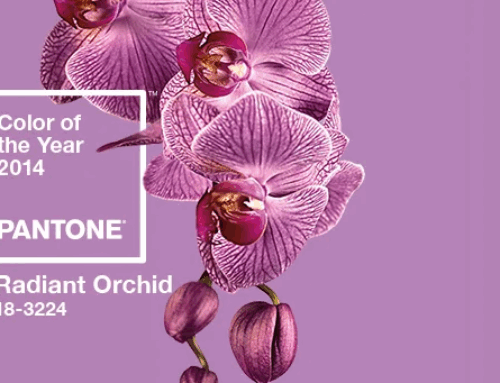
As part of my work with Pantone I spearhead their Pantone View Home + Interior color forecast. In addition, twice a year, I am part of a team that creates the Pantone View Colour Planner, which is a color forecast that spans many fields, such as fashion, textile and industrial design. Both forecasts are a result of trends that are developing on all fronts from media, socio-economics, entertainment, the impact of the environment, travel influences and any other worthy subject or direction for all creative design fields. I then compile this information into imagery with color as the guide. I let color tell the story of the times.
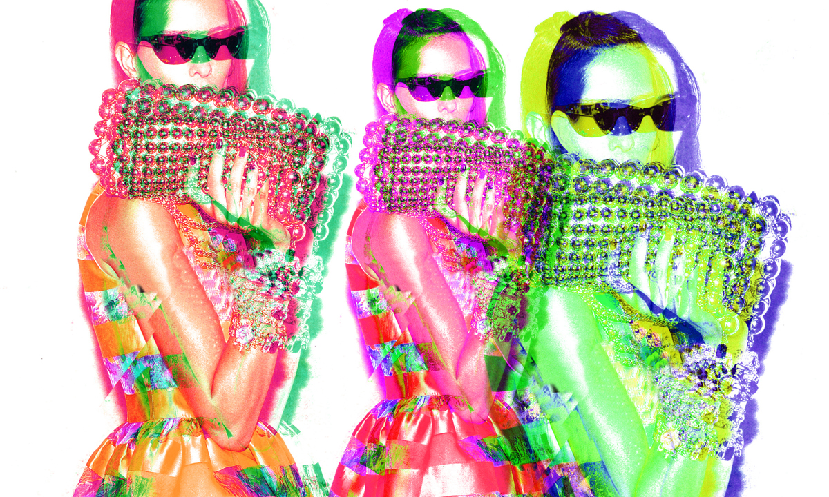
Image via http://www.pantoneview.com/site-preview
These forecasts are coveted among designers and industry professionals as they plan each season’s new creations. They are filled with color palettes designed with a “mood”, a rationale and an inspirational direction. Whether used out of context or within the theme we set in the palettes, they are great tools and hold key design principles with texture and balance.
Forecasts are such an integral part of the color consulting world and intrinsic to the knowledge of color in the future. That is why this subject is included in the Color/Design programs that I teach twice yearly.
For more information on the forecast visit Pantone.com and don’t forget to subscribe to the new Pantoneview.com
Could a forecast help you in your work with color? Does this sound like an interesting part of the color world and were you familiar with forecasts? Please take a moment to share.