July 11, 2011
Bill Gold, called the greatest poster designer in Hollywood, has had an illustrious career designing classic posters for such films as “Yankee Doodle Dandy”, “The Way We Were”, “Casablanca”, “Hair”, “My Fair Lady”, “The Sting”, “Barry Lyndon” and “Mystic River”.
Here are some examples of his colorful work and some of the rationale behind it.
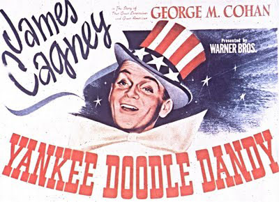
Yankee Doodle Dandy (1942)
For his first major studio release, it was important to Gold to emphasize the patriotism in the story of George M. Cohan. So he used bright American colors and incorporated the flag design as part of the Uncle Sam hat. He did all the lettering by hand then had a sign painter come in and color it at his direction. The “C” in James Cagney’s name is the same type Gold used for Casablanca.
My Fair Lady (1969)
Gold says he used Peak’s “squiggles to get his juices flowing”. The final poster is a collage of the charcoal drawings, to which Gold added color.
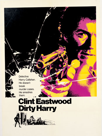
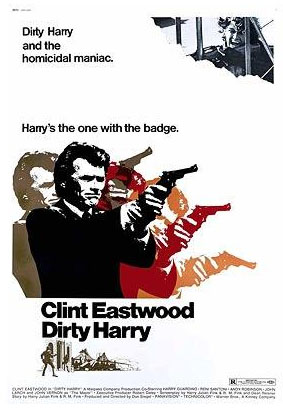
Dirty Harry (1971)
For his first collaboration with Clint Eastwood, Gold saw the police detective’s gun as a central image that he used in all of the poster variations. He exaggerated the size of the gun in the international and main U.S. posters. In the international, he used repeating images and “psychedelic” colors, which design critic Steven Heller praises for having “a pop art quality”.
The Sting (1973)
To capture the 1920s look of the movie, Gold took the approach used in The Saturday Evening Post developed by illustrator J.C. Leyendecker, for both the main poster and the alternate. “The texture of the clothing has a hand-painted quality,” Gold says. “The whole feeling of the story is there.” Gold also used the magazine’s classic lettering style.
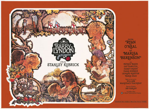
Barry Lyndon (1975)
For Stanley Kubrick’s 18th century costume drama, Gold flew to London for three weeks of intense discussions with the director. Kubrick insisted on having a special hand-lettered alphabet created, and Gold suggested the illustrated outer framing. After Gold returned home, he and Kubrick spoke by phone each day for weeks while a Warners messenger flew back and forth daily with sketches. Kubrick kept adding shading around each illustration to make it more distinctive.
Hair (1979)
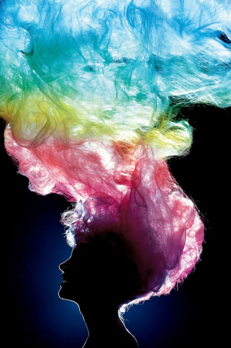
Gold and illustrator Bob Peak did a lot of experimenting, including the picture of the sun coming through hair. He also played with different lettering styles.

