October 7, 2015
As some of you may know, my husband, Herb, is a voting member of the Academy of Motion Picture Arts and Sciences. His career in film and music has certainly helped me to be more aware of the importance of film in formulating public notions about color and design. We subscribe to many periodicals and view many of the films nominated for Academy Awards, and I am constantly researching film archives as well as present-day films to better inform my work in forecasting.
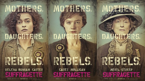
I was recently watching the trailer for the film Suffragette and was instantly captured by the story about the fight for the women’s right to vote. It is hard to deny the value of the movement and the importance of this period of time considering that we as a nation benefit from this movement.
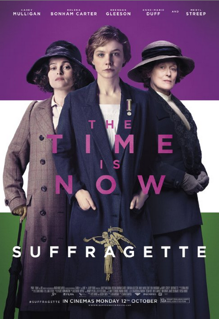
Photo by Pathe UK – © ©Pathé Productions Limited, Channel Four Television and The British Film Institute 2015. All Rights Reserved
I have read many books and seen some notable film, television, and stage shows about the early Suffrage efforts, so I wanted to highlight one compelling point of this particular movie that is almost a supporting character: the color used to convey the mood of this film.
In my talks this past year, I have been discussing the use of “umbered undertones” in current and future films. That expression comes from the somewhat murky tones that are being seen in both children’s films, where so many color stories come from, as well as films for grown-ups. Those more somber tones often reflect the nature, theme, mood, or historic setting of a particular film.
[youtube https://www.youtube.com/watch?v=056FI2Pq9RY&w=560&h=315]
Suffragette reflects a historic time period when there were no Technicolor films, and the theme of the film is a rather sobering subject—women’s struggles in the pre-1920’s to get enacted their legal right to vote, and the indignities and abuse they suffered—hardly the stuff of bright Technicolor effects! Interestingly, the American suffragette colors of violet, white, and gold were very similar to the green, white, and violet carried by their British counterparts. It is believed that the British Suffragettes chose those shades because they represented the first letters of each color and translated into: “Give (green) Women (white) Votes (violet.)
We can expect these “umbered” tones to have a long shelf-life because of films like Mockingjay Part One, which was part of the popular Hunger Games series. Part Two will come this Fall, and the stage show will appear in 2016. Some TV shows are also showing these same effects. Super Girl of 2015 is wearing more somber colored garb than sported by Linda Carter in the Wonder Woman series of the 1970s.
If you were choosing colors to represent the cause of the suffragettes, what colors would you choose and why?
Hi Lee,
Fabulous post! What you say is true and, interestingly, was reflected in colors of textiles and prints, too.
There were the bright mid-tones used in upper class, “high end” clothes but textiles that were worn by most women were earthier, vegetal colors. This is true not only in the woolen and wool coats but also in the floral prints.
Thank you for all you do to promote color!
Pat
This is obviously so appropriate timing for such a film when the right for equal pay is still being sought, thanks Lee. I think the umbertones and muddied hues are very reminiscent of struggle and help us feel the weight of the subject. The only technicolor version I can think of is in Mary Poppins, and although very played down, I do remember white and yellow hopeful hues accenting with the upper class lady’s colorful blue dress and the black and dim colors of the lower class. I think even there a message was slyly put in to raise attention. I think the violet you mentioned here as part of the movement will also fuel many passions coming forth with the millenial generation’s influences in interest.