January 16, 2011
We are having so much fun finding all things Honeysuckle in magazines and online. January’s issue of HFN (Home Furnishings News) has a beautiful spread boasting Pantone’s Honeysuckle as a “step in the bright direction for 2011”. Very clever! Do you think they meant to rhyme? I thought it would be fun to surf the web and see what other fancy gems I could find that showcase other ways that one could Honeysuckle the home.
Can I say Honeysuckle one more time or how about three?
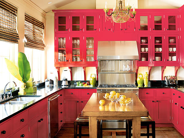
Honeysuckle focal point.
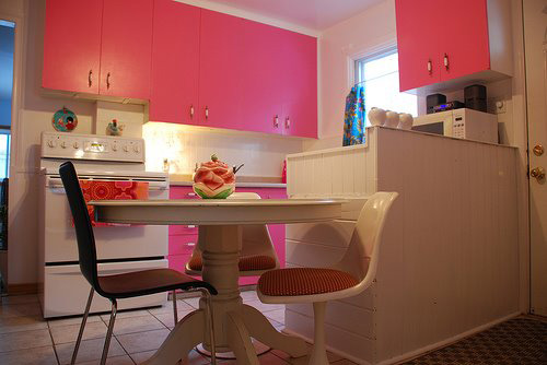
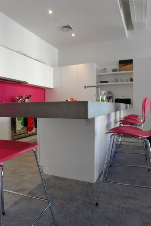
Honeysuckle accents.
“With so much stainless steel and neutral tones dominating kitchen decor, for example, a bright hue can be a real statement color. Honeysuckle ‘offers a real vibrancy…it doesn’t shrink into the background.”–Richard Joseph
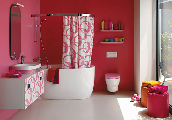
Honeysuckle prowess!
Do you feel inspired by the use of this flirty hue? Will you be adding some touches of Pantone’s color of the year for 2011?


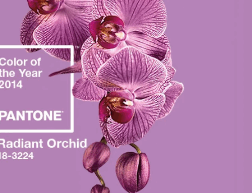

Here’s what the honeysuckle trend makes me think of, and why i’ll be ignoring this one…