March 21, 2011
I like the idea of wearing interesting color combinations. I feel inspired by some of these combinations that Refinery29 suggests so I thought I would take it a little further and give some guidelines for those of you who want to make these looks work for you.
Let’s break it down by Colortime®.
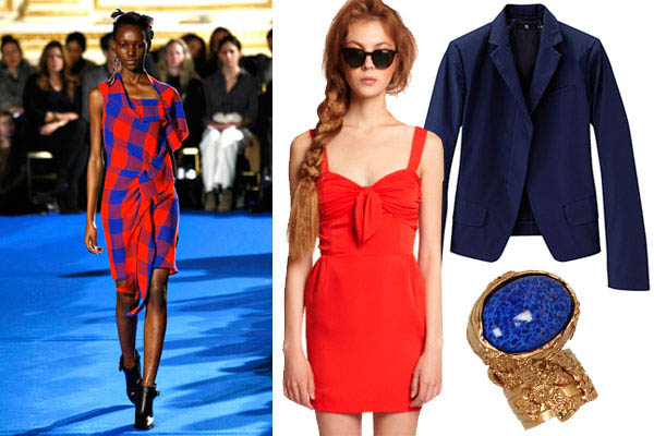
Royal Blue and Crimson
Royal Blue or *Navy Blue 19-3832 is a Crossover color that is flattering to all skin tones.
The Sunrise and Sunlight Colortimes® could skew the Crimson red to a *True Red 19-1664 for a flattering coloration while keeping the jacket and accessories as suggested in this image.
The Sunset Colortime® can go ahead with this duo. The dress as featured here appears to be on the red/orange side of things which is very flattering to the Sunset Colortime. *Think Fiesta 17-1564.
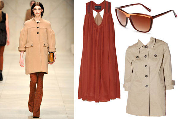
Burnt Orange and Khaki
Khaki or *Bleached Sand 13-1008 is another Crossover color and can be worn by all of the Colortimes®.
The Sunrise Colortime® is not the best coloring for Burnt Orange. As long as the Burnt Orange is not right next to the face this look will be fine. I might also suggest you could add a patterned scarf mixing the two and wear that closer to the face.
The Sunlight Colortime® can pull this off if the Burnt Orange is closer to *Burlwood 17-1516.
Sunset Colortime® can wear this combination confidently. Try finding the dress in *Cranberry 17-1545 or the one pictured here can work too.
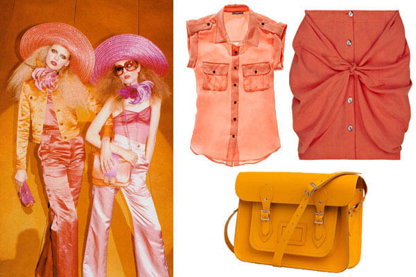
Orange and Fuchsia
Sunrise Colortime® might want to make a smaller statement with these two colors in the form of shoes or accessories.
Sunlight Colortime® could combine *Peach Parfait 14-1219 and *Desert Rose 17-1927 to create a similar effect but in more flattering hues to your skin tone.
It’s as if these colors were designed just for Sunset Colortime®.
Pink and Caribbean Green
Sunrise Colortime® can wear this combination with complete confidence.
Sunlight can pull this combination off if the colors shift to more pastel shades like *Powder Pink 14-1511 and *Fair Green 15-6316.
*Sunkist Coral 17-1736 and *Bright Chartreuse 14-0445 are a better hue for you Sunsets.
Red Orange and Yolk Yellow
I recommend this combination for the Sunset Colortime®.
If the Sunrise and Sunlight Colortimes® would like to wear this combo it may be best not worn next to the face. Try a neutral top and mixing the two on the bottom with tights and shoes along with the skirt.
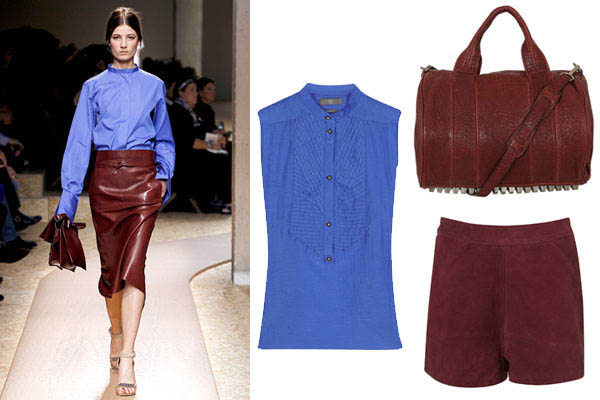
Oxblood and Cornflower
The Oxblood is a Crossover like *Eggplant 19-2311.
This combination is stunning! I love this look for the Sunrise especially with the Cornflower blue top next to the face. Try Little Boy *Blue 16-4132 or *Bonnie Blue 16-4134.
Sunlight is the match with *Cornflower Blue 16-4031.
Sunset should find a blue like *Della Robbia Blue 16-4020.
*Pantone colors found in More Alive With Color fanguide.
If you want to find your Colortime® to learn how to make the runway looks work for you stop by More Alive With Color and pick up a book and fanguide and take the guess work out of making the fashion work for you.
If you want more of a one on one contact me with your questions or schedule a consultation with a certified consultant.
Find us on Facebook.
Also, if you find that you already know what colors look good on you perhaps you would like to become a Colortime® Image Consultant and help others understand what their colors are.





The light gray type is IMPOSSIBLE to read!!! Please stop doing this.