November 9, 2012
Debora House is a multi-talented artist and colorist now living in Stockholm, Sweden. Debora and I met several years ago when I first moved to Bainbridge Island, WA and we formed a fast friendship as we are kindred spirits in color (and a lot of other things as well).
We have worked together on projects since then. Her sense of color is impeccable – so moody and evocative. Of course I have several of her paintings – several in my office, as a matter of fact!
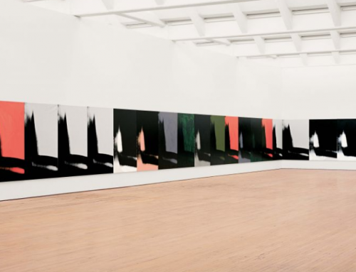
Debora decided to take my online Image Color Training a few years back and I am hoping that she can join us for a future Color/Design program, whether in Burbank in January or here on the island in July (where she still has a lot friends). She is truly a gifted colorist and I invite you to view some of her latest paintings.
I am an artist. To me everything is open to arrangement and interpretation, from clothes to food to garden bulbs. I like the moment standing before the emptiness of the white canvas and knowing the first strokes are like the first lines in a novel – they will lead me to an unknowable place. I recall another artist saying, “If you know the outcome why bother painting the painting?” That’s how it is for abstract expressionism, you don’t know but you explore with hope and energy.
I have had the good fortune of being raised by a designing woman who taught me very young to memorize color. I have practiced recalling color my whole life. It has been what inspires me and has led me to pursue work in fields where it was required: Interior Design, Textile Design, Colorist and now as a painter.
When I took a course in Color Image Training under Leatrice Eiseman, I was forced out of my own comfort zone and personal preferences into colors as they suit or affect others. When a colorist like myself goes through what basically amounts to retraining the eye to see whole color stories as they relate to others, I was made to explore my emotional reaction to colors in a new way because I had to include colors I didn’t like! In learning to assess how certain colors that challenge me might suit someone else perfectly, I opened my heart to a much bigger palette. Using that knowledge as a painter let’s me explore and accept colors that, in the past, I would have omitted without a thought.

Northern Lights
Before I begin a painting I think of the narrative of the story I want to tell. In the painting Northern Lights I wanted to communicate the mysteriousness of the Northern Lights. I live in Stockholm which is as near to the Arctic as one needs to be yet the lights always elude us. The time to see them is precisely when there is too much cloud cover to observe them. We can have months without a single ray of sunlight. Naturally this drives some people mad and if you’ve ever seen a Swede on a beach and wondered how they can lay there like a lizard for hours, days, on end, it’s because they are storing up the light. You know, you just know, those magical colors are out there swirling over your head but you can’t see them. So the painting is my way to illustrate the color behind the clouds and a roiling icy sea.

Pi in the Sky
Pi in the Sky is a landscape about infinity. In a blue band that separates heaven and earth are the beginning numbers of Pi. The numbers start off the surface of the canvas on the side and wrap until there is no more room for the infinite formula. The intention is that math (something commonly perceived to be anchored in reality) at some point, in higher mathematics, becomes an abstraction. In the skyline is a fixed and accurate constellation in gold metallic – The Big Dipper.

Spring
Spring is a part of a series of seasons. Living in a place where winter lasts almost half the year, spring is a longed for time. I used colors that were, to me, hot or acidic: The new green of the grasses, the riotous reds of tulips and peonies, quince in the horizon line and a sky filled with golds and pinks inside the blues.
Spring comes quickly and once it starts it bursts forth all at once with energy and beauty.
I painted this painting quickly as well. It came together with a minimum of washes and almost no struggles. The green is an example of forcing myself to use a color that fit the piece but is not a color I am drawn to naturally. In that way it is more a practice of color theory than intuitive thought.
I feel I am always learning to see things in a fresh way and to enjoy where these color stories lead me. I want to have an experience that is self-satisfying in the process of creation and to look back later and see the sense of commitment that went into every layer. But mostly I want to stand before the next blank canvas and make the first stroke.


I nend some suggestion from my thesis topic color psychology because I`m confused pleasa
help me give some idea`s
What is your field of study?