September 27, 2010
Moving Pictures Magazine
Scorsese’s Film Foundation preserving lifetime of memories
Fall 2010

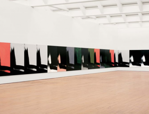
“The future of film itself was at stake. The celluloid reels, whether catalogued in storehouses or gathering dust in an attic corner, were succumbing to the ravages of age. Against the forces of nature-and corporate indifference-Martin Scorsese began deploying his own forces: the not-inconsiderable weight of his own name and a prestigious starting cast of Woody Allen, Francis Ford Coppola, Stanley Kubrick, George Lucas, Sydney Pollack, Robert Redford and Steven Spielberg.”
“There was no system in place or incentive to make sure films would be around in the future. Now, with 545 restored films to The Film Foundation’s credit since he founded the organization dedicated to that purpose in 1990, Scorsese remains passionate about the continuing need for film restoration. In addition to the narrative feature films “we all respond to,” he says, there are “avant-garde films that are deeply compelling and can change the way you look at cinema. Or the earliest silent films that show everyday events and remind us how life has-and hasn’t-changed in over 100 years. There are documentaries, newsreels, home movies that can show the spectrum of human experience and open our eyes to moments and events from the past in a most powerful way.”

“Scorsese, as a young filmmaker, had been inspired by the old RKO films and others from the past. But he noticed that the prints he say, whether from a library or a studio, were pink; the colors were faded. He spearheaded a campaign for Kodak to develop a low-fade stock so the color wold be more stable, advocating for it during his press tour in 1980 for “Raging Bull”-which he shot in black-and-white specifically so as not to be worried about it fading 10 years down the line.”
[…]
“The board (The Film Foundation) helps select the preservation projects the foundation will fund, based on historical and technical significance such as a director’s first use of color, a specific color process or wide screen. Explains Scorsese, “The archives send in a proposal each year, outlining and prioritizing the films most in need of preservation, and the board reviews the titles and proposals, the materials available and the additional information on the cultural and historical significance of the pictures provided by the archives. And then we decide.”
“Two years after launching The Story of Movies, TFF grew in another direction: It consolidated with Artists Rights Foundation, whose mission paralleled TFF’s. ARF’s focus on protecting the films’ creative elements over issues such as colorization and unauthorized editing underscores concerns that restorers constantly grapple with: Using today’s advanced technology to make something look as good as it can without adding one’s own aesthetic.”
“Choices inform the look of the final product. Archivists and TFF’s board study films and look at reference prints (and, in ever more rare cases, even talk to the director) to know what a director may have been going for in his body of work or specific film.”
“John Huston and cinematographer Oswald Morris used a subdued color palette that was almost sepia, even though it was done with the three-strip [Technicolor] process.”

“Three-strip Technicolor films used three different cameras, each creating a color record for the red, blue or yellow section of the color chart. Digital technology enables the color records to be aligned exactly, which give Technicolor a new look. ‘The original was a soft look,’ says Bodde (Margaret Bodde executive Director of TFF), ‘but did the director want that, or would he have wanted a sharp look?”
“Using “The Phantom of the Opera” as an example-it was shot in black-and-white but has one sequence featuring Lon Chaney wearing a brilliant red cloak-Jackson describes the dilemma of leaving the color in the “rather crude, hand-painted-look, two-color process of the time” or improving the appearance and making it more perfect.”

“Assume nobody’s an expert,” he says. “[Offer] the view of how audiences would have seen ‘Phantom of the Opera’ in 1925 and how it would have looked if [the director] would have had access to our technology. …The capacity on discs is such that there’s no reason you can’t offer both versions at no extra cost.” And he adds, “It wold inspire interest, and may make some young viewer into a future historian.”
September 24, 2010
Pantone has released the Spring 2011 Fashion Report. We always get excited when the new ones come out! Please click the images to read the full report.


Ellen Wulfhorst of Reuters writes an article on the role neutrals will play in fashion for spring and summer 2011, and quotes Leatrice Eiseman saying, “Neutrals don’t necessarily mean boring, and they can range from pale rose to deep russet…These are not your mother’s neutrals, they have wonderful undertones, very subtle.”
Let’s see….
Very subtle indeed, with just a little pop of color!!!


Click each of the images to see the full lines from Tracy Reese, Nanette Lepore and Badgley Mischka at Style.com
September 20, 2010
Here is a another little addition to our Turquoise sightings. What a great cause and such a perfect color to use as representative of great intention.
To quote from Color: Messages and Meanings on Turquoise…
“In many cultures, turquoise occupies a very special position in the world of color. The actual name for the gem is derived from the French phrase meaning “Turkish stone” as the first stones were mined in Turkey. Turquoise was used (and continues so in many cultures) as a protective talisman against evil by cultures as varied as the Persians, Egyptians, Greeks, Indians, Spanish, Israelis and Mexicans, as well as the early Aztecs and Native Americans.”
Daily Candy
Falling for Turquoise

Camouflage? Fur accents? Forget it. You need but one trend this fall: turquoise. Not convinced? Ask Kelly Ripa and Electrolux.
The two are supporting Ovarian Cancer Awareness Month (September) by going totally teal (the cause’s official color).
For more information click here…
September 17, 2010
We have set the dates for the January Color/Design class.
Register for our Color/Design class this January 27-30 in Burbank, California. The class will be held at the Residence Inn by Marriot in Burbank.
Phone, fax or email us today to reserve your spot!
Class is filled on a first come first serve basis.
206)842-4456(PH) or (206)842-6498(Fax)
If you are going to be in Denver next week stop by and say hello. This event is open to professional interior designers and retailers who are interested in learning about color.

Click the flyer for more information…..
September 13, 2010

Renowned Mexican architect, Luis Barragan once said “Who can ever describe the vividness, the profusion of light and color?’ What he could not describe in words, he rendered quite brilliantly in the colorations of the homes that he designed and colored. His inspiration was well founded as traditionally, in Mexico, pigments and dyes often came from insects, shells, the color of the soil and vegetation, rendering a large array of indigenous colors. There are sunlit yellows and terra cottas, vivid violets and roses, and greens of all shades, including jade and sage. Blues rendered a range from indigo to cobalt, sapphire and turquoise, while the reds had an even larger range, including cadmium, vermillion, carmine, crimson, magenta and fuchsia. Scarlet is the star of the show, bearing the dubious distinction of being called the “blood of the prickly pear” as they were extracted from an enormous number of insects who inhabited that ubiquitous Mexican cacti.


September 10, 2010
Miller-McCune
When Grading Papers, Red Ink May Mean Lower Scores
New research suggests the use of red ink by teachers to correct students’ work may result in harsher evaluations.
By Tom Jacobs

“A study in the European Journal of Social Psychology suggests the use of red pens may make teachers more likely to spot errors on tests and to be more critical when grading essays. “Despite teachers’ efforts to free themselves from extraneous influences while grading,” write California State University Northridge psychologist Abraham Rutchick, Tufts University psychologist Michael Slepian and Bennett Ferris of Phillips Exeter Academy, “the very act of picking up a red pen can bias their evaluations.”

Because red pens are closely associated with error-marking and poor performance, the use of red pens when correcting student work can activate these concepts. People using red pens to complete a word-stem task completed more words related to errors and poor performance than did people using black pens (Study 1), suggesting relatively greater accessibility of these concepts. Moreover, people using red pens to correct essays marked more errors (Study 2) and awarded lower grades (Study 3) than people using blue pens. Thus, despite teachers’ efforts to free themselves from extraneous influences when grading, the very act of picking up a red pen can bias their evaluations.

September 7, 2010
We found these quotes to be interesting, worthy of note and worth sharing.
“The influence of houses on their inhabitants might well be the subject of a scientific investigation.”-Lytton Strachey
“The Bloomsbury Groups sought forms of domesticity to replace standard concepts…Strachey went on to say “We find satisfaction in curves and colors. Windows fascinate us, we are agitated by staircases, inspired by doors, disgusted by cornices, depressed by chairs, made wanton by ceilings, entranced by passages and exacerbated by a rug.”

For the Bloomsbury Group “the greatest ethic goods were ideals of personal relations and aesthetic appreciation.”

Detail from a portrait of John Maynard Keynes by Roger Fry. Photograph: Bridgeman Art Library
The often controversial collection of artists, writers, intellectuals and philosophers who make up the Bloomsbury Group, largely contributed to the world of aesthetics as well as literature and economics. Virginia Woolf, Lytton Strachey and John Maynard Keynes are among the most influential members.

A few of the members of Bloomsbury Group went on to form the Omega Workshops.

September 3, 2010
Feeling a little bit whimsical today as we share bits of interesting information that we gathered along our journey into the history of color. Jean-Baptiste Reveillon is the object of our admiration with his love of craft in wallpaper. His innovation in design and color spawned generations of designers and do it yourselfers who live to paper their homes and in some cases themselves.
Wallpaper innovation in homes and clothing
Frenchman Jean-Baptiste Reveillon was the father of wallpaper. Reveillon brought revolution to the royals with his velvet paper. In 1775 he opened his own paper mill which allowed for more measured quality control and quantity. The royal courts were enamored with his work.

Reveillon and his workers produced wallpaper that was in league with Chinese paper at the time. His beautiful wallpapers were considered art and had mass appeal. So much is the case that French women would use his papers to add adornment to their cotton crinolines creating inexpensive fashion statements that would last for months. For the first time women could “buy their dresses by the roll, instead of by the yard.”