October 29, 2010
Medicalnewstoday.com
Emotion Processing In The Brain Is Influenced By The Color Of Ambient Light
Researches at the Universities of Liege, Geneva and Surrey did a study investigating the immediate effect of light and its color composition on brain processing.
The study shows the following.
“The acute effects of ambient light on emotional processing might differ from its longer-lasting effects on mood, but the present findings in healthy subjects have important implications for our understanding of the mechanisms by which changes in lighting environment could improve mood, not only in mood disorders using light therapy, but also in our day to day life, by paying more attention to our light environment at home and in the work place.”
Sources: Leige University, AlphaGalileo Foundation
October 27, 2010
The dates for the Burbank class are January 27-30.
Sign up today! Spaces are first come first serve.
Click the image below.
October 26, 2010
We would like to acquaint you with our colleagues from Subkarma-Tony and James Soames.
These images demonstrate what they do best. All of it done with style, wit and intelligence.
For more images from Taiwan and Subkarma follow Lee on Facebook.
October 22, 2010
Lee recently went to Paris for Maison & Objet. Among all of the new and interesting items she spotted some items that pay homage to Piet Mondrian.
Included in the room of Mondrian items is the bookworm bookshelf by Ron Arad. Ron is a multiple disciplined designer that really has an extensive resume that can best be summed up be clicking [HERE].
I can see some similarities between Ron and Piet.
“I construct lines and color combinations on a flat surface, in order to express general beauty with the utmost awareness. Nature (or, that which I see) inspires me, puts me, as with any painter, in an emotional state so that an urge comes about to make something, but I want to come as close as possible to the truth and abstract everything from that, until I reach the foundation (still just an external foundation!) of things…”–Piet Mondrian
We are drawn to the simplicity of the primary palette because it taps into our inner child. The basic shapes and colors together are pleasing without being overly complex.
October 18, 2010
Do you get tired of eating the same old vegetables? Are you like me and stuck in a vegetable rut? I think Duda Farms has found a way to perk up a classic refrigerator staple.
“Red Celery is an all-natural and beautiful variety of celery which has been bred from heirloom seeds and is available all year round and is a colorful, one-of-a-kind variety exclusively offered by Duda Farm Fresh Foods.”
Why, you ask? I don’t know why but it may add some interesting flare to the relish tray during the holidays.
October 15, 2010
One of Lee’s compadres from CMG has thrown her hat into the shoe design ring all for breast cancer. Beth Simon is a graphic designer who likes to occasionally stretch her creative muscles in other fields including fashion design.
Beth shared with us a little bit about the inspiration behind her design.
“We need to celebrate the good times in life, not only to enjoy them more, but to build a reserve to help propel us over the not so good times.”
“Dressing up and wearing bright colors makes me feel good and gives me more power and confidence. When you dance, you don’t want to lose a shoe! So this design utilizes the most powerful shade of pink and wraps it to your arch so that you can dance the night away!”
“I love to design with a little surprise. I’ve used the breast cancer logo in a bold way but in such a natural way that you almost notice, after the fact, that it’s actually the logo. The heel was designed first. It can be overlooked but when you apply color there, it’s also an “aha! moment”.”
Pink Passion is a shoe contest held by Baylor University Medical Center and Saks Fifth Avenue.
October 11, 2010
Stationery Trends
Excerpt from An Infusion of Good Cheer
Sarah Schwartz
Occasionally a color sticks around long enough that it becomes emblematic of an entire era. Many people will see avocado green and recall 1970s appliances, while for others Schiaparelli pink instantly evokes cutting edge fashions from the late 1930s.
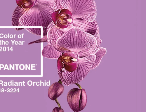
Well, marigold yellow may just become synonymous with the 2010s, even though Pantone actually dubbed its shade 14-0848 Mimosa the color of the year for 2009-a full year before this decade officially started.
“The color yellow exemplifies the warmth and nurturing quality of the sun, properties we as humans are naturally drawn to for reassurance,” explained Lee.
“Mimosa also speaks to enlightenment, as it is a hue that sparks imagination and innovation.”
“…this feel-good color as especially suited to complementary colors in the purple or blue family, the hue also is suited to neutrals from chocolate brown to steely grays, as well as groupings that set moods ranging from autumnal to citrus-y.”


October 8, 2010
Lee was recently quoted in an article about the use of pink in reference to breast cancer.
The Daily Record
The power of pink: Color spins a pop culture all its own
BY PATTI MARTIN
Leatrice describes pink as “soft, romantic and innocent.”
“When people are happy, they look at the world through rose-colored glasses,” Eiseman points out, “and when fair-skinned people are healthy, we say they are ‘in the pink.’ “
“Yet for all its innocence, pink has taken on a more powerful connotation throughout the last decade: breast cancer awareness.”
Please click the image to get more information.
October 4, 2010
I was watching one of my favorite shows last week and thought I noticed something very familiar. On last weeks episode of Mad Men I thought I spotted what looked like a lamp that was inspired by Mondrian.
I did a little “research” on the Mad Men website and found this picture that had the lamp in it.

Is it me, or does that lamp look like a take on a Mondrian painting with Playboy Bunny ears? What an interesting combination.
Also….
There is no mistaking where this funky bookshelf gets its inspiration.

Moving Mondrian by A.M.O.S. Design
October 1, 2010
American Cinematographer
A Magical Manhattan
David Heuring
August 2010
An interesting story that addresses color in film.
The Sorcerer’s Apprentice is the latest retelling of an ancient tale in which supernatural powers threaten to overwhelm the young would-be wizard who summons them. Perhaps the best-known antecedent is the synonymous segment of Disney’s animated classic Fantasia, in which Mickey Mouse filled in the title role. The new film reimagines the story as a live-action adventure-comedy set in modern-day New York, where fresh-faced Dave Stutler (Jay Baruchel) finds himself unwittingly cast as the apprentice to sorcerer Balthazar Blake (Nicolas Cage).

To bring this vision to the screen, director Jon Turteltaub teamed with Bojan Bazelli, ASC, whose previous credits include Hairspray (AC Aug. ’07), Mr. & Mrs. Smith (AC July ’05) and The Ring (Ac Nov. ’02). With a story steeped in magic, Sorcerer’s Apprentice required Bazelli to focus on “the magical feeling you perceive subconsciously as an audience,” The cinematographer offers. “The goal was to engage viewers through characters they can identify with and a story that sweeps them along. If we fail at that, nothing else matters.”
Along the way, Bazelli adds, the filmmakers also wanted “to create a version of New York City that’s never been seen before.”
“I wanted the images in this movie to travel from the mid-tones to black in as many tones and shades as possible.”

“During prep, Brazelli found inspiration in Orpheus Descending, a book of color stills taken by Clayton Burkhart that depict modern New York City, and Fantasy Art Now, a book of contemporary illustrations. ‘I’m a little obsessed with what these fantasy illustrators do in their pictures,’ says Bazelli. ‘They’re very filmic. These photographs in Burkhart’s book make use of the city’s many lights and colors, and often play off of reflections and wet streets. The colors are strong, and the blacks are really pure. That fit with our desire to set this story in contemporary times.”

“Most of the Sorcerer’s Apprentice was shot on stages in the New York area, including Steiner Studios. The remainder was filmed on location throughout the city. More than 1,200 visual-effects shots round our the magic with flying balls of plasma, a fire-breathing dragon, shape-shifting vehicles and many other illusions.”
“Shooting on location in New York posed a number of challenges. The filmmakers spent 16 nights filming a climactic battle sequence in lower Manhattan, where all of their gear had to be set up at 7p.m. and torn down every morning at dawn. Further complicating matters, the city experienced 43 consecutive nights of rain during the summertime shoot. The showers usually lasted no more than an hour, but it was enough to make the short nights even shorter, recalls Bazelli. Nevertheless, the project was finished on schedule in 96 days.”
“In the story, a series of evil sorcerers are locked in a Russian-doll-like series of containers. Each sorcerer must be unlocked by the right code and destroyed before the subsequent sorcerer can emerge. In the final battle, filmed in Bowling Green Park in lower Manhattan, the final sorcerer must be vanquished.”
“The production also spent six nights filming in Chinatown, where a dragon springs to life during a parade and pursues Dave up a fire escape to a rooftop. Balthazar intercedes, creating a curtain of confetti to hide his actions. Five tons of confetti was blown into the scenes. …”The scene was lit with 300 red silk Chinese lanterns; Bazelli chose silk over paper because because he thought the glow was more interesting, and he was relieved to find that the silk held up well in the wet weather.”
“In one key scene, Balthazar generates six circles of fire inscribed in a stone floor and circumscribed by a larger circle 35′ in diameter. Each circle has its own color of flame, created by the special-effects department and captured in-camera.”