Women’s Wear Daily recently quoted me in an article, which began, “A colorful trend is coming back around and responding to today’s wardrobe crisis. Color analysis — or sharpening one’s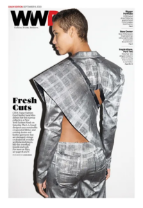 personal style game using compatible colors from the color wheel — has been said to lead to more decisive dressing. The idea is that it takes the guesswork out of getting dressed, doing makeup or hair.”
Women’s Wear Daily is on to something: as color has become such a hot topic and people have become even more interested in their personal “brand”, there is a big resurgence of interest in personal color palettes and self-image. Because of this, I thought it was a good time to share some of the questions that we have gotten recently regarding those personal color choices.
What is personal color analysis? Is it important?
 Personal color analysis — “having your colors done” — is a process through which someone learns which colors look best with their skin, hair, and eye tones. In most personal color analysis systems, the person will receive a set of colors that work for them in order to take some of the guesswork out of choosing new clothing pieces. It helps individuals gain the confidence of knowing the most flattering shades that will help them look and feel their best. It is not only a confidence builder, but it helps people unleash their creative abilities by combining colors and putting themselves together for the best results. So, yes! It is important.
Can personal color analysis help sustainability?
This may sound like an odd question, but yes, it does, actually! Most people have had the experience of choosing some piece of clothing only to get home and realize that it makes them look tired, or like they’re fighting the flu. Using personal color analysis for clothing selection can simplify the shopping process so you make fewer mistakes in choosing garments. You’re much more likely to keep a piece for a long time when you know it makes you look your very best. And since the average consumer throws away 81.5 lbs of clothes every year (that’s 11.3 million tons of textile waste that hits landfills!), choosing for the long term is a good step towards sustainability.
Does Pantone incorporate seasonal color palettes into its annual trend reports? 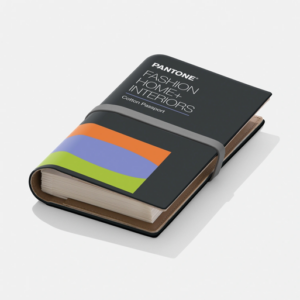
I do several trend reports for Pantone, including the Fashion Color Report which is released on the Pantone website in fall and spring. Within those reports, there is enough of an assortment of colors and color temperatures to inform a variety of color analysis systems. The colors are not divided into specifically “seasonal” palettes, however, as the seasonal palette method is not the only method of color analysis available. There should always be some flexibility allowed for color choices, especially allowing for the emotional attachments one might have for a specific color or color family. And, as there is more than one personal color analysis system available, if an individual is not happy with the results they obtained in the past – or have changed their “look” since having had their colors analyzed – they may want to try a different system. Pantone wishes to support that flexibility by staying color system agnostic.
Does Pantone have any color analysis services?
Pantone has many consulting color services that are available for manufacturers, designers, branding, product development, and much more. They do not provide personal color analysis services directly to consumers; however, as the executive director of the Pantone Color Institute and the Eiseman Center for Color Information and Training, I have developed a personal color analysis system that I teach in my online Colortime course.
What is the Colortime system based on?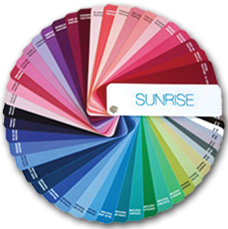
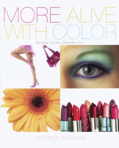
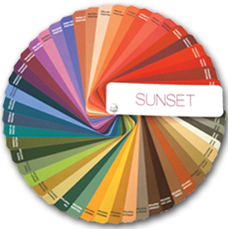
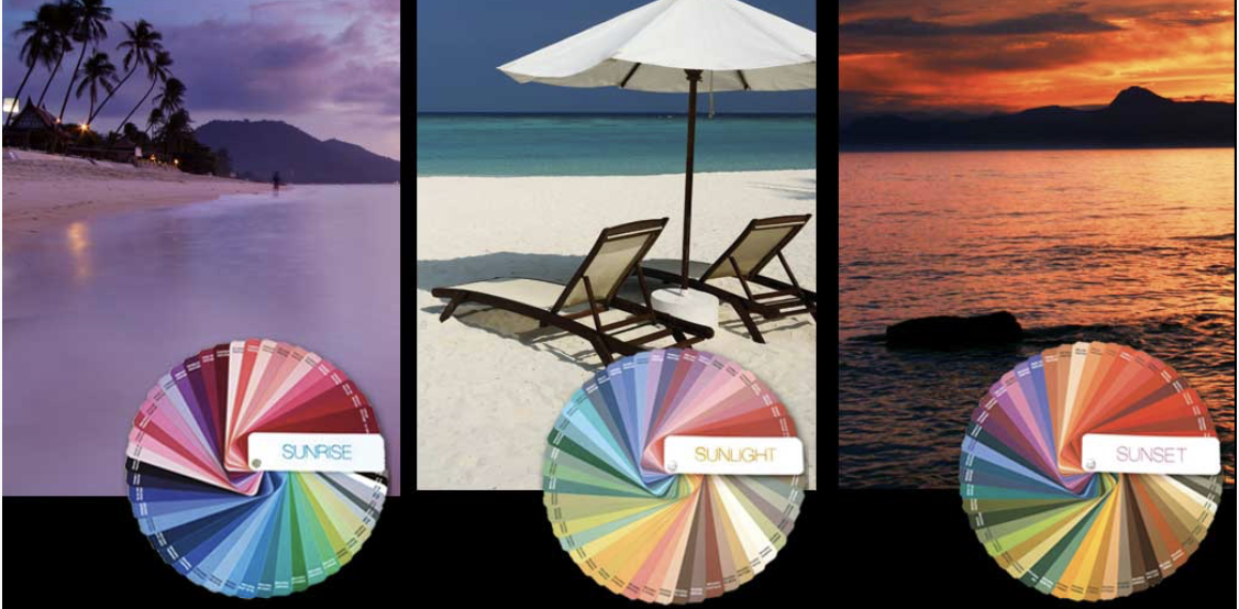
The Colortime system, explained in my book, More Alive With Color, is not based on the seasons, but rather on the changing light at certain times of day. This is a more inclusive and international method, as many people live in climates where they cannot relate to “winter ” colors; they simply do not experience those cooler color temps in their surroundings. Anyone, no matter where they live, can understand — through their own experience — the significance of the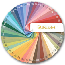 cleaner, sharper, jeweled tones of Sunrise hues, the sun-drenched subtlety of mid–day tones (which I call “Sunlight”), or the warmer drama of a beautifully striated Sunset painted across the sky. I also include a fourth palette called the Crossover™ colors that contains colors that are so apparent and prevalent in nature that they work with every palette. These include shades like Pantone’s Sky Blue, Sand, True Red, and Black. As Pantone is the most widely-used color system used worldwide, I’ve used Pantone colors throughout the Colortime system.
Is personal color analysis just for stylists and individuals who want more confidence when choosing clothing?
No, actually. Understanding the way that colors work with people’s skin, eye, and hair tones is hugely important for other people in the beauty industry as well, particularly makeup artists and hair stylists. The last thing a colorist wants to do is dye someone’s hair a color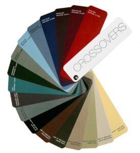 that doesn’t work for them! I could even see a good interior designer thinking about a client’s personal color palettes when choosing colors for a new design so that the client looks and feels amazing in the space.
Color is the foundation of all fashion, a player in setting mood, and a way to send a message. Why wouldn’t you want to understand how to use color to put your best self forward?


I’m glad I found this website. I’m learning about how to choose the right colors for brown skin women. I can’t wait to purchase your book ‘More Alive with Color.’ Thanks again, Kim H.