
I often get asked how I arrive at an upcoming color trend. With that in mind, I thought I’d review some of the most important areas we look at when identifying what colors will be important in the coming year. The following list includes many of the fields we explore and research to arrive at color directions. It includes:
- Fashion and interiors
- The world of entertainment
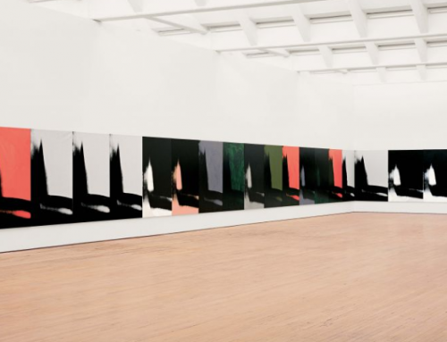
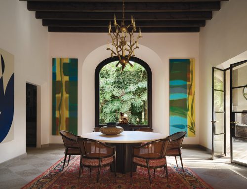
- The world of art and artisanship
- The natural world and environments
- Socio/economic issues
- Lifestyles/ playstyles
- Cyclical patterns
- Technology
- Buzzwords
I also thought it would be interesting to look through our archives and see how pertinent our predictions were. Let’s take a closer look at four interior design palettes that we included in our Pantone View Home + Interiors forecast book for the year 2020. I’ve added notes about how relevant they were at that specific point in time.
Metropolis
The first of the palettes is Metropolis, a very sophisticated approach to interior design that illustrated the eclectic elegance apparent in the year’s design and color.
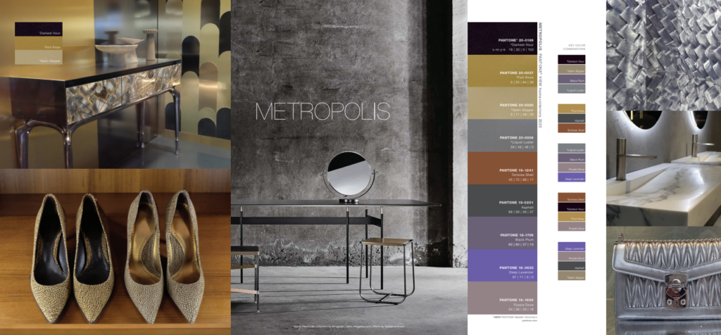
Metropolis speaks to big city living, of steel-girded skyscrapers that reach up and touch the skies. Penetrating light from the reflective windows glimmers and shines, especially at the darkest hours. The richness of the smooth, sleek, or plush surfaces found within the living space are a sharp contrast to the gritty paving and asphalt found in the streets below. Metropolis is a mix of glamour and industrial chic, of striated old-world marble and deepened wood patinas used with futuristic metallics. Accents of vintage plum wine and elegantly deep lavender add a sophisticated touch to this urbane and stylish environment.
Trekking
The second palette is Trekking. It reflected a lifestyle trend that was encouraging people to leave the big city and crowded spaces to embrace the outdoors. Little did we know when we created this palette that soon Covid would be upon us and many would be experiencing an even greater need to get away into the countryside!
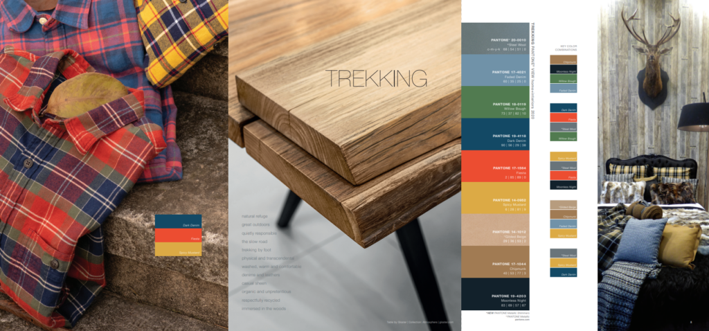
Trekking takes us away from the big city into the great outdoors—a place to escape the noise and the traffic, take a deep breath and, appreciate our natural surroundings. We travel on foot, reveling in the sheer physicality of the experience. This is a palette very much influenced by fashion favorites of plaids and flannels, of soft many-times-washed denims, of sneakers with a sheen or sturdy brown boots that were meant for walking. Translated from fashion into interiors, this color grouping invites a casual, comfortable, unpretentious, no-frills-attached environment punctuated by the energy of red and the warming presence of a Spicy Mustard tone. A metallic Steel Wool adds a surprising and sturdy.
Prints Charming
The following palette, titled Prints Charming, speaks to modern-day trends like tattooing and body art—but translated into fashion and home. The theme marries contemporized trends with history and heritage.
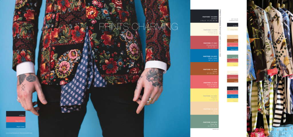
The interest in tattooing as an art form has grown to the point where patterning in interior textiles can provide inspiration for body art. The first part of this palette, appropriately named Prints Charming, calls to mind a sense of history and tradition, while at the same time introducing a cheeky and somewhat irreverent view of how traditional themes and modern-day usage might be co-mingled. Popcorn Yellow is playfully paired with a floral red while Bright Cobalt is calmed by an umber brown and a minted green. The second portion of the palette invites the use of a contemporary Jet Black and historically significant Antique White.
Beyond the Pale
Another palette, Beyond the Pale, was a direct reflection of fashion colors influencing home decor. In addition, because of research into the world of entertainment and films in production, we knew that the Barbie pink influence was going to build in the future. This involved several shades of pink, as reflected in the colors selected for this palette.
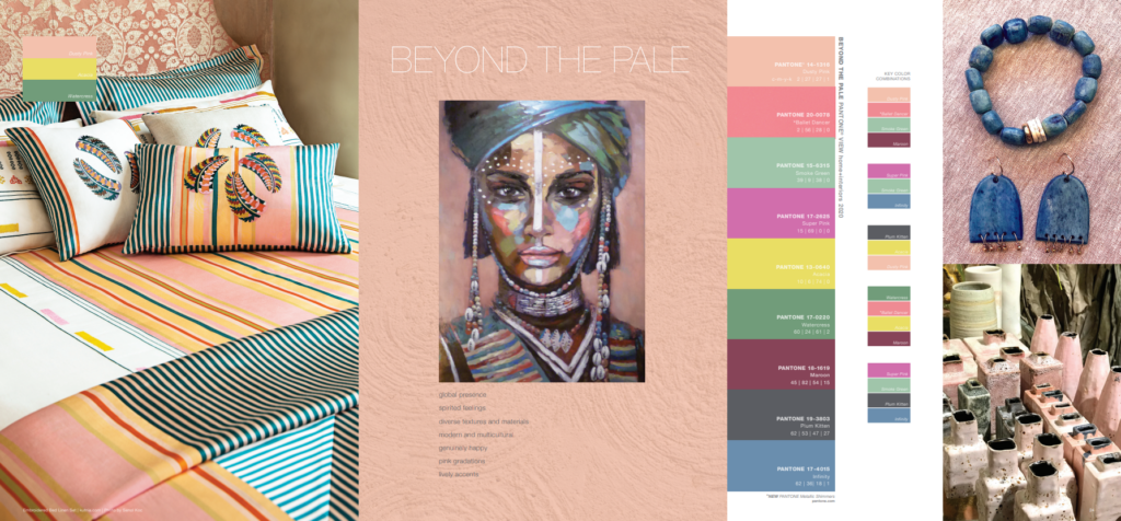
Beyond the Pale pushes pastels to another level. Reflecting its continuing popularity and expanded usage that will continue into the future, the pink family in several permutations is prime. In gradations of light, to mid, to bright tones, the various pinks and roses are muted or dusted, vibrantly bright or romantically inspired, with a sparkling presence. They are coupled with complementary smoky greens, blue greens, a mid-tone Infinity blue, or a lively greenish-yellow, and most effectively with a contrasting tawny brown.
As you can see, color forecasting involves an intrepid perusal of what will be happening in the future. Some trends remain classic and demand only a bit of change. They evolve, rather than revolve.
Color forecasting is a bit like being a detective, looking for all of the relevant cues and distilling them into forecasts that have an impact. And that is one of the many parts that make a career in color so fascinating, and why our color/design courses always include directional color forecasting as one of the subjects.
Leave A Comment