I often get asked how our Colortime concept originated… and what exactly is a “Colortime”.
As we all know, there is nothing like color to make you feel more alive and attuned to your surroundings. As I taught, researched, and interacted with many experts, the more I realized that the world of color is inevitably intertwined with nature. Additional research and study led me to develop a three-palette color system for personal use that mirrors colors as they appear in nature.
Within the context of nature, colors are generally classified as cool or warm. For years it was thought that people with cool skin, hair, and eyes wear only cool colors, while those with warm skin, hair, and eyes should limit themselves to warm colors. To some extent that is a reasonable guideline; however, research has shown that while some skin tones can be placed into groupings of warm or cool, not all can. For instance, if the undertone is not immediately apparent or seems to be a blend of both cool and warm, it is often called neutral.
Armed with this basic concept, and years of studying the variations of hues demonstrated in paintings by Claude Monet and other great artists, I developed a system that organized colors depicting palettes at specific times of day and how they related to personal coloring.
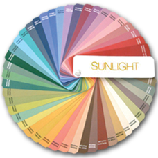 Each palette identifies the best colors for each of the Colortimes, as they are called. Sunrise consists primarily of cool colors, balanced with some warmth; Sunset is a predominately warm palette, balanced with various cool tones; and Sunlight is right in the middle, utilizing the more neutral and/or subtle shadings in both warm and cool tones. In addition to the three Colortimes, there is a group of colors called the Crossovers that can be used with all three palettes. These are colors that occur so frequently in nature that our eyes are accustomed to seeing them in many combinations.
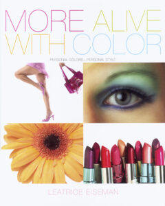
My first book about this theory was published in the 80s. It was an answer to the popular Color Me Beautiful; the Colortime theory was more inclusive and got into the feelings generated by—not just the appearance of—color. It was also a time that many people were “having their colors done”.
We trained many consultants in the Colortime theory, utilizing different color “drapes” that, in time, proved to be difficult to transport, and had to be stored and refolded after every color analysis session. This made them very labor-intensive.
My publisher urged me to do an update on my first book and we titled it More Alive With Color. When I became the director of the Pantone Color Institute, I realized that a Colortime fan guide, like so many other Pantone color guides, would be much easier to transport. A client could also shop easily with this compact guide that was easy to store and use.
 Today we’re seeing another explosive rise in interest in color analysis, so we are offering new drapes that show all of colors in each Colortime palette. This is a far more practical, easy, and attractive way to show the Sunrise, Sunlight, and Sunset palettes, along with a fourth palette of Crossover colors. The drapes do not replace the fan guides, as they are still the most efficient for shopping and demonstrating color combinations, but they are a wonderful visual addition for color draping.
In addition, the drapes are also available for interior decorating purposes to accompany our newly created online interior design course that also utilizes the powerful Colortime system.
For more information about the Colortime theory, our educational programs, our books on color, and More Alive With Color, please visit leatriceeiseman.com.



Leave A Comment