I firmly believe that a solid background in color theory serves as the best guide for effective color communication and application. Today I’m going to talk about one part of color theory, color mixing, because it is not only incredibly interesting but also can help us understand how colors work together.
There are two fundamental aspects of color mixing that have developed through two extremes of color experience: one through the way our eyes interpret light, and one through the actual physical qualities of paints and pigments.
Additive Color Mixing
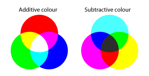
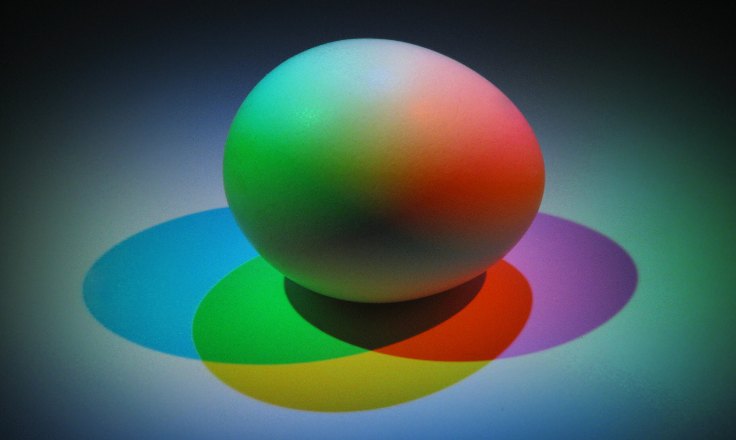
The additive principle applies to the mixing of colored light. The more colors of light that are added together, the closer it gets to being a white light. The main colors of light are red, green, and blue (RGB color code). These are the hues from which all other colors of light are made. Yellow light is obtained (somewhat surprisingly) by adding red to green light. Red and blue light produces magenta, while blue and green light produces cyan. On computer and phone screens, a minute area of illumination on the display screen, called a pixel, emits light in the differing hues that make up the image on the screen.
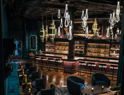
Pixels are, of course, used every day for computers, TVs, and mobile phones, but there are also many other applications of colored lighting, such as in theatre, retail displays, architectural and landscaping modes, or for especially dramatic effects in interiors and exteriors (you can see some interesting light effects in the work of my student, Bridget Frizzie, in this blog on my colorful colleagues).
A key point to remember as a color consultant is that the distortion, through lighting, of the normally perceived color of an object or setting can become irritating, unappealing, and even disgusting. For example, supermarket lighting must be monitored to ensure a natural, healthy glow to food products. Blue turkey meat or purplish cottage cheese would not be particularly appetizing and might appear tainted or decaying.
Subtractive Color Mixing
In contrast, the term subtractive mixing applies to the use of physical materials like paint pigments, printing inks, and dyes as colorants. The surface material absorbs (subtracts) all of the colors of light except the color of the object—which is reflected back to the eye for us to see. This absorption is based on how different atoms behave when light hits them. So an object painted red will absorb all colors but red and will reflect only that hue.
The primary subtractive mixing colors are red, yellow, and blue. We are familiar with those hues because of early childhood exposure to what happened when we scribbled with our crayons or watercolors and discovered all of the shadings and tints we could create by mixing them together.
As children, we soon learn that the mixture of red and yellow produces orange, blue and yellow create green, and red and blue present us with purple. Orange, green, and purple (also used interchangeably as violet) are called the secondary colors. Between the primaries and secondaries are the intermediate hues of red-orange, orange-yellow, yellow-green, green-blue, blue-violet, and violet-red. These are called tertiary colors.
Subtractive color theory is behind the CMYK color code system (often used for printing), but remember that CMYK is based on cyan, magenta, yellow, and black rather than red, blue, and yellow.
Partitive Color Mixing
But wait! There’s more. There is another concept of color mixing, known as the partitive system, that is a bit of both systems.
Partitive or optical color mixing occurs within the eye, rather than in the direct mixture of dye, pigment, or ink when very small colored areas are placed next to each other to form a pattern. Up close, you can see the different colors, but from farther away they blend into a different color entirely. Various Impressionist painters used this technique, and the Post-Impressionist George Seurat created a style called pointillism (small dots of color or points) using this same principle of optical mixing. This technique is currently used to print colored pictures as the dots are so small that they are barely discernible unless viewed under magnification.
This principle is particularly important in fashion and textiles; for instance, weavers often intermingle solid-colored yarns or threads to create many variations of hues. You’ve also probably noticed that the colors of small-patterned prints also tend to blend. For example, a red and blue floral print seen in close proximity will appear to be purple when viewed from a distance, or a white and red striped shirt will look pink from afar. Stylists should beware when choosing patterns for their clients.
In summary: this is just the start!
There are many more applications and implications of color mixing that will help color professionals excel. And I haven’t even begun to start on the vocabulary: dark shadings, light tints and tones, saturation, tonalities, undertone, and value, plus complementary, analogous, triads, and tetrads combinations. If this has piqued your interest my latest book, Color Harmony (Pantone Edition) is available on our website. It’s a must-read for the color professional! I’m also offering an in-person Color and Design Mastercourse this November that will go into depth on color theory like this. For more information, email me at leiseman@nwlink.com.



Leave A Comment