July 31, 2013
I was perusing the Huffington Post when I spotted the story (link at the bottom) on vintage travel posters and was reminded of some of the wonderful posters that we came across when we were doing research for my latest book Pantone The 20th Century in Color.
There is something magically transportive in seeing these fantastic illustrations of life in far away places. The colors, mood, and feeling all come together to entice the eager traveller to get away. The following is an excerpt from the book that can be found in a section addressing the colorful 1920s called “Destinations.”
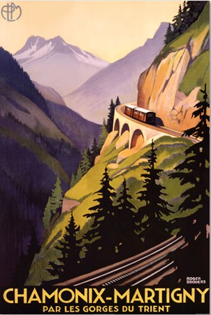
Image via
Though post-WWI nationalism made international travel a little more complicated, improvements in train and ship lines gave it a stylish sense of luxury and adventure. The forward march of technology also made speed part of the thrill.
Graphic designers did their part to build desire for cities like Paris and London with elegant posters that glamorized both destinations and their inhabitants-who all seemed to wear the latest fashions. Resorts like Nice and Vichy also benefitted from such marketing: resort towns that relatively few had heard of became worldwide household names.
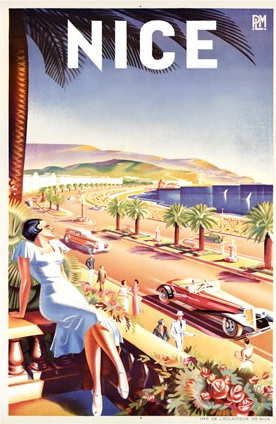
Image via
The color language found in travel posters of the day frequently employed the coppery tones of suntans and the warm neutrals of sand and sunlight. Silvery greens gave elegant life to oceans and rivers, and olives and browns to the landscape.

I love travel posters! I used one as inspiration for an article for Mountain Living’s magazine’s website:
http://mountainliving.com/blog/guest-post-perfect-mountain-home-palette
So lovely I had to share your post on Facebook. Thank you for sharing.