Pantone’s Color of the Year announcement has become one of the most influential and anticipated events in the creative world. Unless you’ve been living under a rock, you’ve heard that Pantone selected Ultra Violet 18-3838 for 2018. For the last three years, the color was revealed first in the New York Times in early December.
Along with the anticipation of the Color of the Year comes a lot of interest in the selection. In this post I answer the questions I hear most frequently about the Color of the Year and the selection process.
1. Why does Pantone choose a Color of the Year?
The Pantone Color of the Year has come to mean so much more than what is trending in the world of design; it’s truly a reflection of what people around the world feel they need today. The Color of the Year provides strategic direction for the world of trend and design. But perhaps most importantly, it gets people talking about color and the deeper messages and meanings they carry. To me that’s very exciting.
2. How long has Pantone been selecting a Color of the Year? When and why was it started?
We started naming a Color of the Year in 1999 as people were asking about the color that best represented the millennium. They were concerned about the future (the millennium bug) yet also looking forward to new technologies and the excitement of a new millennium. So we chose Pantone Cerulean blue as the Color of the Year for 2000— as it represented a clear sky and open vistas leading to the future. Next year will be the 20th anniversary of the Color of the Year, which is a big milestone.
3. What is the Color of the Year selection process and who is involved?
As the executive director of the Pantone Color Institute, I lead a team of 10 color experts that travels the world to search out trending colors and new color influences across many industries.
We look at the entertainment industry and films in production, traveling art collections and new artists, fashion, all areas of design, popular travel destinations, as well as new lifestyles, playstyles, and socio-economic conditions. Influences may also stem from new technologies, materials, textures, and effects that impact color, relevant social media platforms and even up-coming sporting events that capture worldwide attention.
We also try to read the pulse of the public. What are people asking for? What are they saying their needs are? What are they hoping for? What are their aspirations? We try to then pick out a color that speaks to that cultural reaction to color, the collective consciousness’s reaction to color, and the psychological and emotional impact.
We consolidate all of these findings and then start looking for proof points and imagery to support the selection. The process starts in the spring of the preceding year. By the end of the summer we are pretty certain of what the color will be. It’s a very exciting, collaborative and intense process!
4. Why was Ultra Violet selected for 2018?
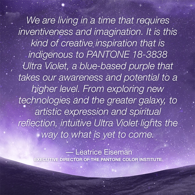
We are living in a time that requires inventiveness and imagination. It is this kind of creative inspiration that is indigenous to Pantone 18-3838 Ultra Violet, a blue-based purple that takes our awareness and potential to a higher level, exploring new technologies and the greater galaxy, to artistic expression and spiritual reflection, intuitive Ultra Violet lights the way to what is yet to come.
Complex and contemplative, Ultra Violet suggests the mysteries of the cosmos, the intrigue of what lies ahead, and the discoveries beyond where we are now. The vast and limitless night sky is symbolic of what is possible and continues to inspire the desire to pursue a world beyond our own. The color is also associated with mindfulness practices, which offer a higher ground to those seeking refuge from today’s over-stimulated and uncertain world.
5. What do you say to people who don’t like a particular year’s color?
I ask them to do two things:
Number one— think about the reasoning behind not liking it and is it still relevant in their lives today? Does their aversion stem from childhood event or a negative experience with a color?
Number two — I ask them to open their minds to the challenge of experimenting with the color, if only in touches or accents and it will generally start to grow on them! How about trying a scarf or an accent pillow or flowers on your desk? It does help to exercise your ingenuity and creativity to make it work.
It doesn’t have to be your favorite color; that’s not the point. The point is to get people talking about color. I say, try it, you just might like it!
6. What have past Color of the Year selections been?
• 2017: PANTONE 15-0343 Greenery
• 2016: PANTONE 15-3919 Serenity and PANTONE 13-1520 Rose Quartz
• 2015: PANTONE 18-1438 Marsala
• 2014: PANTONE 18-3224 Radiant Orchid
• 2013: PANTONE 17-5641 Emerald
• 2012: PANTONE 17-1463 Tangerine Tango
• 2011: PANTONE 18-2120 Honeysuckle
• 2010: PANTONE 15-5519 Turquoise
• 2009: PANTONE 14-0848 Mimosa
• 2008: PANTONE 18-3943 Blue Iris
• 2007: PANTONE 19-1557 Chili Pepper
• 2006: PANTONE 13-1106 Sand Dollar
• 2005: PANTONE 15-5217 Blue Turquoise
• 2004: PANTONE 17-1456 Tigerlily
• 2003: PANTONE 14-4811 Aqua Sky
• 2002: PANTONE 19-1664 True Red
• 2001: PANTONE 17-2031 Fuchsia Rose
• 2000: PANTONE 15-4020 Cerulean
For more information and to view all of the past Color or the Year selections go here.
Now, I have a question for you, are you seeing Ultra Violet everywhere since the Color of the Year announcement? Funny how that happens….