June 20, 2011
In Full Color
Bright and neutral hues mingle
By Andrea Lillo
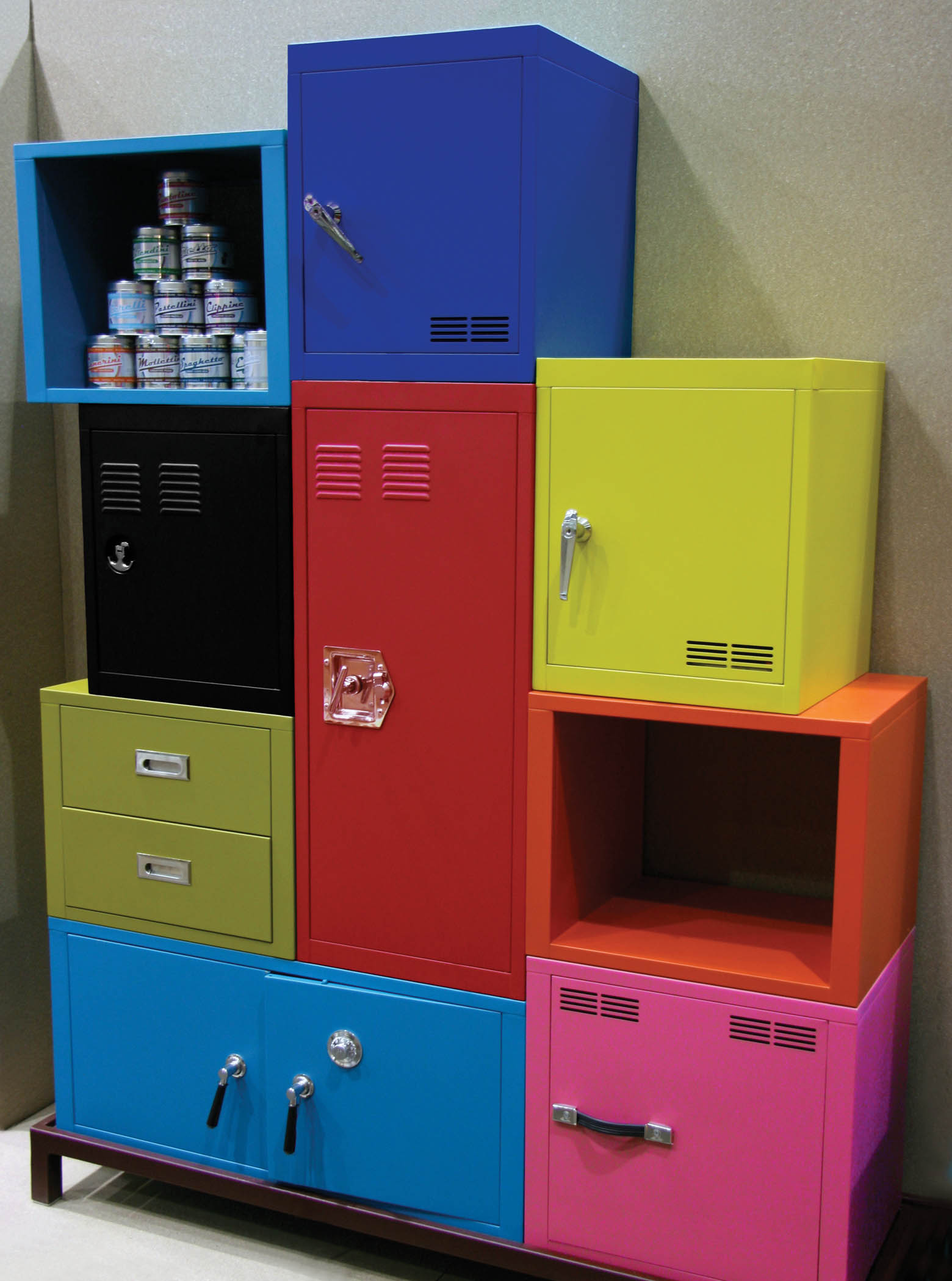
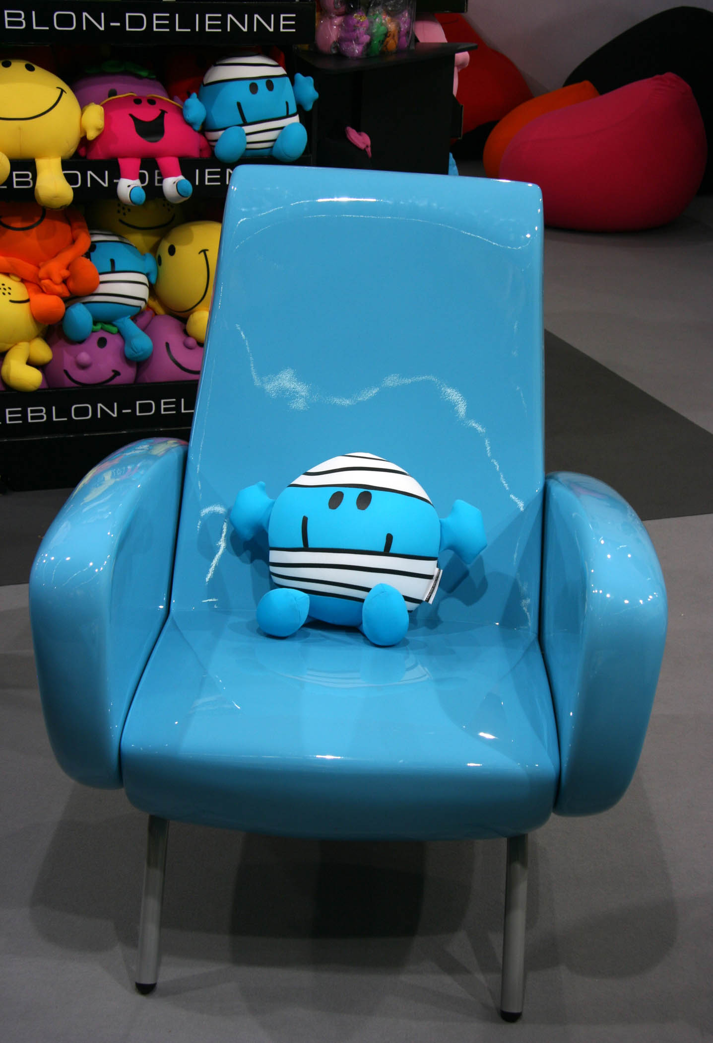
Color-while always a key ingredient in purchasing decisions-has gained a whole new level of importance, bringing bolder tones to the home furnishings arena.
Attendees at this year’s trade shows have been hit with wave after wave of product introductions in a range of hues. “Color, color and color” was the response one exhibitor gave at a recent show, when asked what consumers are looking for.
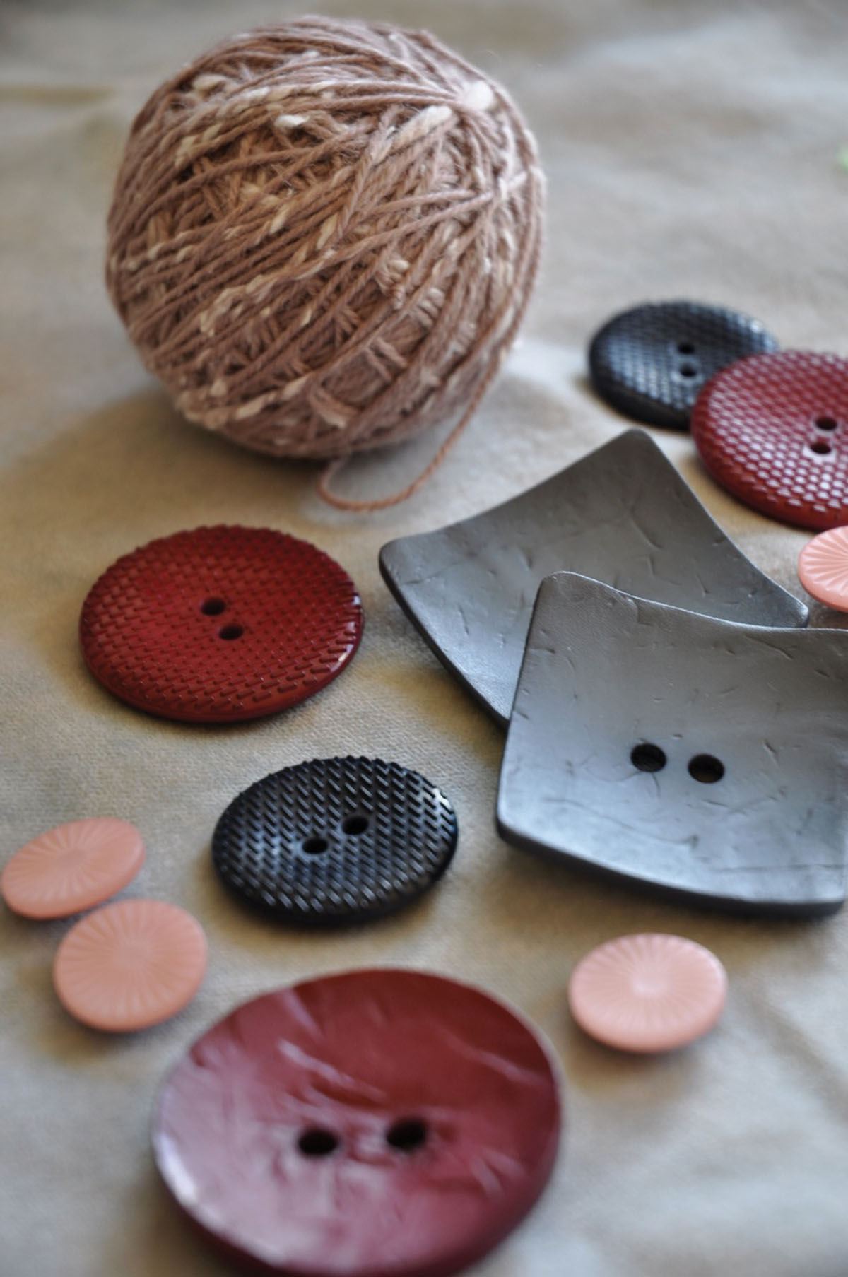
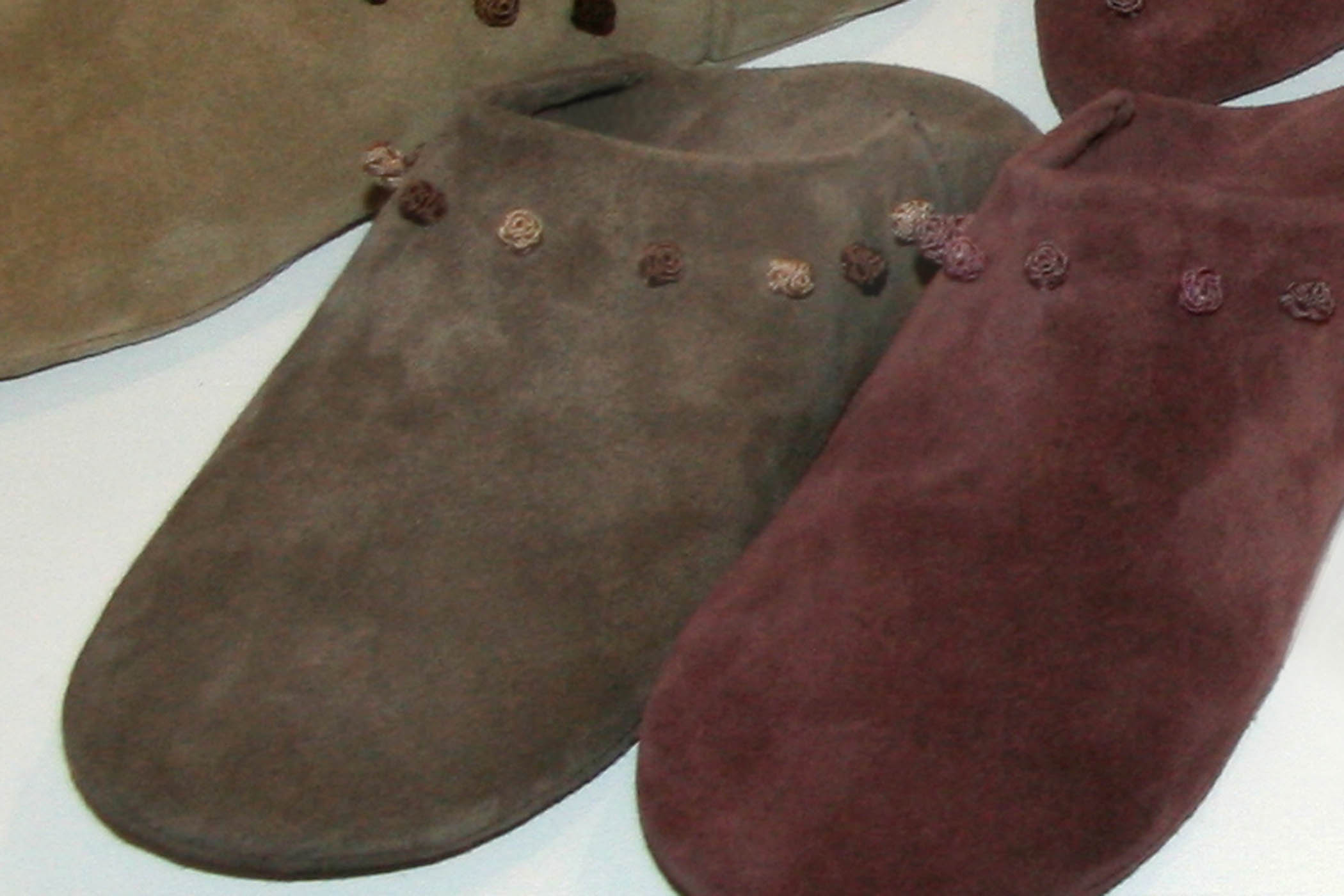
The last decade has seen the rise of the educated consumer, who gained decorating confidence after watching such channels as HGTV and a growing group of celebrity designers telling her to go for it. And now so much is available at consumers’ fingertips so quickly-she can find the exact shade of a color on the spot with an app on her smartphone, for example, or discover what the latest trends were at an overseas trade show through a blog or social media website before the show ends. So now color for the home has taken two distinct directions. In one color camp fall the subtle and the sophisticated tones such as weathered grays and chocolate browns. And in the other, the bold and the bright such as purples and pinks.
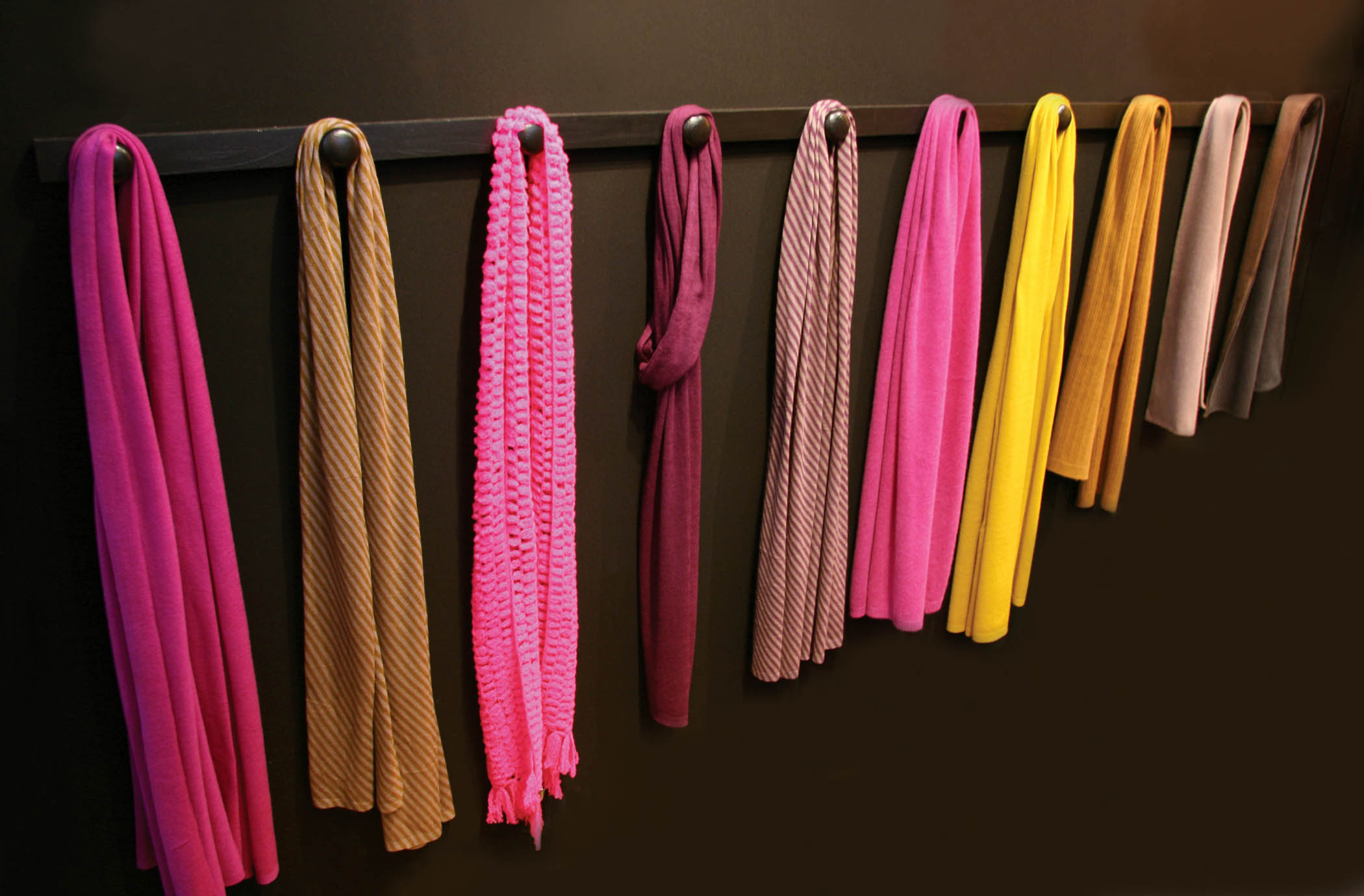
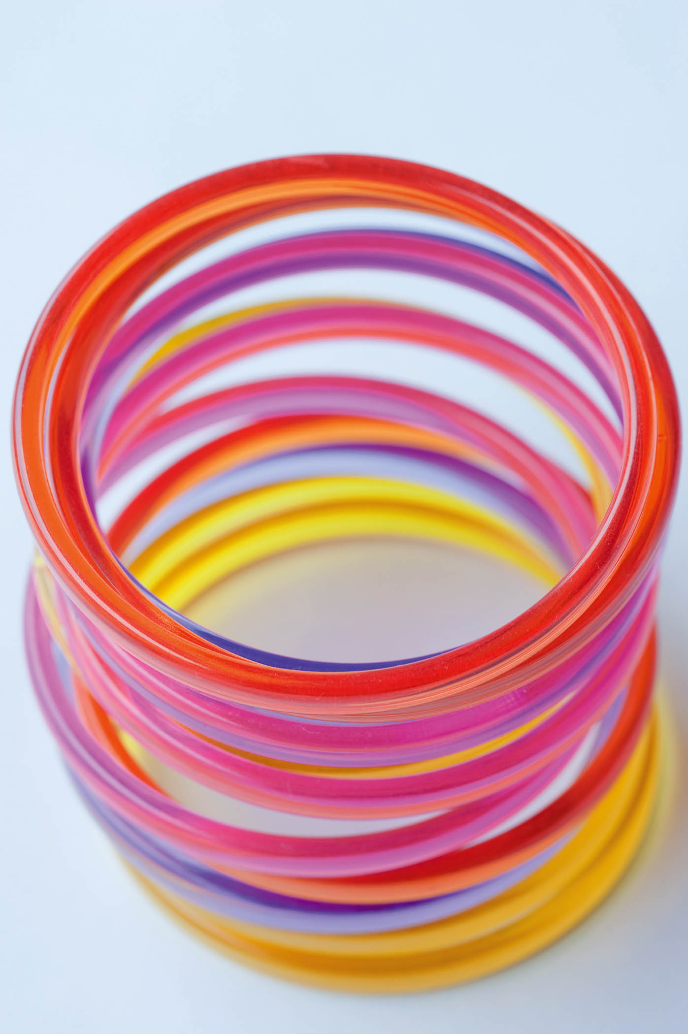
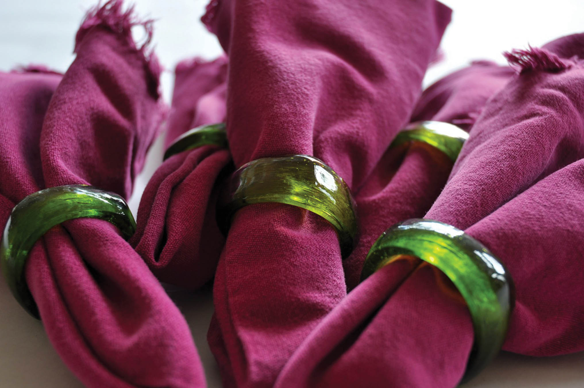
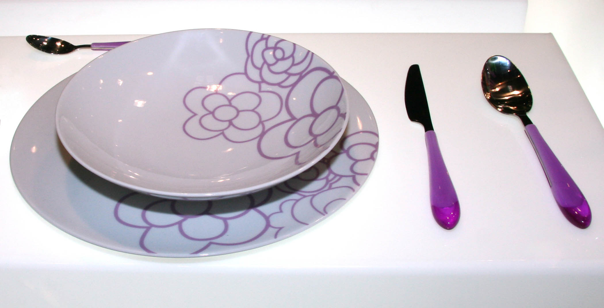
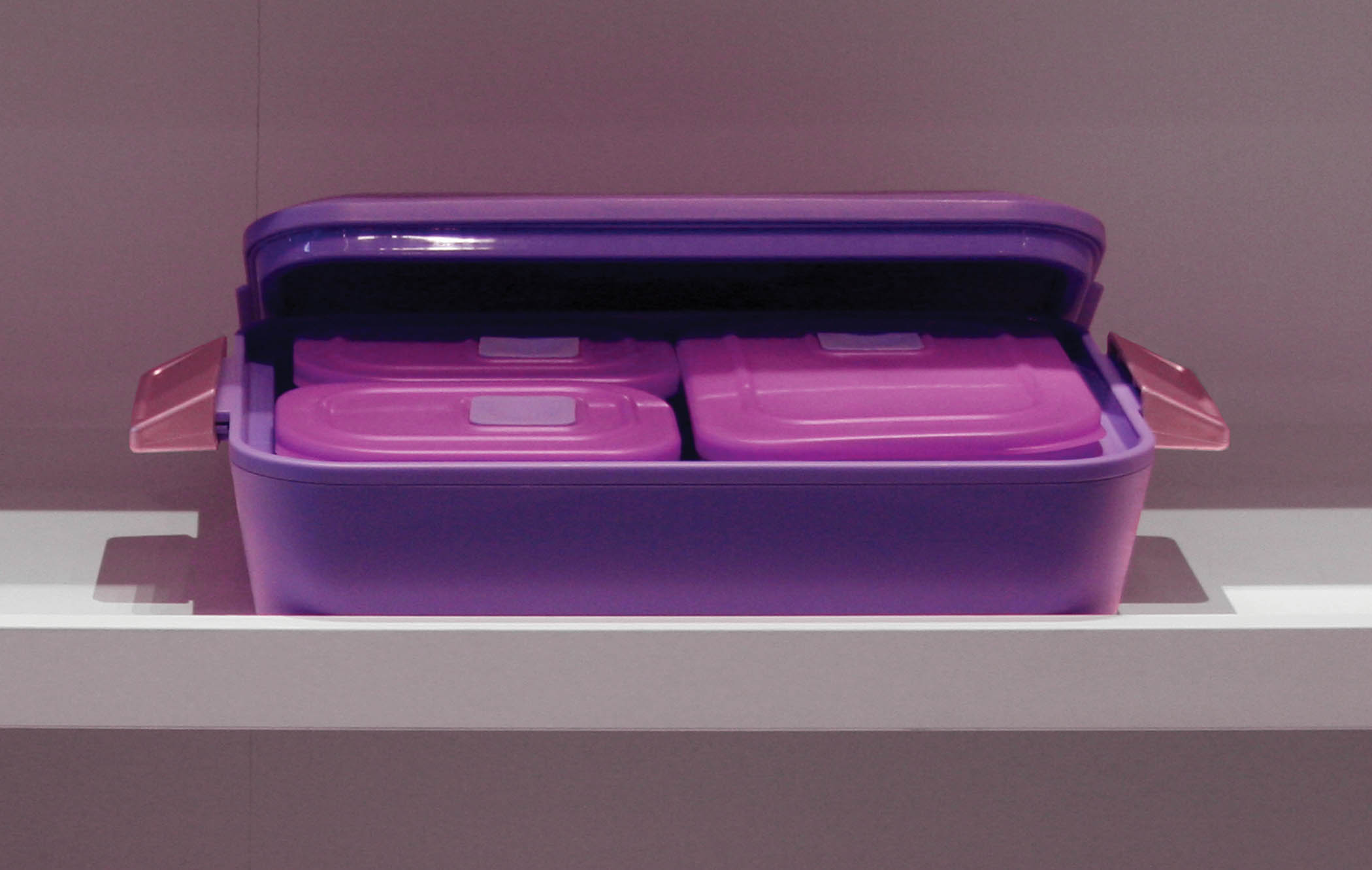
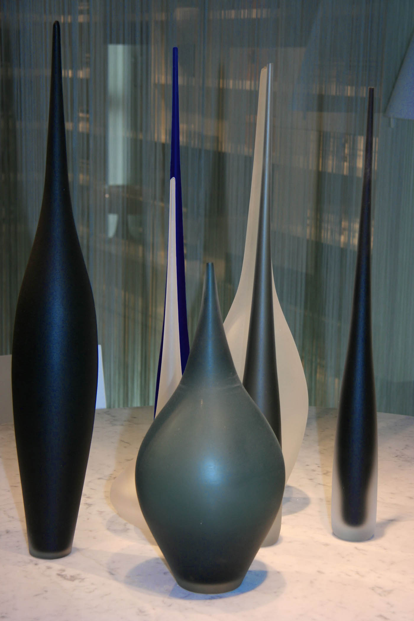
Both groups have been well represented at recent shows. Gray, for example, never before prevalent in the tabletop category, was much more visible at last month’s New York tabletop market. Brights were rampant on the show floor at March’s International Home + Housewares Show-down to colorful cutlery blades. From furniture to flooring, products now come in powerful pops of color. What makes color fresh now is when the neutrals and brights mingle, said Leatrice Eiseman, executive director of the Pantone Color Institute. “It’s all about newly invented color combinations.” By taking what people already have in their homes, and adding in a different hue, the result “brings newness to it.”
For example, Nouveau Neon-one of Pantone’s nine color palettes in its Pantone View home + interiors 2012 color forecast, and one that will be especially influential going forward, she said, along with the palette Back to the Fuchsia-includes vibrant, though non-acid, tones and pairs them with grays and beiges such as butter rum. “It’s such a more sophisticated use, but still has a playful feeling,” Eiseman said. When you put butter rum against citrus, for example, “you have a whole new thing. It just delights me.”
NOUVEAU NEON
And consumers appreciate that knowledge-“it empowers them,” Eiseman said.
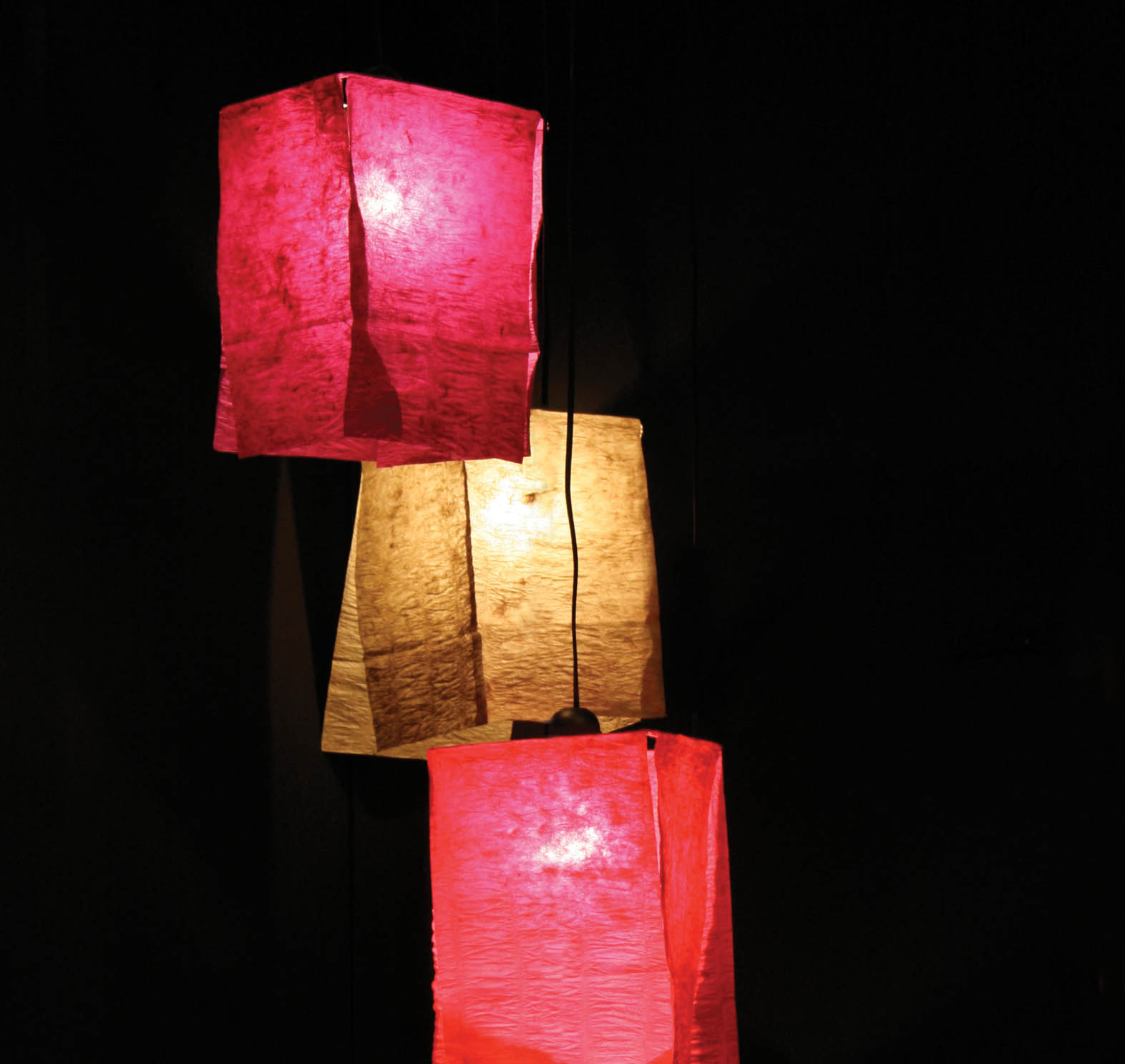
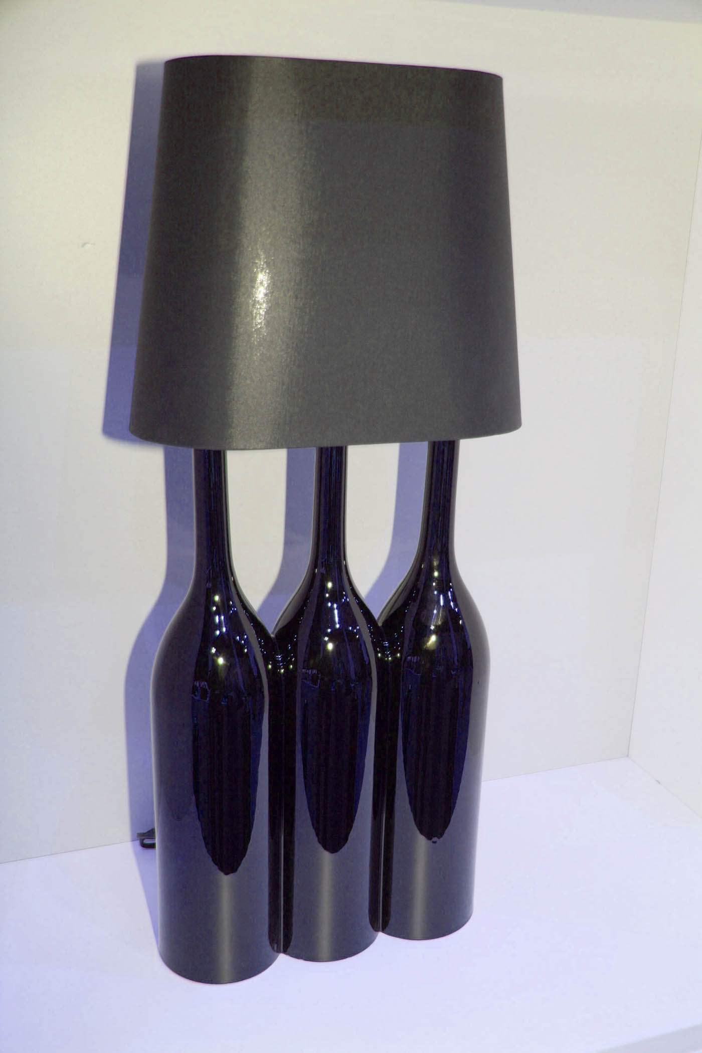
Consumers who are pulling back on bigger purchases will still spend money on the smaller items-decorative pillows, lamps, area rugs, tabletop-to bring some pop of color into the décor they already have, Eiseman said. But that doesn’t mean that larger pieces can’t also be bright.
BACK TO THE FUCHSIA
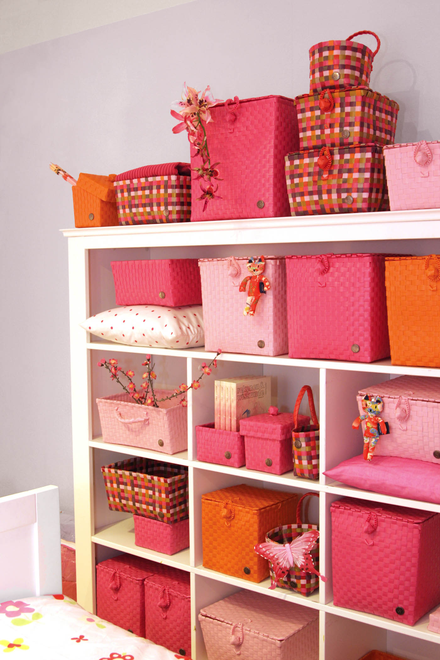
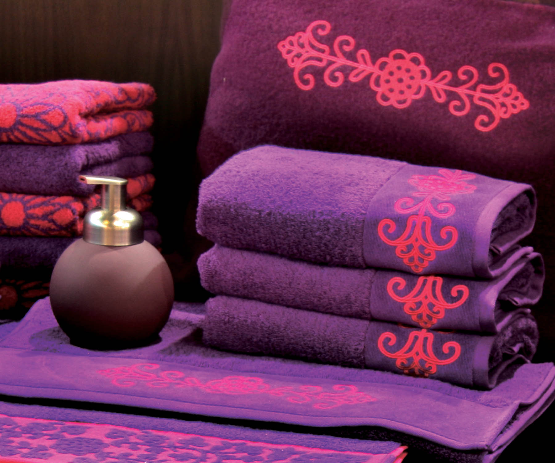
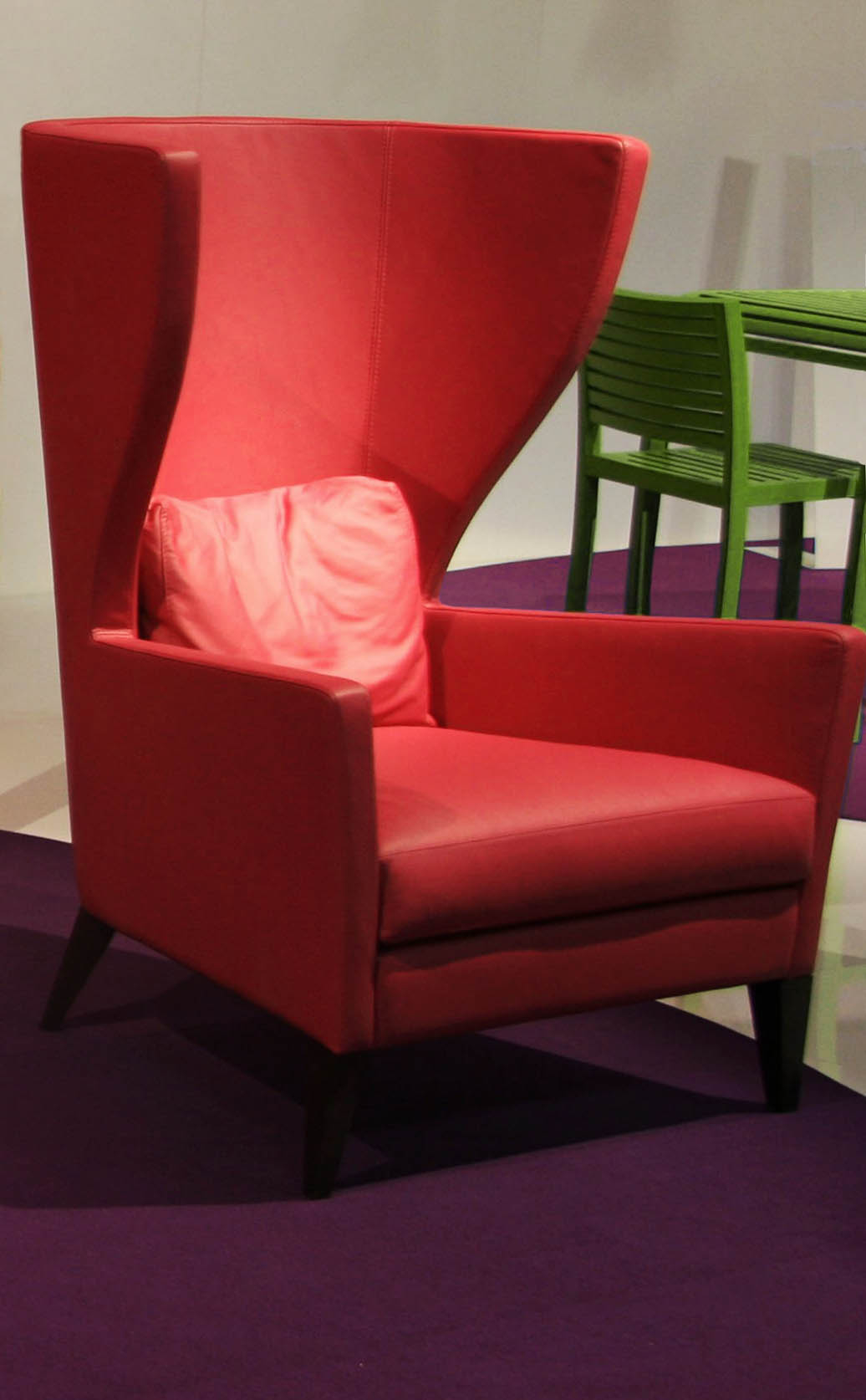
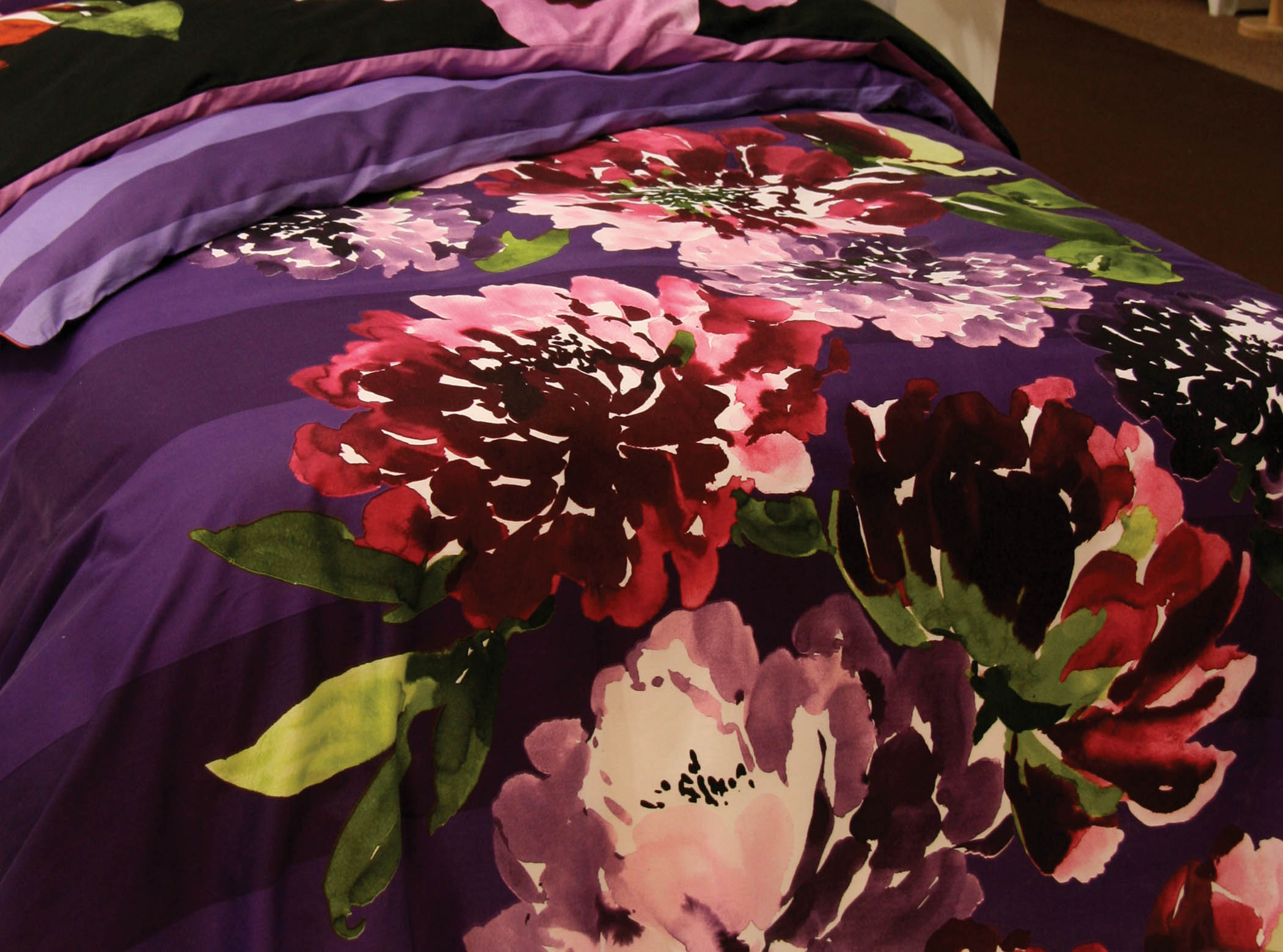
At last month’s Milan Furniture Fair, Eiseman was “absolutely astonished” at the number of products-“these are much bigger [albeit costlier] pieces”-that fell into the Back to the Fuchsia palette, which contains purples and pinks, along with peridot green.
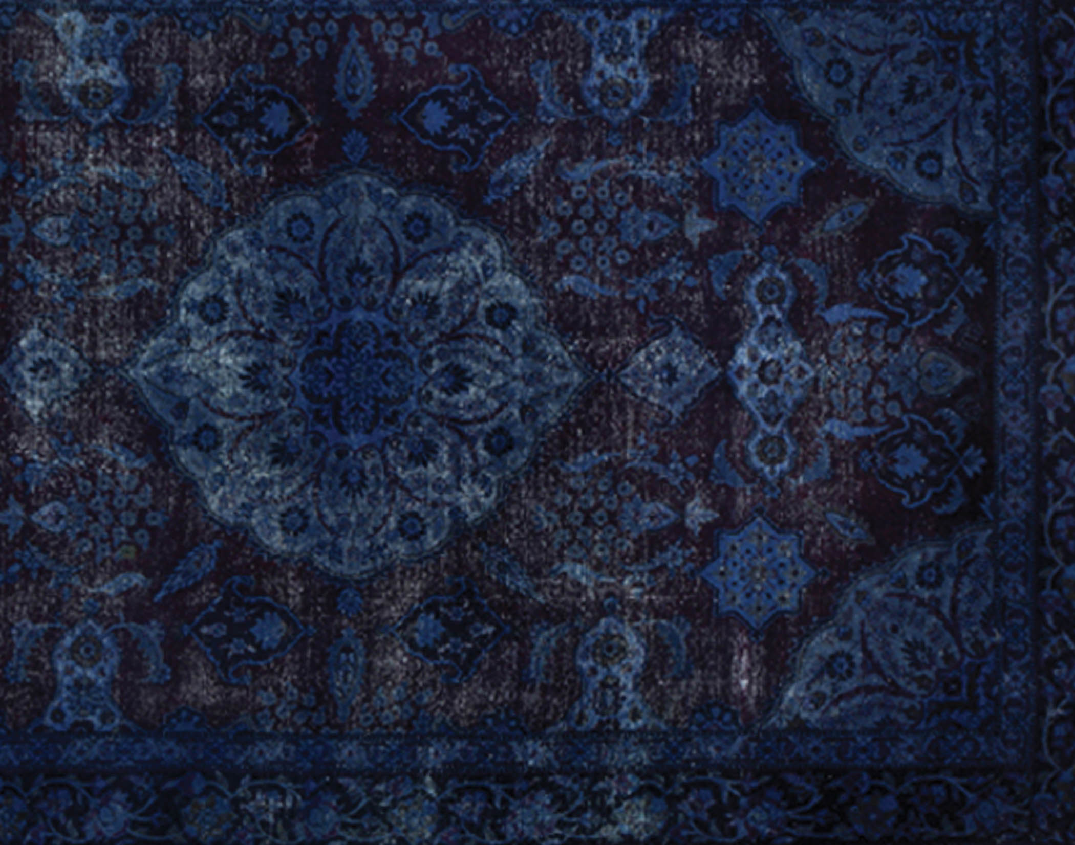
For consumers who are dedicated lovers of blue, there’s the growing appearance of indigo-which has its own Pantone palette for 2012, called Indigo Effects, and which includes a grayed green, a maroon and a purpley indigo. “Indigo is meditative,” Eiseman said. Brights engage the eye, said Eiseman, and are especially welcome after the last few years. “We want to see the light at the end of the tunnel,” she said. “It’s natural when we’re feeling down that we want a pick me up.”
INDIGO EFFECTS
And by adding a calming neutral-such as gray, a classic hue with longevity, Eiseman said-the combination works. “It’s all in the mix of how you present them,” she said. “You’re blending the playful with the practical.”
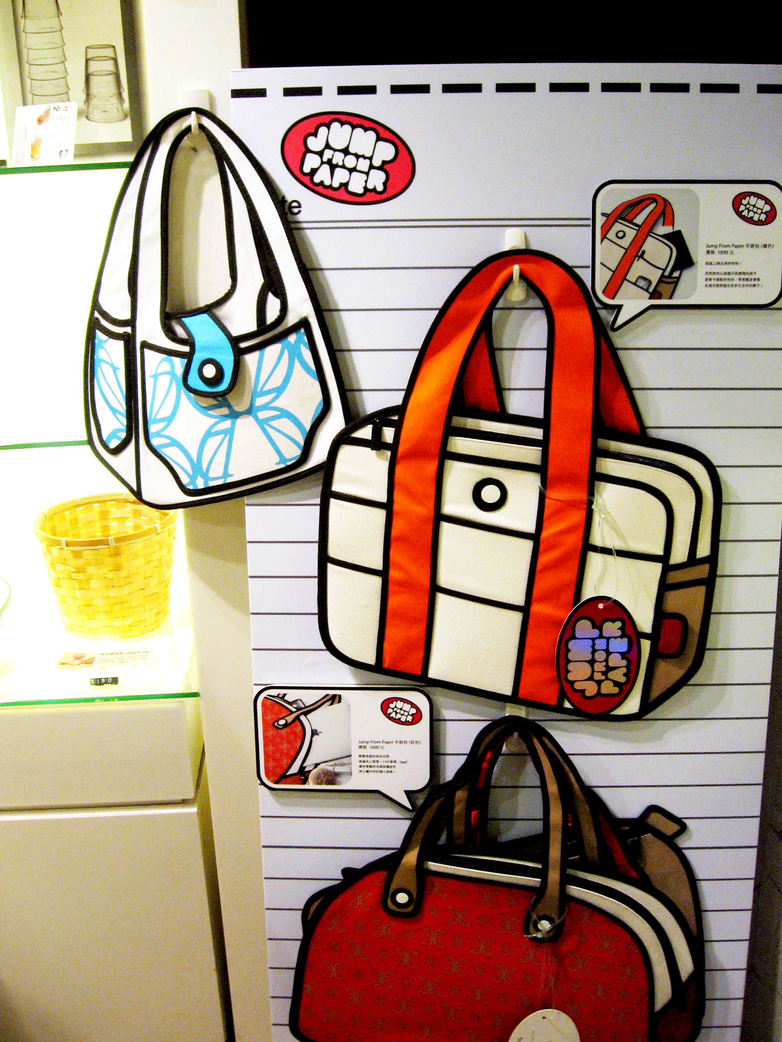
COMICS
Eiseman points to several artists as influencing some of the bright, comic pages colors one is seeing pop up. Paintings of donuts from Kenny Sharf and of cakes and pies from Wayne Thiebaud have become popular, as have the gelatin food art from event planners Bompas & Parr, and they all “play right into that,” she said. “What better reference in the kitchen is art of food?” she said. “There’s been a resurgence of art with goodies.”






At this moment I am going away to do my breakfast, when having my breakfast coming again to read other
news.