COLOR AND EMOTION:
A PERSPECTIVE ON WARHOL
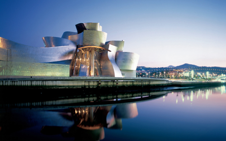
Several months ago, I received an email from one of the curators of the Guggenheim Museum in Bilbao, Spain. They had seen the work I had written for the Agnes Martin* exhibit at the Tate Modern in London and wondered if I could do a presentation in Bilbao. It took me all of a half minute to make up my mind, as I have long wanted to visit the Guggenheim in that location. So I said yes before I even knew the subject!
It turns out that the subject I was asked to address is Andy Warhol, the pop artist icon of the 1950s-1980s, as the Guggenheim is currently showing two of Andy’s most ambitious works: Shadows
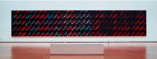
and One Hundred and Fifty Multicolored Marilyns.
One of the most enjoyable things about doing presentations is collecting the research that is such as important part of the talk. I had done some research on Warhol for one of my books, The 20th Century in Color, and had some preliminary information to start with. Of course, Warhol is all about color and that made it especially interesting to me.
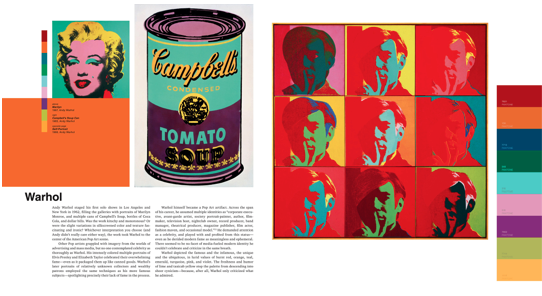
I turned to one of my favorite art historians, Sister Wendy Beckett. In her book: 1,000 Masterpieces, 1999, DK Publishing, New York, there is an overview on Andy Warhol’s work that is titled the Marilyn Diptych — a colorful study of the actress, Marilyn Monroe, who is also the subject of one of the collections mentioned above: One Hundred and Fifty Multicolored Marilyns. Sister Wendy said of Warhol: “He was interested in what might be described as contemporary vulgarities. He loved glamour and fame…
…here was a subject for Warhol and he treated her with profundity.” Sister Wendy suggested that his use of vibrant colors on half of the images signified Marilyn’s life and the removal of color in the other half signified her death. By using Marilyn’s image repeatedly, he “acknowledged his fascination with a society in which personas could be manufactured, commodified, and consumed like products.”
The color palette used for the grounds of the Shadows includes more than a dozen different hues, certain colors that are characteristic of his larger body of work, including violet, aqua, chartreuse, apricot, hot pink, and black. To quote from the Guggenheim’s press release on the collections: “Unlike the surfaces of earlier paintings, in which thin layers of rolled acrylic paint constituted the backgrounds onto which black pixelated images were silkscreened, the backgrounds of the Shadows canvases were painted with a sponge mop. Seven or eight different screens were used to create Shadows, as evidenced in the slight shifts in scales of dark areas as well as the arbitrary presence of spots of light.”
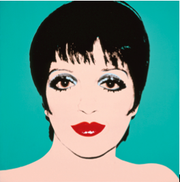
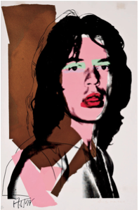
As always, there is much to learn about observing the use of color in different mediums and Warhol’s work certainly is an example of a most prolific career. Check out the images that are posted on this blog and you will get a glimpse of his versatility and depth. His work is certainly not just about Campbell’s Soup cans!
We worked out the date for the visit to Bilbao so that it dovetails with our trip to Salone de Mobilier in Milan, a destination for us every year to that fabulous furniture fair. My associate, Melissa Bolt, is going with me and she will be taking lots of images of the museum and the surrounding areas that we will be sharing with you in a future blog posting.
*See archives Eiseman Color Blog Aug. 15, 2015
Leatrice Eiseman, executive director of the internationally famous Pantone Color Institute, will offer a different look at Andy Warhol’s work, particularly his works Shadows and One Hundred and Fifty Multicolored Marilyns, and his peculiar way of using colors. An expert in color psychology, Eiseman will talk about the emotional perception of color from the perspective of culture and association.
Venue: Museum Auditorium
Date and time: Monday, April 11, 6:30 pm
Free tickets available at the admission desk and on the website


