August 1, 2011
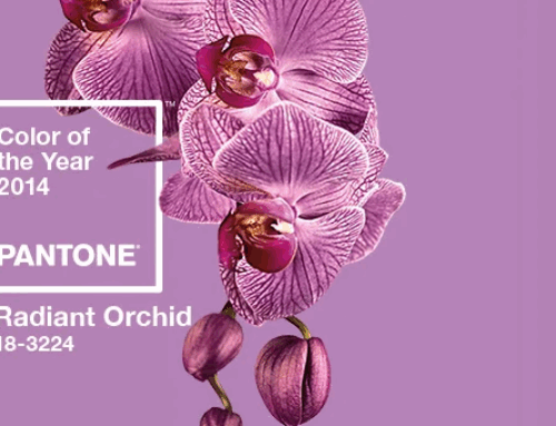
In the 2012 Pantone View Home + Interiors you will find a color palette based on The Comics.
“Cartoons come to life in this effervescent palette called The Comics. Funny paper hues pop off the page in whimsical ways that bring a smile and create the need to take some time to play. Ominous phantom black provides the backdrop for sulphuric yellow and fiery red. A flash of green provokes a strong blue while an inky cyan plays up to the honeysuckle and primrose…”


This is a far stretch from the comic color palette of long ago. Which comes as no shock with all of the advances in computer technology. Gerry Giovinco gives a thoughtful rationale in his series entitled The Comic Company: True Colors – Part 3. Gerry writes “Color in comic books had a specific look for fifty years prior to the 1980′s. Flat color was the norm and part of the charm of the comic books that I grew up reading. There was just something about that limited palette and those pronounced dots that seemed to define the medium as much as the words and pictures that they illuminated. Others agreed and focused on this idiom when referencing comic art in pop culture.”

Ed Piskor was so inspired by this story that he created a digital palette in Photoshop for those of you who are interested in recreating these colors for your personal projects. Click the image below to go to Ed’s site for more information on Ed and this palette.


Love the bright colors. Co