January 27, 2014
I am always intrigued by trending or popular stories that are making their way around the web. I have been known to indulge in my fair share of sharing of colorful infographics and eye catching imagery, thank you, Pinterest. But once the initial glow of awe has dissipated it is then when the real work gets started.
In the color business it is crucial that information be correct when it comes to color as our upbringing and personal experiences shape our lives and perceptions of things. Often our personal feelings can override our objective behavior and we can set things into motion that may not be exactly as they appear. This is especially important in color matching when you are seeing things online versus in person. It is here that I might add the disclaimer that everything you read/see on the internet is not true.
Let’s talk specifically about the most recent color goodie from Google Alerts, that came across my computer screen titled ‘Forget the blue plate special: Have the red plate dieter’s meal’ by Tom Jacobs for Salon.com.
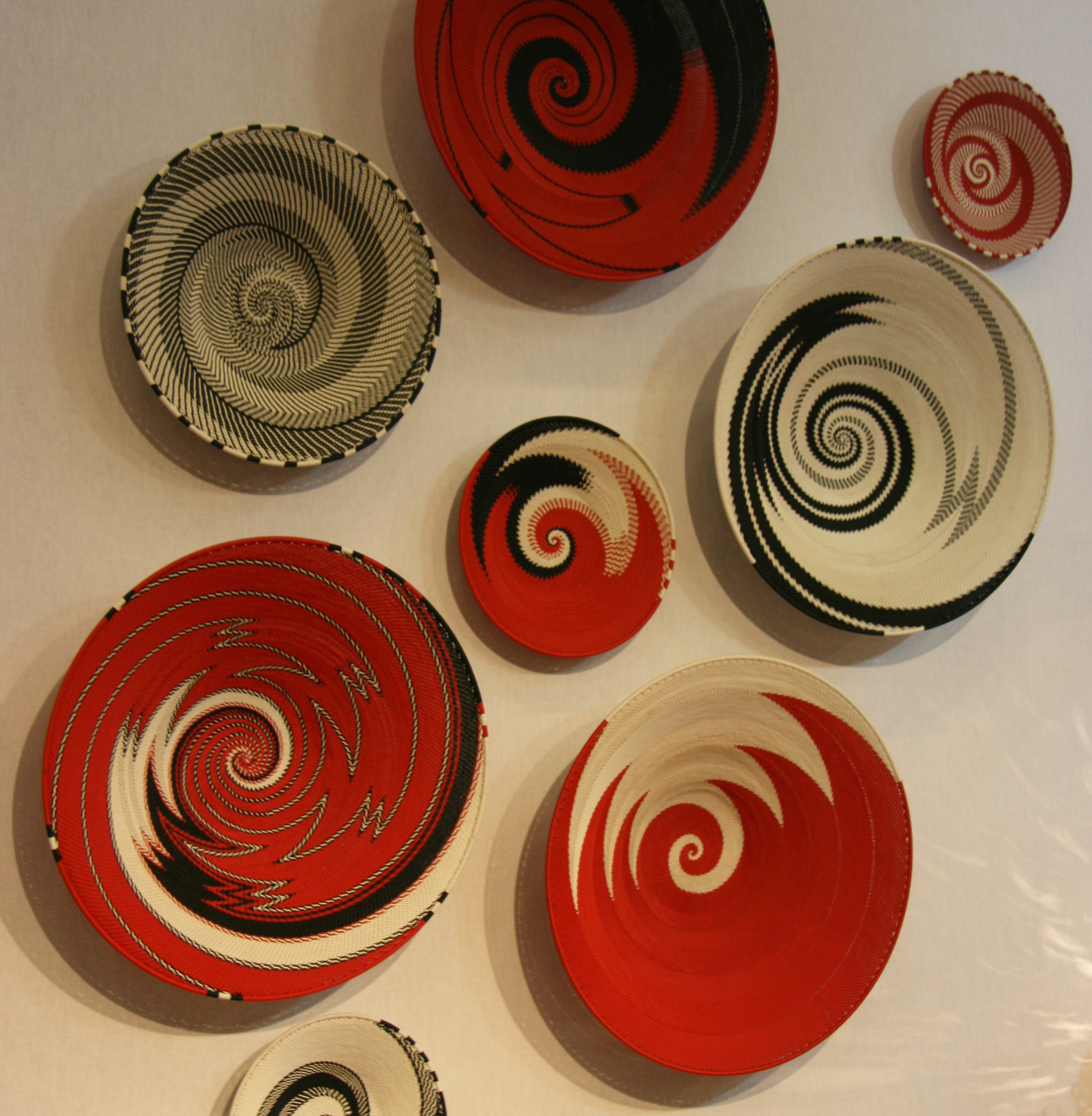
Are these plate studies confusing you?
Here is an excerpt. “…the takeaway from a recent study by researchers from the University of Parma in Italy, published in the journal Appetite.
The researchers served test subjects popcorn and chips on crockery of various colors, and found that the snackers sampled smaller amounts when the items were offered on red plates. The subjects reported the same level of enjoyment of the treats regardless of what they were served on, suggesting the plate color made the difference.
The researchers theorize that red—due to either cultural associations such as traffic lights or biological ones such as blood—is linked in our minds with “danger and prohibition.”
It sounds compelling. Let’s take a closer look at the actual study. Here is the Abstract.
“Recent literature suggests that individuals may consume less food when this is served on red plates. We explored this intriguing effect in three experiments. Independent groups of participants were presented with constant amounts of popcorns, chocolate chips, or moisturizing cream, on red, blue, or white plates. They were asked to sample the foods (by tasting them) or the cream (by rubbing it on the hand and forearm) as they wished and to complete mock “sensory analysis” questionnaires. Results confirmed that red plates reduce taste-related consumption and extended this effect to the touch-related consumption of moisturizing cream. Suggesting that the effect was not due to a decrease in the consciously experienced appeal of products on red plates, overall appreciation of the foods or cream did not differ according to plate color. After careful photometric measures of the materials used for each food-plate pairing, we determined that food and cream consumption was not predicted by Michelson (achromatic) contrast. Although the origin of the intriguing effect of the color red on consumption remains unclear, our results may prove useful to future potential explanations.”
The results were “unclear.” I wonder why that part didn’t make it into the article.
I hope none of you ran out to get those red plates. I too get excited about new studies (especially those on color) that come out but I have learned to take the extra time to trace the information back to the original study to fact check as the information has a way of getting twisted just enough to create a buzz.
We may be a nation in need of dietary assistance but preying on our insecurities and color assumptions or misinformation, is not the way to go about it. As seekers of color truths, it is our responsibility to change the color conversation to properly reflect colors’ true psychology.


Great reminder, Lee! That’s why so many of us rely on you – you’re our trusted source for digging & discerning more deeply & translating the content into accurate information. Thanks so much!
Thank you for reading and the support. It means a lot to me that you took the time to comment. I love to dispel color confusion.
I agree, you’re the Queen of the Color Universe in my book! Thanks for continuing to speak the truth about color.
Thank you, Sorcha89. Your comments and support are greatly appreciated.
Reblogged this on Fibery Things and commented:
Very pretty plates