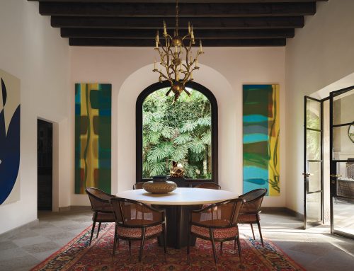
In almost every area of the world, there are examples in museums that give us the best insights into the use of color. From big monolithic buildings to small hometown spaces, there are some wonderful repositories of art, sculpture, crafts, and photos that help to tell the stories of the artists who created them.
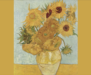
Van Gogh, Sunflowers, 1889
Some of the artists’ intentions have been well-documented through film and literature. More recently, virtual reality, digital offerings, and projections shown both inside and outside traditional museum walls have drawn hundreds of thousands of people. The Musée d’Orsay in Paris alone has attracted more than 800,000 to the Van Gogh immersive experience.
Vincent Van Gogh’s love of yellow is known throughout the world. His Sunflower series is famous for his use of just three shades of yellow, demonstrating that a stunning depth can be created just by using variations of the same color. His feelings about his beloved color were that they represented warmth, gratitude, and vitality. He gifted his good friend, Paul Gauguin, with a Sunflower painting as a “thank you” for sharing his home during a time of need.
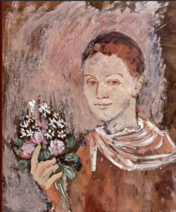
Pablo Picasso, Young Man with Bouquet, 1905
Another very notable artist who used color symbolically was Pablo Picasso. In the early part of his career, he was much affected by the death of a close friend and reflected his grief by painting in cold, somber dusky grays, greens, and blues; a phase often referred to as his “blue period”. Fortunately, he moved to Paris from his native Spain, fell in love, and his mood lifted as he entered his “rose period” filled with blush-like pink and other warm tones. Newly enthralled by the circus, he filled his canvases with more colorful harlequins, acrobats, and clowns. As Picasso later expressed: “Colors, like features, follow the changes of the emotions”.
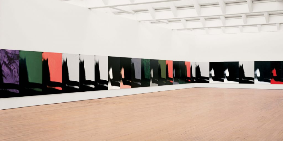
Architecturally, one of the most dynamic of all museums is the titanium-clad Guggenheim in Bilbao, Spain. It was on my wish list, and fortunately I was invited there to do a presentation on the colors used by world-famous American artist, Andy Warhol. But this was a different view of Warhol’s work. Rather than the usual red Campbell Soup cans or glamorous movie stars like Marilyn Monroe or Elizabeth Taylor in oversized vibrant squares, the Guggenheim mounted a Warhol exhibit called Shadows.

Andy Warhol’s Shadows at the Guggenheim Museum, 1978-79
The color palette he used includes more than a dozen different hues, including violet, aqua, chartreuse, apricot, hot pink, and black. To quote from the Guggenheim’s press release on the collection: “Unlike the surfaces of earlier paintings, in which thin layers of rolled acrylic paint constituted the backgrounds onto which black pixelated images were silkscreened, the backgrounds of the Shadows canvases were painted with a sponge mop. Seven or eight different screens were used as evidenced in the slight shifts in scales of dark areas as well as the arbitrary presence of spots of light.” As always, there is much to learn about his use of color in different mediums. Warhol’s work is an example of a most prolific and colorful career that defied the usual “rules” of color, preferring instead the quirky ambiguity of his abstracted mindset and resulting artwork.
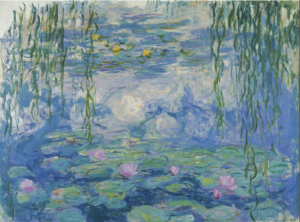
Claude Monet, Nypheas, 1916
In the U.S., one of the most revered and traditional structures—guarded by green patinaed lions—is the Art Institute of Chicago. This imposing edifice houses the largest collection of Claude Monet’s work outside of Paris. The collection includes the famous waterlilies and haystacks, showing color and light reflected at specific moments in time. He often placed complementary colors next to each other (like blue and orange or yellow and violet). Called simultaneous contrast, this technique heightened the intensity of both hues, and his color choices were intended to evoke specific emotional responses.
Personally, I was very taken with Monet’s use of color, especially how he showed the influence of light, and how he showed that the perception of a color can change at different times of day. I spent days at the museum studying and researching his work. I visited his gardens in Giverny, France, to view his colors in real time, further validating and inspiring the ColortimeⒸ theory that is utilized in our Colortime Image Online Training and Interior Design Online Training.
To demonstrate Monet’s personal passion in his own words: “Color is my daylong obsession, joy, and torment”. While we might agree with the first two feelings, our goal is to replace the word “torment” with “comfort”!
Leatrice Eiseman is a world-renowned color expert, known as the “International Color Guru”. She is the founder of the Eiseman Center for Color Information & Training and the Executive Director of the Pantone® Color Institute. Lee has written ten books on color, has been widely quoted in many publications, and recognized by Fortune Magazine and the Wall St. Journal as one of the most influential people in the world of color. Today, she is available as a corporate color consultant and a sought-after speaker. She also offers online courses on color theory and personal image color training.


Leave A Comment