

“Mood” is such an expressive and wonderful word when it comes to our living spaces. It can be described as an “air, tone, atmosphere, aura…..a feeling”… and those “feelings” result from our emotions and sentiments, along with our desires and aspirations.

Here, I talk about mood and color – and my periwinkle bedroom!
Color (or the lack of it!) is a vital conveyor of mood. It’s a catalyst for creating what the French refer to as an “ambiance”. It is the largest contributor to the mood when we enter a space, and a major contributor to the impression it makes. And it’s a big part of the memories you take with you when you leave the area. It is a powerful presence in your life, and the more you learn about it, the greater the opportunity will be to enhance your sense of comfort and well-being. You will be happier with the final results of your creative efforts if you get the color part right.
This is why I advise that instead of picking a color because of something you see on Instagram, you should first think about how you want a room to feel. What mood do you want to evoke? How do you want your guests to feel when they visit? Color moods can be inspired by many aspects of your life, including scenes of nature, travel destinations like places you have visited (or that are on your wish list), or even places that are especially meaningful to you. 
We can also be drawn to those colors that we associate with our favorite things. Look around you at objects you have collected. A piece of clay pottery trimmed with vibrant fiesta-like color from a trip to Mexico, muted green carnival glass found in a flea market, or the subtle, quieting pastels found in a favorite painting. All of these items are cherished for the feelings they invoke, and their colors can set that mood in your space.
 The colors that are indigenous to the part of the world you live in can also provide a sense of place. If you live near the ocean, it seems very natural to use the watery tones of blue, green, and blue-green, contrasted with a sandy beige. If you are nestled into a place in the mountains, then the rugged beauty of the world around might beg to be used in burnished shades of wood, brick red, earthy greens, and denim-like blues. If the desert is your perfect place, then the vibrant sunsets striated in shades of golden apricot, hot pink, purple and terra cotta always make you feel at home.
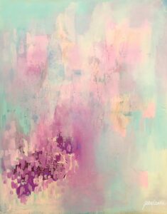 There are also more “emotional” moods that can inspire your décor colors. Ask yourself, “What do I want my home to reflect? How do I want to feel in that space? Do I want it to feel quiet, soft and restful, or full of energy and activity? Or perhaps a bit of both?” Obviously, softer shades, like soft blues, will lend a sense of tranquility, and bright colors will bring a sense of energy. Some colors can even do both! As I mention in this clip, I chose the periwinkle in my bedroom because it combines a sense of peace with the blue, but also has a zip of energy with the red undertone. The perfect combination.
There are many decorating resources to draw from, including visual apps and platforms, magazines and editorial sites that offer palettes to consider. If you feel you need more help, inspiration, and explanation, consider checking out the many books on the subject, including my book titled: Colors for Your Every Mood. You can also purchase a signed copy of the book here.



Leave A Comment