
A sunrise, showing cooler early morning colors.
One of the most important things to know about color is that you never stop learning about it, because color rules are never so rigid that they cannot be adapted to your needs. That said, color knowledge is a great place to start. A perfect example of this is interior design. The home is an extension of the people
A sunrise interior.
who live within it, and should reflect the personalities—and tastes—of the occupants. When people enter a home, they get a sense of the individuals who live within that space the moment they walk through the door.When surrounded by a cohesive and comfortable color palette, the home becomes a haven for well-being and self-expression.

A sunset, showing the rich tones of the sunset palette.
A colorless house, like so many on Instagram these days, has an austere, uninviting impact—but too many colors give a disorganized, jumbled impression. But not all colors are right for a space. An overwhelming use of cool colors, with little warmth, can make a home seem unfriendly and aloof. On the other hand, warm colors are instantly hospitable, but if the colors are too warm, the temperature can feel overwhelming, and the room can feel overstimulating and even physcially hot.
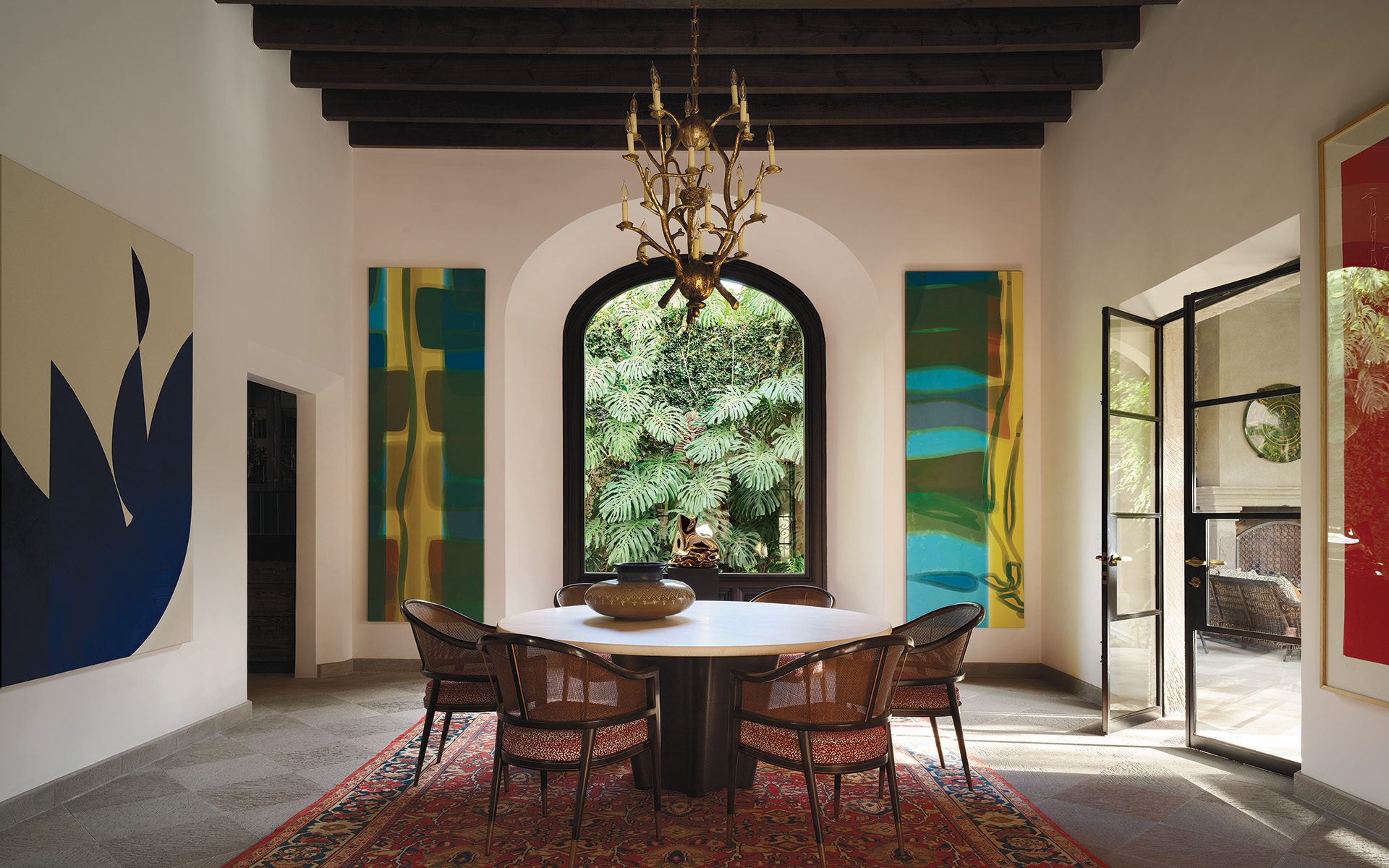
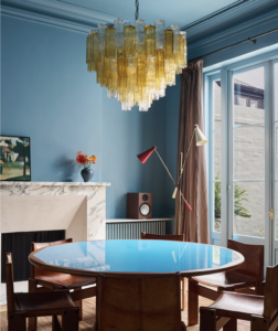
A sunset interior
So, how do we know which colors to use and create amazing color palettes for the home? Is it different if we’re starting with a blank slate, or if we need to select our colors based on an already existing palette?
In my book, More Alive With Color, I created a color system called the Colortime™ concept, which assigns colors based on a time clock. Colors appear to vary with the time of day, due to factors such as changing light and atmospheric particulates. We associated certain shadings, tints, values, and intensities with specific times of day, so it makes sense to organize colors into three palettes: morning (Sunrise), noon (Sunlight), and evening (Sunset).

A field of wildflowers at midday, showing the pastels of the sunlight palette.
For instance, at daybreak, we see the cool gray light of dawn, in clear and sometimes icy blues and dewy mists of green foliage. At noon, you feel the full strength of the sun, muting all colors into delicious, softer colors, including pastels. Think of the sherbert colors, meadow flowers, or boardwalk beach taffy. Ask people what colors we associate with the word “sunset”, and they will invariably say orange golds, fiery reds, twilight blues, and hints of hot purples.
A sunlight interior.
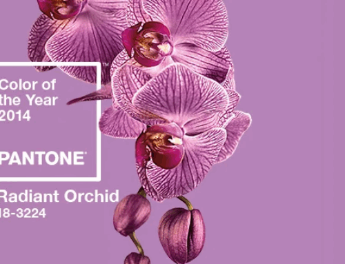
There is a fourth palette as well, which I refer to as the Crossover colors (see the photo at the top of this post). These colors are the colors that occur most frequently in nature, so the eye is accustomed to seeing them in combination with many other colors. These are colors that are generally referred to as classic, basic, and staple. They can be used with all other Colortime palettes.
The palettes and colors in the Colortime system can help you select colors that work for your clients or in your own space, as they are derived from a natural, intuitive system. If you are interested in learning more about utilizing the Colortime system in interior design and how it can simplify your choices, just click here or go to my “Utilizing the Colortime and Crossover Systems in Interior Design” page.
Leatrice Eiseman is a world-renowned color expert, known as the “International Color Guru”. She is the founder of the Eiseman Center for Color Information & Training and the Executive Director of the Pantone® Color Institute. Lee has written ten books on color, has been widely quoted in many publications, and recognized by Fortune Magazine and the Wall St. Journal as one of the most influential people in the world of color. Today, she is available as a corporate color consultant and a sought-after speaker. She also offers online courses on color theory and personal image color training.


Leave A Comment