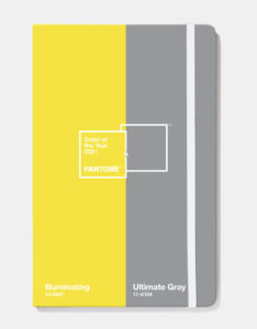
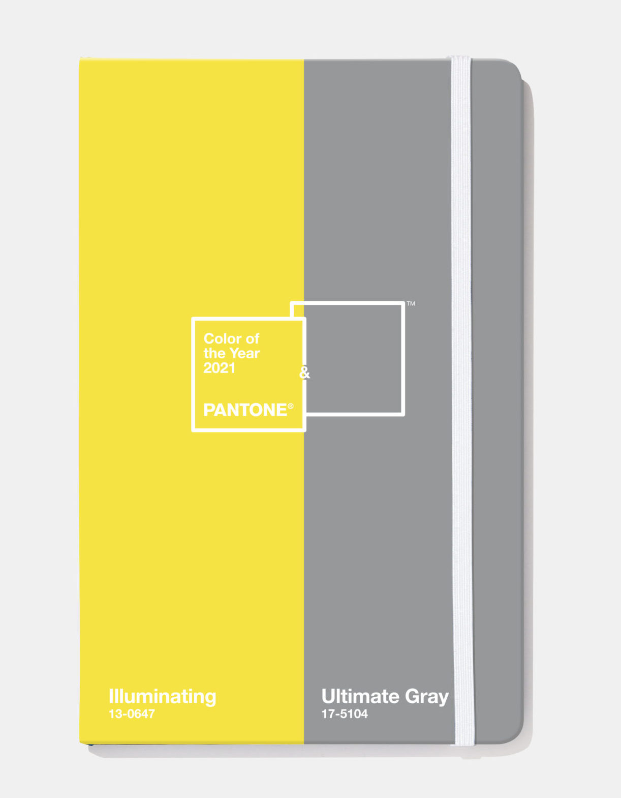
As we are nearing the end of 2021, it’s always interesting to look at how far-reaching the color (or colors) of the year have been, and this year it is Illuminating Yellow and Ultimate Gray. The reasons for choosing the color(s) always include the more emotional aspect of the hues—what the colors symbolize and how they express meaning.
As people look for ways to fortify themselves with energy, clarity and hope to overcome the continuing uncertainty, spirited and emboldening shades satisfy our quest for vitality. Illuminating is a bright and cheerful yellow sparkling with vivacity, a warming yellow shade imbued with solar power. Ultimate Gray is emblematic of solid and dependable elements which are everlasting and provide a firm foundation. The colors of pebbles on the beach and natural elements whose weathered appearance highlights an ability to stand the test of time, Ultimate Gray quietly assures, encouraging feelings of composure, steadiness and resilience.
As the executive director of the Pantone Color Institute, I was asked to contribute my thoughts on why we selected those two colors:
“The selection of two independent colors highlight how different elements come together to express a message of strength and hopefulness that is both enduring and uplifting, conveying the idea that it’s not about one color or one person, it’s about more than one. The union of an enduring Ultimate Gray with the vibrant yellow Illuminating expresses a message of positivity supported by fortitude. Practical and rock solid but at the same time warming and optimistic, this is a color combination that gives us resilience and hope. We need to feel encouraged and uplifted, this is essential to the human spirit.”
We have seen (and will continue to see) some really effective usages of the combinations in a variety of design areas and products. Let’s take a look at some examples:
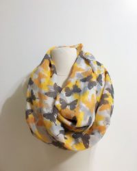
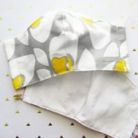
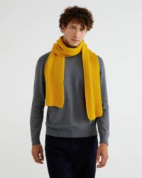
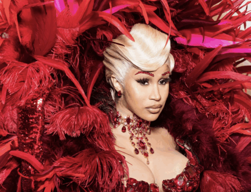
Of course, fashion is always an early adaptor, especially as an accessory color and we will see even more use of the combo as we head into the cooler months.
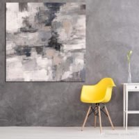
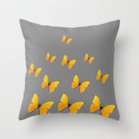
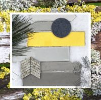
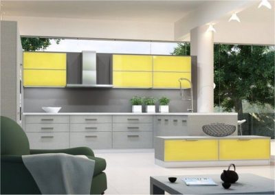
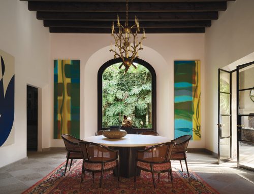
Yellow and gray has made it’s way into home products, in interior products and settings.
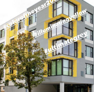
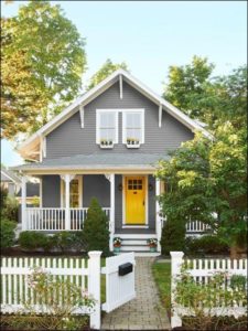
As well as exteriors, both contemporary and traditional.
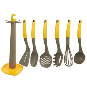
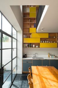
It finds a happy home in the kitchen…
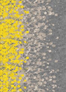
…or at the other extreme, in abstract art.
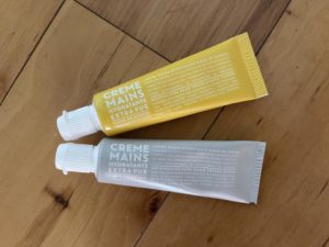
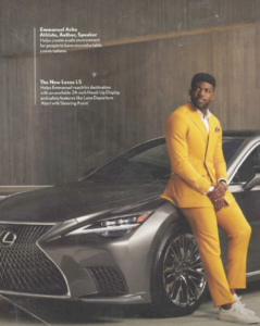
We have seen the combination used effectively in simple packaging and in a stylish high end automotive ad. It’s been a very adaptive color combo that we can expect to see continuing on in 2022.
Dear Lee:
I loved your “Blast From the Past” magazine cover!
It reminds me exactly of of a very citrusy, but sophisticated “custom color palette” i put together, after receiving some interesting information from a very smart cookie I know in Portugal.
The key color is “Juicy Orange”, followed by “Lemony Yellow” , “Plastic Pink”, and “Refreshing Lime”. Key Mixers are “Stainless Steel”, “Epoxy White”, and “Strong Man Black Vinyl”.
These colors are clean, sweet and vibrant, while also being fresh and delicious. They smack of our society developing the strength and natural immunity to thrive in the midst of adversity.
I sent you a card and a note through your website about a month ago.
I used to be on the Pantone Steering Committee for the United States, and also knew Todd Schulman when I was in the color and brand industry.
I am interested in getting back into a color field, and would love your thoughts on the best, most advantageous direction.
I hope that we can connect soon!
Stephanie J. Gwin
575-613-5360 cell