In one of my books, Pantone Guide to Communicating With Color, I referred to color as a “silent salesperson”. Even without the use of verbiage, color is known to work synergistically with all of the senses, symbolizes abstract concepts and thoughts, expresses fantasy and wish-fulfillment, recalls another time or place, and produces an esthetic or emotional response.
Marketing experts understand that one of the best places to gauge the effectiveness of color is within the marketplace where it is a vital key to communicating a positive, enticing, appealing, and irresistible image. Starting in childhood, we have all experienced that moment of “I have to have that” most often brought on by the color of the desired object that “speaks” to us.
Color is considered the silent salesperson as it attracts our attention and conveys a message of what the product is all about. For truly effective marketing, package colors must satisfy a “wish fulfillment” or need that the product promises to fulfill. For example, products offering cool refreshment are best in icy blue, green, or blue-green. Using warm colors like red, yellow, or orange (or any variation of those shades) would be counter-intuitive and turn the would-be customer off as they would be getting “mixed messages”.
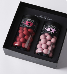
The question often arises, can color be used to sell yourself? And the answer is a resounding “Yes”! As explained in another of my books, More Alive With Color, the colors worn on a job interview give unspoken clues about you. if you are going for a glamour job in fashion or cosmetics, wearing a bright red can give you a dynamic edge and you will certainly be more memorable. But if your goal is entering a more conservative field like banking or finance, especially if you are going for a top-level position, deepening the red to a wine color will impart a more powerful and businesslike image.
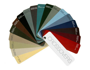
In that same book, there is a list of Crossover™ colors that are a vital part of the color theory called the Color Clock®. The Crossovers include those shades that the eye is accustomed to seeing in natural settings, making them very versatile and adaptable. Many of the Crossover colors are considered power colors including neutral grays, teal, aubergine, navy, black, taupe, and khaki.
As research and experience inform us, from clothing and cosmetics to cars and carpets, color is the magical ingredient for clinching the sale and the most effective means of delivering a message without saying a word.




Leave A Comment