
The term “after-image” describes an image that appears in the eyes after a period of exposure to the original image. They occur because photochemical activity in the retina continues even when the eyes are no longer experiencing the original stimulus. It sounds pretty amazing, and it is!! Most importantly, this mechanism is an automatic reaction. We don’t will it to happen, or imagine it will happen… it simply does. Importantly, this after-image phenomenon provides an instant visual balance.
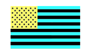
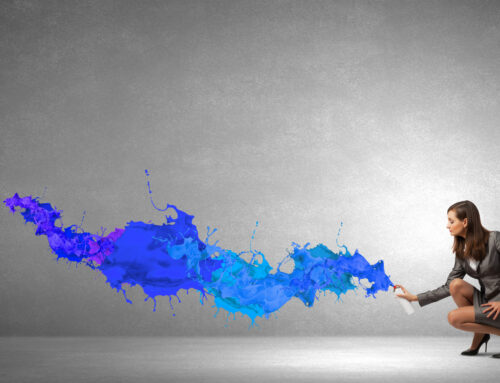
Stare at this image for 30 seconds then look at a white space.
For your own amazement and amusement, study any color surface for a few seconds and then look away to another plain surface, preferably white, and you will see the complementary color or the opposite color on the classic color wheel. If you were concentrating on red, you will see a blue-green tone and if you were focused on orange you will see its complement in blue. Staring at yellow will render a violet shade as its complement. You can see a great example of a color after-image here or to the right.
It is important to recognize that every color registers its opposite in temperature. A warm tone renders a cool color as its complement. This balance through the after-image phenomenon is a dramatic example of the human body’s instantaneous physiological need and ability to restore balance. This need to find balance is referred to as “homeostasis”, meaning “a state of equilibrium”, and we all have an innate drive to maintain both internal and external equilibrium.
We seek equilibrium physically, mentally, spiritually, socially, and aesthetically, and we are constantly playing a balancing act to restore it in our lives.
Interior design and after images
How does this affect design with color, though? Color can help us achieve the equilibrium we seek, especially in our surroundings. Our innate longing for a sense of balance can be satisfied in the way we decorate our living and working spaces.
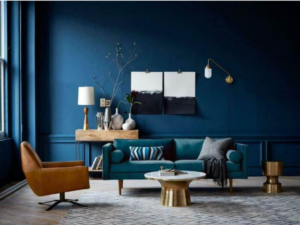
This Nazmiyal Collection image demonstrates how a predominantly blue room and furnishings are complemented by a contrasting warm rusty brown and brass gold.
If we have used too many hot or warm colors in a room, our eyes will search for something cool to rest on. Often that need can be satisfied by a green plant, a window that reveals some greenery, a print, or a painting with some cool tones. The opposite is true as well. If we are in a cold, sterile blue-white environment, we will do a visual search for something warm for the eye to rest on. For example, an Alaskan blue, frosty green, and icy white might seem very refreshing, but a dollop of a warm shade like lemon curry will keep the temperature in the room from going too sterile and cold.
In decorating our surroundings, we feel most comfortable and balanced in an atmosphere that sets a dominant temperature and then provides the presence of the opposite temperature.
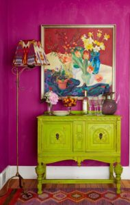
Variations of opposites on the color wheel can make for dramatic statements. Photo by Kritsada Panichgul.
To get a real sense of warmth or coolness, one color temperature must dominate. As in most design projects, it is important to do the math. Dividing the atmosphere into half warm and half cool won’t work; instead, one temperature should dominate so that the message is instantaneous. Aim for a color scheme that is 75 to 85% either warm or cool. If you live or work in a cooler climate, you might welcome cooler colors and the opposite is also true, a warm climate might welcome some cooling off.
Of course, it all depends on your comfort level and personal reaction to color. When in doubt, always choose a favorite color as the dominant color story or theme, because it will simply please you more… and that is what color is all about—providing a pleasant, enjoyable, and livable comfort level.
This is one of the many color theory concepts I share in my comprehensive Color and Design Master Course, a self-paced online course that teaches everything you need to know to work as a certified color consultant—including color theory, the psychology of color, color perception, consumer color preferences, how to detect trends in color—and more. For more information, click here.


Leave A Comment