People will often ask about our online color/image training course and where the concepts originated. The following article will give you some background information on that basic concepts that make up the program.
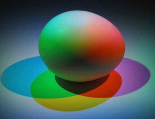
Color Temperature
Color “temperatures” are generally classified as cool or warm. For years it was thought that people with cool skin, hair, and eyes should wear only cool colors, while those with warm skin, hair, and eyes should limit themselves to warm colors. To some extent, this is a reasonable guideline, but research—largely done by cosmetic companies—has shown that while some skin tones can be placed into groupings of warm or cool, not all skin tones are so easily classified. If the undertone is not immediately apparent or seems to be a blend of both cool and warm, it is often called neutral. Hair coloring companies have followed this same concept.
The more I taught, researched, and interacted with many experts, the more I realized that in the world of color, just as in nature, it’s not all black and white. Additional research and study led me to develop a three-palette color system for personal usage that mirrors colors as they appear in nature—the Colortime System. As we all know, there is nothing like color to make you, and your clients, feel more alive.
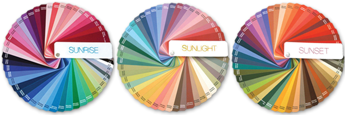
The Colortimes
Each palette identifies the best colors for each of the Colortimes, as they are called. Sunrise consists primarily of cool colors, balanced with some warmth; Sunset is a predominately warm palette, balances with various cool tones, and Sunlight is right in the middle, utilizing the more neutral and/or subtle shadings in both warm and cool tones. Everyone has a natural prime palette of coloring – either Sunrise, Sunlight, or Sunset. 
This is not a rigid system of dos and don’ts. It is truly a very personal choice—based not only on the aesthetics of color but, very importantly, how memories and emotions and even outside influences, like trends, play into color choice.
 And hopefully, it will help to erase some of the negative stereotypes about color and gender.
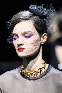
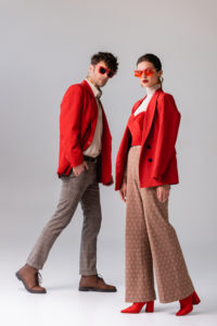
For some people, color judgment and choices come naturally, and what you are seeing today can actually validate your own good instincts and talent. It may simply put into words what you already know. And this is where personal judgment comes into play. For example, even before you had any training you knew that if you have golden brown hair and warm skin and eyes, russets, ambers, and rich chocolate browns are going to make you look terrific because they mirror your own coloring. And if you have dark skin and hair, no one had to tell you that very vibrant colors are dynamite on you. Again, this is a natural sense of color, and you probably choose these colors instinctively.
Sunset
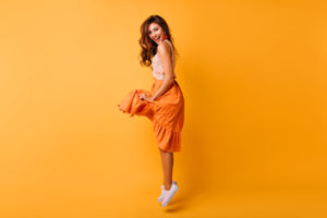
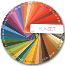 As everyone can relate to the fiery glow of a gorgeous sunset, we’ll start with that dramatic palette. Warm yellow-gold is the pervading undertone of Sunset’s orange, russet, and warm reds. Sunset colors can vary, of course, depending on the locale. They can also include a glowing hot pink or coral.
At dusk, the spectral rays of cooling blue take over, often combining with reflected reds to become a red-violet glow. Surrounding greens have a decided yellow undertone.
If your hair is copper-toned and the skin is warm, or if you have warm brown hair or honey-blonde hair with a warm skin tone and brown eyes, the prime palette is Sunset.
You may also have medium or deep blue eyes, or hazel green eyes with flecks of amber. But the key to the Sunset palette is that it is primarily, but not exclusively, warm, as the infusion of some cool tones will bring a necessary balance to the palette.

Sunrise
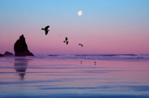
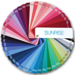 Opposite to Sunset is Sunrise, which is, color-wise, actually Sunset in reverse. In the earliest hours of the day, a cool grayish dawn of frosty tones gradually gives way to dewy rose pinks and apricots.
The air is fresher and cooler in the morning than at any other time of day and the sky exerts a pervasive clear blue light. Blues, blue-greens, and sapphires sparkle in this light, as do other glimmering jewel tones.
Natural coloring for a Sunrise is cool. You may have dramatic platinum blonde hair with the fairest skin or you may have the darkest blue-black hair with fair skin or you may have a dark complexion with extremely dark eyes and hair – almost blue-black. It is the blue undertone that is key to being a Sunrise.
However, not all Sunrises are quite as dramatic in coloring. Some have a bit of rose in their skin, but are still primarily cool, with clear blue or blue-green eyes.
Silver-haired people also fall into the Sunrise category and look stunning in deeper colors or more vibrant, cooler tones. But a word of caution – sometimes a really strong vibrant color in the same color family can overshadow lighter eyes, rendering them drab or colorless.
So-called black skin, as we all know, may not be black at all. In some color systems, people of color have all been categorized in a cool palette. Today we are even more aware of the diversity that people represent, and of avoiding stereotyping for various kinds of coloring.
Sunlight
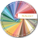 At this point, if you are thinking in terms of yourself and you don’t see yourself in any of the descriptions I have just covered, you are probably right in the middle and most flattered by the soft, sun-drenched tones that appear in the midday light under a placid blue sky.
The colors are a bit more intense than pale pastels. Think delectable ice cream and confection colors and you get the picture – mocha, custardy creams, and delicious pinks. But none are overwhelmingly bright, as subtle and grayed-down shades are particularly flattering.
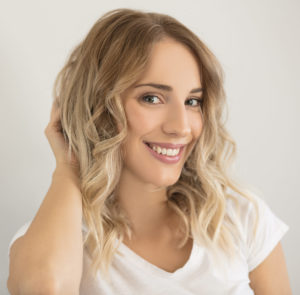
If you are a Sunlight, you are an interesting combination of both warm and cool coloring. Your skin and makeup are often called ivory or neutral beige. Your hair is often a mix of different shades, both warm and cool, particularly in blondes and browns, depending on how the light hits it. Sunlights rarely have really dark hair unless they have chosen to color it. Your eyes are generally variegated with different flecks of color as an undertone.


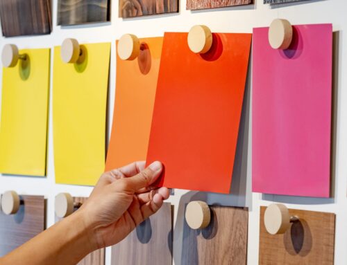
The Crossover Colors
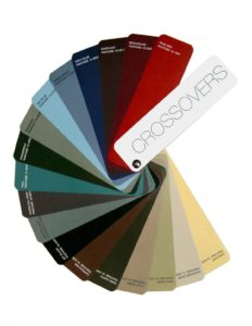 In addition to the three Colortimes, there is a group of colors called the Crossovers that can be used with all three palettes. These are colors that occur so frequently in nature that our eyes are accustomed to seeing them in many combinations. Included are the neutrals—the colors of sand and stone, such as taupes, beige, and grays… and let’s not forget the greens.
And as men, in particular know, navy has a professional look that qualifies it as a dependable and basic Crossover.
Black is certainly another Crossover color that adds confidence and empowerment. Some people may say, “but I can’t wear black because it drains me”. My answer to that is that black is a great foil for other colors. You can always add another color as a dramatic accent, especially near the face. Black is practical, travels well, and is timeless and classic. When I get calls from the media asking, “What is the new black”, I say, “Black is the new black”. It truly never goes away.
Another crossover that might surprise you is true red. Again, looking to nature, it is the pay-attention-to-me signal color that always draws the eye and gets the adrenalin going. Now, you might say, “Red is not one of my favorite colors”. If a color simply does not fit into your comfort level, an option is to consider a different shade or intensity of that color, such as deep, delicious, full-bodied wine-red that is found abundantly in nature – think, berries, grapes, and multitudes of other berry-like growth on plants and bushes.
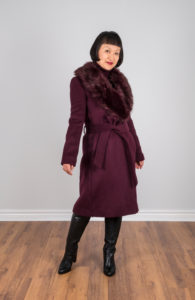
An extension of the berry family, but more plum colored than wine, is Eggplant (often called Aubergine, from the French word). This elegant shade is considered a classic in the world of fashion and interiors.
A universally flattering Crossover hue, that spans the green-to-blue family, is Teal. Think of a tropical sea awash with undulating cool and warm currents.
The color of the sky that surrounds us almost every day is, of course, called Sky Blue. Even on those days that it is not a presence, we have an expectation that it will be there eventually. Our eyes (and minds) are accustomed to seeing Sky Blue as a backdrop for many other shades. And there is also a ubiquitous denim blue.
In real life, especially for travel or business, depending on the industry your clients are in, you have to be more organized and/or practical—and this is where your prime personal palette and the Crossover colors can be most helpful.
A question that might come from a client is, “What if I enjoy wearing a favorite or trend color that isn’t in my personal palette?” My answer to that is even though the old adage says that you can’t fool Mother Nature, we do it all the time. We can switch palettes if we choose to utilize make-up and bronzers to alter skin coloration, contact lenses in every color of the rainbow to alter eye color, and certainly alterations of hair color. Models and actors do it all the time. But if you don’t have unlimited budgets or the skill to be chameleons, it is best to start with a prime palette recommendation.
Yang or Yin?
As we all can relate, everyone is constantly striving for equilibrium and balance in their lives and color can help to maintain that healthy balance. Every Colortime palette contains both yang (forceful and active) and yin (gentle or passive) colors. These terms come from the ancient Chinese who believed that each person is a blend of personalities and it is these opposite characteristics that make up the whole balanced person.
When you feel the need to be more forceful and dynamic, you should reach for the predominantly dark or vibrant (yang) colors in their palette, while using the lighter to medium tones will express their introspective yin qualities.
The More Alive With Color Training Program
If you are currently working as a stylist, make-up artist, fashion consultant, or hair stylist, it is through your gentle (and persuasive) guidance and careful study of the individual hair, skin, and eyes —as well as your client’s input, needs, and aspirations—that will help you to make the best decisions. The More Alive With Color training program will help you to utilize the best color techniques to keep your clients happy and to help to spread the word about your services. If you are preparing for a career or want to extend your current career in color, this training can give you the guidelines and expertise that make for a successful career.
Want to find out more about our ColortimeⓇ Online Course and Certification program? Click here.

Leave A Comment