
In various media interviews, I often get asked about what prompted me to write ten(!) books on color. The answer is simple. It is not only about sharing concepts and knowledge—each book is also an opportunity for me to learn more about the subject of color through research and experience. There was no question, from earliest childhood on, that color would be a major force in my personal and professional life, and working on the books gave me a rare opportunity to express and share my work with others.
As we all know, color is a completely fascinating subject because it can facilitate and satisfy very basic human needs. From a very practical standpoint, color can help us identify and specify necessary objects, whether animal, vegetable, or mineral, for purposes of survival. Physiologically, it can work synergistically with all of the senses—sight, smell, taste, hearing, and touch. Marking territory, signaling, managing, and organizing personal space are other important aspects of color.
Psychologically, color can symbolize abstract concepts and thoughts, recall another time or place, express fantasy and wish-fulfillment, enhance self-image and personal esteem, and express emotions. From a design perspective, it can produce an aesthetic response, and emphasize or camouflage. In the marketing, product, and branding world, color can be used to induce a positive reaction.

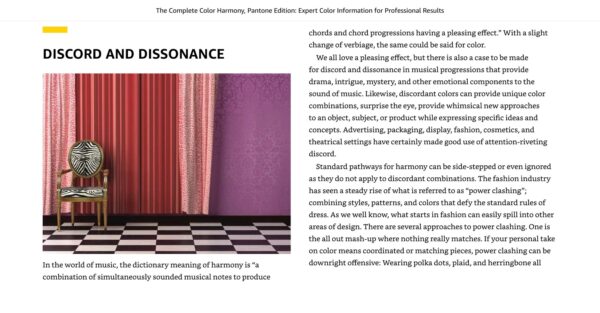
A page from my book, The Complete Color Harmony: Pantone Edition
Most importantly, the use and arrangement of color enables us to create beauty and harmony, express our personal taste, and provides us with a sense of accomplishment and fulfillment.
Color defines a brand’s identity up to 80% of the time, and plays a vital role in consumer purchasing decisions. For this reason, especially in the marketplace or in the fashion and beauty field, color is the “silent salesperson”. Even before a customer reads about a product or service, color communicates messages and influences emotions instantaneously. In milliseconds, visual information gets processed in the brain—even before conscious thought has a chance to process.
For this reason, color is the primary tool used to catch the viewer’s eye. Different colors have different emotional effects on viewers. Cool colors typically evoke the emotions of trust, reliability, and relaxation. Warm colors generally are viewed as exciting, friendly, and attention-grabbing. The neutrals are viewed as more sophisticated. Black evokes luxury and high-end. Using color for brand recognition helps to create consistency and continuity, something all brand marketers strive to achieve.
As color touches on so many various aspects of our lives, there are many opportunities to write about the subject of color. Since I started in the fashion, beauty, and retail world, it was logical to do my first book on color in those areas. It was called “Alive With Color” as that was my goal—to help people feel more confident and alive through the use of color. The book explained the Colortime™ concept that I had developed through my teaching career. To my delight, it was chosen by the same publisher that had done Color Me Beautiful. They felt my book was more inclusive and took essential color concepts to a more advanced level of expertise and insight.
A page from my book, The Complete Color Harmony: Pantone Edition
Fortunately, my book was brought to the attention of Pantone, where I was asked to help establish and lead the Pantone Color Institute. That led to book #2, featuring newly formulated Pantone colors and color theory, titled the Pantone Book of Color.
As Pantone’s core audience at that time was the graphic design industry, which includes marketing, advertising, branding, and packaging, the next two books were aimed toward that readership: The Pantone Guide to Communicating With Color and Color Messages and Meanings. Soon followed The Color Answer Book: 100+ most frequently asked questions about color, Colors for Your Every Mood, containing colors for interior design, two books showing historical perspectives through The 20th Century in Color and Pantone on Fashion, including background on Pantone’s Color of the year. I also made an update to my very first book, logically titled More Alive With Color, and then next came The Complete Color Harmony, Pantone Edition.
I am happy to tell you that many schools and universities have made the books part of their recommended reading for their color courses, and—of course—we utilize them as well as part of our online training classes.
I am currently working on three additional books, so stay tuned!
If you are interested in learning more about the subject of color, you can purchase personalized, signed copies of specific books through my website, LeatriceEiseman.com.


Leave A Comment