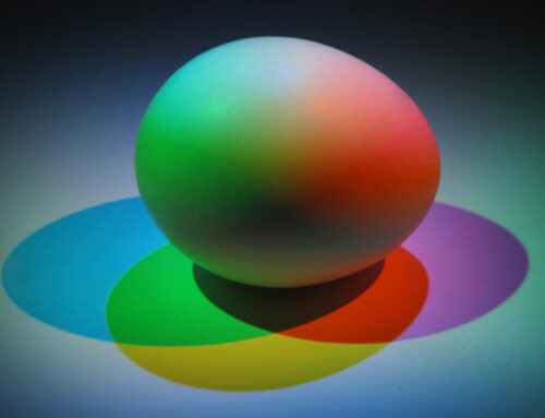
As we all know, our homes are an expression of who we are. We strive to “feather our nests” with objects that not only serve some practical purposes but are also pleasing to our sensibilities, lifestyles, and playstyles. Whether you are a professional interior designer or a dedicated “do-it-yourselfer,” one way you can inject personality into a space is through colorful items. For those not as comfortable designing with color—or even those that just want to get better at it—there are many helpful tips about color outlined in our online training course on the Colortime™ concept for interiors.
The following objects, accessories, or settings are based on this intuitive, nature-based, and easy-to-follow training system. I hope they will inspire and instruct you and help you create more beautiful and meaningful surroundings in your home.
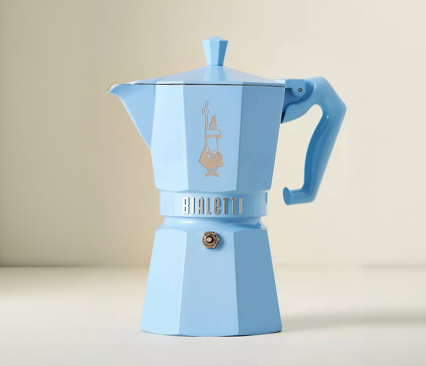
Blue Espresso Maker; by Bialetti on Anthropologie
Look for interesting design in colors that speak to you
Whether scrolling online or checking out what the stores have to offer, there are times when your eye is riveted by a product or object that you just can’t resist. It can be the shape, form, material, texture, but certainly most of the time, for me, it’s the color that calls. This perfect gem of a blue espresso-maker is reminiscent of the cool tone that we might see spread across an expansive sky at sunrise (and therefore part of our Sunrise palette). In the kitchen, this beautiful blue hue would be a welcome addition to the countertop.
We know that countertops can get crowded for space, and this architectural piece begs to be seen. It doesn’t deserve to be hidden in a cupboard; instead, it’s a small object d’art that nods to vintage or retro styles. This charming piece would make a great centerpiece on a table in the kitchen or even the dining room. Pop the lid up and put a bunch of bluebells into it, or place some rolled-up ornamental napkins peeking out of it when you have friends or family come for lunch. Give it a special place in a china cabinet with glass doors, or fill it with colorful wrapped candies and place it on an end table.
Collect vintage china to add a color palette to your display
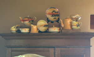
A collection of vintage Noritake
If you have a treasured piece (or pieces) of china, put them together in a display. They could be arranged on top of an armoire, chest, or on shelving where they add some color and shape; they don’t need to be confined to the kitchen or dining room. These examples of vintage Noritake pieces are now considered collector’s items. The designs or scenes are like little works of art, and the color combinations are most often exceptional, like this group that includes softened sunset-lit earthy shades in gingery apricot and golden tones, accented by coriander green and a violet-infused blue. The display could also include a broken piece hidden under another, or a lonely piece of glassware that adds a different shape to the mix. Thrift shops are a great source of these fun finds, and show the personality of the owner more than any “decor” item purchased at a big box store.
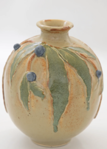
Berry vase; Artful Home Dorothy Bassett
Build a room’s palette around a beautiful object
Keep your mind open to where and how you can display something you really love, whether you actually own it or would like to call it your own. Street fairs, estate sales, and online markets are great places to treasure hunt. Etsy and catalogs like Artful Home are great sources of beautiful imagery that can inspire an entire color palette. This lovely glazed vase has softened shades of leaves, berries, and twigs against a neutral background that could have been plucked directly from our Sunlight Colortime palette. It’s unique enough that you could build a color scheme for an entire room around it.
Be bold with your color choices for your furnishings
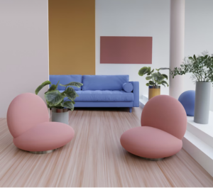 Interior Design magazines have always been a great resource for stimulating decor ideas, just as Pinterest and Instagram are today. Here is an example of an entire room done in subtle Sunlight hues, undoubtedly inspired by—and built around—the whimsical (and very modern) pink chairs. One slight change we would recommend is softening the starkness of the white walls by adding just a touch of any of the colors already present in the furnishings. A bit of rose mixed into the white paint would make the atmosphere a bit warmer, while adding a touch of the blue undertone would make it seem slightly cooler.
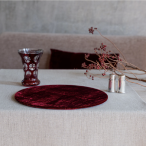
Burgundy place setting; OnceMilano.com
Use Crossover Colors when you want to add visual interest to any room
The Colortime concept includes a full range of colors called Crossovers that are considered classic, neutral, basic, and staple. Within that range is—believe it or not—a rich, robust wine color, a shade that adds subtle glamour wherever it is used. This example of a plush placemat coupled with an ornamental matching wine glass adds color and sophistication to a tabletop. It’s a bit of a surprise in a placemat, and that makes it even more appealing—bringing an unexpected hue into the mix. If you are the practical type and concerned about the use of velvet and washability, many velvets today are cotton or blended velveteens. They are easy care and should you (or your guests) actually spill some wine, it will disappear into the background!
If you would like to learn more about the Colortime Concept for interior design, please click here.
Leatrice Eiseman is a world-renowned color expert, known as the “International Color Guru”. She is the founder of the Eiseman Center for Color Information & Training and the Executive Director of the Pantone® Color Institute. Lee has written ten books on color, has been widely quoted in many publications, and recognized by Fortune Magazine and the Wall St. Journal as one of the most influential people in the world of color. Today, she is available as a corporate color consultant and a sought-after speaker. She also offers online courses on color theory and personal image color training.

Leave A Comment