This month we have a couple more reader questions that we thought were extremely interesting—all about how we react to the colors around us. Let’s take a look, shall we?
Question 1: How can color help to achieve balance in our lives?
Lee’s answer: Seeking equilibrium is a natural human longing, whether it be physically, spiritually, aesthetically, or emotionally. The ancient Chinese were very aware of this need, one they called the balance of yin and yang. In more scientific terms, this balanced state of ease, as opposed to dis-ease, is referred to as homeostasis. Interestingly, these amazing bodies that we inhabit contain a mechanism that always provides an instant visual balance.
For example, if you studied color in school you probably had a teacher who introduced you to a fun and fascinating experiment. Concentrate on any color surface for a few seconds, then look away at another plain surface, preferably white, and you will see what is called the after-image. This is actually the complementary color opposite to the color you were concentrating on. This phenomenon is a graphic example of the body’s ability to provide instantaneous restoration of balance through color.
When a cool color is viewed, the after-image will always be a warm color. Conversely, a warm color will always be balanced with a cool after-image.
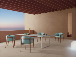
Photo courtesy of Pedrali New Horizons and CMP Design
Although we have no conscious awareness of this colorful balancing act that is going on within us, our eyes will seek out a touch of warming color in a too-cool environment. The sight of radiating hot flames in the fireplace warms our psyches as well as our bodies. In a room full of warm colors, we welcome the sight and suggestion of refreshing greenery.
Our innate restorative powers swing into gear when we turn the color temperature up or down. This is especially important in our living and working environments—when we are so totally immersed (or not) in color.
When balancing the color in our workspace (or any space), the most important point to remember is that one color temperature should be dominant. A room should be approximately 75% cool colors and 25% warm colors, or vice versa, so that a dominant message and comfort level is conveyed: Warm and inviting with a cooling touch, or cool and serene with some warm accents. This decision is yours.
If you are really fascinated by the subject of mood and balance my book titled, “Colors For Your Every Mood” explores the subject in greater detail.
Question 2: What colors are most associated with luscious, sweet tastes, and why?
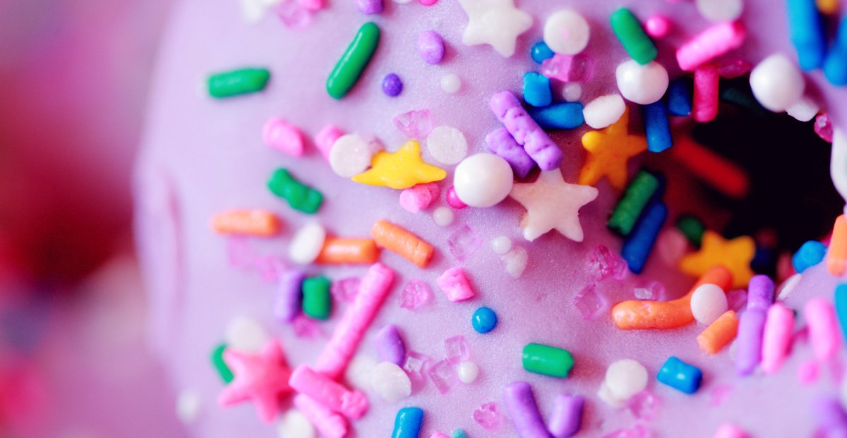
Lee’s answer: It’s all about pleasure. Starting way back in your infancy, to your earliest reaction to color and taste, it is invariably the sweet confectionery colors that are always thought of as not only sweet to the taste buds, but to the eye as well. Think of your first bit of birthday cake with sugary sweet pure white, bubble-gum pink, delicate lavender, lemon-drop yellow, or baby blue icing. Think yellow Necco wafers. Think of a chocolate ice cream cone dripping down on your clean white shirt and leaving a sticky residue gluing your fingers together. Think of hot fudge sundaes with whipped cream and a cherry on top. Recall sugary spun pink cotton candy at the carnival or red dots sticking to your teeth and delighting you with their spiciness. If you can’t remember back that far, observe any baby as it dives to stuff sweet stuff into its little mouth, and you can see that the reaction is almost invariably pure joy.
 When you were older, unless you are the rare exception, this translated into more sophisticated tastes, but no less sweet and suggestive of your earliest pleasurable memories. Think of purple smoothies and raspberry sherbets, pastel petit fours, delectable fudge caramel ice cream, creamy gelatos, lattes with mocha, and decadent seven-layer chocolate cake. Think blueberry tarts and crème fraise, mint chocolate, and banana cream pies. How about strawberry daiquiris and peach melba? Get the picture (and the colors in those images)?
If you are not already salivating, a look at the “real thing”, in the colors mentioned above, will immediately elicit the taste of sweet and luscious goodies, just as they did with your first realization that sweet tastes in all of those enticing colors were extremely pleasurable. And it is just these memories that make it so difficult to resist the temptation especially when there are so many colorful enticements that beckon from the supermarket shelf, the bakery, ads, commercials, and not least of all the neighborhood Starbucks or Baskin Robbins!”
We hope you enjoyed these questions – and, again, please submit any questions of your own in the comments below (or email us at leiseman@colorexpert.com). We can’t answer all questions, but we’ll publish answers to those questions that are most relevant to the majority of our readers.


Leave A Comment